Forum Settings
Forums
New
This topic has been locked and is no longer available for discussion.
Pages (196) « First ... « 65 66 [67] 68 69 » ... Last »
Dec 12, 2010 1:58 PM

Offline
Mar 2009
817
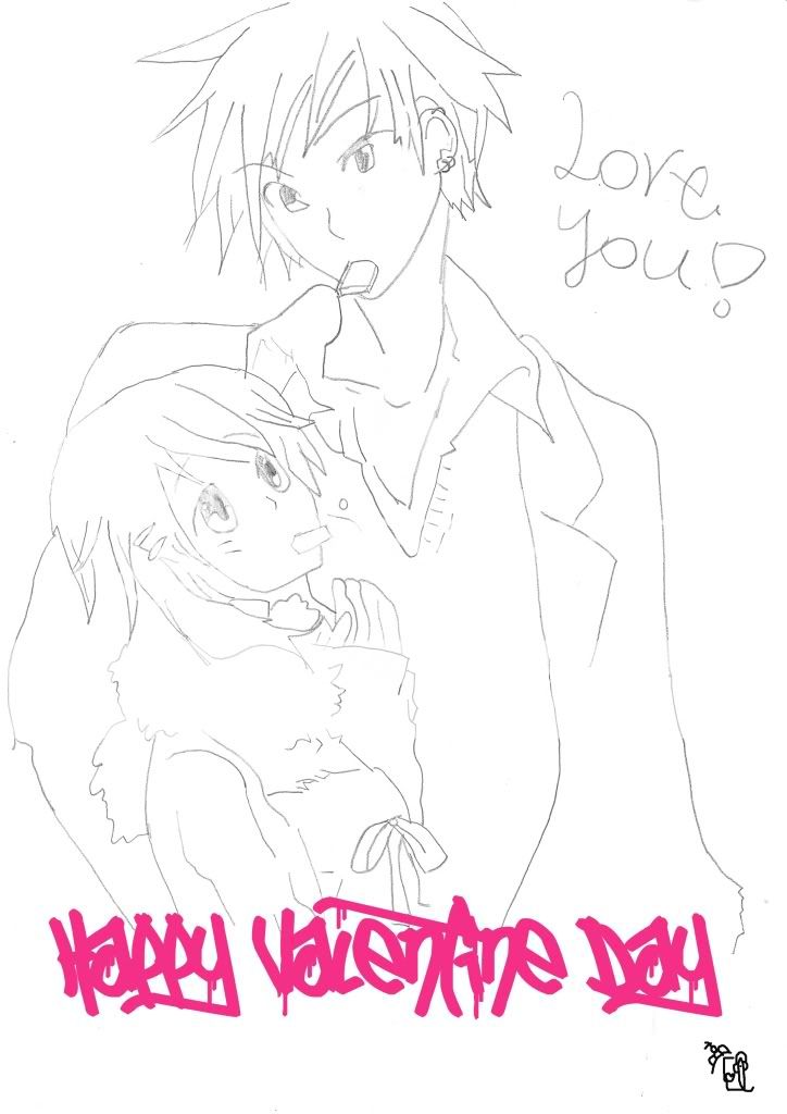
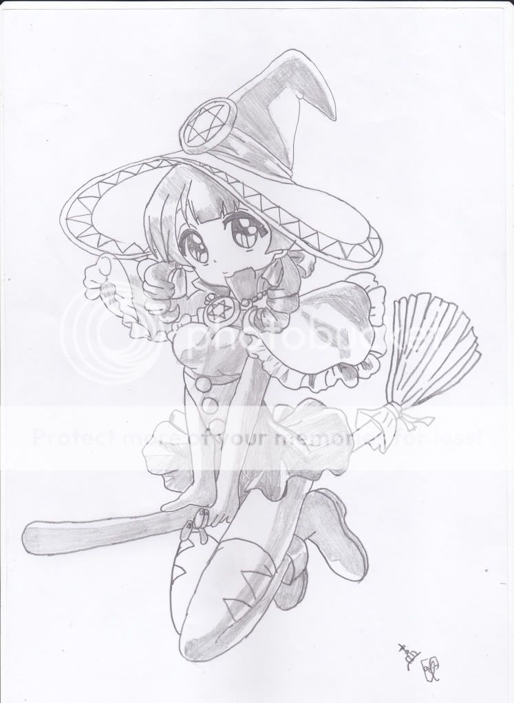
@sweetmonia: I agree with you about the hand. I think the hand in the actual manga looked funny to me and I copied it how I saw it. I think my version could have been a little better, but also I think the original wasn't a great reference. As for the skewed head.. I don't think that is what is throwing it off (if by skewed you mean that the features of the face are in perspective such as how the foreground eye is bigger than the one further back, that is intentional). I think the neck is too long, and I noticed this about 3/4 of the way into the drawing. That shows why the under drawings are so important; if you mess up there and have to go back later in the drawing, it's a pain to erase other parts of the body to correct a mistake like that. It could also be the hair, which I quickly penciled. I did a really messy job. All together it took me about an hour and a half to complete both drawings so there's actually quite a few more mistakes than you pointed out, such as the left hand on the 2nd image which sticks out like a sore thumb to me. Also, some of the drawings in the panels were done hastily and very sloppy. Thanks for your comments though, they really force me to look at my work again and do better next time.
perspectiveDec 12, 2010 2:11 PM
Dec 12, 2010 7:05 PM

Offline
Apr 2010
9


I've been meaning to post more in this thread forever, but school work bogged me down......that, and I haven't been too proud of most of my drawings till now....

Philia Philis, Tales of Destiny
Dec 12, 2010 8:35 PM

Offline
Jul 2009
645
This is the last thing I've drawn in a while. It's kind of messy, but I like it. Tell me what you think!

Dec 12, 2010 8:38 PM

Offline
Mar 2009
65239
lonerurouni187 said:


It looks alright. I like the hair and its colour which reminds me of C.C.
Dec 12, 2010 10:58 PM

Offline
Mar 2008
2253
Dec 12, 2010 11:00 PM

Offline
Mar 2009
65239
Fui said:


Her right leg just looks very wrong and odd. Like it's very short. The shape of the thigh looks off too. Very skinny arms. I like the eyes and facial expression though.
Dec 12, 2010 11:16 PM

Offline
Mar 2008
2253
AlexSadist-sama said:
Fui said:


Her right leg just looks very wrong and odd. Like it's very short. The shape of the thigh looks off too. Very skinny arms. I like the eyes and facial expression though.

Yeah...especially zoomed out a I see a lot of errors. Not good at all. Thanks for letting me know. Ironically I don't like the face, either...lol.
Dec 13, 2010 4:15 AM

Offline
Nov 2009
1417


my recent art XD
Dec 13, 2010 6:34 AM

Offline
Mar 2009
817
Fui said:


I'm sure you're already aware of most of the problems with the figure. I only want to mention that think the torso is a bit long there. I'd like to lend most of my comments towards inking and coloring, since I think that is what you might be trying to work on the most. I think for your inking that you could probably focus a bit more on your line weights. This will make it look less flat on the page; even with coloring and shading. Also, I can tell you're a lot like me in that you prefer inking with a tablet. I assume you're using sai paint because I think I saw a post where you commented on that, and I think that the editing tools for inking layers can really help you smooth out those lines and curves. If you'd rather keep inking exclusively with the tablet (it is good practice imo), I suggest after you scan in your sketch to scale it up to at least 4000 px width or so, so that when you scale it down again it's very smooth. Really take your time on this phase so that it looks right. Bad inking is just too noticeable. Use your eraser to help you correct and taper lines as well. With the coloring, I see you colored over some of the shading, which you inked with hatch marks (under the chin). This is why I think inkers can give colorists a hard time; because they like to fill in the shading with blacks, and then the colorist has to work around these areas when doing their job. I think in general, especially for anime, you should do all of your lights and shadows in your coloring stage because you really want more control of the values when you color. My last thought is that you should have done the skin shading with soft-celled shading instead of hard; that is, I think it would have looked better with a lot of blending of the tones and a soft brush to make the edges of the shadow appear more gradient. I say that because you did so with the hair and there's other visual queues that tell me the entire piece should have been done in that style. The areas which you chose for your lighting and shading look appropriate to me, and I think you did a great job there.

I've personally made a ton of crappy fully inked and colored drawings (some taking upward to 10 hours to complete) and the number one reason they look that way is because I cheated some step in my illustrations. Its usually the under drawings I don't pay enough attention to, and that's why you might have some proportion or perspective problem and not notice it until too late. Inking is also a very crucial stage; don't rush that either. If you can get those 2 areas down, I think you could color your drawing pink with purple polka dots, shade anywhere you want randomly, and the drawing would still look awesome. And, please don't take my advice as I know better than you... cause that's not the case. I struggle with the same issues. I think any decent artist needs to hear when to go back to the drawing board because that's how we improve. Look forward to seeing more of your work.
perspectiveDec 13, 2010 6:42 AM
Dec 13, 2010 9:32 AM

Offline
Mar 2008
2253
I probably should have clarified, but I just colored in a sketch I scanned in with pencil as sort of a study to experiment with coloring. I originally actually didn't ink anything, so the "inking" came last/was an afterthought. Normally I'd scan it in, make an actual lineart, then color it. So that's why the lines are kinda weird. But it's good to know that it doesn't look right if you skip the step. I'll definitely not use this workflow if I want to make a piece for presentation. As for values/rendering, although I know about soft/firm/hard/lost edges, I'm trying to work only hard right now since that's what they use in cel shading for animation, and also because I'm trying to figure out how to make interesting shadow shapes. But for illustrating, I will definitely experiment with all of them.

Right now though, although I know these things are important, I still have problems getting an interesting figure out. The rest is really not a priority for me right now, since if you can't draw a good figure/comp, it doesn't matter how clean it is; it'll still look bad. This is definitely a much bigger problem, because it can't easily be solved by just being more clean with lines...but is much more fundamental...like basically what your brain is doing while you draw. I think this is the difference between animators and illustrators, and it's really killing me.
Dec 14, 2010 12:53 PM

Offline
Aug 2010
21
drawed it some time ago, free hand ,based on picture. imma just show ,watch out - ultra high res
Dec 14, 2010 2:28 PM

Offline
Mar 2009
817
Fui said:
I probably should have clarified, but I just colored in a sketch I scanned in with pencil as sort of a study to experiment with coloring. I originally actually didn't ink anything, so the "inking" came last/was an afterthought. Normally I'd scan it in, make an actual lineart, then color it. So that's why the lines are kinda weird. But it's good to know that it doesn't look right if you skip the step. I'll definitely not use this workflow if I want to make a piece for presentation. As for values/rendering, although I know about soft/firm/hard/lost edges, I'm trying to work only hard right now since that's what they use in cel shading for animation, and also because I'm trying to figure out how to make interesting shadow shapes. But for illustrating, I will definitely experiment with all of them.

Right now though, although I know these things are important, I still have problems getting an interesting figure out. The rest is really not a priority for me right now, since if you can't draw a good figure/comp, it doesn't matter how clean it is; it'll still look bad. This is definitely a much bigger problem, because it can't easily be solved by just being more clean with lines...but is much more fundamental...like basically what your brain is doing while you draw. I think this is the difference between animators and illustrators, and it's really killing me.


There's no difference in solving visual problems between animators and illustrators. They both need to make figures dynamic. I would argue illustrators would have to stress more importance on making interesting figures because they don't have a lot of frames to compensate.

I think that a great way to make figures interesting might be to use gesture drawing. This is a tool used by animators and illustrators alike because it loosens up those drawings and makes things flow with force and balance as we see it in life. Another suggestion is to abuse forshortening to give your figures a greater sense of depth. Also, copy other artists who inspire you. They often have already solved the visual problems that are the most difficult to draw.

*note: When I say copy, I don't mean copy line by line or trace. I mean do a contour drawing, or a wood doll figure of the pose, or a gesture drawing of the pose. I mean something that engages your brain and actually makes you learn from it.
Dec 14, 2010 3:13 PM

Offline
Mar 2008
2253
No, I don't think there's a difference in what they should know. However, (Japanese key) animators study differently from illustrators, and I believe it is their background that makes them, in my eyes, more skilled artists overall. It's just my preference/opinion.

I've done countless gesture drawings due to classes in the past, with varying approaches based on the teacher's interpretation of what gesture drawing is. I don't think any of their methods have helped me at all. I start working rough though and put down stuff as basic as possible, so if this is considered a form of gesture drawing, then I think it's useful.

Foreshortening is basically shape comp, proportions and understanding form in space. However, when you work solely in form I feel that the figure tends to get stiff. It's hard to compromise the two and get something interesting and dynamic but convincingly structured.

I think the last bit you mentioned is a productive means of studying. I feel that it's been useful to me, at least.
Dec 14, 2010 9:09 PM

Offline
Aug 2009
12
Just want to add a quick comment to fui and perspective, although I'm just entering the conversation.
Being able to create a dynamic image, whether it is the job of the illustrator or animator, really takes being able to "zoom in" and "zoom out". The gesture drawing exercise, which for me is depicting the overall movement of the image, has to be balanced with more intricate decisions such as foreshortening, proportions, etc. You have to constantly be able to see the big picture while draw the details. That's why, when I feel that a figure gets too stiff or doesn't feel right, I feel myself having to hold the page at arms length. That's why I hate using the computer, because you loose that sense of scale, although we all know we have the power to zoom in and out.
>.< well, that's my 2 cents.
Dec 15, 2010 4:34 AM

Offline
Mar 2009
817
Fui said:
I start working rough though and put down stuff as basic as possible, so if this is considered a form of gesture drawing, then I think it's useful.


It can definitely be a type of gesture drawing, but the point is to start out very loosely then tighten up the structure to bring some reality to it. Just think of it as another tool in your tool belt. I know a variety of artists have gotten powerful results from it, so don't forsake it just yet. I think when it comes down to it, the 3rd thing I mentioned might be most effective for you. You really can't learn to draw better without the experience of studying other artists and drawing from life. That's just my thought on it anyway. Whether you think animators are better than illustrators, I think we can both agree that they can be respected because we ask that they draw from their imagination; and not just draw or paint what's in front of them. It's a much more difficult skill set to acquire.

@silstar_7: I think you are getting at the point I mentioned briefly above and that is that gesture drawing with all of it's looseness needs to be counter balanced with a good frame that tightens up the drawing and brings in a sense of reality. I usually throw a manikin doll over the gesture drawing to do that before erasing it all down and doing a drawing with actual details. That's just me though. It helps me have a stable framework to draw on top of so that everything just matches up.
Dec 16, 2010 1:31 AM

Offline
Mar 2008
2253
Yeah I agree with most things...just need a lot more practice/experience.

Nothing very interesting here. Just wanted to try out some shapes.
Dec 16, 2010 1:35 AM

Offline
Mar 2009
65239
Fui said:
Yeah I agree with most things...just need a lot more practice/experience.

Nothing very interesting here. Just wanted to try out some shapes.


The elbows are quite pointy.
The left shoe looks like it's bent.
Apart from those, it looks alright.
Dec 16, 2010 1:39 AM

Offline
Aug 2009
12
Well, anyways, here's an example of some of my recent work. And by "recent", it's probably already 6 months old. I am open to any criticism, comments, etc.


I am particularly bad at creating chibis, so any criticism would be great. I've been meaning to color it for ages, but if u have any ideas of a color palete, that would be great, too!
Dec 16, 2010 10:44 PM

Offline
Oct 2010
33
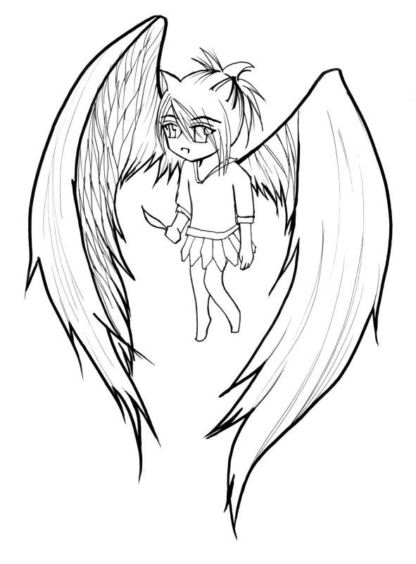
uhmmm here's something I did for our club >.<......uhm I know its not that good but uhm yeah. XD


Dec 17, 2010 12:38 AM

Offline
Dec 2010
6
hi :D

this is just something i'm -still- working on xP

Dec 17, 2010 2:56 AM

Offline
Mar 2009
65239
silstar_7 said:


The left and right eyes look quite different from each other. Well, unless you meant to draw them differently.

The wings are quite big.. decreasing the size would make them look better.

Is the character supposed to be floating or standing on the ground?

imadoki44 said:


The clothes look simple but nicely designed.
The characters' stick thin bodies aren't quite pleasant though esp the girl's arm.

Ideal said:


The picture is at a bad angle so I can't say much. It looks decent though.
Dec 17, 2010 3:53 AM

Offline
Dec 2010
6
AlexSadist-sama said:


Ideal said:


The picture is at a bad angle so I can't say much. It looks decent though.


I actually did that on purpose XD
anyways thanks I guess :3
Dec 17, 2010 4:20 AM

Offline
Aug 2008
137
This started off as just a random doodle while I was waiting for a youtube video to upload, otherwise it would have been better, and more intricate. Not one of my best but ah well -
Dec 17, 2010 7:45 AM

Offline
Jun 2009
858

JungTacoDec 17, 2010 9:43 AM
Dec 20, 2010 10:01 PM

Offline
Jul 2009
645
I was in the mood to do some fanart, so I decided to draw Sasuke. Tell me what you think!

Dec 20, 2010 11:04 PM

Offline
Nov 2009
1417
this my 5 recent drawings :)

Dec 22, 2010 12:04 AM

Offline
Feb 2010
1890
AlexSadist-sama said:
Fui said:
Yeah I agree with most things...just need a lot more practice/experience.

Nothing very interesting here. Just wanted to try out some shapes.


The elbows are quite pointy.
The left shoe looks like it's bent.
Apart from those, it looks alright.


I think the girl in the pic has her toes stepping onto the shoe making it point upward, if that's what you're referring to.
Signature removed. Please follow the signature rules, as defined in the Site & Forum Guidelines.
Dec 24, 2010 12:36 PM

Offline
Mar 2008
2253
Merry Christmas!
Dec 24, 2010 3:02 PM

Offline
Feb 2007
1028
merry christmas #2

Donate to my awesomeness! | "Insanity: doing the same thing over and over again and expecting different results." - Albert Einstein
Dec 25, 2010 12:43 AM

Offline
Feb 2007
5481
@fui and perspective about blue swimsuit girl

Other than the one leg being terribly way too short, the colours and line weight are really interesting and nice. It reminds me of something really reminiscent of water colour work. If I crop the image and cut off her legs (cut off just below her crotch) it actually looks a lot better. I think the sketchy-ness of the lines only enhances the feel of a quick water-colour art.

by "interesting figure" do you mean the pose, or an interesting body :shape: or an interesting silhouette?

It's my preference in anime and manga that all of the above never look.. too distorted, like how you drew the one leg. When something is too distorted I find myself drawn to that aspect and I start to dislike it over all. What's more important is, hm, character design and colour? (Also other things like general frame composition) ... At least to me, a non-artist.

*sorry if I do not get what you are talking about I am just curious*
Dec 26, 2010 8:24 PM

Offline
Mar 2008
2253
Deleted post and re-edited so I don't double-post
Spoiler'd is response to selective yellow:


Misc sketches - sorry for the terrible scanner; I had to make it something like 200% contrast and 10% brightness just for the lines to show.
FuiDec 27, 2010 1:11 AM
Dec 28, 2010 11:56 AM

Offline
Dec 2010
6
@Fui:

aww it's such a shame!
i really like your lines and how you.. whats the word.. design(?) the body *_*


a few sketches in Drawr
i dunno why but i really like that site @_@

Dec 28, 2010 11:09 PM

Offline
Jun 2009
6
I was reading Dragon Half when I had an urge to draw Mink :3


Her hips are entrancing xD
Dec 30, 2010 8:44 PM

Offline
Mar 2009
817
Fui said:
Misc sketches - sorry for the terrible scanner; I had to make it something like 200% contrast and 10% brightness just for the lines to show.


Good stuff. I like the facial expressions and the character design. I think the last 2 drawings you posted both look somewhat off-balance, and that's mostly because I think you draw the legs a bit pigeon toed. Otherwise they seem to be very appealing to me.
Dec 31, 2010 3:35 AM

Offline
Jun 2009
858
Jan 1, 2011 1:07 AM
Offline
Dec 2010
18
Heres an old pic i drew of naruto, its kinda hard to see though

Jan 1, 2011 7:47 AM

Offline
Sep 2010
150
snumbers said:
Heres an old pic i drew of naruto, its kinda hard to see though


i think you missed its Konoha's headband sign XD

btw just wanna share XD,,
i dont even have a sketching basic at all actually,, so here's mine
Jan 1, 2011 9:09 AM

Offline
Jun 2009
858
Jan 4, 2011 2:59 PM
Offline
Jan 2011
1
Nice to meet you.
English cannot be spoken.
とりあえずこれを見てくれ(´・ω・`)つ
http://i1197.photobucket.com/albums/aa429/sbamboo/sdfa.jpg
信じられるか?これ、リンなんだぜ
Jan 4, 2011 7:00 PM

Offline
Jul 2009
645
bamboosweetie said:
Nice to meet you.
English cannot be spoken.
とりあえずこれを見てくれ(´・ω・`)つ
http://i1197.photobucket.com/albums/aa429/sbamboo/sdfa.jpg
信じられるか?これ、リンなんだぜ


It's cute!
Jan 4, 2011 9:45 PM
Offline
Jul 2009
3
<--- Well, I drew my profile picture :3
Jan 6, 2011 2:12 AM

Offline
Sep 2010
150
bamboosweetie said:
Nice to meet you.
English cannot be spoken.
とりあえずこれを見てくれ(´・ω・`)つ
http://i1197.photobucket.com/albums/aa429/sbamboo/sdfa.jpg
信じられるか?これ、リンなんだぜ


what should i say,, kawaiii ;D
Jan 6, 2011 3:51 AM

Offline
Aug 2010
472
bamboosweetie said:
Nice to meet you.
English cannot be spoken.
とりあえずこれを見てくれ(´・ω・`)つ
http://i1197.photobucket.com/albums/aa429/sbamboo/sdfa.jpg
信じられるか?これ、リンなんだぜ


I like this a lot.
Jan 7, 2011 12:41 PM

Offline
Jun 2009
284
Aen Sumra~elf I am currently working on so he's not yet complete. Comments and advices are welcome :)

Jan 7, 2011 5:45 PM

Offline
Aug 2010
147
The face is waaaaay too squished. Also, the neck looks weird, like a snake or something. I assume it's a woman, so the shoulders are way too broad.
Jan 7, 2011 7:49 PM

Offline
Jun 2009
284
Waaaaa0_0 You're tottttallly right, i didn't notice that neck is as you said weirdxD But thats a man not a woman0_0 Thanks for that comment:)

Jan 8, 2011 2:52 AM

Offline
Sep 2010
150
NanamiFukumitsu said:
Waaaaa0_0 You're tottttallly right, i didn't notice that neck is as you said weirdxD But thats a man not a woman0_0 Thanks for that comment:)

I think the face and head ratio isnt proportional,, his face is way too small XD
I think you should make his face a little bit bigger
Jan 8, 2011 9:38 PM

Offline
Jul 2010
89
swoodles said:


Ah it all looks amazing.
I especially love the color scheme you're using.
<3
Jan 9, 2011 9:41 AM
This topic has been locked and is no longer available for discussion.
Pages (196) « First ... « 65 66 [67] 68 69 » ... Last »

More topics from this board

» 【 ART THREAD 】Let's share our art! ‪‪❤︎‬ ( 1 2 3 4 5 ... Last Page )

mewmewforever - Aug 30, 2024

274 by RetroCagliostro »»
47 minutes ago

» Have you ever used a mechanical pencil for drawing?

DesuMaiden - Dec 19

7 by Retro8bit »»
5 hours ago

» I made a 'Cultured' higher or lower game

DuxAlbion - 9 hours ago

1 by Retro8bit »»
5 hours ago

» AI-Powered Anime Recommendations + Stats ( 1 2 )

ameo___ - May 23, 2022

88 by therex55213 »»
6 hours ago

» Did I go over the top with the stamps on my profile?

vermerin - Dec 17

8 by Chipp_Dipp »»
11 hours ago
It’s time to ditch the text file.
Keep track of your anime easily by creating your own list.
Sign Up Login