New
Apr 11, 2016 8:36 PM
#6451

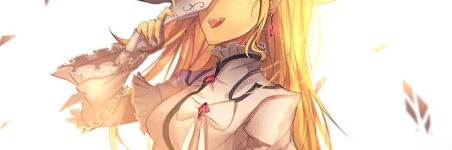
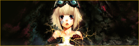
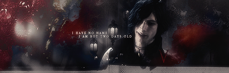
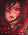
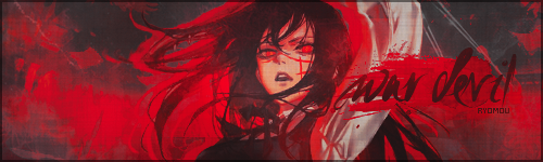
| updated my set and profile picture. Any tips would be great. |
 |
Apr 12, 2016 11:49 AM
#6452

the blur effect is done pretty nicely. I'm not a huge fan of the text being split in half, but otherwise really like your signature C: |
 |
Apr 12, 2016 5:27 PM
#6453
shuryukan said: the blur effect is done pretty nicely. I'm not a huge fan of the text being split in half, but otherwise really like your signature C: Yeah splitting the text was a bad idea but I don't know where to put it. |
|

Apr 14, 2016 7:13 PM
#6455

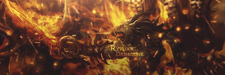
It does look perfect except for the colors, they are pale and the image kinda feel LQ imo. I think you should use more adjustment layers, and bit of sharpen. http://i.imgur.com/kj5awEv.png |
 |
Apr 15, 2016 1:03 PM
#6457
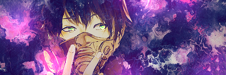
tsudecimo said: It does look perfect except for the colors, they are pale and the image kinda feel LQ imo. I think you should use more adjustment layers, and bit of sharpen. http://i.imgur.com/kj5awEv.png The problem with the one you've edited is that it's over saturated and sharpened. Flames should be fluid and not sharp which is why I only sharpened the area around Rytlocks face. I could have probably put an overlay on the flame effects but that's not really the look I was going for with this piece. Tainted said: is my sig in low quality? I don't think it's of a "low quality," not a fan of that phrase, however if you note that on your renders head there's an area where light is striking, but you have no light source coming from that direction. You might want to use the pen tool to create rays of light and fade the opacity to like 40% on that layer. I'm assuming your using Photoshop, not GIMP or Photopaint. |
 |
Apr 15, 2016 8:14 PM
#6458
jondoom said: tsudecimo said: It does look perfect except for the colors, they are pale and the image kinda feel LQ imo. I think you should use more adjustment layers, and bit of sharpen. http://i.imgur.com/kj5awEv.png The problem with the one you've edited is that it's over saturated and sharpened. Flames should be fluid and not sharp which is why I only sharpened the area around Rytlocks face. I could have probably put an overlay on the flame effects but that's not really the look I was going for with this piece. Tainted said: is my sig in low quality? I don't think it's of a "low quality," not a fan of that phrase, however if you note that on your renders head there's an area where light is striking, but you have no light source coming from that direction. You might want to use the pen tool to create rays of light and fade the opacity to like 40% on that layer. I'm assuming your using Photoshop, not GIMP or Photopaint. Thanks I didn't noticed that part .:) |
|

Apr 21, 2016 5:23 AM
#6460

| Now that looks really pretty ;) |
 |
Apr 22, 2016 9:58 AM
#6462

Fixed something up yesterday. A little experiment since I was getting stuck on one of my requests. I think it looks kinda decent;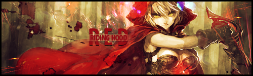 Here's the original stock image for comparison: 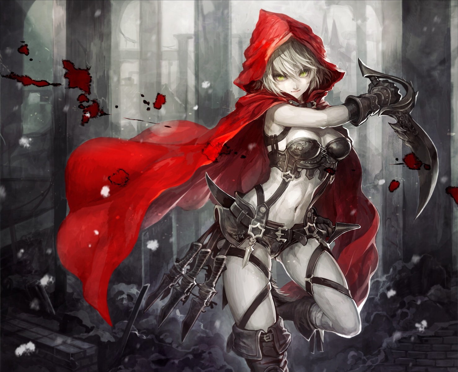 |
 |
Apr 23, 2016 9:29 PM
#6464
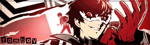
Tomboy said:  got into the groove today I really love your work <3 |
|
Apr 25, 2016 11:16 AM
#6465
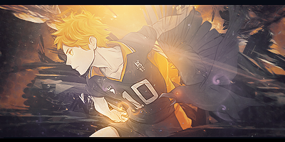
more practice shit like i conjured up in 10 minutes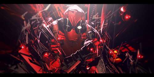 |
 |
Apr 29, 2016 12:30 PM
#6467

much better than the yato one. i can't give specifics but i just find it better. |
 |
May 5, 2016 11:44 AM
#6468
| Feedback on current signature? or any of these two? http://i.imgur.com/93FsAir.png http://i.imgur.com/YEEdUKA.jpg |
|
May 5, 2016 12:36 PM
#6469
A test for this month's signature contest: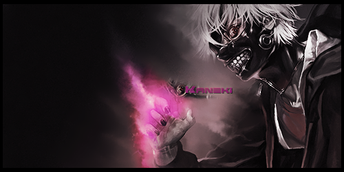 @tsudecimo the sparks in the monogatari tag are rather distracting and you might wanna look into blurring, since the background stands out too much. The Nishinoya tag is much better, but the light source is standing out too much, taking focus away from the focal that is Nishinoya. Aside from that, the c4d at his thigh just looks odd. |
|
May 5, 2016 12:58 PM
#6470

tsudecimo said: Feedback on current signature? or any of these two? http://i.imgur.com/93FsAir.png http://i.imgur.com/YEEdUKA.jpg Well well. This time your stuff actually looks like you did something. There is plenty to improve though. Some things yhunata mentioned, for example. If you plan to make a tag with that same render and basic idea, you just disqualified yourself from entering. I advice you to make something entirely different if you still want to enter. On an constructive note though, it's very empty, the render is quite far off the right which contributes to the emptiness. Do you mean test as just a basis of a tag you envision or a finished tag you made as a test to see if it looks good? If it is the latter, the tag looks like one of mine after I placed a background, a render and think about what to do with it. With other words, it looks unfinished or more like not even started. |
 |
May 5, 2016 1:05 PM
#6471
May 5, 2016 1:10 PM
#6472
yhunata said: @Isa__ Oh no, this was just a test. I've never really done this before, so I just wanted to get something done. The final image for the actual tag for the contest I've got in mind looks nothing like this, except for the fact that it would be a well... a color splash. Okay, that's fine then. Good luck~ |
|
May 5, 2016 2:47 PM
#6473
yhunata said: The Nishinoya tag is much better, but the light source is standing out too much, taking focus away from the focal that is Nishinoya. Aside from that, the c4d at his thigh just looks odd. Yeah I agree with the Monogatari one, didn't know what to do. I will take the blur advice into consideration in the future. I thought if I removed the moon the right side would look empty. Yeah I really don't get how to use C4D, I only add it just to fill up space while not being too distracting. What do you think of the text is it good? I'm pretty weak at typography as well. |
|
May 7, 2016 2:14 AM
#6474

Tomboy said: Yato Tag (Just more practice) 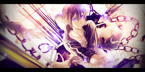 I really love your work too. ;) Any chance I can ask you for a Yato signature? :) I tried the signature request club but it seems dead. |
 |
May 7, 2016 2:19 AM
#6475
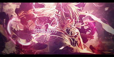
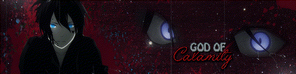
yhunata said: A test for this month's signature contest: This one looks much better to me... 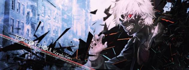 |
|
May 7, 2016 12:52 PM
#6476

| Hello. I made a little example for auto generated signature. What do you think about this?  it's impossible fit in 300 kb with slide animation, but I can just switch them. |
overmesMay 7, 2016 1:03 PM
| MyAnimeList Affinity Search - http://affinity.animesos.net/ |
May 7, 2016 3:14 PM
#6478
Looks great and unique. Really like the text. One little thing I found distracting, why is ''ONL'' so far apart from the ''Y''? |
|
May 7, 2016 11:58 PM
#6479
| Thank you tsudecimo :D I never noticed that, thank you for telling me :D I tried to change that, but it seems to be the fonts mistake. Maybe I will modify it a little, so it will looks better :D |
 |
May 8, 2016 1:35 AM
#6480
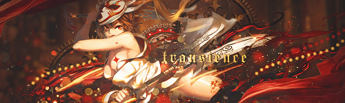
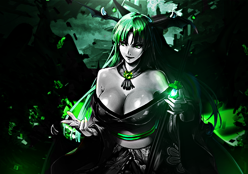 Render used Doing accent color/color splash. Didn't think it was great so I thought I would get some CnC on it instead of entering the GFX context with. |
|
May 8, 2016 2:25 AM
#6481
tsudecimo said: Render used Doing accent color/color splash. Didn't think it was great so I thought I would get some CnC on it instead of entering the GFX context with. This doesn't qualify anyway, because it's more green and grey than a mere color splash. |
|
May 8, 2016 2:48 AM
#6482
What does qualify then? it's still one color. Grey is black and white, why would it count as another color in this theme? Can you give an example of accent color? because the skin of any render without color will be grey. |
|
May 8, 2016 2:59 AM
#6483
tsudecimo said: What does qualify then? it's still one color. Grey is black and white, why would it count as another color in this theme? Can you give an example of accent color? because the skin of any render without color will be grey. That's not the issue. The tag has far too much green. It's not just a splash of color. I've described well enough what the theme means in the entry thread. |
|
May 8, 2016 3:03 AM
#6484
Isa__ said: tsudecimo said: What does qualify then? it's still one color. Grey is black and white, why would it count as another color in this theme? Can you give an example of accent color? because the skin of any render without color will be grey. That's not the issue. The tag has far too much green. It's not just a splash of color. I've described well enough what the theme means in the entry thread. You really didn't explain it good at all. You only conveyed that only one color should be used. Did not directly state how much of it should be there, only implied and indirectly by saying roses and eyes. |
|
May 8, 2016 3:12 AM
#6485
tsudecimo said: Isa__ said: tsudecimo said: What does qualify then? it's still one color. Grey is black and white, why would it count as another color in this theme? Can you give an example of accent color? because the skin of any render without color will be grey. That's not the issue. The tag has far too much green. It's not just a splash of color. I've described well enough what the theme means in the entry thread. You really didn't explain it good at all. You only conveyed that only one color should be used. Did not directly state how much of it should be there, only implied and indirectly by saying roses and eyes. If that wasn't clear enough for you, how about scrolling down? The thread's for questions after all. There is a question AND an answer that'd probably answer yours too. And if something's still not clear to you, then ASK. |
|
May 10, 2016 5:20 AM
#6486

i like it, but i need tips on how to make signatures better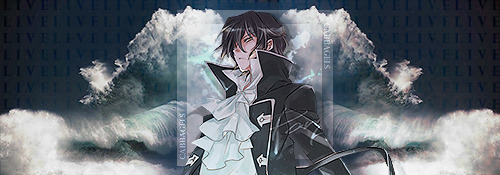 |
May 10, 2016 5:41 AM
#6487
Special border second attempt.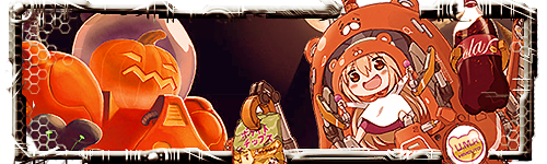 any comments? It never looks as good in a white background :/ |
|
May 10, 2016 5:54 AM
#6488
| Updated my signature. It's shitty though. Any comments would be nice. cabbagels said: i like it, but i need tips on how to make signatures better I feel like the sides are too empty. If you can't add anything then maybe make the render bigger. tsudecimo said: Special border second attempt. any comments? It never looks as good in a white background :/ I feel like the border is out of place probably because of the color. And the two renders too they're not sync with each other. |
TaintedMay 10, 2016 5:59 AM
|
May 10, 2016 6:15 AM
#6489
Tainted said: I feel like the border is out of place probably because of the color. And the two renders too they're not sync with each other. 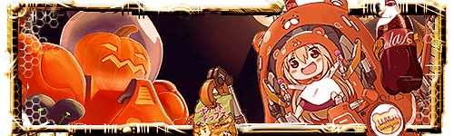 Now? The pumpkin isn't a render it's the background. Umaru is supposed to pop out from the border and background @your sig same tech brush lol. It's okay I guess. But it's just kinda bland imo, nothing going on just some lighting and a render. Why do you not use fractals, textures, C4D and other resources in your signatures if you don't mind me asking? Most of them are the same type, nice text usually though. They always seem blurry/unshapred and not high quality. Do you use GIMP? |
|
May 10, 2016 6:38 AM
#6490
tsudecimo said: Tainted said: I feel like the border is out of place probably because of the color. And the two renders too they're not sync with each other. Now? The pumpkin isn't a render it's the background. Umaru is supposed to pop out from the border and background @your sig same tech brush lol. It's okay I guess. But it's just kinda bland imo, nothing going on just some lighting and a render. Why do you not use fractals, textures, C4D and other resources in your signatures if you don't mind me asking? Most of them are the same type, nice text usually though. They always seem blurry/unshapred and not high quality. Do you use GIMP? I'm practicing and experimenting some stuffs in this sig I tried using only blurr and some lightings with a black background and I failed so miserably :(. I'm not using GIMP. Your sig still didn't go well for me. It should go well like this 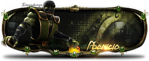 They're not mine btw. |
|
May 10, 2016 6:42 AM
#6491
| Yeah I know. Mine is a simpler special border with just marquee tool, and not taken parts of images and making them a border. |
|
May 10, 2016 6:50 AM
#6492
tsudecimo said: Yeah I know. Mine is a simpler special border with just marquee tool, and not taken parts of images and making them a border. I'm talking about the color and drawing style (or whatever it's called) if you look at umaru, the background and the render you could immediately tell that they're three different pictures put together. |
|
May 10, 2016 6:58 AM
#6493
Tainted said: tsudecimo said: Yeah I know. Mine is a simpler special border with just marquee tool, and not taken parts of images and making them a border. I'm talking about the color and drawing style (or whatever it's called) if you look at umaru, the background and the render you could immediately tell that they're three different pictures put together. That's my point. I made the border but it wasn't to fit Umaru. While in the above example the border fits Ermac because it probably taken from an image of him, which fits his personality. Also I didn't bother adding more details to make them all fit together (background isn't a good choice in the first place) This what it's ideally supposed to look like:  |
|
May 10, 2016 7:31 AM
#6494
tsudecimo said: Tainted said: tsudecimo said: Yeah I know. Mine is a simpler special border with just marquee tool, and not taken parts of images and making them a border. I'm talking about the color and drawing style (or whatever it's called) if you look at umaru, the background and the render you could immediately tell that they're three different pictures put together. That's my point. I made the border but it wasn't to fit Umaru. While in the above example the border fits Ermac because it probably taken from an image of him, which fits his personality. Also I didn't bother adding more details to make them all fit together (background isn't a good choice in the first place) This what it's ideally supposed to look like: I tried playing with it a little 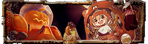 it didn't work though. I blurred the border a little so it got fucked up since its already transparent xD. |
TaintedMay 10, 2016 7:35 AM
|
May 10, 2016 8:08 AM
#6495
| I've seen that border sig a billion time lulz But thats a really good attempt at it imo. |
|
May 10, 2016 8:15 AM
#6496
| @Tainted Lol yeah the transparency won't make that look good. Tomboy said: I've seen that border sig a billion time lulz But thats a really good attempt at it imo. Positive comment at last D: thanks I skipped some steps of his tutorial anyway |
|
May 10, 2016 8:38 AM
#6497
| But to be very honest despite the intricacy and appealing look of a border sig, I dislike it for one sole reason, it's a pain in the ass to make and I prefer to focus on the render more than the border. |
|
May 11, 2016 7:36 AM
#6499
| updated my forum set. what you guys think? updated my profile layout as well, if u want to check it out o: |
May 11, 2016 7:51 AM
#6500
ryukan said: updated my forum set. what you guys think? updated my profile layout as well, if u want to check it out o: Your current profile layout is awesome *.* I really liike all the little details. I especially like the ''they were more than team'' portion, perfect gif choices. Definitely way better than your previous ones +1 Your forum sets look cool, but I think the dark style fits better with profile layout than here. The Hinata portion and the text are great but Kageyama doesn't look as good. this little area in general is kinda distracting, and the Japanese text is faded but not in a nice way. Otherwise cool set. I think you should nominate it I would vote for it :P whoops that already happened |
tsudecimoMay 11, 2016 7:55 AM
|
More topics from this board
» My Realism Oil Painting #NSFWsalsalsalsal - Aug 17 |
4 |
by salsalsalsal
»»
4 hours ago |
|
» This my DrawingKirika_Madeleine - Aug 24 |
2 |
by Zarutaku
»»
10 hours ago |
|
» favorite moviesO_Peres - Sep 20 |
3 |
by Little_Sheepling
»»
Yesterday, 10:45 AM |
|
» favorite TV series/showsO_Peres - Sep 20 |
0 |
by O_Peres
»»
Sep 20, 7:34 PM |
|
» favorite mangas/in manga styleO_Peres - Sep 20 |
0 |
by O_Peres
»»
Sep 20, 7:11 PM |