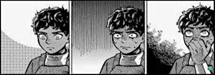
Not sure. Heck, I noticed when reading Banana Fish that a lot of the pages have background on maybe 1/3-1/2 of the panels. The rest have none or minimal at best, for example:
But to be fair, it's like she knew when they'd be more useful and she never covers everything with flowers either. I don't see anything wrong with making good use of dramatic lines either from time to time. But in the case of Banana Fish, the plot is so engrossing that once you've got a basic sense of location (ex, apartment), do you really need it repeated if all you're really supposed to be looking at is the character's facial expression? In that way, I think she avoids the negative pitfalls usually associated with lots of blank white or black space by focusing on the expression well.
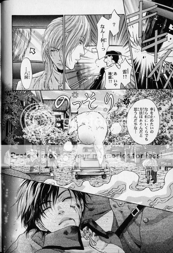
But she seems capable of doing backgrounds just fine too, she tends to put a lot of graffiti on her backgrounds for this series in certain appropriate places. I mean, look how awesome the subway is, I'm more than willing to forgive the simple door with the guy bursting through it on the other page when she put the detail where it more needed to be.
So in Banana Fish's case, I'd say it's there to better focus the audience's attention where it belongs and to make the read go by a bit faster when you don't have to take in unnecessary scenery.
In the case of this page. , it might be a tad lazy to not put some backgrounds there, but I think it somehow works too because you're only looking at those panels for a few moments anyway. I really don't think every panel needs to be scenery porn so long as you've got a good grasp of the setting due to some earlier really well placed and defined scenery and the panels without backgrounds aren't lacking. I think in the case of pic 3, having the full graffiti backgrounds on the panel at the right would be a visual clusterfuck, so to say, and it'd actually make it more awkward to look at in a space that closed.
Why Wallflower has like nothing, going down the 4 chibis against a white background...yes, this seems excessively lazy, it happens far too frequently and it's not like noteworthy expressions and word bubbles are filling up the space. I think as long as the space is either filled with dialogue or it's just a no-nonsense look at a specific expression meant to hold your attention. Used correctly, I see nothing inherently wrong with it as a technique but gyah, so much white space in Wallflower!!
I think I'd actually be curious to see a manga with no backgrounds and only white space. Like, no props, nothing, like all the characters are imagining it. |