New
Jun 22, 2007 5:12 PM
#101

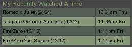
| I updated my list again. It's a 1600x1200 wallpaper, but I also have a 1024x768 wallpaper that I can use. I was told to vector Rider to make her look better, but to me it's not worth it. Vectoring Rider = 4+ hours Making WP = 15-20 minutes ...Not worth the time. |

Jun 22, 2007 6:26 PM
#103

Ceray said: I can't see the whole thing, but it looks purdy. Same here. But it`s probably `cause i`m using 1024x768 |
 |
Jun 22, 2007 6:31 PM
#104
| And as I just said, I have a 1024x wallpaper that I can use. =P |
Jun 22, 2007 6:33 PM
#105
I wouldn`t use it. Everyone else could probably be able to see it. @_@;; |
|
Jun 22, 2007 6:51 PM
#106

abhin4v said: Here goes my list Nice list. Only thing I find strange though is on Firefox everything aligns to the left but when viewing on Opera and IE the category headers like Currently Watching, Plan to Watch, etc. are centered. Just a minor browser compatability quirk but otherwise it looks good. |
 ...even a saint needs a soldier to do the dirty work. |
Jun 24, 2007 1:00 AM
#107

| Just updated my list, but I'm not sure if the colors are too bland. I'd like to work a little more of the red in there somehow, but I'm not sure how exactly I should do it. ShinoFuji said: And as I just said, I have a 1024x wallpaper that I can use. =P It's not so much that as it is the position of the list. Using a large background is fine. Good, even, as long it's positioned so that the important parts don't get cropped out if the window isn't huge, but you don't want people to have to scroll horizontally to see the actual list. I think you should anchor the wallpaper on the left side so that you can see Rider regardless of your resolution, and align the list to the right side of the window so you don't have to scroll to see it. |
 |
Jun 24, 2007 2:32 AM
#108

| I think your list looks good, Krelian. Nice job on the whole color scheme! |
 staff.applications ▼ guidelines.faq ▼ report.abuse ▼ thx.skittles ▼ thx.kina ▼ [H+] ³ ▼ |
Jun 24, 2007 8:19 AM
#109

Krelian said: Just updated my list, but I'm not sure if the colors are too bland. I'd like to work a little more of the red in there somehow, but I'm not sure how exactly I should do it. I don't think it's bland =) I like muted color palettes. |
Jun 24, 2007 8:45 AM
#110
Krelian said: Just updated my list, but I'm not sure if the colors are too bland. I'd like to work a little more of the red in there somehow, but I'm not sure how exactly I should do it. ShinoFuji said: And as I just said, I have a 1024x wallpaper that I can use. =P It's not so much that as it is the position of the list. Using a large background is fine. Good, even, as long it's positioned so that the important parts don't get cropped out if the window isn't huge, but you don't want people to have to scroll horizontally to see the actual list. I think you should anchor the wallpaper on the left side so that you can see Rider regardless of your resolution, and align the list to the right side of the window so you don't have to scroll to see it. Er.. The list -is- on the right. >.>; And I don't have to scroll to see it. o_o; But I see what you mean about putting the wall on the left. Edit: The wall is on the Top Left, now. Though I don't really see how much that will help. o_O; Though, for those who have to scroll to see the list.. what res are you on? o_O; |
VyraLoveJun 24, 2007 8:54 AM
Jun 24, 2007 9:13 AM
#111
| I'm on 1024x768, and I get an h-scroll. You know, you guys....I'm going to write a tutorial for designing for multiple resolutions :D because this is silly. |
Jun 24, 2007 9:19 AM
#112
| My resolution isn't particularly small. It might be just a browser compatibility thing since I'm using Opera - it's usually a good idea to check that stuff out since browsers tend to display their css a little different. But ideally the list should be positioned relative to the right side of the screen, so that if you move the window the list moves with it. That makes it at least usable to most anyone, and using transparency lets people still see the background too. The toughest thing about designing for the internet is trying to make things work for as many people as possible hehe. I'm glad you guys like mine - I'm a bit of a minimalist, but sometimes I lean too far that way and end up leaving things rather bland and boring, so it's always nice to get some outside input. |
|
Jun 24, 2007 9:48 AM
#113
| After fooling around with the window, I do see the scrolling bit with the list. But yeah. A tutorial would be nice, or at least some sort of hints/tips. lol If I really wanted to, I could make walls of every resolution. But that's kinda... yeah. |
VyraLoveJun 24, 2007 9:52 AM
Jun 24, 2007 11:05 AM
#114

| Changed my list to a Seto no Hanayome theme. Was a bit hard trying to find a fitting background. Ended up having to do a lot of stuff to a scan. |
     |
Jun 24, 2007 11:06 AM
#115

| ive changed my list, hope everyone likes it. Shock Horror.... sidestep has the same avatar as me. |

Jun 24, 2007 11:16 AM
#117
Jun 24, 2007 11:28 AM
#118
| Huzzah! And nice list designs, guys. Sidestep: I'm really fond of the sakura blossoms in the headers - that looks very snazzy. AK: I like it, but I think the colors on the list could use a little more tweaking so that they match the image a little better. Particularly that green. It's a shame the wallpaper isn't any wider, but I can't really think of anything that can be done about that one. |
|
Jun 24, 2007 12:58 PM
#119

Krelian said: I'm glad you guys like mine - I'm a bit of a minimalist, but sometimes I lean too far that way and end up leaving things rather bland and boring, so it's always nice to get some outside input. Well I think it looks ok,, its nice and calming to the eyes and sometimes that is important as well. I can agree that it needs a little more color, but then again, the way the list is now is good as well and sets it apart from the rest in a good way! |
ZirgoJun 25, 2007 2:42 PM
      |
Jun 27, 2007 9:33 PM
#120

| I like it a lot, Krelian. One of my favorite lists that I've seen. I figured it was time I update mine since I've had the same style for months now: New Style |
| Signature removed. Please follow the signature rules, as defined in the Site & Forum Guidelines. |
Jun 27, 2007 9:39 PM
#121
Neverender said: I like it a lot, Krelian. One of my favorite lists that I've seen. I figured it was time I update mine since I've had the same style for months now: New Style WOW O___O very impressive! I love it. |
Jun 27, 2007 9:40 PM
#122
| Lol, thanks. |
| Signature removed. Please follow the signature rules, as defined in the Site & Forum Guidelines. |
Jun 27, 2007 9:41 PM
#123

ScrumYummy said: Neverender said: I like it a lot, Krelian. One of my favorite lists that I've seen. I figured it was time I update mine since I've had the same style for months now: New Style WOW O___O very impressive! I love it. Damn Really Nice |
     |
Jun 27, 2007 11:59 PM
#124
Neverender said: I figured it was time I update mine since I've had the same style for months now: New Style Shana~ Looks awesome indeed, stick with it until the next MAL List Awards come around, please. :D |
staff.applications ▼ guidelines.faq ▼ report.abuse ▼ thx.skittles ▼ thx.kina ▼ [H+] ³ ▼ |
Jun 28, 2007 1:38 AM
#125
Jun 28, 2007 3:34 AM
#126

Neverender said: That looks pretty awesome. Nice work~I figured it was time I update mine since I've had the same style for months now: New Style |
     |
Jun 28, 2007 7:41 AM
#127
| Thanks for the compliments. Looks like I finally got it right for once! |
| Signature removed. Please follow the signature rules, as defined in the Site & Forum Guidelines. |
Jun 29, 2007 10:58 AM
#128
| Ok ,I finally finished my new design... (spent the last 2 days one it -_-')... I'm fairly happy with what I got atm, though I might tweak it a bit according to the input I receive. I also designed two versions of the same style: (Previews in in my resolution.) Black & White Previewtop Previewbottom Colors (which is the one I have atm, and I'll probably will keep it. Since it's the one I like best and also from the input so far it's the one people like best^^) Previewtop Previewbottom Current Style I managed to make the list viewable for virtually every resolution. Though, the view in 1024x768 is the worst (but still decent). The best view would probably be @ a res of 1600x1200 or something close to that. But I can't tell for sure since the larger res I have is 1280x800. All input is appreciated :) .. and if someone with a large resolution can post a screen shot of his view, it would be great ^_^ (Edit: fixed the messed up links -_-') |
KayrhandrosJul 2, 2007 12:11 PM
|
Jun 29, 2007 11:16 AM
#129


Jun 29, 2007 3:54 PM
#130
| Neverender: Awesome list style - I really like it. The CSS is a little off in Opera though. It tends to happen a lot when people try to left-align their lists, but the actual list table doesn't line up with the header and such. It'd be even better if you could take care of that little glitch. Kayr: I like it, but I think I'd try something somewhere between the black and white and the color. It's a bit bland in grayscale because it lacks contrast, but the reddish skin is a little too red in color. Try desaturating the background somewhere between 40% and 60% perhaps. As it is it looks a little unbalanced. |
|
Jun 29, 2007 4:24 PM
#131
Kayrhandros said: Ok ,I finally finished my new design... (spent the last 2 days one it -_-')... I'm fairly happy with what I got atm, though I might tweak it a bit according to the input I receive. I also designed two versions of the same style: (Previews in in my resolution.) Black & White Previewtop Previewbottom Colors (which is the one I have atm, and I'll probably will keep it. Since it's the one I like best and also from the input so far it's the one people like best^^) Previewtop Previewbottom I managed to make the list viewable for virtually every resolution. Though, the view in 1024x768 is the worst (but still decent). The best view would probably be @ a res of 1600x1200 or something close to that. But I can't tell for sure since the larger res I have is 1280x800. All input is appreciated :) .. and if someone with a large resolution can post a screen shot of his view, it would be great ^_^ I think it looks good at 1024x768 =D The colors are definitely better. I really like the floral work, too. It looks good! XD |
Jun 29, 2007 4:26 PM
#132

Kayrhandros said: Ok ,I finally finished my new design... (spent the last 2 days one it -_-')... I'm fairly happy with what I got atm, though I might tweak it a bit according to the input I receive. I also designed two versions of the same style: (Previews in in my resolution.) Black & White Previewtop Previewbottom Colors (which is the one I have atm, and I'll probably will keep it. Since it's the one I like best and also from the input so far it's the one people like best^^) Previewtop Previewbottom I managed to make the list viewable for virtually every resolution. Though, the view in 1024x768 is the worst (but still decent). The best view would probably be @ a res of 1600x1200 or something close to that. But I can't tell for sure since the larger res I have is 1280x800. All input is appreciated :) .. and if someone with a large resolution can post a screen shot of his view, it would be great ^_^ i liked the BW one better, hehe. *loves grey* |
逃げちゃ駄目だ。 |
Jun 29, 2007 6:04 PM
#133
| The color version is pretty sweet |
| Signature removed. Please follow the signature rules, as defined in the Site & Forum Guidelines. |
Jun 29, 2007 7:10 PM
#134
| er.... damnit.... -_-' ... I messed up with the screenshots there. the color ones were from testing and not the final result. Fixed them... Thanks for the input everyone. Krelian said: I actully did a lot of editing in that wallpaper.. believe me it was even more reddish. I'll see what I can do. It was a pain in the arse to come up with those tones, so they could match each other and the wallpaper.. specially coz I didn't/don't wanna use those pinks and reds in the tables. I'll probably tweak it a little more tomorrow and see if I can make it better.Kayr: I like it, but I think I'd try something somewhere between the black and white and the color. It's a bit bland in grayscale because it lacks contrast, but the reddish skin is a little too red in color. Try desaturating the background somewhere between 40% and 60% perhaps. As it is it looks a little unbalanced. (still waiting on that high rez screenshot...anyone? :D ) |
KayrhandrosJun 29, 2007 7:34 PM
|
Jun 29, 2007 7:31 PM
#135
| 'fraid I only go up to 1440x900 hehe. I may play with the colors a bit myself in Photoshop. As for the tables, I think it'd help balance it some to use more color there if you wanted to do that instead, but I really like the way they are now - the header/footer designs for each section are awesome. |
|
Jun 29, 2007 7:37 PM
#136
Krelian said: hmm.. I'll get to it tomorrow and see what comes out then. hm.. I'd still be wanting the "1600xsomething" screeshot since the wallpaper as 1600px width, but if you can send one from that 1440x900 res I'll appreciate too :) 'fraid I only go up to 1440x900 hehe. I may play with the colors a bit myself in Photoshop. As for the tables, I think it'd help balance it some to use more color there if you wanted to do that instead, but I really like the way they are now - the header/footer designs for each section are awesome. |
|
Jun 30, 2007 12:21 AM
#137
| Sweet stuff, I'm not on my PC right now so I have to check your current list design in 10 hours again but it looks great from what I can tell right now. :D |
staff.applications ▼ guidelines.faq ▼ report.abuse ▼ thx.skittles ▼ thx.kina ▼ [H+] ³ ▼ |
Jun 30, 2007 7:01 AM
#138

| Well, here is my list design. Don't expect to change it anytime soon. |
Jun 30, 2007 8:07 AM
#139
| Neverender: It looks really good but I also see the header problem Krelian mentioned. It shows up in both Opera and IE. Kayrhandros: Very nice work especially with the headers and footers. I'd say stick with the color version. TheTsunami: Love the wallpaper. The list has the same type of alignment problem as Neverender's but it's less apparent. |
| ...even a saint needs a soldier to do the dirty work. |
Jun 30, 2007 8:37 AM
#140
TheTsunami said: Well, here is my list design. Don't expect to change it anytime soon. Ah, I love that wallpaper! But I do get an h-scroll while viewing it. Have you checked out this tutorial on designing for multiple resolutions? =D |
Jun 30, 2007 8:38 AM
#141
tainteddonut said: TheTsunami: Love the wallpaper. The list has the same type of alignment problem as Neverender's but it's less apparent. Hmm. It was designed for a 1280x1024 resolution, and the headers were lowered because the top text was overlapping the sun in the background (making it unreadable). Anything in particular that you would suggest? ScrumYummy said: TheTsunami said: Well, here is my list design. Don't expect to change it anytime soon. Ah, I love that wallpaper! But I do get an h-scroll while viewing it. Have you checked out this tutorial on designing for multiple resolutions? =D No, but I will now, thanks. |
Jun 30, 2007 12:45 PM
#142
| Very nice, Tsunami. The background isn't quite wide enough for my screen, but the image's color scheme works gread with the black background as a border on the sides. No problem there. |
|
Jun 30, 2007 10:25 PM
#143
TheTsunami said: Hmm. It was designed for a 1280x1024 resolution, and the headers were lowered because the top text was overlapping the sun in the background (making it unreadable). Anything in particular that you would suggest? I see so it was a design decision. Not much you can do unless you want to mess with the colors or nudge the table even more but then it probably wouldn't look right. It's better off as is in that case. |
| ...even a saint needs a soldier to do the dirty work. |
Jun 30, 2007 11:42 PM
#144

| i put up new wallpaper, 1024x768 res please |
 |
Jul 1, 2007 3:31 AM
#145
| Well I think the list color settings is perfect against the background so really good job on that one! |
|
Jul 1, 2007 9:32 AM
#146
Cloudrayne said: i put up new wallpaper, 1024x768 res please Very nice! :D |
Jul 1, 2007 12:23 PM
#147

| I changed my wallpaper(1024x768) and list design. It's Hei from Darker Than BLACK. *drool* Please tell me how it looks. *bows* |
 |
Jul 1, 2007 1:39 PM
#148
| TheTsunami: Wallpaper is pretty good. I think you should try and match the table color with the bg, using brown or copper colors. Same for the yellow on the anime title, score etc. ---- Cloudrayne: Looks very good. I only think you need to do is increase the font size and maybe also increase the table opacity. 'coz in higher resolutions (like mine) it's pretty difficult to read. ---- All-Star: Only thing I dislike is the purple border on the tables. |
|
Jul 1, 2007 2:27 PM
#149
| wow...you guys have the mad skillz. All I can do is pick a bg and mess with the opacity to have it look decent. I need to learn CSS... Either way updated...I seem to float around this same picture for everything..but once I get the CSS on lock, I'll have a nice perty list. I have lot's of bg's to work with and I can't wait... :) Tsunami..your list is really hot. Also simple which = bonus points....actually like everyone's lists are really hot. Bonus points to you tainted donut for the haibane renmei setup. Such an underrated show yet probably ABe's best work since Lain. |
Deceptive621Jul 1, 2007 5:30 PM
  [url=http://myanimelist.net/clubs.php?cid=327]*The Asuka Appreciation Club* Join Now![/url |
Jul 1, 2007 7:36 PM
#150
Kayrhandros said: TheTsunami: Wallpaper is pretty good. I think you should try and match the table color with the bg, using brown or copper colors. Same for the yellow on the anime title, score etc. ---- Better or worse? |
More topics from this board
» Vladimir Volfovich Zhirinovsky's MAL Diary of Kawai MemoriesV_V_Zhirinovsky - 7 hours ago |
1 |
by V_V_Zhirinovsky
»»
7 hours ago |
|
» MAL Analog HorrorWendy-- - Yesterday |
6 |
by Retro8bit
»»
9 hours ago |
|
» New Clashing Feelings volume after a decadeShiratori-san - Yesterday |
1 |
by Retro8bit
»»
9 hours ago |
|
» New Android App – Shimeji Mascot Screen Petsshimejimascot - Sep 26 |
8 |
by hacker09
»»
Sep 26, 10:03 PM |
|
» SHMUP CreatorElderNerd - Sep 26 |
0 |
by ElderNerd
»»
Sep 26, 9:28 PM |