New
Oct 15, 2015 10:18 PM
#1

| I really like the new profile layout, but every prototype has flaws. I encourage other users to point out things I have missed. Please don't start flaming in this thread, I want to create a productive thread that will help capture all the ideas and put them in one place for the developers. That will ultimately be more helpful for the developers than having to sift through flame wars. Please stop asking for the old layout to come back. If you want to add to the count of people complaining about the new layout, post here instead. This is a place for constructive criticism of the new layout only. 1) Images are downscaled and then handled by the CSS to render it. For people with Stylish, this is an easy fix. I don't know if MAL plans to extend this to the rest of the site, but for people with limited bandwidth usage, this could pose problems on pages with a lot of thumbnails, as it is downscaling the original size thumbnail. Please have these thumbnails processed by the server before handing them out to us.  2) Profile image has the wrong width. It is supposed to be 225px, not 224px.  3) The grid is unaligned.  |
Syrup-Oct 16, 2015 12:18 AM
 |


Oct 15, 2015 10:27 PM
#3
| As much as I want to share my feedback, I just can't be bothered anymore. Before this, they asked us what need to be changed in user profile. I gave my suggestions and plenty of users here did the same and some of it were great. Fast forward to present, they implemented nothing despite the support of users. The thumbnails for example are just too small to be viewed as something distinguishable, the prevalent of white space and the general feel of dullness of the profile. |
Oct 15, 2015 10:28 PM
#4

| 1. Option to move boxes around, similar to how "My Panel" page worked and how modern DeviantART profile works. 2. Fix progress bar glitch. 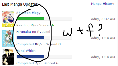 3. Option to have one colour vs multiple colours. I don't like this rainbow they have going on. 4. Consistency. 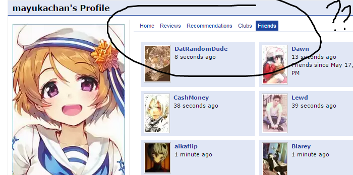 5. Option to have Favourites like before. 6. Option to opt-out of bars. 7. Option to Spoiler comments, like before. To prevent unbalanced profile height. That's it from me. #1 would pretty much fix the complaints. |

Oct 15, 2015 10:33 PM
#5

| I'm not a fan of the drop down arrows; They seem redundant. It seems MAL was aiming to compress as many things as possible while still implementing user suggestions, but the final product was just a huge mess in my opinion. It sacrificed practicality for a new look that's pretty abysmal as well. I'd prefer if the anime stats/history/favorites were near the top again as well. That was usually the first thing I looked at and it gave me incentive to look at people's anime list and About Me. Almost no one will click an expand arrow to learn more about you. There's so much white space on the left still, I don't see why the devs couldn't just add a lot of the stats and features they removed for this superfluous update right there. The only real thing about this update that's anything close to good is the ability to have ten favorites of everything now, but again, the drop down arrow makes it pointless since no one will notice it, let alone click it. At least make them bigger or give them a more noticeable color. And MAL could have easily implemented this suggested feature without tearing up everyone's profile. /constructive criticism. |
   I envy your delusion; I wish I could live in it  |
Oct 15, 2015 10:41 PM
#6
Undim said: I'd rather have less favourites like before and on the left side instead.Protaku94 said: I'm not a fan of the drop down arrows; They seem redundant. It seems MAL was aiming to compress as many things as possible while still implementing user suggestions. The arrows was user suggested. I gave my constructive feedback against it and here we are. |
Oct 15, 2015 10:41 PM
#7

| does anybody think that the new profile are a bit limit for low-profile PCs? |
 |
Oct 15, 2015 10:43 PM
#8
Undim said: Protaku94 said: I'm not a fan of the drop down arrows; They seem redundant. It seems MAL was aiming to compress as many things as possible while still implementing user suggestions. The arrows was user suggested. I gave my constructive feedback against it and here we are. Like one person suggested it and everyone else was against it. I'd be happy if they at the very least put it back on the left side near the top again. But we're probably going to be stuck with this layout even though the response to it is overwhelmingly negative. |
I envy your delusion; I wish I could live in it |
Oct 15, 2015 10:43 PM
#9

| How about we don't make changes that require a thread like this? Maybe actually go through some feedback cycles before making a change instead of just pretending they happened? I agree that helping to resolve this catastrophe is important, but please, can we also make sure this sort of thing doesn't happen again? |
 |
Oct 15, 2015 10:50 PM
#10

| I have nothing good to say about the new design, it's actually really annoying. |
 |
Oct 15, 2015 10:50 PM
#11

Kittenpotpie said: Preach.revert everything except 10 favorites limit |
 |
Oct 15, 2015 10:56 PM
#12
Aka_Saber said: This isn't the thread where we say good things, this is the thread where we provide constructive criticisms towards the layout. By all means, say what you can about it.I have nothing good to say about the new design, it's actually really annoying. mayukachan said: +1 to better usage of the left side.I'd rather have less favourites like before and on the left side instead. |
|
Oct 15, 2015 10:58 PM
#13

Syrup- said: mayukachan said: +1 to better usage of the left side.I'd rather have less favourites like before and on the left side instead. Agree with this as well. The empty space on the left is not aesthetically pleasing. |

Oct 15, 2015 10:58 PM
#14
mayukachan said: Honestly even if it wasn't filled with Javascript magic to help you do it effortlessly, even if it worked like http://myanimelist.net/editprofile.php?go=panelsettings it would solve so many problems for people, and it would also open up so many possibilities.1. Option to move boxes around, similar to how "My Panel" page worked and how modern DeviantART profile works. |
|
Oct 15, 2015 11:00 PM
#15

| i like the modern design as well but the old suggestion about giving us the option to hide unused areas/section of the profile page is not implemented though, like if you do not have any favorites you get this annoying area/section saying "no favorites yet" blah blah, if you do not have anything on your about me section you will see this "write one now" message that is a annoyance to the user that do not want to have an about me section and also give us the option to have a show/hide button for the comments section for more minimalism |
Oct 15, 2015 11:04 PM
#16
Syrup- said: This isn't the thread where we say good things, this is the thread where we provide constructive criticisms towards the layout. By all means, say what you can about it.
Will do Goods |
Aka_SaberOct 15, 2015 11:07 PM
|
Oct 15, 2015 11:06 PM
#17
Aka_Saber said: +1 I actually like this suggestion a lot. It's simple. It's efficient.Can't hide my comments section anymore and I really don't want to see it, use the drop down arrow on that instead. |
|
Oct 15, 2015 11:13 PM
#18

| I only like the 'Favorites' part. edit: The enlarged portraits yes, however not the column style.
|
CashdaxOct 15, 2015 11:31 PM
"Your taste is shit cause you like what I hate. Believe me I have 1000 cartoons that I rated with less than 5."  |
Oct 15, 2015 11:13 PM
#19
Kittenpotpie said: revert everything except 10 favorites limit |
Oct 15, 2015 11:14 PM
#20
Grudge said: Kittenpotpie said: revert everything |
Oct 15, 2015 11:14 PM
#21

Grudge said: Kittenpotpie said: revert everything except 10 favorites limit The old one was better in every aspect, expect for this one. |
Oct 15, 2015 11:15 PM
#22

| PLs add auto-fresh for comments now :-A I am raping my refresh button here |
 |
Oct 15, 2015 11:16 PM
#23

Cool_DuDE said: that would be amazing, they have that on humming bird and it was really convenient when I briefly used that site, but it seems like it isnt simple to implement.PLs add auto-fresh for comments now :-A I am raping my refresh button here |
Oct 15, 2015 11:17 PM
#24
| Does anyone know how the new "Affinity to You" is being calculated? My compatibility with some people is drastically lower now than it was before. I had 80.7% compatibility before and now I supposedly have 61.5% affinity. |
|
Oct 15, 2015 11:18 PM
#25
mayukachan said: Grudge said: Kittenpotpie said: revert everything CondemneDio said: pls stop shitposting. The developers already have a 10 page thread (probably with your names in it) of people saying the same thing.The old one was better in every aspect, expect for this one. edit: Aka_Saber said: Does anyone know how the new "Affinity to You" is being calculated? My compatibility with some people is drastically lower now than it was before. I had 80.7% compatibility before and now I supposedly have 61.5% affinity. Before it used some sort of sine/cosine operations and then compared the affinity using the closeness to each other's value, (I think I got that right?) but now I don't know how it works. My friend is now at 66% and he and I pretty much share the same opinion on everything. I doubt I'm that far away from 100% from him. |
Syrup-Oct 15, 2015 11:23 PM
|
Oct 15, 2015 11:19 PM
#26
mayukachan said: 1. Option to move boxes around, similar to how "My Panel" page worked and how modern DeviantART profile works. 2. Fix progress bar glitch. 3. Option to have one colour vs multiple colours. I don't like this rainbow they have going on. That's it from me. #1 would pretty much fix the complaints. #1 I think is the best suggestion. If not, then at least move the About Me below the stats and list updates. I think people usually go to people's profile to look at their stats/lists first rather than to look at their About Me, since this site's primary function is its listing feature. Like this: 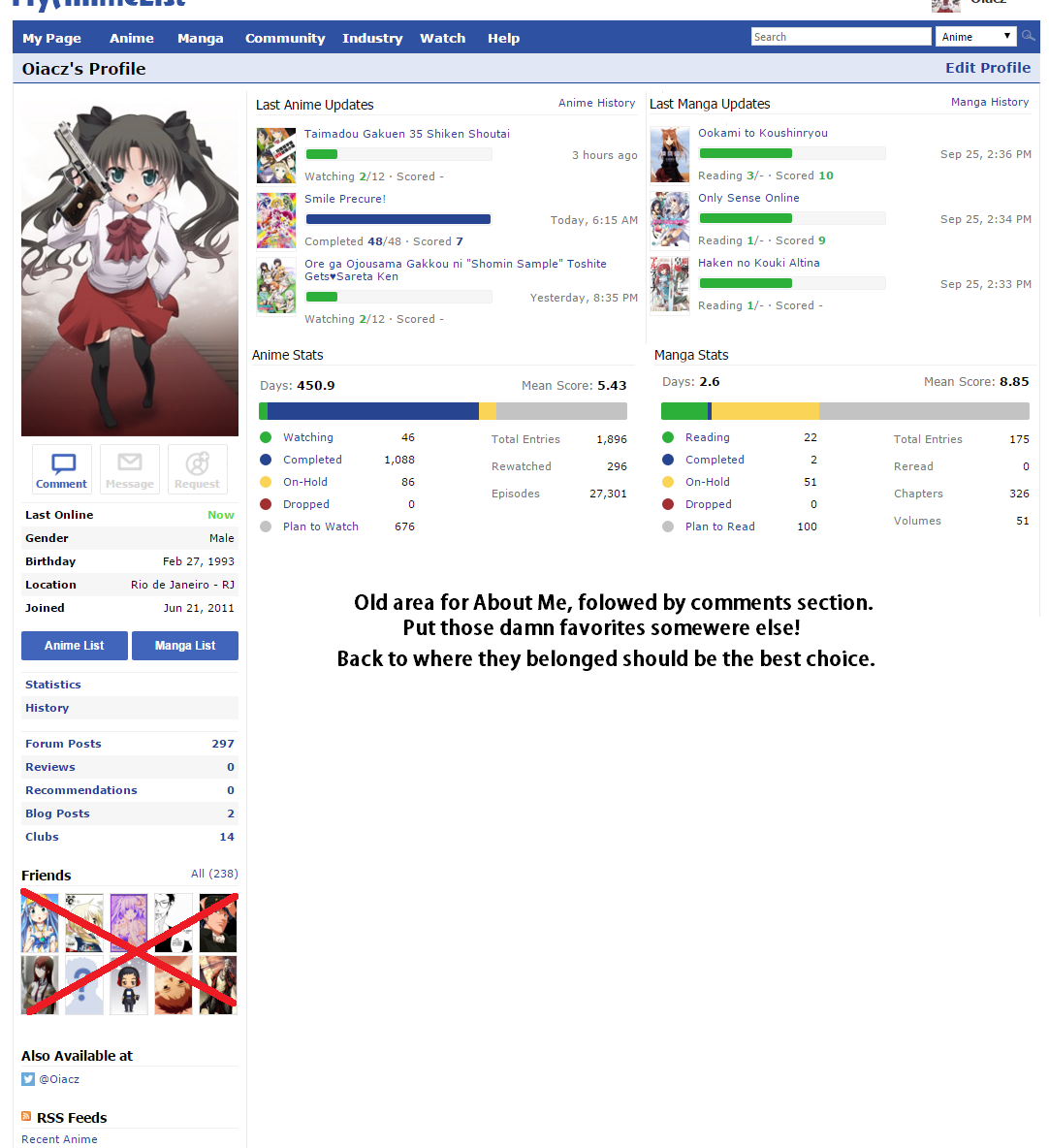 As for the #2, I think it's best just to get rid of the progress bar. It's redundant given that it already says 2/12 or 4/-, there's really no need for the bar. It definitely doesn't make sense when a show with unknown episodes or manga with unknown chapters gets half of the bar filled. I think the recent history sections was fine the way it was, although I do like how there are separate sections for last anime and last manga updates. #3, I don't like the colors either, I think simple is better. I really like MAL because it's always just been blue and white. edit: added Oiacz's screenshot |
tingyOct 15, 2015 11:25 PM
Oct 15, 2015 11:23 PM
#27
tingy said: #3, I don't like the colors either, I think simple is better. I really like MAL because it's always just been blue and white. I worked hard to fill all my blue bars up, now all my hard work is colorful :( |
|
Oct 15, 2015 11:23 PM
#28
Syrup- said: pls stop shitposting. The developers already have a 10 page thread (probably with your names in it) of people saying the same thing.[/quote]Just voicing my opinion. Goes to show how people don't like the new design. (I don't know why you're so aggressive, and think I'm clogging up some threads. Take a chill pill, man) A choice between the new and old style would be a nice; a nice compromise. |
Oct 15, 2015 11:23 PM
#29

| Is there a new resolution for profile pictures? Looks a little blurry to me. |
 |
Oct 15, 2015 11:27 PM
#30
Tensho said: as outlined in the second problem in the OP, the blurriness is caused by the typo on the img width, so now it's downscaling the image by 1px*1.5px or something. Is there a new resolution for profile pictures? Looks a little blurry to me. CondemneDio said: Sorry man, I'm trying to do damage control here and bring something positive from this change. I don't think the profile is all bad, it just needs a few adjustments. Asking for a complete revert is, I feel, kinda rude to the devs who 'wasted' their time on it. Hope you understand.I don't know why you're so aggressive, and think I'm clogging up some threads. Take a chill pill, man |
Syrup-Oct 15, 2015 11:30 PM
|
Oct 15, 2015 11:29 PM
#31
Syrup- said: Sorry man, I'm trying to do damage control here and bring something positive from this change. I don't think the profile is all bad, it just needs a few adjustments. Asking for a complete revert is, I feel, kinda rude to the devs who 'wasted' their time on it. Hope you understand. No hard feelings. And I feel bad for the devs too, because I don't like the new style. With time I probably will get used to it. |
Oct 15, 2015 11:30 PM
#32
| can anyone try if the profile images are automatically resize now? or do you still need to upload the exact dimensions for it to be accepted? i do not want to change my profile image right now if its still the old one, then please MAL implement automatic resize of images depending on the max dimensions of the site already, not just on the profile page but all over the site including the forums |
Oct 15, 2015 11:32 PM
#33

mayukachan said: Undim said: I'd rather have less favourites like before and on the left side instead.Protaku94 said: I'm not a fan of the drop down arrows; They seem redundant. It seems MAL was aiming to compress as many things as possible while still implementing user suggestions. The arrows was user suggested. I gave my constructive feedback against it and here we are. ^ This. Would much rather have less if it meant getting that entire section back at the top/left. |

Oct 15, 2015 11:33 PM
#34

| I can get over the fact that they removed the stats bars, but then why adding bars on the recent updates instead? Those ones are 10 times more useless than the previous one no matter how I look at it. If you want a visual in color to see if an entry is finished or "reading" why not change directly the color of the text for example? Use the won place for something else ImO. |
 |
Oct 15, 2015 11:35 PM
#35
| and anyone here have a lot of youtube and GIF images in their profile? did you see any speed improvements or lazy/dynamic loading behavior like images and youtube videos will not load unless you scroll down and focus on it, that is how images and videos are loaded on facebook for example to not hang the browser when huge numbers of images and videos load all at once i really hope they implement that lazy/dynamic image/video loading already |
Oct 15, 2015 11:39 PM
#36
| ^I think it's loading faster, not sure. http://myanimelist.net/profile/Stark700 It used to take a lot longer to load Stark's page, although I'm not sure if he has taken anything off of his About Me since the last time I went on his page. On the other hand, is it just me, or does com-to-com load slower now? |
Oct 15, 2015 11:40 PM
#37

Aka_Saber said: Does anyone know how the new "Affinity to You" is being calculated? My compatibility with some people is drastically lower now than it was before. I had 80.7% compatibility before and now I supposedly have 61.5% affinity. Used to go from 0 to 100 but now goes from -100 to +100:  |
| There is no such thing as shit taste. Only idiots who think everyone should have the same taste as they do. |
Oct 15, 2015 11:42 PM
#38
Syrup- said: Tensho said: as outlined in the second problem in the OP, the blurriness is caused by the typo on the img width, so now it's downscaling the image by 1px*1.5px or something. Is there a new resolution for profile pictures? Looks a little blurry to me. ah right nice catch ios said: and anyone here have a lot of youtube and GIF images in their profile? did you see any speed improvements or lazy/dynamic loading behavior like images and youtube videos will not load unless you scroll down and focus on it, that is how images and videos are loaded on facebook for example to not hang the browser when huge numbers of images and videos load all at once i really hope they implement that lazy/dynamic image/video loading already I didn't see any lazy loading but I did notice that if someone comments with a huge pic on your profile, that image no longer spills over to the side and gets cut off. it resizes instead. So there's that. |
|
Oct 15, 2015 11:42 PM
#39
tingy said: ^I think it's loading faster, not sure. http://myanimelist.net/profile/Stark700 It used to take a lot longer to load Stark's page, although I'm not sure if he has taken anything off of his About Me since the last time I went on his page. ah thats not how lazy/dynamic image loading works, so its still the old behavior then thanks for that example i really wish the dev team could focus implementing lazy/dynamic loading already so that low speed internet users as well as low specs computers will not struggle too much when there are too many images and videos |
Oct 15, 2015 11:44 PM
#40
| Ah sorry for misunderstanding you ^^; but you're welcome for the example. |
Oct 15, 2015 11:47 PM
#41
Tensho said: I didn't see any lazy loading but I did notice that if someone comments with a huge pic on your profile, that image no longer spills over to the side and gets cut off. it resizes instead. So there's that. automatic resizing is implemented? i asked this earlier but how about when you upload a profile picture do you still need to upload with exact dimensions or any image size is fine since it will now be automatically resize? |
Oct 15, 2015 11:51 PM
#42
ios said: Tensho said: I didn't see any lazy loading but I did notice that if someone comments with a huge pic on your profile, that image no longer spills over to the side and gets cut off. it resizes instead. So there's that. automatic resizing is implemented? i asked this earlier but how about when you upload a profile picture do you still need to upload with exact dimensions or any image size is fine since it will now be automatically resize? I was talking about the comment section, it was on the forums but not on comments. as for the profile pictures hmm hasn't that always been automatically resized?  but I don't think there're any under the hood changes for profile pics. |
|
Oct 15, 2015 11:52 PM
#43
ios said: automatic resizing is implemented? i asked this earlier but how about when you upload a profile picture do you still need to upload with exact dimensions or any image size is fine since it will now be automatically resize? I think any size is fine, I just tried it with a image with larger width dimension than specified, and it resized. I'm not sure if that's what you mean though. Tensho said: I was talking about the comment section, it was on the forums but not on comments. as for the profile pictures hmm hasn't that always been automatically resized? but I don't think there're any under the hood changes for profile pics. If it wasn't the same scale, it would stretch the image. |
tingyOct 15, 2015 11:56 PM
Oct 15, 2015 11:58 PM
#44
| ah i see thanks tingy and Tensho so they did improve that at least, its been a long time when i have uploaded a new profile picture so i got no idea and i do not want to change or reupload my current one just to test it EDIT: tingy said: If it wasn't the same scale, it would stretch the image. almost miss this, so they still have not perfected that automatic scaling/resizing then |
Oct 16, 2015 12:03 AM
#45
kuuderes_shadow said: Aka_Saber said: Does anyone know how the new "Affinity to You" is being calculated? My compatibility with some people is drastically lower now than it was before. I had 80.7% compatibility before and now I supposedly have 61.5% affinity. Used to go from 0 to 100 but now goes from -100 to +100: Well that's certainly an odd way of doing it. Thanks for letting me know though. |
|
Oct 16, 2015 12:05 AM
#46
ios said: tingy said: If it wasn't the same scale, it would stretch the image. almost miss this, so they still have not perfected that automatic scaling/resizing then No no no, I was telling Tensho that it wasn't automatically resized before, meaning that the problem was it didn't scale the image down properly and would cause the image to stretch. It is fixed, as I have checked with a larger image and it didn't stretch when uploaded. |
Oct 16, 2015 12:07 AM
#47
tingy said: ios said: tingy said: If it wasn't the same scale, it would stretch the image. almost miss this, so they still have not perfected that automatic scaling/resizing then No no no, I was telling Tensho that it wasn't automatically resized before, meaning that the problem was it didn't scale the image down properly and would cause the image to stretch. It is fixed, as I have checked with a larger image and it didn't stretch when uploaded. ah ok, nice to know |
Oct 16, 2015 12:14 AM
#48

| 1. Give us the option to use the old layout because the new one is terrible. edited and fixed , the rage is real |
alpha_shadowOct 16, 2015 2:26 AM
| :3 |
Oct 16, 2015 12:15 AM
#49
I have only one question at this moment |
| gone bai bai |
Oct 16, 2015 12:20 AM
#50
Mkim said: I have only one question at this moment its still better than to scroll infintely and get crashed 800th post |
|
More topics from this board
» Add the option to change profile favorites picturesk1rb - Oct 21, 2022 |
19 |
by k1rb
»»
3 hours ago |
|
Poll: » Add list setting to make notes private (on public lists)S_h_a_r_k_93 - Nov 12, 2022 |
25 |
by anonymate
»»
Apr 24, 9:57 PM |
|
» Add number of episodes and number of members in the advanced search.Yacine2104 - Jan 10 |
8 |
by Alexioos95
»»
Apr 24, 12:26 PM |
|
» Local Language districtskuroneko99 - Apr 22 |
5 |
by Luchipher-Zen
»»
Apr 23, 1:02 PM |
|
Poll: » Change picture of favorite character ( 1 2 )gehoti2822 - Nov 12, 2022 |
60 |
by AgravityBoy
»»
Apr 23, 9:09 AM |