New
Aug 17, 2014 10:56 AM
#5751

Isa__ said: I did two things yesterday..  It's not exactly my favorite work ever, but it's okay I guess. The part of his hair that is blue, I kinda failed there and I noticed this only when I was done, so I was too lazy to change anything. Maybe later orz  I like this much better actually. I don't even know if you can call it a sig, but I'm showing it anyway. Wanted to make something for a long time with this character and I'm happy with the result, because it was hard to to something with that partiicular picture. Most of his body was covered by parts of other characters, but it was the best picture I had of DeRosso, so I tried what I could. They both look beautiful. |
Aug 17, 2014 11:57 AM
#5752

| Looks really good. I kinda like the first one actually, that blue effect and the lighting on the text look neat ^^ |
 |
Aug 17, 2014 6:41 PM
#5753
Watched Senzaki-kun tutorial and practiced. 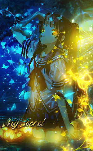 |
dream_easyAug 17, 2014 7:06 PM
Aug 17, 2014 6:47 PM
#5754

Exo_x said: senzaki from da? Watched Senzaki-kun tutorial and practiced.  and it looks beautiful!!! :3 |
 |
Aug 17, 2014 6:53 PM
#5755
| Thank u :) Same. His tutorials are very useful. Now I know some Ps tricks ;o |
Aug 17, 2014 8:42 PM
#5756
| Heh, I am actually on that same exact tutorial, was trying it out with a few of my stocks instead of senzaki stocks ^^ |
|
Aug 18, 2014 3:54 AM
#5757

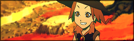
| @Exo_x: Absolutely amazing, man.. Made another artwork in the style of the DeRosso one. This time with Alternis Dim.  |
IsalinaAug 18, 2014 6:03 AM
 |
Aug 18, 2014 7:14 AM
#5758

Soo I made new things: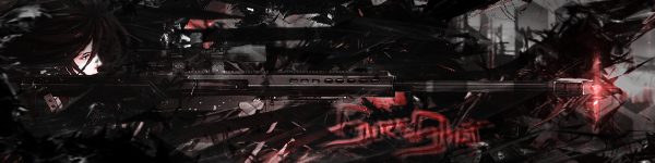 This one is a profile picture I made for a friend but I suppose I can post it here. 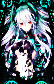 And this. I don't even know how to call it, I was just practicing with brushes and Apply Image.  On another note, I wanted to thank all the people of this thread. I feel like I've improved a lot thanks to all the advices and critiques that you all gave me. Thanks a lot, really. |
 |
Aug 18, 2014 7:38 AM
#5759

Isa__ said: Made another artwork in the style of the DeRosso one. This time with Alternis Dim. I mean, I don't really know what to say. It looks amazing. KuraiTomu said: Soo I made new things: Well, I'd agree that you are steadily improving. I think that the 2nd one (the DP) is the best of all 3. With the first one, I can see you're trying to improve your blending, which is always good. I'm not sure I like the effects and the text, but it's an improvement nonetheless. And as for the third one.... I think I know what you're going for but there's just a little too much going on. It's interesting, but just a little too busy. Anyway as some of you may or may not know, I've been spending this week doing this little challenge of mine. It's basically a 7 day challenge, and I took all of them and threw them on a tagwall. The image itself is a little too big to post here, so I'll just post a link |
 |
Aug 18, 2014 9:46 AM
#5760
| I like the concept of the challenge. But then I guess I am not too much into this kind of music :p |
|
Aug 19, 2014 8:36 AM
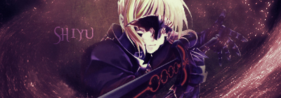
#5761

| Hello, Lately I got interested in photoshop, graphics design and stuff like that. With some help from friends and tutorials I made this:  Some tips, critism, feedback would be nice! |
 |
Aug 19, 2014 10:12 AM
#5762

Shiyu said: Hello, Lately I got interested in photoshop, graphics design and stuff like that. With some help from friends and tutorials I made this: Some tips, critism, feedback would be nice! It looks.. ok. The render and the background don't really match in my opinion. Some beginner stuff, try to layer it so that the render looks like it is part of the background... so it doesn't look like the render is just placed on top. (Though my signature is not a good example of this) Also consider using rules of third for placement of render and text. http://zenron.deviantart.com/art/Typography-for-Beginners-371897847 ^A great tutorial on using text and such. |

Aug 19, 2014 10:17 AM
#5763

Shiyu said: Hello, Lately I got interested in photoshop, graphics design and stuff like that. With some help from friends and tutorials I made this: Some tips, critism, feedback would be nice! Looks nice to me. But you can enhance more. Try to blend your render with your background, or adding some stocks in front of the render and back of it to give a more depth feel. (Although my signature has no depth :X) |
 |
Aug 19, 2014 1:11 PM
#5764
Zelot said: It looks.. ok. The render and the background don't really match in my opinion. Some beginner stuff, try to layer it so that the render looks like it is part of the background... so it doesn't look like the render is just placed on top. (Though my signature is not a good example of this) Also consider using rules of third for placement of render and text. http://zenron.deviantart.com/art/Typography-for-Beginners-371897847 ^A great tutorial on using text and such. hivekiller said: Looks nice to me. But you can enhance more. Try to blend your render with your background, or adding some stocks in front of the render and back of it to give a more depth feel. (Although my signature has no depth :X) Thank you for the tips. I'm already at my 2nd sig and it looks like this: 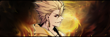 alot of trial and error, experimenting but still couldn't do what you guys told me to. This time I made a background from the render itself and smudged it and then added some C4d. I've also tried adding a stock in front of the render making it look like: http://imgur.com/a/UL0BZ As for the text, I think this one looks better without (or I just completely failed it) http://i.imgur.com/JQ7ikd9.jpg |
|
Aug 19, 2014 1:31 PM
#5765
Shiyu said: I think it's much better than your first one. Nice background but for me the render doesn't really blend in. Maybe you could put a fractal in front of the image too. Zelot said: It looks.. ok. The render and the background don't really match in my opinion. Some beginner stuff, try to layer it so that the render looks like it is part of the background... so it doesn't look like the render is just placed on top. (Though my signature is not a good example of this) Also consider using rules of third for placement of render and text. http://zenron.deviantart.com/art/Typography-for-Beginners-371897847 ^A great tutorial on using text and such. hivekiller said: Looks nice to me. But you can enhance more. Try to blend your render with your background, or adding some stocks in front of the render and back of it to give a more depth feel. (Although my signature has no depth :X) Thank you for the tips. I'm already at my 2nd sig and it looks like this: alot of trial and error, experimenting but still couldn't do what you guys told me to. This time I made a background from the render itself and smudged it and then added some C4d. I've also tried adding a stock in front of the render making it look like: http://imgur.com/a/UL0BZ As for the text, I think this one looks better without (or I just completely failed it) http://i.imgur.com/JQ7ikd9.jpg I would like to hear more comments about my last sigs. I can't see what I'm doing wrong and what I'm doing right if no one tells me. |
|
Aug 22, 2014 1:52 PM
#5766
| Made something new. Tried to make something from a screenshot of KH2 opening. I seriously don't think this came out good, but let me hear your feedback guyz ;w; [spoiler] 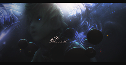 Didn't know where I could find these orbs everyone's kinda using, so I made it myself. (or do you make them yourself in the first place? :'D) |
|
Aug 22, 2014 2:03 PM
#5767

| Looks nice : o This is my first post in MAL forums :x Did this today:  |
Aug 22, 2014 3:16 PM
#5768
Isa__ said: The face....is kinda creepy ;A; Made something new. Tried to make something from a screenshot of KH2 opening. I seriously don't think this came out good, but let me hear your feedback guyz ;w; Didn't know where I could find these orbs everyone's kinda using, so I made it myself. (or do you make them yourself in the first place? :'D) Maybe there could be a tiny bit of lighting on it, so the majority of his face isn't so dark? I also don't think the text fits. The colors are a bit off (along with some of the sparks that are orange-ish, and pops out too much to its surroundings. The left side also seems a bit dimmer than the right. It looks nice otherwise ^^, but yeah, not one of my favorites from you OTL Dripstylish said: Looks nice : o This is my first post in MAL forums :x Did this today: I generally like it, thought I'm not a huge fan of the text, the "tempted" part is ok, but the text(?) under it doesn't fit too much. |
|
Aug 23, 2014 2:39 AM
#5769
shuryukan said: Isa__ said: The face....is kinda creepy ;A; Made something new. Tried to make something from a screenshot of KH2 opening. I seriously don't think this came out good, but let me hear your feedback guyz ;w; Didn't know where I could find these orbs everyone's kinda using, so I made it myself. (or do you make them yourself in the first place? :'D) Maybe there could be a tiny bit of lighting on it, so the majority of his face isn't so dark? I also don't think the text fits. The colors are a bit off (along with some of the sparks that are orange-ish, and pops out too much to its surroundings. The left side also seems a bit dimmer than the right. It looks nice otherwise ^^, but yeah, not one of my favorites from you OTL Dripstylish said: Looks nice : o This is my first post in MAL forums :x Did this today: I generally like it, thought I'm not a huge fan of the text, the "tempted" part is ok, but the text(?) under it doesn't fit too much. xD Oh well, i've never been good with text in sigs. Just felt like it needed something. |
Aug 23, 2014 6:15 PM
#5770
Isa__ said: Made something new. Tried to make something from a screenshot of KH2 opening. I seriously don't think this came out good, but let me hear your feedback guyz ;w; [spoiler] Didn't know where I could find these orbs everyone's kinda using, so I made it myself. (or do you make them yourself in the first place? :'D) I got the orbs from Jeav, and he isn't sure where he got them. I'm guessing they're from some pack. I can send you them if you want. As for the signature, I don't think it's too bad. I think you should have just done more with it. Dripstylish said: Looks nice : o This is my first post in MAL forums :x Did this today: Welcome to the forums! The signature looks good overall, but I personally think the lighting needs to be worked on more with adjustments. |
Aug 24, 2014 2:57 AM
#5771
Aug 24, 2014 12:21 PM
#5772
Dripstylish said: Looks nice : o This is my first post in MAL forums :x Did this today: Welcome to the forums! The signature looks good overall, but I personally think the lighting needs to be worked on more with adjustments.[/quote] Thanks ^^ Something else i just did:  |
Aug 24, 2014 4:18 PM
#5773
| Need opinions do you think it's ok? |
Aug 25, 2014 12:08 PM
#5774
Dripstylish said: Something else i just did: I really love it! :3 The only thing I would note on is the character; I think she looks just a tiny bit bright? See what a low opacity dark soft light layer could do ^^ |
|
Aug 25, 2014 12:18 PM
#5775
Supercolin said: Need opinions do you think it's ok? Huff, sometimes it's really hard not to be mean.. Let's just say, you need A LOT of practice. |
|
Aug 25, 2014 12:33 PM
#5776
Dripstylish said: Something else i just did: Again, you put together your signatures really beautifully, but I think with some more blending this signature could have turned from great into a masterpiece. |
Aug 26, 2014 12:26 AM
#5777

| daamn these looks so nice. I have sigs but they aren't anime related and damn anime sigs are so different from sigs that i make. I should try one of these |
 |
Aug 26, 2014 12:45 AM
#5778
shuryukan said: Dripstylish said: Something else i just did: I really love it! :3 The only thing I would note on is the character; I think she looks just a tiny bit bright? See what a low opacity dark soft light layer could do ^^ Thank you n.n You could be right :x Though i changed the lightning several times with dodge/burn and soft dark/light layers xD Ryugen said: Dripstylish said: Something else i just did: Again, you put together your signatures really beautifully, but I think with some more blending this signature could have turned from great into a masterpiece. Thank you ^^ Some more blending? |
Aug 26, 2014 12:53 AM
#5779
| @Dripstylish: Ryugen is right and I thin the main thing that ruins it a bit are those black parts. Either remove them or lower the opacity until the transition between blue and black isn't so hard anymore. Sorry I just woke up, so my english is asleep :'D Hope you understand >< |
|
Aug 26, 2014 5:18 AM
#5780
Isa__ said: @Dripstylish: Ryugen is right and I thin the main thing that ruins it a bit are those black parts. Either remove them or lower the opacity until the transition between blue and black isn't so hard anymore. Sorry I just woke up, so my english is asleep :'D Hope you understand >< I suppose. That's what i did already tho D: But it's not like i'm pro or anything xD Alright so another try :O  |
Aug 26, 2014 11:09 AM
#5781
Dripstylish said: Alright so another try :O I really love the colors! The only advice I would give you would be to establish a better focal. The effects are nice, but it ends up being a little bit distracting imo. |
|
Aug 26, 2014 1:54 PM
#5782
| @Dripstylish: Well there are these black parts again. I could imagine with a bit more contrast and without the black it would look very, very beautiful. ^^ - - - - - - - - - - - - - - - - - - - - - - - - - - - - - - - - - - - - - Made a new sig again. More or less vertical this time o/ Let me know what ya think~  The text is half-assed, I know. Couldn't come up with anything fancy :( Overall I'm still very satisfied with it though. |
IsalinaAug 26, 2014 2:00 PM
|

Aug 27, 2014 10:16 AM
#5784

| @Isa why do I always see your vertical Sigs as DP's? ..really now xD Beside the pure Awesomness of the whole thing, there is one thing I noticed. On the left side of her head it seems not as smooth as maybe her legs.. may be just me.. and was the sparkly spot on her fingers done on purpose? :P The text.... yeaaaah~ not ya best one, but still far better then on the Roxas Sig =w= |
LuziferAug 27, 2014 11:17 AM
 |
Aug 27, 2014 11:03 AM
#5785

| Thread merged. |
Aug 27, 2014 12:15 PM
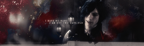
#5786
| @Luzi: My my, you always see things D: Thanks though. And last time I checked, Sheik was a guy, you see.. no breasts and all. And yeah, I know full well who Sheik really is! Mattogen said: I wanted to hear your opinion on my latest and greatest signature, I know I'm not really good at this but I'm trying to get better. I think it turned it quite good. 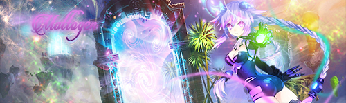 It's far from good, my friend. But everyone starts like that well some are already awesome when they start, so just keep practicing. You need a focal and in your signature there are random things placed at random locations. No focal. Try to concentrate on your render (the girl in this case) and build your sig around it. Take note of colors and flow so you can add stuff that fits into the sig and matches your render. Never place your text somewhere near the top or bottom, nor too far to the left or right and NEVER in a corner. It's probably best if you position your render close around the middle and the text near it. I think the points you need the most practice are definitely the organization of your signatures and colors. Sure people can make colorful signatures with lots of different colors, but in your case it looks... excuse me, I won't say that out loud. It's better this way. *cough* Anyway, you can do it o/ |
|
Aug 27, 2014 12:30 PM
#5787
Isa__ said: It's far from good, my friend. But everyone starts like that well some are already awesome when they start, so just keep practicing. You need a focal and in your signature there are random things placed at random locations. No focal. Try to concentrate on your render (the girl in this case) and build your sig around it. Take note of colors and flow so you can add stuff that fits into the sig and matches your render. Never place your text somewhere near the top or bottom, nor too far to the left or right and NEVER in a corner. It's probably best if you position your render close around the middle and the text near it. I think the points you need the most practice are definitely the organization of your signatures and colors. Sure people can make colorful signatures with lots of different colors, but in your case it looks... excuse me, I won't say that out loud. It's better this way. *cough* Anyway, you can do it o/ Damn you're so harsh Isa. I'm not saying that being realist is bad but I'd be pretty discouraged if someone replied like that to my first post. (I agree with everything you said tho) |
|
Aug 27, 2014 12:38 PM
#5788
| I honestly don't think Isa is being harsh at all. It's all determined by the way the person views the comment. If one wants to be negative and think that all she said was "this is horrible, this looks ugly, I'm just going to criticize your work" then of course he/she will deem her comments harsh. She actually gives some solid advice regarding flow, focal, colors, and typography. I would much rather have someone give me this kind of advice than have someone just point out all the good parts of my signature and not letting me know what's wrong with it. In fact, I wish that I had someone tell me these things when I first started making graphics because I think it would have saved me a lot of time and effort trying to find my flaws myself. That's just my opinion, though. |
|
Aug 27, 2014 12:44 PM
#5789
Insidious said: Yeah she gives very useful advices and that's what I said, but, as you said, people can view the same comment differently, and personally I think that's a little harsh.I honestly don't think Isa is being harsh at all. It's all determined by the way the person views the comment. If one wants to be negative and think that all she said was "this is horrible, this looks ugly, I'm just going to criticize your work" then of course he/she will deem her comments harsh. She actually gives some solid advice regarding flow, focal, colors, and typography. I would much rather have someone give me this kind of advice than have someone just point out all the good parts of my signature and not letting me know what's wrong with it. In fact, I wish that I had someone tell me these things when I first started making graphics because I think it would have saved me a lot of time and effort trying to find my flaws myself. That's just my opinion, though. |
|
Aug 27, 2014 1:51 PM
#5790
Mattogen said: Here we go again, being misunderstood really sucks. Ok maybe it's just me, but for my standards that comment is harsh. And of course it's an advice, and I already said it damn, I didn't say that she just talked shit about the sig, once again, her advices are really useful n'stuff.Isa__ said: It's far from good, my friend. But everyone starts like that well some are already awesome when they start, so just keep practicing. You need a focal and in your signature there are random things placed at random locations. No focal. Try to concentrate on your render (the girl in this case) and build your sig around it. Take note of colors and flow so you can add stuff that fits into the sig and matches your render. Never place your text somewhere near the top or bottom, nor too far to the left or right and NEVER in a corner. It's probably best if you position your render close around the middle and the text near it. I think the points you need the most practice are definitely the organization of your signatures and colors. Sure people can make colorful signatures with lots of different colors, but in your case it looks... excuse me, I won't say that out loud. It's better this way. *cough* Anyway, you can do it o/ Thanks for the advice, and for all the people saying Isa is harsh beinh harsh, if you actually say why you dislike it/give some tips for me to work on I see it as advice. I wasn't hating I really like that she's realist, this turned out into an argument when it was just a (kinda)non-serious toned comment. (ok maybe I should have put like "hahaah" cause some people could think that it was serious and I was criticizing her -.-) |
|
Aug 27, 2014 3:04 PM
#5791
Mattogen said: I wanted to hear your opinion on my latest and greatest signature, I know I'm not really good at this but I'm trying to get better. I think it turned it quite good. I think there is too much going on.. I mean we have an arch, the palm trees, some floating islands on the left hand side, a bright orange hue in the right corner. Maybe it's because I prefer simpler signatures, but I think all of it is distracting. The text itself doesn't match well either. There is a purple strand coming from the bottom right... what is it? Took me a while to place it as part of her ponytail, I think you should remove it once it leaves the frame. Consider trying to get the text to be part of the signature rather than being placed on top. Place some C4Ds or fractales above your text. |
Aug 28, 2014 1:30 AM
#5792
KuraiTomu said: Mattogen said: Here we go again, being misunderstood really sucks. Ok maybe it's just me, but for my standards that comment is harsh. And of course it's an advice, and I already said it damn, I didn't say that she just talked shit about the sig, once again, her advices are really useful n'stuff.Thanks for the advice, and for all the people saying Isa is harsh beinh harsh, if you actually say why you dislike it/give some tips for me to work on I see it as advice. I wasn't hating I really like that she's realist, this turned out into an argument when it was just a (kinda)non-serious toned comment. (ok maybe I should have put like "hahaah" cause some people could think that it was serious and I was criticizing her -.-) I think you misunderstood something now. It's like Insidious says, it depends on how people view the comment. And it seems you tend to view comments negatively. To me it just looks like he wanted to reassure you that he isn't offended by it. That's all. Concerning my post, I always give honest critique and if I don't like something or think it looks bad I at least try to not sound TOO harsh. Sure some people might take it the wrong way, but fortunately there are also those who take it serious and use the advice. Solely bashing something is always a waste of time, so I never do it. Tbh though, how I critisize also depends a bit on my mood xD Mind, I'm not critisizing you, I just wanted you to understand the comment in a more positive way. |
|
Aug 28, 2014 6:05 AM
#5793
Isa__ said: @Luzi: My my, you always see things D: Thanks though. And last time I checked, Sheik was a guy, you see.. no breasts and all. And yeah, I know full well who Sheik really is! xD I suppose it's to balance out my bad sight *cough* ..but wait.. Sheik is supposed to be guy?! w-w-what? I always thought he was a her even in the game and that the clan was only of females... ... ... ...my life was a lie orz |
|
Aug 29, 2014 11:16 AM
#5794
Mattogen said: I'm not a big critic so I'm just gonna say this: Change the text. Really, that just ruins everything.So ehh.... Tried something again. I'm really trying to get better at this so I'd really like some tips. This time I focused more on the coloring etc. but I still think there's too much going on. If I decrease the amount of sh*t going on it just doesn't look as good imo. And I don't really know what to do with the text so I'd like some tips on that too ;).  |
|
Aug 29, 2014 11:50 AM
#5795
Mattogen said: So ehh.... Tried something again. Honestly, it's a pretty huge improvement from your previous one. I see you've got more of an idea of what you want to do in terms of colors and flow, and you've improved on your focal and text placement. Something to focus on would be to further blend your render so it doesn't just look "pasted" on there. Other than that, I'd say just keep practicing and eventually you'll get the hang of it. EDIT: As for the text... I'd have to agree that it looks pretty bad. But that's okay! Most beginners struggle with text, in fact I'd venture to say that everyone still struggles with text from time to time. I can't really give you much advice regarding typography other than to practice and experiment while looking at what others are doing. Here's a couple text tutorials I have favorited on my deviantART. here and here |
InsidiousAug 29, 2014 11:54 AM
|
Aug 29, 2014 11:59 AM
#5796
Mattogen said: KuraiTomu said: Mattogen said: So ehh.... Tried something again. I'm really trying to get better at this so I'd really like some tips. This time I focused more on the coloring etc. but I still think there's too much going on. If I decrease the amount of sh*t going on it just doesn't look as good imo. And I don't really know what to do with the text so I'd like some tips on that too ;). I agree, the text is horrible. I just don't know how to make good looking texts on a signature. It's a pretty big improvement, as Insidious says. I'll give you that. The text looks horrible, that's true. Try this tutorial to improve your text work. http://zenron.deviantart.com/art/Typography-for-Beginners-371897847 The colors are good, just try to blend things together better. You can do this with several adjustment layers like brightness/contrast for example. You will get a feel for colors eventually. At least that's how I think iit will be, cause you already make huge improvements. It's also less chaotic, but it still could have more harmony. Try to get a flow and work with it. I'm proud of you. *slaps your back real hard* |
|
Aug 30, 2014 4:28 AM
#5797
Mattogen said:  I hope this is a bit better, I'm quite satisfied with it now. Ready to move on to my next one. The only thing significantly better is the text. Good work. For my taste it is a tad to bright, but definitely a huge improvement. You're satisfied with it now, so I'd move on and practice more. I look forward to your next work ^^ |
|
Sep 3, 2014 7:14 AM
#5798
Mattogen said:  Man I'm spamming this thread so much now. Well, looking for some tips/opinions on this one. As much as Red santa suits and winter are put together, it's something I dislike a lot. It's the clash of red with the background. You can remedy this with either adding more red to the background, maybe red fractals and such.. or what I would probably do scrap a blue wintery background, do a red themed background with winter accents. EDIT: OR A RED AND GREEN CAUSE RED AND GREEN IS CHRISTMAS Render looks a bit too sharpened, but it isn't too much of a big deal. and the text looks fine. I think more could be done, but since i too suck at text, idk what I would do. I think this would be the best one you made though, if I weren't biased against Santa + Winter (These things never made much sense to me) |
Sep 3, 2014 7:27 AM
#5799

| In my opinion you do not use lighting/blur/sharpen tool enough, but it might just be me as im a big abuser of those.~~ And adding a basic outline might help too~~ |
[center]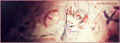 |
More topics from this board
» Maki - Anime Recommender System ( 1 2 )xDevily - May 1, 2022 |
50 |
by DesuMaiden
»»
8 hours ago |
|
» I make animations and oil paintings, so I need your supports, please!mufarari - May 17 |
4 |
by DesuMaiden
»»
8 hours ago |
|
» Show us your latest sketch or drawing v.2 ( 1 2 3 4 5 ... Last Page )Luna - Feb 21, 2017 |
1632 |
by DesuMaiden
»»
8 hours ago |
|
» AI-Powered Anime Recommendations + Stats ( 1 2 )ameo___ - May 23, 2022 |
64 |
by DesuMaiden
»»
8 hours ago |
|
» Painting Kimi no Na Wa (Your Name) Music Albummufarari - Jan 13 |
8 |
by mufarari
»»
May 17, 11:10 AM |