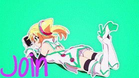
Hello members, welcome to ER Card Design Tournament Preliminaries (Summer 2016). We hope that you would take some time to participate in voting the winner of this Preliminary Round.
Here the criteria used for grading: 1. Overall Design Contextuality:
This criterion conceptually evaluates how the design match the description of the theme. A good designer should be able to creatively design an art work that match with the specified concept or the theme. In this particular Summer 2016, the theme is not determined and thus designer has the freedom to choose the theme. But in the future contest we may choose the theme for the tournament.
2. Images and Effects:
This criterion evaluates how the image selection and effects are incorporated together. This may involves coloring and formal composition, utilization of static image or animated gif, and so on.
3. Border Design:
This criterion evaluates how the border is designed and incorporated into the overall layout of the design.
4. Text Styling and Positioning :
This criterion evaluates how the text is incorporated into the design layout and how the style of the text match the theme.
GRADING RULES:
1. Members Give Grade From 0 to 10 Based on the Average Score Describing the Quality of the Cards.
2. The Comment should include critical input and reasons of why you give the score as such. Members can use the Grading Criteria Above as the parameters to explain the reasoning.
3. Please also put it under a spoiler tag.
GRADING FORMAT:
[spoiler]
Participant A:
Average Score:
Comment:

Participant B:
Average Score:
Comment:

Participant C:
Average Score:
Comment:

Participant D:
Average Score:
Comment:

Participant E:
Average Score:
Comment:

Participant F:
Average Score:
Comment:

Participant G:
Average Score:
Comment:

Participant H:
Average Score:
Comment:

Participant I:
Average Score:
Comment:
[/spoiler]
Participant B:
Average Score:9
Comment:The design them rain and sakura is beautiful but the third one is not that good.
Participant C:
Average Score:8
Comment: its cool but not my type.
Participant D:
Average Score:9
Comment:you did a good job there. The themes that you use is the one that i like. But the last one the theme that about LoL. It's the only one that is not my type. Because we are talking about anime here not games. Anime is better that games.
Participant E:
Average Score:10
Comment:That what I want. They all have unique themes and good art work.
Participant F:
Average Score:7
Comment: It's not good. Or maybe just not my type. Just try to put more art work there. And good themes.
Participant G:
Average Score:10
Comment: Wow. They all have my attention. Mostly the last one. You got a good thing there. Nice work.
Participant H:
Average Score:8
Comment:LOL. I like them but not the themes and the ideas there.
Participant I:
Average Score:perfect 10
Comment: I like them all. The theme, the style the background and the girlish style. I like them. And if you can give me a copy of that. I will be happy. That's all.
Participant A:
Average Score: 7
Comment: The 2 still cards are great but the moving one is a bit too much.
Participant B:
Average Score: 9
Comment: I really like the first 2, they are beautifully done. The last 2 are good as well but not as well done as the first 2.
Participant C:
Average Score: 8
Comment: They are cute :) I wouldn't mind having these cards!
Participant D:
Average Score: 10
Comment: These are so perfectly done and beautiful. Also, the moving images aren't too much or too little, they have been used perfectly!
Participant E:
Average Score: 9
Comment: These are very cool! Not too much to say tbh!
Participant F:
Average Score: 7
Comment: They seem to be lacking a little bit in some areas but aren't too bad!
Participant G:
Average Score: 9.5
Comment: These are very original and beautifully done. Nice work!
Participant H:
Average Score: 10
Comment: I love them <3 I love the style and the themes used. Very nice :)
Participant I:
Average Score: 9
Comment: I love the last 3 as they fit so perfectly with the theme used. The first 2 are also quite good but not as good as the last 3.
Participant A:
Average Score: 7
Comment: The colours on the first one match very well and where you put the text is well place. The second one is just a bit too much for my eye though, kind of hurts it. Third one is decent to me, could've done with the frame being different but still good.
Participant B:
Average Score: 7.5
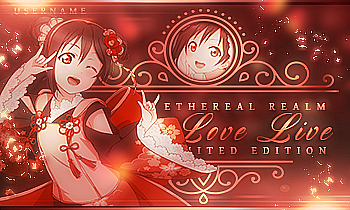
Comment: The rain and guns cards are not to my liking as the rain doesn't use a good picture and the guns has too much of a texture/text overwhelming the card. The cherry blossoms are nice and cute though, and the vampires the texture/text there is much better than the guns one.
Participant C:
Average Score: 6
Comment: Personally I think that cards that have those types of layers aren't for what I like like in the third one. The first one is a bit too purple on the shadow and in general, but the third one is nice except for the standing out colour difference on the "Username"
Participant D:
Average Score: 8.5
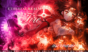
Comment: These are around very good, especially the fire usage put in within the fourth card and the colours. The fifth one is also good, I like the bronze usage and shine. The first one is maybe a little too pink but the idea and text design is good. The second one isn't one of the best ones with the lighting but the design idea and text once again is good. The third has good colouring but I'm not sure if choosing Celeste for this colouring was good but it's nice.
Participant E:
Average Score: 7.5
Comment: The steampunk's border, photo, and font all work well together and are all in a nice way in the card. The techo has a nice background and lighting, but the text is a little weird to me. The flowers is decent, I like the photo used but not the way the borders were put or the colouring of the text. The pink is my least favourite here, the repetitive font is nice but not part of my liking, but the photo used and the lighting is okay. The green is the best out of the bunch to me, the photo used matches the background, and the text is nice here.
Participant F:
Average Score: 8
Comment: I think I mostly like the design on the first card. The purple colouring actually fits here and the slight transparent text is a nice match with the colouring, and the blocky text could've personally been better maybe up in a different corner but since I can't move it around and see for myself I'm not sure about moving it. The second one has a google circular border and text, but I'm not a big fan on the lighting. The third one I like the border and text once again, but the green bokeh on Nagito in general I don't like. The blood one is a better one, since it uses a good photo, text, and the colours all match. The Bungou Stray Dogs one is a simple little flower but it's also very cute with nice text.
Participant G:
Average Score: 8
Comment: I don't think the shaping of the first card was a good decision, but the lights and photo + the font works very well. The card would've been better to me without the shape. The second one uses pretty text and a nice photo, but I personally think the border could've been a different colour than gold as it doesn't match. The third one is a simple one but it's my favourite of the three. A very good artwork was chosen and put into a nice card with the simple text and design. 👍
Participant H:
Average Score: 9
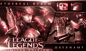
Comment: The use of Excalibur being placed on the border is a brilliant idea. The font and text could've been better, but the lights/textures on Saber has good usage. Personally the second card could've gone without some of the green, but the border around and fonts fit the "Tech" theme well. The third one is arguably the best though, I like how the dragon loops around the whole card and the colours are all matching blues. I think the "username" font is a little too ordinary compared to the font and style of the club name but it's great still.
Participant I:
Average Score: 9
Comment: The first two aren't that great considering the little black shadows you forgot to erase on the first card (just had to mention it) and the texts on the second one being maybe too close but the last three fit the themes you chose best. The fire one is the best, the flaming fire border worked best but the "username" isn't as visible. (I also like how you chose Cinder Fall for a fire theme.) The snow one has a border as of a snowflake so it fitting with the snow theme is great. The colour of the picture has a darker one of that of the frame and text though, so it looks a bit weird. And the third one fits the gold theme well. The use of a border with something other than gold on it fits and the text has a nice gradient. Nice job.
Participant A:
Average Score: 6
Comment: text and borders needs some improvement, but the designs are somewhat alright especially because Miku Hatsune.
Participant B:
Average Score: 6
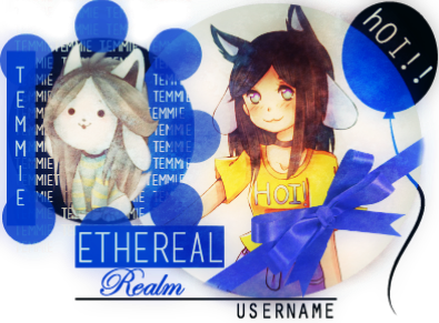
Comment: borders could be added, but I love the rain and the cherry blossom designs. I'm not too sure about the gun and the vampire theme though. it could be a bit more improved, the images are a bit faded looking. maybe also make the text a medium sized, kinda like the one in the rain theme.
Participant C:
Average Score: 5
Comment: the text could be improved, as well as the borders, I kinda like how the "Temmie" theme card design looks. and I love the Determination one also, but the text definitely needs some improvement.
Participant D:
Average Score: 5
Comment: the card designs are pretty interesting but they could be a bit better looking with borders on, and also a bit less designs on the background of the images, but I do indeed like the League of Legends card design, and the Fire card I like that it has a gif/moving images in them. and some of the colors on certain card designs could be a bit less bright/colory? (if that's even a word?? :P)
Participant E:
Average Score: 4
Comment: I like the border of the steampunk card one, but it would look cooler if the image on that card design had a gif of edward elric on it. The Techno card design kinda looks to be on the somewhat "give-up" sort of moment it could be improved. the Flower card design has too much of a border taking up most of the image, but I like that it looks vintage. as for the Pink card design, there's too much text, maybe make a smaller size for the text. the Green card design is pretty interesting.
Participant F:
Average Score: 8
Comment: I love the look of these card designs, I really like the Sci-fi one and the Blood card. the text and the design on both of these cards I would personally like to have them on my card collections,(if they were card editions) they are very appealing to the eye.
Participant G:
Average Score: 10
Comment: these card designs are perfect! I love these type of designs, I love how the borders look especially, and the choice of text as well. I really do love the Elegance card and the Digital card the border on that one looks very interesting too. ^-^
Participant H:
Average Score: 8
Comment: these card designs are also amazing, but the size of them I don't agree on too much, for some people bigger might be better, but in my case, I wouldn't mind have a bit of a medium sized card. but I do indeed like the design on them, especially the dragon one, I like the concept of it, the text could be improved though. but I can definitely see some guys wanting this card in their card collections. same thing goes for the Bravery card design.
Participant I:
Average Score: 7
Comment: the style of some of these card designs I like, but not all.
there's something about the Technology card that doesn't sit well with me, same thing goes for the Beach one, but other then that I like that Fire, Snow and Gold, have interesting borders to them and the way the card design looks too. the text on these three cards I can definitely agree on.
Participant A:
Average Score: 5
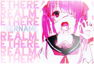
Comment: Interesting use of shape. Great gif effect. Messy combination of colors. Text styling needs improvement. Messy graphic effects. Design not relevant to theme.
Participant B:
Average Score: 7
Comment: Great color combination. Squarish shape is not interesting enough. Great graphic effects. Skillful text placement. Design color matches theme.
Participant C:
Average Score: 6
Comment: Text placement needs improvement. Too many text styles in one design. text styling needs improvement. Messy graphic effects. Character posing/graphic choice needs improvement. Color combination needs improvement.
Participant D:
Average Score: 8
Comment: Skillful text styling and placement. Great graphic effects. Great character posing/graphic choice. Great color combination. Gif effect needs improvement (Slight pause before the fire loops back needs to be edited out).
Participant E:
Average Score: 5
Comment: Text styling needs improvement. Graphic effect needs improvement (looks plain). Color combination needs improvement (looks plain). Design not relevant to theme (I get Edward is from steampunk era but there's no element about it, and I can't see his robotic arm clearly. You can't just place one sci-fi-ish effect in the background and consider your card as techno themed. Placing two/three flowers in your card doesn't make it flower themed.)
Participant F:
Average Score: 6
Comment: Great hue. Text placement needs improvement. Great character posing/choice. Good graphic effects. Good text styling. Overall quality needs improvement.
Participant G:
Average Score: 10
Comment: Perfect character posing/choice. Skillful color combination. Simplistic graphic yet appealing. Design matches theme. Interesting use of shape. Great text styling and placement. Well placed graphic effects.
Participant H:
Average Score: 9
Comment: Sharp colors compliment design. Interesting use of shape. Text styling and placement needs improvement. Great graphic effects. Great hue and color combination. Character posing/choice needs improvement.
Participant I:
Average Score: 9
Comment: Interesting use of shape. Great hue. Great character posing and choice. Text styling needs improvement. Great border design.
Participant A:
Average Score: 8.25 + 8.75 + 7.425 = 8.1
Comment: Great borders. Excellent effect in the 2nd one. Should have picked better images to match the theme.
Participant B:
Average Score: 7.1 + 8.75 + 6.0 + 8.4 = 7.5
Comment: Sakura theme was OP. Gun was hugely dissappointing. Nice font in the Vampires. Just a more likable photo whould have been fine.
Participant C:
Average Score: 7.25 + 7.87 + 9.32 + 8.425 = 8.2
Comment: Where's the determination in the first one? The Yandere one was abso *_* . Awesome borders in the second one; just a different pic selection would have been nice.
Participant D:
Average Score: 6.62 + 8.95 + 8.87 + 6.43 + 8.625 = 7.9
Comment: Couldn't relate to most of them, unfortunately.
Participant E:
Average Score: 8.675 + N/A + 8.175 + 7.5 + 9.5 = 8.5
Comment: What's 'Techo'? Last card is OP as f *_*
Participant A:
Average Score: 7
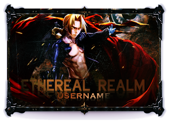
Comment: I like the fact the participant incorporate the smooth looping GIF in 2nd design. But need to improve the border in that 2nd design.
The first and third design looks cool, but need composition and combination between elements in 3rd design looks a bit rought, especially between photo frame and the girl. This participant though has a very good potential in that they try to explore much on the border and GIF, which is pretty uncommon these days where many designers seems comfortable to repeat their design style and not exploring the border so much. The theme and design seems to match pretty well to, especially on the 2nd design. Good job :)
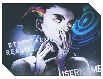
Participant B:
Average Score: 6
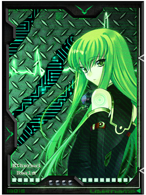
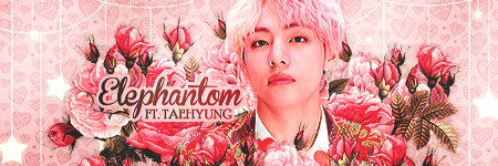
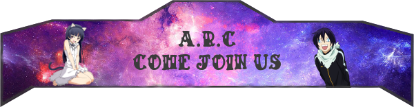
Comment: I loved the selection of pictures in all those cards. The text seems to be incorporated well in the overall design. The placing of the text and additional effect added into the text are pretty well done. However this participant needs to explore more on the border. A complex shape of borders may not be necessary, however emphasize by means of coloring and border width would need to be explored more. In addition, the design theme needs to be more descriptive in how it relates to the actual design. For example I would give the first design different theme that can somehow relates the facial expression of character with the environment. The fourth design also does not show clearly the text, and the text "Ethereal Realm" seems to be hidden by the coloring. Still, a thumb up I give to this designer for their amazing work :)
Participant C:
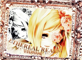
Average Score: 9.2
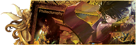
Comment: Really beautiful works. I like the how much the creativity is put into every single design. Though still much needs to be improved related to the border design (need to make a better transition between the background space with the design), but this participant has bravely explore the border very well. The selection of the pictures and the effect given to each design is also amazing. I love the first design very much, and really depict the theme of determination well. This participant has very good potential, and slight improvement would make them outstanding. Great job :D
Participant D: 8
Average Score:
Comment: Elegant and unique. The placing of the text into the design are awesome. I appreciate how this participant tries to incorporate GIF as special effect into their 4th design. Nearly perfect. However this participant might want to explore more the border design. Currently seems only the 5th design that does the exploration. Nevertheless, overall really good. Good job :D
Participant E:
Average Score: 7
Comment: The overall designs looks cool and pretty. I like the 5th design the most. However third design might need a bit of articulation in the border. The 4th design also does not quite show the text clearly. The text "Ethereal Realm" seems to be not written in complete form, and might cause confusion. Other than that, these designs looks great, and I give a thumb up for these great works :D
Participant F:
Average Score: 7
Comment: The overall design looks great. The 1st design is neat, and looks really smooth, the composition between the size of the text and overall design looks great. The border's decoration also designed well, simple but elegant. Also good exploration on the border for 2nd design. However the coloring of the text in the 2nd design are overlapped with the background, and thus the text cannot be seen clearly. The same problem also occurs in the 4th design. 5th Design looks cute, the border looks elegant, but the size of the text for USERNAME seems too small compared to the overall design. This participant has great potential. Good job!! :)
Participant G:
Average Score: 9.5
Comment: Nearly perfect, this participant really pick my interest in how they design from the border, coloring and the text. The composition for all design nearly perfect, and transition of colors between each element in each design looks very smooth. Just some piece of advises, the theme description need to be elaborated more, especially for the first design, where the theme "digital" seems does not match well with the elegance of the color of what the design gives. The text "username" in the 3rd design might need a bit larger. Other than that, amazing works!! :D
Participant H:
Average Score: 9.7
Comment: Nearly perfect. border, placement of text, coloring and special effects are all incorporated very well into the overall design. The third design is my favorite. Not much to say about this perfectness, other than give the score of 9.7 to whoever this guy might be :D
Participant I:
Average Score: 7.5
Comment: This designer has a very creative works to be presented. Starting from the border exploration, effects and pretty much everything. The text in design 3 though need to be fixed because its overlapped with the background, and really hard to see. The placement of text also need to be explored more, like creating a special design or spot for locating or incorporating the text. Currently the text are just put in the center of the design. Perhaps creating some kind of different background in the edge or corner, or additional decoration for locating the text at that spot might make the design more organized. However, this participant has great potential, and thus I raise my thumb :D
Participant A (iizaninja): 7.133333333 Participant B (mcxynth): 7.5 Participant C (magicalofmagic): 7.116666667 Participant D (Exo_x): 8.491666667 Participant E (Maze): 7.666666667 Participant F (Shuuka): 7.1 Participant G (xyenne): 9.25 Participant H (Visceras): 8.916666667 Participant I (Kishar): 8.441666667
Participants F, out.
Message: Don't be discouraged. Your works are really great. But maybe need a bit of improvement or not just your lucky days.
Anyhow, you still earn points rewards for participating :D