Thanks for the compliments everyone! Really appreciated, especially when I'm new. :)
@Meri: Yup I tried my best with my colors recently; and that's cause people commented that colors had been drained out of my life for a while, as seen in the first few (most recent) large pieces I've made. Hope you guys can make an exception for me to post some here in this sig club. :)
I feel as if I'll be shunned here though, as my main focus of GFX is icons, rather than sigging. As for my sigs, I generally do not use C4Ds. I have nothing against them, I just suck really hard with them. So I go for the whole bright and 500millon textures look.
With that said, I'll post a few of my personal favorites.
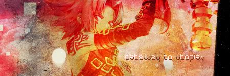
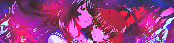
My first sig that I've ever done in this style, the style being one that matches my graphics. Features Haseo from .hack//G.U.'s cover art for Vol 1. Nothing special about this sig, aside from it being one of my first, although I personally feel that it's a bit more "well blended" than some of my newer ones. I also like the choice of textures. A lot of reddish tones, rather than my normal cooler tones. Also has some fancy text. I don't really like the text in this one
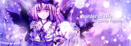
Did this one for a friend, on a whim. I had the image in my pics, and I hadn't done one for Yuyuko, so I figured I'd give it a shot. I liked it a lot at the time, but now that I look at it, I should have done butterflies instead of those large blotches (the concept of the blotches was to be "spirits" because, y'know, she's a ghost, lolololol). Either way, I like the purples in this one.
My first sig of Tear Grants from Abyss. Ironically, it was made for a guy on a forum named after Asch, a character from the same game (which is why some were like, lol wat?) One of the first times I used brushes in a way that it surrounds a character as if it were a backdrop. Too bad I kind of abused this style...
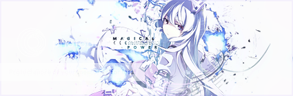
Another Touhou tag. This time, Remilia. When I saw this image, I knew I had to use it, so, well, I did. This is the first sig where I used an actual background theme, trying to go for the whole "depth" thing. I feel that this is the only sig where I actually pulled that off, but not too well. The text is from an IOSYS arrange, which is, ironically, a circle I hate...
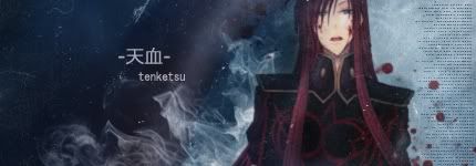
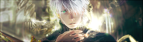
Tenketsu, Holy Blood. Obvious theme for this is both a play on not only Asch's name, but his title too (another from Tales of the Abyss). I like the concept of this sig a lot, but everytime I look at it, I notice 10 things I should have fixed (although a friend finally got me to stop fixing after like, 5 different versions). I tried to do a whole err... I think the technique is called "Neutralizing dead space" or something. Yeah. I did that successfully for once... Too bad the render looks kinda blah IMO, as its cut badly near the hair...
Unfortunately I don't know any tutorials dealing explicit how to use C4D's but normal tutorials are always helpful.
The best site for resources I've encountered is sigresource.com which Meri posted a few pages before. Also planetrenders.net has a nice collection of C4D's
It's also worth checking out resource packs smaller gfx communitiy sites do as advertising for example: http://sigresource.com/index.php?showtopic=32663
well I felt like posting some of my lil crappy things here.
The signatures are big for MAL and I use them in an anime forum I hang out a lot
here is my most recent one
I am trying lil by lil to get used with c4d because they were a pain for me at first and I was bound to filters/textures. Recently I've found the hue/saturation trick to change the color of my images and it really helped me make less ugly c4d bases signatures.
I really don't know but I love this signature and it was my first one with c4d. The only bad thing is the image quality. The scan was all blurry and it had these annoying lines which i had to clean them and it was one hell of a pain!
this one was also quite advanced in the making. I used a trick here. The maximum size limit of the signature is 100kb but by making it transparent,the size would fly to like 300kb so by copying the main color base of the forum and place it as background,I could save it as .jpeg within the acceptable size but it looked completely transparent xD. Later i added the links because i had them as simple links under the image but they warned me it exceeded the height limit so instead of having them under i put them IN the signature. Oh well, me and my crazy ideas xD
finally here is my scripted signature. A friend made the coding but he is way too busy now so he doesn't script anymore
I absolutely adore this image and the result was a bit dark but yeah,my mood was kinda bad these days xD
oh I shouldn't bug you more! I'd like to hear some opinions
Black_RockJun 14, 2010 6:43 AM
Thank you so much Santa! Merry Christmas & a wonderful new year!
What I stumbled across randomly when downloading a ressource pack, was something called "Light beam". When you use it with the blending mode screen and around 10-15% opacity and with a Vibrance adjustment layer above it you can increase the depth effect of the signature greatly. Especially when you erase parts of it you can make part of your signature pop out while the background gets an washed out effect. I haven't tried it in combination with c4d's but it works very very well with anime renders + brushes.
Imho, you should try to use colours that fits the render, it looks like you forced the red colour on both renders. Also the plain black background doesn't match well in both sigs. This advice is kind of lame, but the best way to start is to have some tutorials guide you in the beginning, you will improve much faster and better.
@Kid28: Nice background and colours! :D
from the above these two are my favourites:
Kid28 said:
Also if you haven't already noticed, Animerender has now a search function and "most viewed" for its render gallery. I already downloaded lots of nice renders ^^
and made this one:
@Meri
Thank you :)
And yeah, typo is the part I always had problems with.
And great to see new ones from you: from the two verticals I favour the orange one. I saw that render too and couldn't think of how to use it, but the flowers and the white shadow matches the render very nicely
And about your second one: the background looks somehow pixelated? However, the confetti-like effect on her left looks great.
Thank you SixFlags :)
Me too, typography is hard ^^
Everyone seems to fav the orange one, while I prefer the 2nd one lol ^^
The background isn't pixalated, it's an effect :> Filter > Sketch > Water paper on the original size render. I loved it so decide to leave it :3
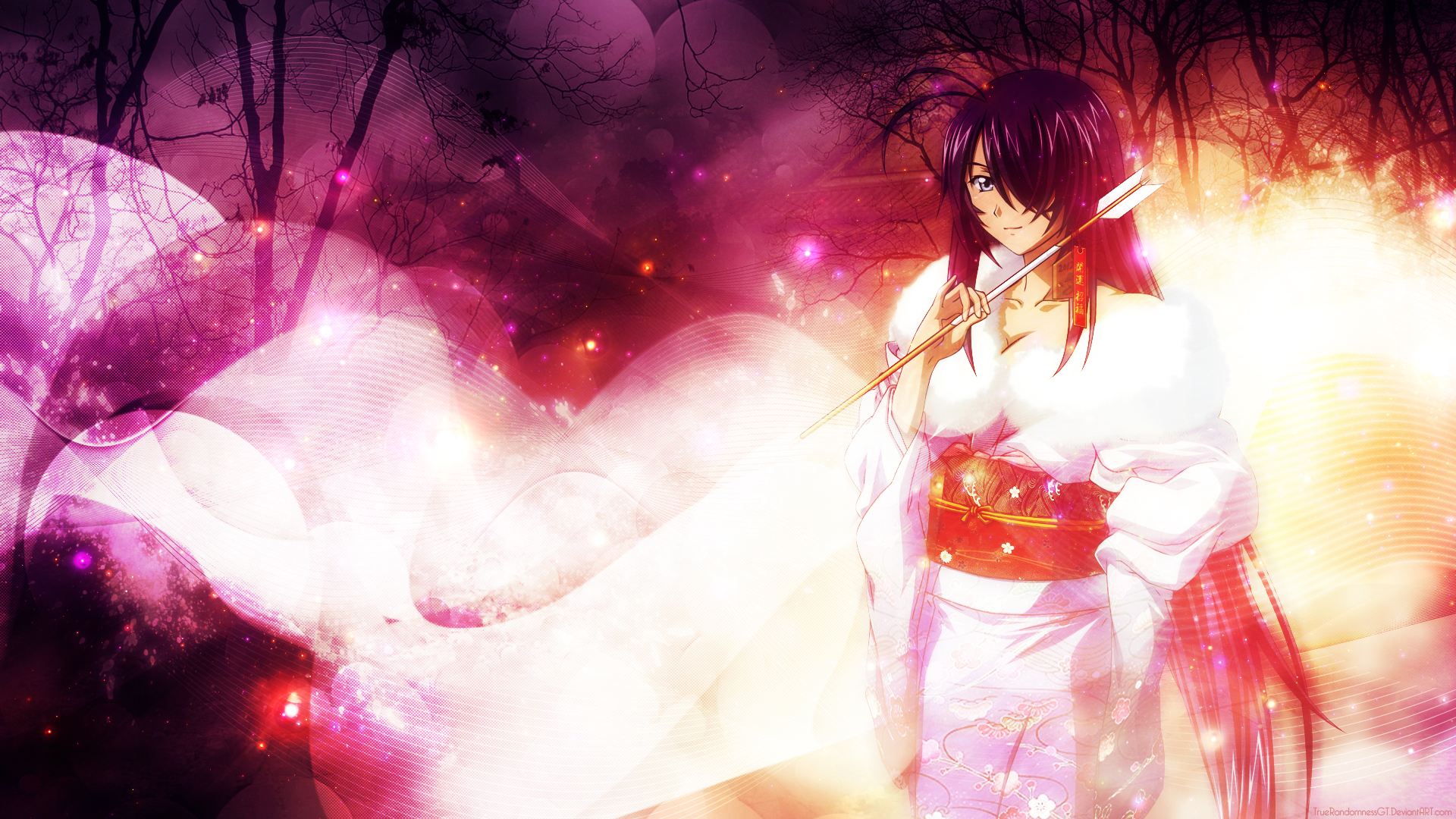
Made this for GESC: Boobs but not gonna enter with it. Thoughts? Mine is that I'm getting more and more generic. And I've been using a lot of blue lately.
I decided to bump this thread with absolutely everything I've made up to date, from first to latest sig. I still somewhat consider myself a beginner, but I think I've improved a lot since I started. Comments are welcome!
My first attempt using one of the tut in the tut thread... i think it's too red. I think I had the same wire frame brush too... Lawl, just using what I had. Random font I googled...
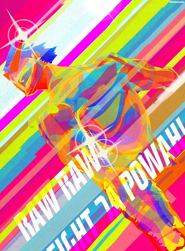
My final entry won't win any awards but I found it more fun and artistically interesting (though even less challenging to make). So I guess I just took the risk


 and
and 


 this looks so much better on a darker backround.


