New
Mar 11, 2010 11:08 AM
#3801
sophy4ever said: Cool lists people. mine is really simple and a bit unreadable. A question. how do I make the CSS lists show in Firefox? They work when I use IE8. Edit profile > My list settings > In Default Settings > Uncheck Style Override > Update Settings |

Mar 12, 2010 2:11 PM
#3802
| @GamerchiX: Luv the colors~ |
Mar 13, 2010 12:24 AM
#3803

| Nice lists in this thread as usual :D From the latest updates, my favorites would be DwChan's and Mimi_Taylor's. @MeitDeist : The headers really look cool! @phrmcy : Nice bg and colors, but I think you could make the headers a bit more "angelic" imho. Also, I prefer when there's an hover effect on the links, even the slightest one, but that's just me :) @HanaDrool : Cute list! One thing tho, is that your headers font could be better matched with the list imho. @drewn9 : I must agree that the Headers font looks a bit out of place. It's been a while since I made my previous one, so I decided to update mine too. Joining the Drrr!! mania. Wondering why my cursor won't show up tho :/ Any one has an idea how to fix it? |
 |
Mar 13, 2010 4:50 PM
#3804

| @Dust2Dust: Looks great! (: Cursor's working fine for me. |

Mar 14, 2010 3:01 AM
#3805

| Im a lil rusty @ css but my current list was working fine untill the other day. I have the following string put in the body and the a:hover tables cursor:url(http://i41.photobucket.com/albums/e289/ranivus/Headers/MAL%20CSS%2023/cursor.png) 0 0, auto; it was working completely fine ever since i updated my list. Until today... I just noticed my cursor is dead. The image is still there but it wont display any more. The only recent change i can think of is that my firefox updated. Can anyone help? |
  "What happens when we die?" I know that the ones who love us will miss us. |
Mar 14, 2010 5:01 AM
#3806
| Basically the same problem than Ranivus for me. And it's not only my list, it's a specific cursors problem since I can't see his either, and tried on several other lists which I know had a cursor. I also updated FF recently, and it worked fine before that :d And I can't see any cursor on IE either :/ Thanks Rukayex :) |
|
Mar 14, 2010 11:21 AM
#3807

Mar 21, 2010 2:40 AM
#3808
| Seems like I'm stuck in this one format of designs where there's a character on the right while the list scrolls on the left. My previous one broke the mold, but now I'm back at it. Long story short: intended resolution 1920x1200, rather simple compared to my previous one, and what would be a list based on a parody series without sort of parodying one of the characters? (Anyone afraid of heights?) You're not supposed to see the category totals. Therefore they might seem a little off if you happen to see them due to a setting in your browser. Also, clicking on tags messes it up, but I'm not going to fix it as I never use the tag search feature. Not to mention that it's not much of use on my list anyway.  |
Mar 21, 2010 5:14 AM
#3809

| Update my anime list. Compared to my previous style the color theme and bg's the same, but I moved my list to the right, changed the main header, rounded the tables, removed the borders, and changed the font of the section headers. As for my manga list...I'll get around to it during my spring break xD. @Spawwvy - Hinagiku <3 Looks great. I really like the cloud style your using for it. |
Mar 24, 2010 1:31 PM
#3810

| I just did my first style for my list and I think I did a pretty good job! :D I kinda rushed it and finished this in like a day.. >_< |
Mar 24, 2010 5:06 PM
#3811
NETRiP26 said: Really nice list. :) I like how you positioned watching, completed, plan to watch. Noooo waiiii! It's not that good, I just rushed it because I wanted a temporary style before I make a really nice one! I love yours! It's REALLY neat and creative O.O |
Mar 24, 2010 6:21 PM
#3812
Moronicidiot said: I just did my first style for my list and I think I did a pretty good job! :D I kinda rushed it and finished this in like a day.. >_< :O Looks great; the color scheme could be better, but you've done some cool stuff with the code/script. I like. :D |
Mar 24, 2010 8:04 PM
#3813

| @Moronicidiot That's awesome! Those "buttons" on the left make it so much easier to see your whole list. Plus it's very well-tasted. Really nice :D |
Mar 24, 2010 9:36 PM
#3815
| @Rukayex I actually think your right about the color scheme, I was gunna change it but I got lazy and was like "ahh screw it" :3 @poketonip Haha thanks I tried to make it like that xD @PresSiT How did I do wut? o.o |
Mar 24, 2010 11:38 PM
#3816
| I was wondering how you repositioned and added images to the completed, watching, plan to watch etc. buttons. Its cool, and really effective too. :) |
Mar 25, 2010 12:33 PM
#3817
PresSiT said: I was wondering how you repositioned and added images to the completed, watching, plan to watch etc. buttons. Its cool, and really effective too. :) This is what I used.. The CSS for it is really long though o_O #list_surround .status_selected { background:url(http://i41.tinypic.com/1iokm0.png); display:block; height:130px; left:-284px; padding:0; position:absolute; top:0; width:273px; } #list_surround .status_selected a { color:#184900; display:block; font-size:1px; height:2px; padding:128px 0 0 243px; width:30px; } #list_surround .status_not_selected { background:url(http://i41.tinypic.com/1iokm0.png); display:block; height:130px; left:-284px; padding:0; position:absolute; top:0; width:273px; } #list_surround .status_not_selected a { color:#184900; display:block; font-size:1px; height:2px; padding:128px 0 0 243px; width:30px; } #list_surround .status_selected + .status_not_selected { background:url(http://i44.tinypic.com/2lk7crt.png); top: 140px; } #list_surround .status_not_selected + .status_selected { background:url(http://i44.tinypic.com/2lk7crt.png); top: 140px; } #list_surround .status_not_selected + .status_not_selected { background:url(http://i44.tinypic.com/2lk7crt.png); top: 140px; } #list_surround .status_selected + .status_not_selected + .status_not_selected { background:url(http://i44.tinypic.com/6o0k01.png); top: 280px; } #list_surround .status_not_selected + .status_selected + .status_not_selected { background:url(http://i44.tinypic.com/6o0k01.png); top: 280px; } #list_surround .status_not_selected + .status_not_selected + .status_selected { background:url(http://i44.tinypic.com/6o0k01.png); top: 280px; } #list_surround .status_not_selected + .status_not_selected + .status_not_selected { background:url(http://i44.tinypic.com/6o0k01.png); top: 280px; } #list_surround .status_selected + .status_not_selected + .status_not_selected + .status_not_selected { background:url(http://i44.tinypic.com/51ug7r.png); top: 420px; } #list_surround .status_not_selected + .status_selected + .status_not_selected + .status_not_selected { background:url(http://i44.tinypic.com/51ug7r.png); top: 420px; } #list_surround .status_not_selected + .status_not_selected + .status_selected + .status_not_selected { background:url(http://i44.tinypic.com/51ug7r.png); top: 420px; } #list_surround .status_not_selected + .status_not_selected + .status_not_selected + .status_selected { background:url(http://i44.tinypic.com/51ug7r.png); top: 420px; } #list_surround .status_not_selected + .status_not_selected + .status_not_selected + .status_not_selected { background:url(http://i44.tinypic.com/51ug7r.png); top: 420px; } #list_surround .status_selected + .status_not_selected + .status_not_selected + .status_not_selected + .status_not_selected { background:url(http://i39.tinypic.com/wb5p1i.png) no-repeat 0 0; padding-bottom:30px; top: 560px; } #list_surround .status_not_selected + .status_selected + .status_not_selected + .status_not_selected + .status_not_selected { background:url(http://i39.tinypic.com/wb5p1i.png) no-repeat 0 0; padding-bottom:30px; top: 560px; } #list_surround .status_not_selected + .status_not_selected + .status_selected + .status_not_selected + .status_not_selected { background:url(http://i39.tinypic.com/wb5p1i.png) no-repeat 0 0; padding-bottom:30px; top: 560px; } #list_surround .status_not_selected + .status_not_selected + .status_not_selected + .status_selected + .status_not_selected { background:url(http://i39.tinypic.com/wb5p1i.png) no-repeat 0 0; padding-bottom:30px; top: 560px; } #list_surround .status_not_selected + .status_not_selected + .status_not_selected + .status_not_selected + .status_selected { background:url(http://i39.tinypic.com/wb5p1i.png) no-repeat 0 0; padding-bottom:30px; top: 560px; } #list_surround .status_not_selected + .status_not_selected + .status_not_selected + .status_not_selected + .status_not_selected { background:url(http://i39.tinypic.com/wb5p1i.png) no-repeat 0 0; padding-bottom:30px; top: 560px; } I just did my manga list. This one was done REALLY QUICKLY! I did this style in 1 hour.. I think I did a nice job :P It's pretty simple though but I like it! http://myanimelist.net/mangalist/Moronicidiot |
DrizeMar 25, 2010 5:46 PM
Mar 25, 2010 6:02 PM
#3818
| Nice manga list, but there is a problem with the headers... |
Mar 25, 2010 7:17 PM
#3819
poketonip said: Nice manga list, but there is a problem with the headers... What's the problem? Can you show me a screenshot of what you mean because they look perfect to me. I check the manga list on firefox and internet explorer 8. [I use Firefox] o_o |
Mar 25, 2010 8:27 PM
#3820

| What do y'all think of mine? I updated the wallpaper to look like Morpheel is swimming in the dark waters of the Lakebed Temple. |
| "Never trust a man in a business suit. You never know what kind of business he may be conducting." -Me |
Mar 26, 2010 7:44 PM
#3821
Moronicidiot said: poketonip said: Nice manga list, but there is a problem with the headers... What's the problem? Can you show me a screenshot of what you mean because they look perfect to me. I check the manga list on firefox and internet explorer 8. [I use Firefox] o_o  |
Mar 26, 2010 10:22 PM
#3822
| @Morpheel4ever I have no clue what a Morpheel is.. but looks nice. :3 @poketonip Well... I can't do much about Google Chrome =/ Because I don't know the problem on Google Chrome and I don't wanna download Google Chrome cuz I prefer Firefox :D But I made some mods to the theme.. so tell me if it's fixed or not.. [I doubt it] |
Mar 28, 2010 9:19 AM
#3824

| @Moronicidiot: I see it just fine and I got to say, the idea is darn good. I like it a lot. Also the buttons on your anime lsit are quite interesting, I never thought of something like that. |
Mar 31, 2010 2:03 PM
#3825

| Hey I'm looking for something, I remember there was some kind of list challenge thing at one time that had links to some epic lists, anyone know where that is? I thought it would be back in another topic somewhere but I can't find it. ^_^;; |
     |
Mar 31, 2010 2:42 PM
#3826
GamerchiX said: Hey I'm looking for something, I remember there was some kind of list challenge thing at one time that had links to some epic lists, anyone know where that is? I thought it would be back in another topic somewhere but I can't find it. ^_^;; Is it this that Talon set up? http://myanimelist.net/forum/?topicid=55068 most have probably changed by now though. |
Apr 1, 2010 10:13 PM
#3828
| My background image doesn't show on my list, and the font's wrong too. Can anyone help pinpoint the error? List Just in case, Code: // Self-explanatory */ BODY { background-image: url(http://img51.imageshack.us/img51/7160/34983840.jpg); background-attachment: fixed; background-repeat: no-repeat; background-position: top left; background-color: #ffffff; font-size: 11px; font-family: Verdana; } /* // Determines the positioning of your list */ #list_surround { margin-top: 85px; margin-bottom: 0px; margin-left:30px; margin-right:auto; padding-top:105px; width: 600px; background-image: url(http://i282.photobucket.com/albums/kk265/koleargrim/List-UVERchan/Headerv1.png); background-repeat: no-repeat; background-position: top center; color: transparent; } #mal\_control_strip { position:fixed; top:0; letter-spacing:0px; z-index:100; background: transparent url(http://i282.photobucket.com/albums/kk265/koleargrim/List-UVERchan/controlbar.png) repeat bottom right !important;} #mal\_cs_powered{position: fixed !important; top: 7px !important; right: 50px !important;} #mal\_control_strip a {color: #ffffff !important;} #mal\_control_strip a:link, #mal\_control_strip a:visited {text-decoration: none;} #mal\_control_strip a:hover {text-decoration: underline;} } #mal_cs_powered {position:fixed !important;} /* // All links on your list */ a { color: #cacaca; text-decoration: none; } a:visited { color: #cacaca; text-decoration: none; } a:hover { color: #cacaca; text-decoration: underline; } /* // Alternating row color 1 */ .td1 { color: #cacaca; border-style: none; border-color: #000000; border-collapse:collapse; padding: 5px; background-image: url(http://i282.photobucket.com/albums/kk265/koleargrim/List-UVERchan/row01.png); background-repeat: repeat; } /* // Alternating row color 2 */ .td2 { color: #cacaca; border-style: none; border-color: #000000; border-collapse:collapse; padding: 5px; background-image: url(http://i282.photobucket.com/albums/kk265/koleargrim/List-UVERchan/row02.png); background-repeat: repeat; } /* // This represents the "Anime Title", "Score", "# Eps" columns */ .table_header { color: #dedede; border-width: 1px; border-style: none; border-color: #000000; border-collapse:collapse; padding: 5px; background-image: url(http://i282.photobucket.com/albums/kk265/koleargrim/List-UVERchan/rowtopping.png); background-repeat: repeat; } /* // headerLink represents the color of the links inside the_header */ .table_headerLink { color: #ffffff; text-decoration: none; } .table_headerLink:Visited { color: #cacaca; text-decoration: none; } .table_headerLink:Hover { color: #cacaca; text-decoration: underline; } /* // Controls the select form decoration (the drop down select box) */ .form { border-width: ; border-color: ; border-style: ; color: ; padding: ; font-size: px; font-family: ; } /* Which 'status' up top is selected? */ .status_selected { color: transparent; border-width: 1px; border-style: none; border-color: #000000; border-collapse:collapse; padding: 2; } .status_not_selected { color: transparent; border-width: 1px; border-style: none; border-color: #000000; border-collapse:collapse; padding: 2; } /* Header classes for Currently Watching, Completed, Dropped, etc... */ .header_cw { height: 37px; background-image: url(http://i282.photobucket.com/albums/kk265/koleargrim/List-UVERchan/watching.png); color: transparent; padding: 9px; } .header_completed { height: 37px; background-image: url(http://i282.photobucket.com/albums/kk265/koleargrim/List-UVERchan/completed.png); color: transparent; padding: 9px; } .header_onhold { height: 37px; background-image: url(http://i282.photobucket.com/albums/kk265/koleargrim/List-UVERchan/onhold.png); color: transparent; padding: 9px; } .header_dropped { height: 37px; background-image: url(http://i282.photobucket.com/albums/kk265/koleargrim/List-UVERchan/dropped.png); color: transparent; padding: 9px; } .header_ptw { height: 37px; background-image: url(http://i282.photobucket.com/albums/kk265/koleargrim/List-UVERchan/plantowatch.png); color: transparent; padding: 9px; } .header_title { font-size: 10px; font-weight: bold; } .category_totals { height: 37px; background-image: url(http://i282.photobucket.com/albums/kk265/koleargrim/List-UVERchan/listbottom.png); text-align: center; color: #565656; font-size:9px; } #grand_totals { padding-top: 10px; height: 60px; background-image: url(http://i282.photobucket.com/albums/kk265/koleargrim/List-UVERchan/listfooter.png); background-repeat:no-repeat; text-align: center; color: #565656; font-size:9px; } /* header_al is thesurrounding "User's Anime List" at the top */ .header_al { font-weight: bold; font-size: 16px; } /* header_al_links is thewith your "Profile" and "MyAnimeList home" links */ .header_al_links { } /* controls what styles you can give to all the anime titles in your list */ .animetitle { font-weight: bold; } /* copyright contains the "Producted by Garrett Gyssler" text DO NOT REMOVE OR HIDE THIS DIV IF FOUND TO BE REMOVED, YOUR LIST WILL BE REMOVED TOO */ #copyright { margin-bottom:0px; margin-top:auto; margin-left:auto; margin-right:auto; height: 60px; background-image: url(http://i282.photobucket.com/albums/kk265/koleargrim/List-UVERchan/listfooter.png); background-repeat:no-repeat; padding-top:18px; text-align: center; width: px; color: #565656; font-size:9px; } #copyright:after{content:' Design by PRESSit ';} Thanks! :} |
PRESSitApr 1, 2010 10:23 PM
Apr 1, 2010 10:52 PM
#3829
thestatement said: My background image doesn't show on my list, and the font's wrong too. Can anyone help pinpoint the error? List Just in case, Code: // Self-explanatory */ BODY { background-image: url(http://img51.imageshack.us/img51/7160/34983840.jpg); background-attachment: fixed; background-repeat: no-repeat; background-position: top left; background-color: #ffffff; font-size: 11px; font-family: Verdana; } /* // Determines the positioning of your list */ #list_surround { margin-top: 85px; margin-bottom: 0px; margin-left:30px; margin-right:auto; padding-top:105px; width: 600px; background-image: url(http://i282.photobucket.com/albums/kk265/koleargrim/List-UVERchan/Headerv1.png); background-repeat: no-repeat; background-position: top center; color: transparent; } #mal_control_strip { position:fixed; top:0; letter-spacing:0px; z-index:100; background: transparent url(http://i282.photobucket.com/albums/kk265/koleargrim/List-UVERchan/controlbar.png) repeat bottom right !important;} #mal_cs_powered{position: fixed !important; top: 7px !important; right: 50px !important;} #mal_control_strip a {color: #ffffff !important;} #mal_control_strip a:link, #mal_control_strip a:visited {text-decoration: none;} #mal_control_strip a:hover {text-decoration: underline;} } #mal_cs_powered {position:fixed !important;} /* // All links on your list */ a { color: #cacaca; text-decoration: none; } a:visited { color: #cacaca; text-decoration: none; } a:hover { color: #cacaca; text-decoration: underline; } /* // Alternating row color 1 */ .td1 { color: #cacaca; border-style: none; border-color: #000000; border-collapse:collapse; padding: 5px; background-image: url(http://i282.photobucket.com/albums/kk265/koleargrim/List-UVERchan/row01.png); background-repeat: repeat; } /* // Alternating row color 2 */ .td2 { color: #cacaca; border-style: none; border-color: #000000; border-collapse:collapse; padding: 5px; background-image: url(http://i282.photobucket.com/albums/kk265/koleargrim/List-UVERchan/row02.png); background-repeat: repeat; } /* // This represents the "Anime Title", "Score", "# Eps" columns */ .table_header { color: #dedede; border-width: 1px; border-style: none; border-color: #000000; border-collapse:collapse; padding: 5px; background-image: url(http://i282.photobucket.com/albums/kk265/koleargrim/List-UVERchan/rowtopping.png); background-repeat: repeat; } /* // headerLink represents the color of the links inside the_header */ .table_headerLink { color: #ffffff; text-decoration: none; } .table_headerLink:Visited { color: #cacaca; text-decoration: none; } .table_headerLink:Hover { color: #cacaca; text-decoration: underline; } /* // Controls the select form decoration (the drop down select box) */ .form { border-width: ; border-color: ; border-style: ; color: ; padding: ; font-size: px; font-family: ; } /* Which 'status' up top is selected? */ .status_selected { color: transparent; border-width: 1px; border-style: none; border-color: #000000; border-collapse:collapse; padding: 2; } .status_not_selected { color: transparent; border-width: 1px; border-style: none; border-color: #000000; border-collapse:collapse; padding: 2; } /* Header classes for Currently Watching, Completed, Dropped, etc... */ .header_cw { height: 37px; background-image: url(http://i282.photobucket.com/albums/kk265/koleargrim/List-UVERchan/watching.png); color: transparent; padding: 9px; } .header_completed { height: 37px; background-image: url(http://i282.photobucket.com/albums/kk265/koleargrim/List-UVERchan/completed.png); color: transparent; padding: 9px; } .header_onhold { height: 37px; background-image: url(http://i282.photobucket.com/albums/kk265/koleargrim/List-UVERchan/onhold.png); color: transparent; padding: 9px; } .header_dropped { height: 37px; background-image: url(http://i282.photobucket.com/albums/kk265/koleargrim/List-UVERchan/dropped.png); color: transparent; padding: 9px; } .header_ptw { height: 37px; background-image: url(http://i282.photobucket.com/albums/kk265/koleargrim/List-UVERchan/plantowatch.png); color: transparent; padding: 9px; } .header_title { font-size: 10px; font-weight: bold; } .category_totals { height: 37px; background-image: url(http://i282.photobucket.com/albums/kk265/koleargrim/List-UVERchan/listbottom.png); text-align: center; color: #565656; font-size:9px; } #grand_totals { padding-top: 10px; height: 60px; background-image: url(http://i282.photobucket.com/albums/kk265/koleargrim/List-UVERchan/listfooter.png); background-repeat:no-repeat; text-align: center; color: #565656; font-size:9px; } /* header_al is thesurrounding "User's Anime List" at the top */ .header_al { font-weight: bold; font-size: 16px; } /* header_al_links is thewith your "Profile" and "MyAnimeList home" links */ .header_al_links { } /* controls what styles you can give to all the anime titles in your list */ .animetitle { font-weight: bold; } /* copyright contains the "Producted by Garrett Gyssler" text DO NOT REMOVE OR HIDE THIS DIV IF FOUND TO BE REMOVED, YOUR LIST WILL BE REMOVED TOO */ #copyright { margin-bottom:0px; margin-top:auto; margin-left:auto; margin-right:auto; height: 60px; background-image: url(http://i282.photobucket.com/albums/kk265/koleargrim/List-UVERchan/listfooter.png); background-repeat:no-repeat; padding-top:18px; text-align: center; width: px; color: #565656; font-size:9px; } #copyright:after{content:' Design by PRESSit ';} Thanks! :} Copy and replace- /* // Self-explanatory */ BODY { background-repeat: no-repeat; background-color: #000000; background-image:url(http://img51.imageshack.us/img51/7160/34983840.jpg); background-position: top left; background-attachment: fixed; color: #ffffff; font-size: 11px; font-family: Verdana; } |
Apr 2, 2010 12:59 AM
#3830
| Thanks so much. That did the trick. :} List updated |
Apr 2, 2010 1:41 AM
#3831
| @Menty: looks nice, I really like the background picture. But there are two things that imo could be better. The font you used for the titles and somehow the left side seems too colorless. The gray doesn't really match the black-blue-pink color theme. EDIT: it's even better with the bubbles :) |
werrstonApr 2, 2010 3:06 AM
Apr 2, 2010 2:39 AM
#3832
| Hahas. Updated, but I meant for the font to be this way, instead of plain bold lettering. I'll leave it as it is until more people comment. Bobbles! :P |
Apr 2, 2010 4:44 PM
#3833
I took a stab at making a Higashi no Eden design xD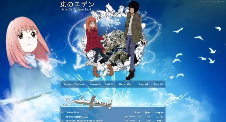 |
Mimi_TaylorApr 2, 2010 5:08 PM
Apr 2, 2010 5:20 PM
#3834
| @ Mimi: Looks good! Nice colors, they're very calming. :) The wallpaper could be higher quality, though. @ Pressy: see profile. ;) |
Apr 2, 2010 6:39 PM
#3835
| @Mimi Nice! The only thing that I don't like about is it the size of the wallpaper =/ It'll get cut off on some people's monitors if their resolution is too small.. but mine is too big, that it gets cut off becuz the wallpaper is too small o_o Anyways, It looks really nice!! :D |
Apr 2, 2010 8:04 PM
#3837
| @Mor & Ruk: Thanks! I'll see to it that I edit the wallpaper. :3 I'm not sure if I'm going to try and make it bigger though. It's already 1920x1200px and I don't suspect that most people will have insanely large monitors. o_o And it doesn't look so bad when it's as small as 1024x786. But smaller than that, yeah.. *shrug* |
Mimi_TaylorApr 2, 2010 8:26 PM
Apr 3, 2010 5:21 AM
#3838
Apr 3, 2010 9:57 AM
#3839

| Nice work Mimi! Too bad that the frame of the list goes through the text once you expand one of the entries by clicking on More though. :< |
 staff.applications ▼ guidelines.faq ▼ report.abuse ▼ thx.skittles ▼ thx.kina ▼ [H+] ³ ▼ |
Apr 3, 2010 9:26 PM
#3840
cyruz said: Nice work Mimi! Too bad that the frame of the list goes through the text once you expand one of the entries by clicking on More though. :< Oh well.. D: I hardly ever use the 'more' feature so I didn't even notice that lol. |
Apr 4, 2010 6:36 PM
#3841
cyruz said: this limitation really pisses me off. once I was making a list of a notebook (which turned to be my actual list nowadays) and I had to redo ALL OF IT from scratch because the body needed to fit the width of the text. RRRRRNice work Mimi! Too bad that the frame of the list goes through the text once you expand one of the entries by clicking on More though. :< btw, @mimi_taylor really nice list :D |
Apr 5, 2010 7:34 AM
#3842
| yep, very nice list Mimi. :) @poketonip & Mimi_Taylor: try bumping the 'More' text to the right with: *[id^='menu'] .td1, *[id^='menu'] .td2 { padding-left: **px; } |
Apr 5, 2010 9:32 PM
#3843
scorpedo said: yep, very nice list Mimi. :) @poketonip & Mimi_Taylor: try bumping the 'More' text to the right with: *[id^='menu'] .td1, *[id^='menu'] .td2 { padding-left: **px; } Oh it's you! =O I always admired your list design and I've had it bookmarked for a looong while. :3 Thank you for the tip~! Thanks, and yours is still as awesome and cute as ever~ :D |
Apr 6, 2010 6:24 AM
#3844
| I've updated my manga list here: http://myanimelist.net/mangalist/iristigerlily I wanted the white to join the way down, to avoid having gaps between the tables, but do you think it looks okay as it is? I also wanted a bigger border around the edge of the tables (about 5px) but changing the css just made all the borders 5px and I'm far too tired to sift through the code to find a solution, so for now, it's a small border ^////^ |
iristigerlilyApr 6, 2010 6:34 AM


Apr 6, 2010 9:13 AM
#3845
| @iristigerlily: looks really nice, I like it a lot. It would look better if there was no gap between the sections. As for the border, this in the header, td1 and td2 should do it. border: 0px 5px 5px 0px They go like this "top, right, bottom, left" By the way, you can hide the "manga title" "score" titles, it would look better. |
Apr 6, 2010 4:01 PM
#3846
| @Mimi_Taylor aw, thank you! :D @iristigerlily I really like it! very nice colors. and an awesome BG. |
Apr 6, 2010 7:14 PM
#3847
| @iristigerlily: Awesome! I like the colors too~ =O |
Apr 7, 2010 6:53 AM
#3848
| uhm how do i add the shades behind the text? uhm like putting a transparent black picture behind the text sry for my english dunno if u understand anything i wrote here lolz and one more question how do i get pic above the uhm Complete, currently and the rest of the crap so yeah how? xD i kinda new on this css stuff lolz |
nakitokunApr 7, 2010 7:30 AM
 |
Apr 7, 2010 7:02 AM
#3849

nakitokun said: uhm how do i add the shades behind the text? uhm like putting a transparent black picture behind the text sry for my english dunno if u understand anything i wrote here lolz Being that I just learnt basic CSS. I'm guessing its something to do with hover color and non-hover color. The fact that it looks transparent is probably just because of the compliment with the color of the panel behind it. |
 |
More topics from this board
» New to writing and started a script for an animeN0t-A_W33b - Aug 12 |
3 |
by W3TFT
»»
5 hours ago |
|
» Academy Showdown Gaiden – Audiobook/Audio Drama Announcement!MRD_Crowe - Mar 21 |
9 |
by MRD_Crowe
»»
Yesterday, 4:44 PM |
|
» 【 ART THREAD 】Let's share our art! ❤︎ ( 1 2 3 4 )mewmewforever - Aug 30, 2024 |
186 |
by Retro8bit
»»
Yesterday, 4:34 PM |
|
» Four Ages!Robert_SS_Gordon - Feb 21 |
45 |
by Robert_SS_Gordon
»»
Yesterday, 9:06 AM |
|
» Created a waifu discord serverUzuki_ - Sep 11 |
1 |
by Retro8bit
»»
Sep 11, 5:49 PM |