New
May 19, 2010 5:45 AM
#3951

| Lmao. x3 And it's only Wednesday lol. Anyway, I really like the list. The background is awesome and the headers are decent enough to not distract while looking fancy. Good work. |
 staff.applications ▼ guidelines.faq ▼ report.abuse ▼ thx.skittles ▼ thx.kina ▼ [H+] ³ ▼ |
May 19, 2010 12:06 PM
#3952

| @SnG: Looks pretty good for my taste and if only the wallpaper was a little wider. cyruz said: What he said.Lmao. x3 And it's only Wednesday lol. Anyway, I really like the list. The background is awesome and the headers are decent enough to not distract while looking fancy. Good work. |
 "A Legend is but a tale of a beautiful lie." |
May 19, 2010 3:59 PM
#3953

| @AsianLucas- Pretty good list. Nice and Simple. One thing I would update is your top header: Give your render some blending. Probably a little bit of shadow would work best with that header. Again I would only do it to the render and not the text, since the rest of your text on your list doesn't have shadow blending. *Make sure you shadow angle matches your background image ;) |

May 20, 2010 2:47 AM
#3954

| Thanks for the very positive replies and constructive criticism. @ Spineslayer Yeah, i can definitely see your point there - i might as well try out with a new header, since the font to begin with, didn't fit well with the rest. I'm going to look into that, thanks :3. Edit: Decided to do something more experimental - check it out :3. Hopefully it'll look like the same, no matter browser. |
AsianLucasMay 20, 2010 4:16 AM
May 20, 2010 9:35 PM
#3955

| Help please, my custom cursor are not showing anymore... And I'm not sure why.. D: my css code /* // Self-explanatory */ html {cursor: url(http://i83.photobucket.com/albums/j304/crystal_yuy/MAL/ListDesign/Dogs.png) 1 2, auto;} a{ cursor: url(http://i83.photobucket.com/albums/j304/crystal_yuy/MAL/ListDesign/Dogs.png) 1 2, auto; /* X and Y are the clickpoint of the cursor, default is 0 0 (left top) corner of the image. ,auto is that he changes back to the standard cursor if he can't load the image*/ } BODY { background-image: url(http://i83.photobucket.com/albums/j304/crystal_yuy/MAL/ListDesign/creambg.png); background-attachment: fixed; background-repeat: repeat; margin: 0; color: #FFFFFF; font-size: 11.00px; font-weight: norma; font-family: Verdana, Arial; background-color: #dedbc8; } #mal_control_strip{ filter:alpha(opacity=80); -moz-opacity:0.5; opacity: 0.5; } /* // Determines the positioning of your list */ #list_surround { margin: 0 auto; width:600px; margin-top:5px; padding-top: 386px; background-image: url(http://i83.photobucket.com/albums/j304/crystal_yuy/MAL/ListDesign/MAL_Header.png); background-repeat: no-repeat; } /* // All links on your list */ a { color: #206377; text-decoration: none; } a:visited { color: #206377; text-decoration: none; } a:hover { color: #206377; text-decoration: underline; } /* // Alternating row color 1 */ .td1 { color: #206377; border-width: 0px 1px 1px 0px; border-style: solid; border-color: #9b4943; padding: 1px; background-color: #f0e5da; } /* // Alternating row color 2 */ .td2 { color: #206377; border-width: 0px 1px 1px 0px; border-style: solid; border-color: #9b4943; padding: 1px; background-color: #dbcab6; } /* // This represents the "Anime Title", "Score", "# Eps" columns */ .table_header { color: #206377; border-width: 1px 1px 1px 0px; border-style: solid; border-color: #9b4943; background-color: #dbcab6; padding: 1px; } /* // headerLink represents the color of the links inside the_header */ .table_headerLink { color: ; } .table_headerLink:Visited { color: ; } .table_headerLink:Hover { color: ; } /* // Controls the select form decoration (the drop down select box) */ .form { border-width: 2px 2px 2px 2px; border-color: #000000; border-style: none ; color: #206377; padding: 2px; font-size: 11.00px; font-family: Verdana, Arial; } /* Which 'status' up top is selected? */ .status_selected { color: #FFFFFF; border-width: 0px 1px 1px 0px; border-style: solid; border-color: #9b4943; padding: 2px; background-color: #9e9a96; } .status_not_selected { color: #FFFFFF; border-width: 0px 1px 1px 0px; border-style: solid; border-color: #9b4943; padding: 2px; background-color: #d1cfcc; } /* Header classes for Currently Watching, Completed, Dropped, etc... */ .header_cw { width: 600px; height: 170px; background-image: url(http://i83.photobucket.com/albums/j304/crystal_yuy/MAL/ListDesign/MAL_CW.png); background-repeat: no-repeat; background-position: center; } .header_completed { width: 600px; height: 170px; background-image: url(http://i83.photobucket.com/albums/j304/crystal_yuy/MAL/ListDesign/MAL_C.png); background-repeat: no-repeat; background-position: center; } .header_onhold { width: 600px; height: 170px; background-image: url(http://i83.photobucket.com/albums/j304/crystal_yuy/MAL/ListDesign/MAL_OH.png); background-repeat: no-repeat; background-position: center; } .header_dropped { width: 600px; height: 170px; background-image: url(http://i83.photobucket.com/albums/j304/crystal_yuy/MAL/ListDesign/MAL_D.png); background-repeat: no-repeat; background-position: center; } .header_ptw { width: 600px; height: 170px; background-image: url(http://i83.photobucket.com/albums/j304/crystal_yuy/MAL/ListDesign/MAL_PTW.png); background-repeat: no-repeat; background-position: center; } .header_title { font-size: 14px; font-weight: bold; display:none;/* let the text disappear above every categorie*/ } .category_totals { font-size: 9.00px; text-align:center; padding-top: 8px; Padding-bottom: 10px; color: #518594; } #grand_totals { text-align: center; font-size: 9.00px; padding-top: 5px; Padding-bottom: 13px; color: #518594; } /* header_al is thesurrounding "User's Anime List" at the top */ .header_al { font-weight: bold; font-size: 16px; } /* header_al_links is thewith your "Profile" and "MyAnimeList home" links */ .header_al_links { } /* controls what styles you can give to all the anime titles in your list */ .animetitle { font-weight: bold; } /* copyright contains the "Producted by Garrett Gyssler" text DO NOT REMOVE OR HIDE THIS DIV IF FOUND TO BE REMOVED, YOUR LIST WILL BE REMOVED TOO */ #copyright { padding-top: 5px; Padding-bottom: 10px; text-align: center; margin: 0 auto; width: 480px; font-size: 9.00px; color: #518594; } |
crystal_yuyMay 21, 2010 3:12 PM
     |
May 21, 2010 4:11 AM
#3956

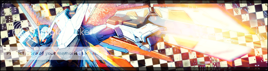
| @crystal_yuy I'd try putting the cursor css in the body tags, and probably the a, a:hover, etc... because it will use the default if you dont specify. e.g. If you put it in the body but not links it will work but go back to normal when over links. Edit: If you only intended it to come up on links then put the cursor css in all the link tags(a, a:hover, a:visited) also i'm not expert but have the a tag twice might cause some conflict so put in all in one. -- Also, opinions on my lists? Both the anime and manga designs are new. For anime list not sure on the design, see spoiler.   |
HonarisMay 21, 2010 8:04 AM
 |
May 21, 2010 7:57 AM
#3957

| Glad you like it guys. :) @ Siva: Yeah, wider Wallpaper would be great.. I'll see if I can find better one. xD |
 |
May 21, 2010 9:00 AM
#3958
| My resolution is 1920x1080, so it's quite common for me to see peoples lists, having a to small wallpaper background for my resolution. One of the reasons as to why i've kept my own background with a color and a render which fades out to that background color. @ two posts above I'm experiencing the same with yours, the background is black on the sides when i watch it, due to my resolution. Here's a screenshot: 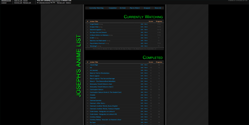 Otherwise, it looks well good :3. |
May 21, 2010 10:14 AM
#3959
| Just adjusted my background for wider resolutions, cant say that it's great looking but better than sudden black areas on the page. And thank you. :) |
HonarisMay 21, 2010 10:19 AM
|
May 21, 2010 7:57 PM
#3960
| @MajorJoseph: doesn't works... :X I wanted to have the cursor all time not just on links... ---- I would like to have your opinion on this please XD took me hours to figure out (and then code it to the position I want it to be) how to get that header to the side of the list lol |
|
May 22, 2010 3:00 AM
#3961
| @crystal_yuy If you only want it on links just put the code in a, a:hover and a:visited and nowhere else. As far as I can tell the cursor isn't working because of the size of it. Don't know if it varies but cursor size needs to be smaller than 32x32 usually. I resized yours to 30x30 if you need it.  |
|
May 22, 2010 9:40 AM
#3962
| First try with CSS, nothing complicated. http://myanimelist.net/animelist/ShiroiNoKiwi http://myanimelist.net/mangalist/ShiroiNoKiwi A bit bright now that I look at it.. |
May 22, 2010 11:31 AM
#3963
| @ShiroiNoKiwi I think it only appears bright because there is a lot of white, it is more light than bright. That isn't a problem because ef was awesome though which makes up for it. On the mangalist it says "Plan To Watch" on the header when it should be "Plan To Read", and might be worth changing the text colour of the category footers as in white they cannot be read, but I don't know if you want them visible or not. =P |
|
May 22, 2010 12:34 PM
#3964
| Fixed those. Thanks for pointing them out. :) Might try a bit darker background later if I find a suitable one. |
May 22, 2010 1:39 PM
#3965
| @ MajorJoseph: oh, it has to be smaller than 32x32? didn't know that since it was working previously... I'll try with a resize one, thanks ^^ EDIT: hum.. ok my anime list cursor show now but the manga list cursor still doesn't show :/ |
crystal_yuyMay 22, 2010 2:07 PM
|
May 22, 2010 2:54 PM
#3966
| @crystal_yuy For me the manga list cursor is working fine but the anime list isn't because the image hasn't been resized yet. |
|
May 22, 2010 4:38 PM
#3967
| @MajorJoseph: I resized both and replace them but for me it's the other way around (anime shows, manga don't) weird... |
|
May 22, 2010 5:44 PM
#3968

| @crystal_yuy: I see them both :) hopefully the size limit will be removed eventually for firefox. :\ as stated here: "(Due to bug 541182 Gecko 1.9.2/ Firefox 3.6.x on Windows limits to 32x32px. A future minor update will probably fix this.)" |
May 22, 2010 9:27 PM
#3969
| @crystal_yuy I can see them too. Both lists look good :) I just finished updating mine too. It's pretty simple, nothing flashy. The only hard part was extracting the characters in the background from their original scan. Took forever :S |
valtizarMay 22, 2010 10:24 PM
 |
May 23, 2010 6:22 AM
#3970
| Good work :3. I tend to be unable to see the text sometimes though, due to the high transparency and the white text, on the -sometimes- white background :3. Especially on the "navigation" for each part of the text underneath the header image. |
May 23, 2010 10:26 AM
#3971
| Ahh really?? So far I can see those fine, but I think I might have to change the text for the category totals and grand totals. Perhaps I'll just change the font colours for everything while I'm at it. Thanks for the input :) |
|
May 23, 2010 1:17 PM
#3972
| Ah, see it now.. I guess it just needed some time to kick in.. @valtizar: your totals are hard to read (specially at the bottom of the screen with the bg being really "colorful") maybe change to a lighter color or put a transparency bg |
|
May 23, 2010 3:26 PM
#3973
| I agree, and I think I will do just that. Thanks for your help ^^ |
|
May 24, 2010 2:51 AM
#3974
| Updated my anime list with a Aria theme. |
May 24, 2010 7:01 AM
#3975
| Nice - looks sleek :3. |
May 24, 2010 10:21 AM
#3976
| I think it looks really good too ^^ Some of the text is hard to read, like the scores, but that may also be because I just woke up. I'm not sure, so maybe someone else can give you some input on that as well haha. I like the overall design alot though. |
|
May 24, 2010 11:43 PM
#3977

| I'm into the "clean and beautiful" type profiles, and styled mine to be just that. Heck even looks nice in IE (tho no shadows and rounded corners but oh well) =P http://myanimelist.net/animelist/frifox Enjoy =) |
 |
May 25, 2010 7:17 AM
#3978
frifox said: I'm into the "clean and beautiful" type profiles, and styled mine to be just that. Heck even looks nice in IE (tho no shadows and rounded corners but oh well) =P http://myanimelist.net/animelist/frifox Enjoy =) I love it. Great thing that you rounded and shadowed the corners with css alone,that's not very common around here and i get the feeling that it looks more professional that way :3. Well done! Being simple is definitely sometimes better than over doing it. |
May 25, 2010 11:56 AM
#3979
| Impressive. I'm still very new to css, I didn't even know you could use it to do the shadowing. It looks great though. Clean and beautiful is a pretty accurate description. |
|
May 26, 2010 1:45 AM
#3980
| Updated mine. A temporary b&w Iwasawa version :) @frifox - clean and beautiful, definitely. Love it <3 |
May 26, 2010 11:57 AM
#3981
| @ NastyMuffin - really nice Updated mine 2. Its my second attempt, so please don't expect too much. ^^ |
May 27, 2010 1:30 PM
#3982
| @Stephen- That's better than my second attempt so cant complain but it agrees with me on a few things. I have the font used in the header, the colours work well together and I like minimal designs. Only thing I can see that is off at a glance is the empty space at the bottom of the list above the copyright, but i'm only saying that because I don't like one-sided critiques. On a side note, it inspired me to finally start watching Spice and Wolf which used to be in my Plan To Watch, and it's awesome. =D |
|
May 27, 2010 8:57 PM
#3983
May 27, 2010 9:44 PM
#3984

frifox said: I'm into the "clean and beautiful" type profiles, and styled mine to be just that. Heck even looks nice in IE (tho no shadows and rounded corners but oh well) =P http://myanimelist.net/animelist/frifox Enjoy =) That is actually a really nice list. I love it. Only problem is  You see the bottom how the white and grey are not blended? I don't know how you'd fix it though. change the bg or make the list go all the way to the bottom. Unless it is on purpose :< |
May 28, 2010 10:26 AM
#3985

| Am I allowed to post here that you are all amazing and how much I wish I had one of them fancy looking lists? Bravo Bravo~ (Sorry if this is spam, it's just much easier than Commenting on all your profiles ♥) |
| You're still the one that I love, the only one I dream of~ |
May 28, 2010 2:06 PM
#3986
May 31, 2010 9:48 AM
#3987

| Hi Guys~ I was wondering... does anyone know how to change the color of the "Grand Totals" title? I can't find one neither know how to do it ^^'' |
MoonyMay 31, 2010 1:29 PM
     |
May 31, 2010 12:23 PM
#3988

this should work:#grand_totals_header{color: #000; font-size: 50px;} |


May 31, 2010 1:47 PM
#3989
svaax said: this should work: <pre>#grand_totals_header{color: #000; font-size: 50px;}*o* It Works! o/ Thank you very very much *bows* |
|
Jun 1, 2010 2:01 AM
#3990

| okok, i've updated my list. its very simple, nothing much/ ahhaha, =D |
Jun 1, 2010 3:36 AM
#3991
SZ- said: okok, i've updated my list. its very simple, nothing much/ ahhaha, =D Your list is set to private - i believe :3 |
Jun 1, 2010 1:32 PM
#3993
| That looks pretty nice. If i were to contribute with anything, i'd advice adding padding on the left side of the td1 and td2 (the areas where the title is.) I'm not exactly sure if that's where the padding should be, but the titles are very close to the border of your list. If i were to put my honest opinion on it, i'd say that it's to sad that the list itself doesn't blend very well, due to the simple white background, in contrast with your background :3. |
Jun 1, 2010 10:34 PM
#3994
| @SZ- I agree with AsianLucas. The list looks great, but the white stands out rather alot. Maybe if you tried a slightly darker colour it would blend better?? Other than that I think it looks excellent. |
|
Jun 1, 2010 11:41 PM
#3995
| ohokok, i'll go edit it. thanks for the advices. =D |
YeonaJun 1, 2010 11:44 PM
Jun 2, 2010 8:55 AM
#3996
| Update anime list. Go Go =p I'm going to change it sometime over the next few days as I don't really like how it came out. Started out wanting to do a Spice & Wolf design but the colours didn't look right so went B&W... Eh...Don't hate the whole list, but the background feels tacked on to an otherwise okay list. |
HonarisJun 2, 2010 11:32 AM
|
Jun 2, 2010 1:03 PM
#3997
| @ MajorJoseph: A black/white background would make your list look much much better. :) |
Jun 2, 2010 1:30 PM
#3998
| Ack, in the middle of editing too so I don't know what it is you're seeing. xD Gonna edit this post when i'm done editing.^^ Okay i've change my anime list now and it's finished, opinions appreciated. ^^ Also, is it worth hosting my css files externally? Reasons I can think of for doing so are -When I hit update the css on MAL too often it rolls back. >.< -Convenience -Prevent too many people seeing your code, though not hard to follow url. |
HonarisJun 2, 2010 2:06 PM
|
Jun 2, 2010 7:12 PM
#3999
| It looks somewhat better now. I just save the code on Word Pad just in case I screw it up in the browser editing thing. I don't think many people will bother looking at your code unless your list has something really cool on it. :P |
Jun 2, 2010 7:36 PM
#4000

| Wordpad? ...kill me now. Get a text editor with syntax highlighting that cares about encoding... I like Notepad++ or InType but there are many others. You can even find editors specialized for css, but I've found they're usually as intrusive as they are helpful. MajorJoseph said: Also, not only does mal roll back your code but it filters it to remove things that it doesn't like.... and they're generally random and harmless things so it's very frustrating when bits of your code get replaced and broken. And yeah, you can use a lot of tricks to hide your code, like hex-encoding the @import url and hex-encoding the css itself (in a format like \FF for each letter); that makes decoding difficult for non-techies but older or non-standard browsers will not be able to see your css (pretty much just IE and very old versions of other browsers).Also, is it worth hosting my css files externally? Reasons I can think of for doing so are -When I hit update the css on MAL too often it rolls back. >.< -Convenience -Prevent too many people seeing your code, though not hard to follow url. |
 I am a banana. |
More topics from this board
» New Clashing Feelings volume after a decadeShiratori-san - Sep 27 |
4 |
by Shiratori-san
»»
8 hours ago |
|
» MyAnimeList x Honeyfeed Writing Contest 2025 SubmissionAvarion - Yesterday |
2 |
by Avarion
»»
Yesterday, 11:09 PM |
|
» MAL Analog HorrorWendy-- - Sep 27 |
10 |
by Shizuna
»»
Yesterday, 3:05 PM |
|
» Vladimir Volfovich Zhirinovsky's MAL Diary of Kawai MemoriesV_V_Zhirinovsky - Yesterday |
1 |
by V_V_Zhirinovsky
»»
Yesterday, 1:00 AM |
|
» New Android App – Shimeji Mascot Screen Petsshimejimascot - Sep 26 |
8 |
by hacker09
»»
Sep 26, 10:03 PM |