New
Jun 8, 2009 10:12 PM
#3101

| imageshack is pure crap now, with all the adds and shit. Pretty much anything else is better, lol. |
 |
Jun 9, 2009 2:39 AM
#3102

| If you got the ads blocked, it's better now than it was before. With blocked ads you had to refresh the page to see the image if someone linked you to one using a thumbnail pic. Now it works better. But I won't switch from Photobucket. |
 staff.applications ▼ guidelines.faq ▼ report.abuse ▼ thx.skittles ▼ thx.kina ▼ [H+] ³ ▼ |
Jun 9, 2009 6:00 AM
#3103

Jun 9, 2009 6:34 AM
#3104

| V3gas: It's spartan, which is cool. The only thing I can really comment on is the header font, which is awesome. The color seems spot on as well. Your list gave me an idea for a fabulous list; I'm probably never doing it though. |
Jun 9, 2009 12:12 PM
#3105
kuroshiroi said: V3gas: It's spartan, which is cool. The only thing I can really comment on is the header font, which is awesome. The color seems spot on as well. Your list gave me an idea for a fabulous list; I'm probably never doing it though. Thanks a lot! Haha, make it, make it! |
Jun 9, 2009 5:19 PM
#3106
V3gas said: I've updated my lists now. Removed those fugly borders, changed design on the top bar and added a background image (repeating tiles). Manga and anime! I've read a lot more manga than I've watched anime, btw. Better? Worse? Looks fantastic. I like how you spaced the text. Although it looked fine with the borders, the current design you have looks really sleek. (As a side note, I'm happy that you're re-watching Akagi. :-D) Any suggestions in my current list? |
 |
Jun 10, 2009 1:27 AM
#3107
surikae said: V3gas said: I've updated my lists now. Removed those fugly borders, changed design on the top bar and added a background image (repeating tiles). Manga and anime! I've read a lot more manga than I've watched anime, btw. Better? Worse? Looks fantastic. I like how you spaced the text. Although it looked fine with the borders, the current design you have looks really sleek. (As a side note, I'm happy that you're re-watching Akagi. :-D) Any suggestions in my current list? Thanks! (Yeah :D) Hm, I love it, the headers are really nice and the background image fits really well. Also nice opacity level. But; there's one thing I find a bit annoying; that the links change both size and color and that the letters change from capitalized to lowercase when you hover the links. I'd say, maybe remove one of those hover effects. But of course, that's just my opinion. |
Jun 10, 2009 5:35 AM
#3108

| not sure if people pay attention to the contest area on this forum but there is a contest running for the best anime and mangalists. Somehow there aren't much nominations yet while it's already running for 10 days... Ofcourse you're all welcome to nominate the list you guys like, including your own list if you're really love it. |
 Donate to my awesomeness! | "Insanity: doing the same thing over and over again and expecting different results." - Albert Einstein |
Jun 10, 2009 6:14 AM
#3109
| Hmm, somehow i've completely missed it even though at some point i was actually looking for it D: CBA to nominate myself though ;o |
|
Jun 13, 2009 7:17 AM
#3110
| Yea i dont know how to do that cool stuff like you guys lol. I fail |
 |
Jun 14, 2009 1:55 AM
#3111

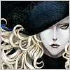
| http://myanimelist.net/animelist/Yankowich I tried to go for simplicity, clarity and consistency - I might have strayed a bit from that agenda, but still I'm somewhat happy with the result. Nothing really special, but it's my first list design anyway so be gentle. :) The texts (namely anime titles) were smaller in the first version, but Opera and Chrome make small-caps text look pretty bad if the font's too small. :/ I just "had" to use it no matter what so a larger font size it is... The thing that baffles me the most is the right portion. Firstly, there's so much white space between the list and the picture especially at higher resolutions that it starts to be a little annoying (to me). I tried positioning the image right next to the list, but it seemed even more awkward. Still I feel that it "needs" the pic there. So ehh does it bother anyone else but me? Secondly the image itself. Namely the text part... it's so lame. :) The style of the handwriting is intentional though, but ugh. Well maybe I'll figure out something better in the future. Aaand thirdly the images used all have white backgrounds instead of transparent ones, but that's just me being lazy... I probably can't leave the list alone any time soon so I'll be tweaking it all the time, but if there's some apparent flaw or annoyance in the list, please say so. I'll even gratefully accept comments like "the list looks like shit" if there's some more words to accompany the statement. After all the whole design tweaking is meant to be eye candy for the people accidentally stumbling upon the list, so if the "audience" doesn't like it, I want to change it to please as many people as possible. Oh, and thanks to at least Pumpernikkeli for the tip on how to change the control panel style without MAL removing it from the sheet, and Monsieur Spawwvy for making such beautiful lists that just made me want to start designing one myself. :) (Great, another short post... o_o) |
YankowichAug 24, 2012 4:10 AM
| - TAH "Even those with fortitude have joints." |
Jun 14, 2009 2:52 AM
#3112

| @Yankowich: wow that is a pure art there. |
 "A Legend is but a tale of a beautiful lie." |
Jun 14, 2009 11:49 AM
#3113
| I second what Siva said, it's pure art! Simple, but awesome! |
Jun 14, 2009 11:28 PM
#3114
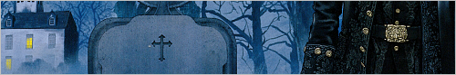
| I updated my Anime list....Black Lagoon Theme. |
spineslayerJun 15, 2009 1:57 AM

Jun 15, 2009 1:33 AM
#3115
spineslayer said: Your anime list is not Black Lagoon-themed, and your manga list is set to private (I didn't even know you can set individual lists to private).I updated my list....Black Lagoon Theme. |
staff.applications ▼ guidelines.faq ▼ report.abuse ▼ thx.skittles ▼ thx.kina ▼ [H+] ³ ▼ |
Jun 15, 2009 1:53 AM
#3116
cyruz said: spineslayer said: Your anime list is not Black Lagoon-themed, and your manga list is set to private (I didn't even know you can set individual lists to private).I updated my list....Black Lagoon Theme. I meant anime list. You may have to clear your cache....because it is Black Lagoon. I set my Manga List to private because...well, there's nothing there.  |
spineslayerJun 15, 2009 1:59 AM
Jun 15, 2009 6:35 AM
#3117
| I already cleared the cache when I noticed I'm not seeing any BL. No luck. I tried 3 different browsers now, I get the blue beach list with the girls in every one of them. Maybe the server delay is messing things up. I'll try again later. |
staff.applications ▼ guidelines.faq ▼ report.abuse ▼ thx.skittles ▼ thx.kina ▼ [H+] ³ ▼ |
Jun 15, 2009 8:08 AM
#3118
| LOL me either. Wish you can fixed it soon. |
"A Legend is but a tale of a beautiful lie." |
Jun 15, 2009 9:27 AM
#3119
| Yep, definitely not black lagoon there :D Are you sure you have chosen the right CSS file to use? |
|
Jun 15, 2009 11:31 AM
#3120

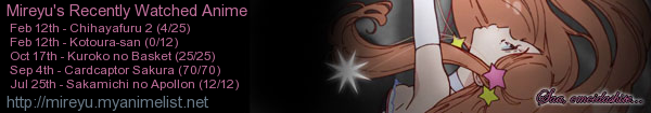
| I've updated the anime list style,however I can't see the tabbing part and I don't understand why ;_; However the next step is trying to edit css which I'm studying now.. Edit: solved :D! |
MireyuJun 15, 2009 11:45 AM
 |
Jun 15, 2009 12:16 PM
#3121
| Sorry everyone....I don't know what the problem was but it is now fixed. Take a look at it now. :P |
Jun 15, 2009 12:20 PM
#3122
spineslayer said: Sorry everyone....I don't know what the problem was but it is now fixed. Take a look at it now. :P Now it looks what it should like. And damn it's nice ;p |
|
Jun 15, 2009 1:04 PM
#3123
spineslayer said: Sorry everyone....I don't know what the problem was but it is now fixed. Take a look at it now. :P Lookin' nice. :) The thing that bothers me though is that is it really necessary to have a 1.2 meg png background? A jpg with decent quality would take a tad under 200 kilos and you won't notice the artefacts unless you use a magnifying glass (even a "max" quality one would be half the size and without practically any difference to the bare eye). Combined with the ~1 meg worth of other pics (which of course have to be png's for transparency) it's quite a hefty amount to download while checking out your list. @ Siva, V3gas: Thanks! I dunno about the art part (edit: apart from the source material), but it feels good to know people like it :) |
YankowichJun 15, 2009 2:58 PM
| - TAH "Even those with fortitude have joints." |
Jun 15, 2009 2:35 PM
#3124
| @Pumpernikkeli -thanks. After some technical difficulties, it's fixed! XD @Yankowich- I changed the default status to watching so it loads faster. My internet is pretty fast so I don't really notice the difference between how long my lists loads compared to others. |
Jun 16, 2009 6:25 AM
#3125
spineslayer said: @Pumpernikkeli -thanks. After some technical difficulties, it's fixed! XD @Yankowich- I changed the default status to watching so it loads faster. My internet is pretty fast so I don't really notice the difference between how long my lists loads compared to others. That's not a reason to use "heavy" images, when you wouldn't notice the difference if you downgraded the quality. |
Jun 16, 2009 11:54 AM
#3126

| Hey guys, I just made my first CSS-list! (click here) It might look wierd on computers with screens bigger than 1024x768, don't really know for sure though It's not very special nor great-looking, but I'm very happy that I managed to create it, I usually have so much trouble with CSS. (many thanks to Ranivus for the great tutorial!) |
 |
Jun 16, 2009 12:50 PM
#3127
V3gas said: Get faster internet or learn how to use tabs?spineslayer said: @Pumpernikkeli -thanks. After some technical difficulties, it's fixed! XD @Yankowich- I changed the default status to watching so it loads faster. My internet is pretty fast so I don't really notice the difference between how long my lists loads compared to others. That's not a reason to use "heavy" images, when you wouldn't notice the difference if you downgraded the quality. I suppose saving it to a 100% quality JPEG wouldn't be too bad. PNGs are sexy though. |
Jun 16, 2009 1:30 PM
#3128
kuroshiroi said: V3gas said: Get faster internet or learn how to use tabs?spineslayer said: @Pumpernikkeli -thanks. After some technical difficulties, it's fixed! XD @Yankowich- I changed the default status to watching so it loads faster. My internet is pretty fast so I don't really notice the difference between how long my lists loads compared to others. That's not a reason to use "heavy" images, when you wouldn't notice the difference if you downgraded the quality. I suppose saving it to a 100% quality JPEG wouldn't be too bad. PNGs are sexy though. I have a fast connection and know how to use tabs, so I'm not complaining. It's just that the list is probably for random visitors, and some of them might have a slow connection. And when there isn't a notable difference between the version with a small(er) file size and the original, I'd recommend him to use the smaller one. But yeah, I guess people with a slow connection should know how to use tabs, too. And yeah, PNGs are sexy. |
Jun 16, 2009 1:43 PM
#3129
V3gas said: MAL is more about the anime, not the list :) It's just that the list is probably for random visitors The only one you need to consider when making your list is yourself, since most visits will be made by the owner. Anyway, /offtopic |
Jun 16, 2009 1:47 PM
#3130
kuroshiroi said: V3gas said: MAL is more about the anime, not the list :) It's just that the list is probably for random visitors The only one you need to consider when making your list is yourself, since most visits will be made by the owner. Anyway, /offtopic I guess you're right. |
Jun 16, 2009 3:38 PM
#3131
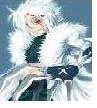
| Alright, I've replaced my old animelist design with a new one. I decided to go for the simplistic clear and bright look this time. The list features custom titles for the different categories (watching, completed etc.). I couldn't image making myself a design without those, as I feel that they add their own unique flavor to the mix. Optimally viewed at 1920x1200 or 1920x1080, but as usual, anything reasonably smaller will do as well.  |
Jun 16, 2009 4:19 PM
#3132
| Spawwvy: Excellent and cute list. Chibi Hayate, huh? I especially dig the CSS magic. |
Jun 16, 2009 4:36 PM
#3133
| @Spawwvy I Really liked your previous anime list, of Haibane Renmei alot better then the current one (Hope it was you that had that theme) But this one is a really simple/cute design you have going on, great job none the less. |
 |
Jun 16, 2009 6:52 PM
#3134
| @V3gas I wanted to use png for my headers because there is alot of transparency in them which shows up better using png. Though I did use png for the background image; as kuroshiroi pointed out: kuroshiroi said: PNGs are sexy though. I like to use better quality images (like png) because you get a better picture than a jpg image even at 100%. @Spawwvy Great list....I like how your quotes in your headers match up with the images in your headers. Nice! |
Jun 17, 2009 3:19 AM
#3135
| @ kuroshiroi, DarkDemonz, spineslayer Thank you, everyone. Seems like I accomplished my goals with this design then (see below). @ DarkDemonz Yes, that was me. I have to admit that my previous list was more of what could be considered as my signature style (in art generally) and what I usually prefer personally. In short and exaggerated: I tend to tinker endlessly with frivolous details. That's why I decided to do something different for once. I can tell you that my next design will most probably be more in line with the Haibane Renmei one – and filled with even more detail – now that I have learned a few more CSS tricks and improved my skills with the GIMP. |
Jun 18, 2009 12:15 PM
#3136
| @Pim - Fist, I want to point out that your link is wrong (it ends with pim-chan instead of just pim) so you might want to fix that. The list looks great! I love, love love the wallpaper, and how it serves as both a bright image beside the list and a dimer picture behind it. The colors are great -- I love pink in any case, but I like that you used it in a way that wasn't too in-your-face girly. And everything looks like one complete work without being too matchy-matchy, which is something I have a lot of trouble with. The only thing I would think about changing is the font of the links; I think it's a bit too powerful in contrast to the more delicate font in the headers. Awesome work! (By the way, I don't think you have anything to worry about with other resolutions. At the very least, mine is 1280 x 800 [huge difference, I know :p], but it looks compatible with any resolution to me.) |

Jun 19, 2009 11:32 AM
#3138

| Havent been here in years so ill just put up what i have here since i did some slight retooling i love my background :P It'll show white borders if you have a 1440x900 screen reso like i do, but my browser is windowed 99.9% of the time so i dont care bout it and havent taken the liberty to reinstall Photoshop back on to my pc |
RanivusJun 19, 2009 11:36 AM
  "What happens when we die?" I know that the ones who love us will miss us. |
Jun 19, 2009 11:57 AM
#3139
Ranivus said: Sexy, sexy background. What's it from?i love my background :P |
Jun 19, 2009 12:03 PM
#3140
| its a fan artist named Yahako mainly draws NSFW art but if you want to check 'it' out : NOT SAFE FOR WORK |
| "What happens when we die?" I know that the ones who love us will miss us. |
Jun 19, 2009 2:04 PM
#3141
| I just saw it on Sankaku also :) Thanks for the link. |
Jun 22, 2009 12:35 PM
#3142

Jun 22, 2009 12:49 PM
#3143

| @Dust2Dust: woooo, it's pretty damn amazing!! >< Especially, that I can't see it ;) |
Jun 22, 2009 1:56 PM
#3144
| Oh lol yeah I forgot to put it back on public sorry. Way to fail ): It's ok now. |
 |
Jun 22, 2009 8:37 PM
#3145
| Nicely put together. The only things I would change is making the list text more visible. When it scrolls up into the tree, it's very hard to see the text because the color blends into the tree. To go with the flow of the list. I would put a semi-transparent backgrounds behind the Grand totals and copyright also. |
Jun 23, 2009 2:02 AM
#3146
| Alright, so... Beautiful bg, but like spineslayer said, the font is really almost invisible :/ Make the tables bg less transparent maybe. And also... serif font die!! |
Jun 23, 2009 6:29 AM
#3147
| Oh yeah I forgot to put something behind the grand total indeed ^^" With my screen everything was quite readable, but I'm trying on another pc right now and I realize it's not that good. I'll try changing the font and colors, and ultimatly the transparent background if I can't find something good. Anyway, thanks for the feedback, much appreciated! |
|
Jun 23, 2009 11:36 AM
#3148
| >.< I'm so jealous... All these lists look so nice in comparison to mine.. So many good people.. |
Jun 26, 2009 9:58 PM
#3149

| Updated my Anime List. Had to hijack #grand_totals for the main header, hence the reason it being on the top. Saka's list especially helped me with the coding. Another div to hold that image would've been great. The list must be viewed either in its default state or using show all link, because otherwise you'll get a huge empty space instead of grand totals. Best viewed in 1680x1050 or bigger. Things to do: -Custom cursor -Fix the nuımbers of the anime, they're sitting right on the stripes. -Fix 'more' button, 'tis broken for the same reason as the one above. There was a way to modify it IIRC, remind me. -Give a background to Currently Watching, On-Hold, etc. links. I actually think the reason the list actually fits inside the stripes is pure coincidence. Whatever. |


Jun 27, 2009 9:59 AM
#3150
| DaBigD: Looks good. Do you need the numbers in your list? Also, I don't get why you needed to hijack the grand totals? |
More topics from this board
» MAL Analog HorrorWendy-- - 11 hours ago |
5 |
by OnigiriBhai
»»
8 hours ago |
|
» New Clashing Feelings volume after a decadeShiratori-san - Today |
0 |
by Shiratori-san
»»
Today, 4:14 AM |
|
» New Android App – Shimeji Mascot Screen Petsshimejimascot - Yesterday |
8 |
by hacker09
»»
Yesterday, 10:03 PM |
|
» SHMUP CreatorElderNerd - Yesterday |
0 |
by ElderNerd
»»
Yesterday, 9:28 PM |
|
» Four Ages!Robert_SS_Gordon - Feb 21 |
48 |
by Robert_SS_Gordon
»»
Yesterday, 8:42 AM |