New
Jan 10, 2010 2:54 PM
#3651

| @Mimi_Taylor- have you thought about using some blending like shadows and glow to make the headers render and text blend better with the background. Because right now it looks copy and pasted. |

Jan 10, 2010 4:53 PM
#3652

| Mmkay I added a white glow around the pictures, and put a drop shadow behind the text. Does it look better? =O |
Mimi_TaylorJan 10, 2010 5:47 PM
Jan 11, 2010 11:15 AM
#3653

| I've grown tired of the slowness of my list. So, here's a list update. The last one was September 2007. It's actually not really an update since it's basically aero's list with a few tiny changes so all credit goes to him as well as my thanks for letting me use the design. Click the sig. (: I can't seem to get the cursor working though. The CSS code has changed since aero did his list so I couldn't use that code. When I hover off my list, the cursor changes back to the regular windows one. Does anyone have an idea how to get it working so it doesn't switch back at all? |
 staff.applications ▼ guidelines.faq ▼ report.abuse ▼ thx.skittles ▼ thx.kina ▼ [H+] ³ ▼ |
Jan 11, 2010 12:02 PM
#3654

Jan 11, 2010 12:10 PM
#3655
| Genius. Thanks a lot, scorpedo. It's been a while since I touched CSS. ^^; And yes, I agree. Hope I'll someday have the time and creativity again to create a list thats actually my effort. xD |
staff.applications ▼ guidelines.faq ▼ report.abuse ▼ thx.skittles ▼ thx.kina ▼ [H+] ³ ▼ |
Jan 11, 2010 12:24 PM
#3656

cyruz said: I've grown tired of the slowness of my list. So, here's a list update. The last one was September 2007. It's actually not really an update since it's basically aero's list with a few tiny changes so all credit goes to him as well as my thanks for letting me use the design. Click the sig. (: I can't seem to get the cursor working though. The CSS code has changed since aero did his list so I couldn't use that code. When I hover off my list, the cursor changes back to the regular windows one. Does anyone have an idea how to get it working so it doesn't switch back at all? It looks good imo. But there a few points where it is unreadable. |
| No sig :( |
Jan 11, 2010 12:54 PM
#3657
| Really? It's quite a bit clearer than my previous design, I'm not sure which bits you are referring to. |
staff.applications ▼ guidelines.faq ▼ report.abuse ▼ thx.skittles ▼ thx.kina ▼ [H+] ³ ▼ |
Jan 11, 2010 12:55 PM
#3658

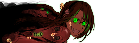
| Updated Anime List (: Actually, this is my first REAL CSS edited list ;p I think it came out okay (: [I know there are still a few mistakes but I'll leave it as it is..] Hmm.. What do you guys think? >__< ps: The font color of my titles will change, it's a bit unreadable when you don't go on it with your mouse .. (: edit: forgot, erm.. the background is normally bigger in width so maybe you guys see it different than I do .. >___< |
 |
Jan 11, 2010 1:17 PM
#3659
| @cyruz On the girls fingers, eye and hair. That might be because of my resolution which is quite popular: 1280x800. @DwChan The wallpaper is too big for my resolution :D therefore, I can only see the hand of the girl. The text is unreadable at certain points of the sky where the sky color matches the font color. :) |
| No sig :( |
Jan 11, 2010 1:30 PM
#3660
Algirdyz said: Might be. I'm on a pretty big screen here so Ai, the girl, doesn't really touch the list. I got the same resolution as you on my MacBook so I'll have a look at it tomorrow at work and see for myself. Thanks.@cyruz On the girls fingers, eye and hair. That might be because of my resolution which is quite popular: 1280x800. Looks good, DwChan. The color of the links (anime entries) is a little on the bright side and therefore hard to read, maybe darken it a little bit. |
staff.applications ▼ guidelines.faq ▼ report.abuse ▼ thx.skittles ▼ thx.kina ▼ [H+] ³ ▼ |
Jan 11, 2010 1:46 PM
#3661
| Fixed the color of the links ^^ indeed, I know I had to darken it, but I didn't know in which blue xD it took long until I found something nice ;O & fixed the background xD just like Algirdy said, I made it less wide XD even though it doesn't look that great on my pc then D; Hmmm... just hope you guys like it ^^ |
|
Jan 11, 2010 1:53 PM
#3662
DwChan said: Fixed the color of the links ^^ indeed, I know I had to darken it, but I didn't know in which blue xD it took long until I found something nice ;O & fixed the background xD just like Algirdy said, I made it less wide XD even though it doesn't look that great on my pc then D; Hmmm... just hope you guys like it ^^ Text color is still unreadable at some point :D I suggest not using blue :P About the wallpaper, I would try to photoshop it, so that it could be 1920*1080 size, but the picture itself would be at the size it is now. Just extend the background blue color, with clone stamp tool so it will look good on all resolutions. Although, this solutions is quite hard because of the complex background. But its doable... |
| No sig :( |
Jan 11, 2010 2:12 PM
#3663
Algirdyz said: DwChan said: Fixed the color of the links ^^ indeed, I know I had to darken it, but I didn't know in which blue xD it took long until I found something nice ;O & fixed the background xD just like Algirdy said, I made it less wide XD even though it doesn't look that great on my pc then D; Hmmm... just hope you guys like it ^^ Text color is still unreadable at some point :D I suggest not using blue :P About the wallpaper, I would try to photoshop it, so that it could be 1920*1080 size, but the picture itself would be at the size it is now. Just extend the background blue color, with clone stamp tool so it will look good on all resolutions. Although, this solutions is quite hard because of the complex background. But its doable... But at most point it's readable ;p hmm.. I'll change it tomorrow or something (: any suggestions of what color I should use? ;p Hmm.. I don't rlly get what you mean XD I don't use photoshop so I don't rlly get those terms you used XD but erm.. the background pic is okay now isn't it? XD |
|
Jan 11, 2010 2:25 PM
#3664
DwChan said: Algirdyz said: DwChan said: Fixed the color of the links ^^ indeed, I know I had to darken it, but I didn't know in which blue xD it took long until I found something nice ;O & fixed the background xD just like Algirdy said, I made it less wide XD even though it doesn't look that great on my pc then D; Hmmm... just hope you guys like it ^^ Text color is still unreadable at some point :D I suggest not using blue :P About the wallpaper, I would try to photoshop it, so that it could be 1920*1080 size, but the picture itself would be at the size it is now. Just extend the background blue color, with clone stamp tool so it will look good on all resolutions. Although, this solutions is quite hard because of the complex background. But its doable... But at most point it's readable ;p hmm.. I'll change it tomorrow or something (: any suggestions of what color I should use? ;p Hmm.. I don't rlly get what you mean XD I don't use photoshop so I don't rlly get those terms you used XD but erm.. the background pic is okay now isn't it? XD Maybe try girls skin color. The background looks good for me, but not so much for people with bigger screens... :D |
| No sig :( |
Jan 11, 2010 8:37 PM
#3665
But at most point it's readable ;p hmm.. I'll change it tomorrow or something (: any suggestions of what color I should use? ;p Hmm.. I don't rlly get what you mean XD I don't use photoshop so I don't rlly get those terms you used XD but erm.. the background pic is okay now isn't it? XD @DwChan: I love your list..! I reeeeaaaally like all the blue. x3 -bookmarks- Mryah I hate having to edit the BG so it can fit other resolutions too. I at least make it 1600x1200. And I don't mind the text color too much; it's a nice blue, and you can read it for the most part I suppose. I might be tempted to change the blue BGs to make them a little less transparent so the main BG doesn't interfere with the text as much. But that can be annoying to go back and do. XD Overall I really love your list. |
Mimi_TaylorJan 11, 2010 8:43 PM
Jan 12, 2010 10:47 AM
#3666
| @ Algirdyz: I don't think it would be such a good idea to change it in the girls skin color xD so I'll leave it as it is (: When you go over the title and such with your mouse it's readable so that's good for me XD @ Mimi_Taylor: Thaaaaanks ^^ Yeah, I hate it too ! but since most ppl don't have a wider screen I decided to the it in the way where ppl see "everything" on the background picture like now.. => & on a wider screen it doesn't look great >________< but it's okaaay (: 1600x1200 wasn't a great view ;p I asked a friend to make a screenshot [since I have a wide screen] & I only could see her legs & part of her arms so I had to cut it a lil more.. Yeaaah ;p I guess I'm going to leave it as it is (: hmm... less transparant? maybe when I make a new list ;p cuz when I have to do that, I have to edit my pictures >__< |
|
Jan 12, 2010 6:14 PM
#3667

| Is there any way to change the black bar at the top of the screen (table ID mal_control_strip?), or better yet remove it all together? I'm trying to go for a simplistic theme for my list (No flashy themes and banners like the rest of you, not that I couldn't do that of course) Also can anyone see if my Background looks good on their computer? I can't use any resolution higher than 1024x768. The page shouldn't be able to scroll (no matter what) and the background should be anchored bottom right so that it looks better. Also, I don't want to add any fancy images because the page will take way too long to load / or will be harder to read. I might change the background to the TDs however to some shade of pink. Hex value suggestions would be nice. I don't like dark style themes like everyone else. White is my favorite way to have things ^_^. |
 |
Jan 13, 2010 12:27 PM
#3669

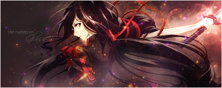
| Ok after having my anime list design since early 2008, I made something new now. Fitting my signature~  bonus for people with immense screen resolution included |
MathesJan 13, 2010 12:31 PM
 |
Jan 13, 2010 1:15 PM
#3670
| Wow, it looks amazing. Is it Avatar inspired? The place seems like something you could find on Pandora. |
| No sig :( |
Jan 14, 2010 7:12 AM
#3672
Mathes said: bonus for people with immense screen resolution included Lol, nooooooooooo~ xD Very nice list, mate. Very... green. :D |
staff.applications ▼ guidelines.faq ▼ report.abuse ▼ thx.skittles ▼ thx.kina ▼ [H+] ³ ▼ |
Jan 14, 2010 12:20 PM
#3673

Mathes said: >_<bonus for people with immense screen resolution included It was so beautiful. And GREEN! |
 "A Legend is but a tale of a beautiful lie." |
Jan 14, 2010 12:53 PM
#3674

Mathes said: bonus for people with immense screen resolution included I don't have an immense screen resolution. No bonus for me? :( Nice design! |
Jan 14, 2010 1:21 PM
#3675
| Firstly glad you guys seem to like the list. :D Algirdyz said: Uh, not really. The image I used seems to be mushishi-inspired. (see source below)Is it Avatar inspired? The place seems like something you could find on Pandora. Chupachupi said: Right Click and "View Background Image" and you'll see it. ;>I don't have an immense screen resolution. No bonus for me? :( cyruz said: Lol, nooooooooooo~ xD Siva said: >_< Here is the source image I used, if anyone cares, you will probably see why I had to think of something like that bonus. :> |
|
Jan 14, 2010 1:47 PM
#3676
Mathes said: Chupachupi said: Right Click and "View Background Image" and you'll see it. ;>I don't have an immense screen resolution. No bonus for me? :( Haha, I was just about to edit my post to say that I did just that. Major hotness right there. |
Jan 14, 2010 6:52 PM
#3677
| The only problem I have now is that I would like to remove Show All from the nav bar. It creates a problem with scrolling if the viewer doesn't want to use the directional keys or Padge Up / Down. Does anyone like it? |
|
Jan 14, 2010 8:29 PM
#3678
| @Mathes: very nice list. I wouldn't have realized what you edited on the background had you not linked the original. small thing: I'm not sure if it's just me or intentional, but some of the repeating list background stripes don't line up correctly, probably an easy fix with the positioning though. @Kraust: nice and simple list design. If you intentionally wanted the scroll bar removed with the 'overflow: hidden;' in the body and want to remove the Show All, try adding: .status_selected[width='90'], .status_not_selected[width='90'] {display: none;} |
Jan 15, 2010 6:41 PM
#3679
| @ Mathes: Very nice and so green. Was the bonus is on the bottom right? That's cool integration. ^ ^ @Kraust: nice list there. I updated my mangalist but I still have a problem with my alternating rows. Maybe someone can help me about it? :D Oppsss WARNING for those who totally despise any hints of BL. You've been warned. ;) Edit: CSS problem has been addressed. Thanks a lot again to scorpedo for his help. :) |
removed-userJan 15, 2010 7:25 PM
Jan 16, 2010 2:28 AM
#3680
| @Lieila Wow very nice looking list, perfectly readable, colors blend in nicely. The best list I've seen for quite some time. |
| No sig :( |
Jan 16, 2010 1:30 PM
#3681
| @Lieila: Girl on a mission, huh? :P Very nice list! Everything blends in nicely. |
Jan 17, 2010 5:14 AM
#3682
| I changed mine too, was the first time I did it myself :) Nothing too special but I don't think it's that bad for a first timer... http://myanimelist.net/animelist/Jimbow if anyone knows something to improve the list please tell me! |
Jan 17, 2010 6:25 AM
#3683

| http://myanimelist.net/animelist/Nakei I am a css pro. If anyone needs help, pm me lol. |
Jan 17, 2010 9:37 AM
#3684

| @ Mathes: wow 0__0 looks amaizing great work on it!! @ Lieila: kyaaa - very nice list even though im not a yaoi fan its still great ^_^ |
| Signature removed. Please follow the signature rules, as defined in the Site & Forum Guidelines. |
Jan 17, 2010 10:12 AM
#3685
Jan 17, 2010 2:36 PM
#3686
| @ Mathes: Great list! It reminds me of Devil's anime list. But your list is brighter and I like that. =) @ Lieila: The tables are neat and easy to use. All of the colors work well together. The only problem is with the bg... j/k =P @ Jimbow: Not bad for your first try. But next time, try to find renders that aren't cut off at the top, and try to make the images match each other more. |
Jan 17, 2010 2:56 PM
#3687
| Someone, opinions please. >A< http://myanimelist.net/animelist/Nakei |
Jan 17, 2010 3:05 PM
#3688
| It's nice but having the headers of each section centered make it look a bit funny looking on my low resoluition. More specifically the word Progress. And, the transparent mal_control_strip is nice, it's how I wanted mine to be initially set up actually but I wanted it to be hidden unless you hovered over that area. I couldn't make it like that with CSS alone so I let it be. It's really nice though. |
|
Jan 17, 2010 9:41 PM
#3689
| @Nakei: Whoa, really nice. I agree with Kraust though, centering the section headers looks kind of funny. "Score" and "Type" are too far to the left on my screen (1280x800), and it feels a bit weird to have "Anime Title" right in the middle there. Also, I think the shadow behind "Currently Watching", "Add Anime to My List", etc., comes off a bit strong. Other than that, this is an amazing, minimalist list design. Awesome. Really like what you did with the control strip too. |

Jan 18, 2010 3:22 PM
#3691

| @Nakei: Like others have said, really nice, clean design. I also have to agree on the centering thing though, it doesn't line up with the respective columns. On a side note, after years I finally got fed up with my old design and threw together something new. It's kind of generic though so I'll probably be tired of it soon, but it'll have to do for now. http://myanimelist.net/animelist/Mobb At least 1400*X resolution recommended, to avoid background invading list space. Also, the menu thingy on top uses some CSS3 stuff, so certain browsers (I'm looking at you IE) will render it in a more boring way. |
Jan 18, 2010 3:59 PM
#3692
Mobb said: At least 1400*X resolution recommended. I'm already used to not being able to see anyone's lists properly anymore, or hell any web pages really. It's nice I guess. *But is still stuck on 1024x768 |
|
Jan 18, 2010 4:13 PM
#3693
| @ Mobb: That's a great list. My favorite lists are ones that are simple like yours. I think it'll look even better if you add some of the colors from the bg onto the tables. But it's elegant and easy to use. Good job! :) |
Jan 18, 2010 5:44 PM
#3694

| Yeah nice list Mobb! Clean and simple is <3 and so is meru-meru (: |
 |
Jan 21, 2010 4:28 AM
#3695
| Thanks for the comments. :) I felt like cranking out another one, so now I have two to switch between for a while. :P Not anime themed this time and once again, IE doesn't know CSS3 (and screws up the top menu) so view it in any other browser. http://myanimelist.net/animelist/Mobb Note: I do not know kanji, I can just hope the creator of the brushes does. :P And by the way, is there any way to create more stylesheet... slots? I have two named "Style #IDxxxx", but I can't remember if I created them myself or if they were there from the beginning. |
Jan 21, 2010 1:34 PM
#3696
| Nice idea with the scroll thingie, I think it looks nice with the kanjis and the font you used, but imo you could use a better background :D As far as I know you can only have two list style. So well your account comes with two style ID, which you can customize as you wish. |
|
Jan 21, 2010 3:08 PM
#3697
| Yeah I actually agree about the background, I didn't really know what to use. I wanted to have some sort of pattern/texture, but it won't work well without some extra markup (at least with my skill level). Color suggestions are very welcome though. |
Jan 21, 2010 3:31 PM
#3698

| I just learned how to change list styles a few days ago, so here is my first attempt http://myanimelist.net/animelist/valtizar The background is for 1440x900 and probably won't look great for most other resolutions (just learning how to make them for all sizes xD). Most of the pictures need to be rendered a little better too I think. Something I will fix for the next one. |
 |
Jan 22, 2010 2:25 AM
#3699

| Great list valtizar, I really like it. In my opinion, all you need to do for making a background for higher resolution is to extend the blue part of your background picture. |
More topics from this board
» Vladimir Volfovich Zhirinovsky's MAL Diary of Kawai MemoriesV_V_Zhirinovsky - 8 hours ago |
1 |
by V_V_Zhirinovsky
»»
7 hours ago |
|
» MAL Analog HorrorWendy-- - Yesterday |
6 |
by Retro8bit
»»
10 hours ago |
|
» New Clashing Feelings volume after a decadeShiratori-san - Yesterday |
1 |
by Retro8bit
»»
10 hours ago |
|
» New Android App – Shimeji Mascot Screen Petsshimejimascot - Sep 26 |
8 |
by hacker09
»»
Sep 26, 10:03 PM |
|
» SHMUP CreatorElderNerd - Sep 26 |
0 |
by ElderNerd
»»
Sep 26, 9:28 PM |