New
Jan 2, 2013 10:11 PM
#4101
Rukayex said: Yoshida_Haru said: I just made a new one. I think it's a lot better than my old one. (I know the GIF bugs. It's because I had to split it into two, but I'll try to fix it tomorrow!) Not bad for one of your first few tries :D Up to you to change or not if you disagree, but here goes: Not sure if you meant to overlap the text in the header, but it looks slightly awkward as it is. The text on the left side is a little hard to read. Maybe it's too small? And serif fonts when small tend to be harder to read, too. >.< "Version 3.0" and "Layout made by Yoshida_Haru" text is blurry, so hard to read. ^^" May need to change the font size, anti-aliasing, or choice for it to become clear again. GIF is pretty distracting since it's so quick and sudden, while the rest of the profile looks pretty calm and peaceful. Hope to see your improvements! :D Thanks for the feedback! Luckily, all three texts are easy to change, so I'll do it some time tomorrow. As for the GIF, I really like it, haha! Maybe when I fix it, it won't be as bad! |
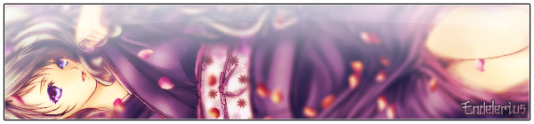
| Oi, Haru desu. |
Jan 10, 2013 6:07 AM
#4102

| Just made my second profile thingy. The first one I made wasn't consistent and was overflowing with text, though I think I still did a little too much with text in this one. I don't really know how to start these profiles off since I'm not used to working with something on a exceptionally large canvas, nor am I really good with textures, so I just sorta winged it. Hopefully, this one is a lot more visually pleasing for others. I personally like it. I'm open to all sorts of criticism ^^ |
 |
Jan 19, 2013 10:29 AM
#4103

Nigglez said: I like it!Just made my second profile thingy. The first one I made wasn't consistent and was overflowing with text, though I think I still did a little too much with text in this one. I don't really know how to start these profiles off since I'm not used to working with something on a exceptionally large canvas, nor am I really good with textures, so I just sorta winged it. Hopefully, this one is a lot more visually pleasing for others. I personally like it. I'm open to all sorts of criticism ^^ Just took a quick look, and all I'm going to say is "scanline overdose". I like scanlines myself, but... :p Also, I wouldn't cover text with it, at least not the "likes/dislikes" titles. Makes it harder to read. |
 |
Jan 26, 2013 7:38 AM
#4104

| Well, it's been a while since my last one. Updated now :3 |
Feb 5, 2013 4:20 AM
#4105
| Almost one year since I made a profile design. Updated yesterday. Any feedback, ciriticism and suggestions would be very much appreciated! |
Feb 9, 2013 3:19 AM
#4106

| Just Recenly Change Mine..!! Care to Check out mine Guys..!!? |
 |
Feb 9, 2013 6:55 AM
#4107

AnimeOtakuDesu said: Just Recenly Change Mine..!! Care to Check out mine Guys..!!? Beware of using squished circles. ^^" |

Feb 25, 2013 8:11 PM
#4108

| I recently updated by profile~ Any feedback would be loved. |
 Where there is no imagination there is no horror. || Arthur Conan Doyle || Happy Halloween! |
Feb 26, 2013 1:56 AM
#4109

Suzune-chan said: I recently updated by profile~ Any feedback would be loved. Hm, well I liked your previious profiles a lot more, at least previous two, especially the lemon one, that was one awesome profile. This one is pretty chaotic, if I had to say something. Sorry that I can't contribute any good feedback v__v -------------------------------------------------------- EDIT: Updated my profile \o/ |
IsalinaFeb 26, 2013 6:18 AM
 |
Feb 26, 2013 6:39 AM
#4110

| Changed my profile after 100 years. Super late for Valentine's Day OTL Anyway, comments are appreciated. I lost touch with PS, not good D: |
 |
Feb 27, 2013 2:03 PM
#4111

| ^ Pink , pink everywhere :O Really cool style ^^ I'm making something new, i didn't see anyone had similar ( i mean by idea, not style and all) :) It's under spoiler tag, and, ideas and comments are appreciated ^^ |
 |
Mar 1, 2013 3:30 PM
#4112
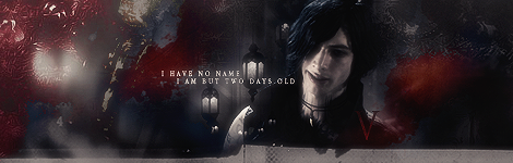
| My ugly profile - updated. |
Mar 1, 2013 3:38 PM
#4113
DarkLover said: Oh you...so modest.My ugly profile - updated. @Squ I love your new profile! The text is a bit difficult to read though, and the character section is hardly visible. I liked the previous ones with a monochromatic color scheme implemented more, but overall, it's really great <: @Sheia Love the design and the colors. Pink, pink, everywhere *^* |
AestherMar 1, 2013 3:52 PM
Mar 1, 2013 3:49 PM
#4114

DarkLover said: My ugly profile - updated. Looks nice, but I think you messed up the animation timings. :x |
Mar 2, 2013 3:26 AM
#4115
Sophilia said: @Squ I love your new profile! The text is a bit difficult to read though, and the character section is hardly visible. I liked the previous ones with a monochromatic color scheme implemented more, but overall, it's really great <: And there I already tried making it more visible, but if I make it lighter/more visible it looks like shit imo. I wanted to make it fitting with the overall KH theme (the eternal fight between light and dark) and tbh I couldn't find any suiting light effects orz Anyways I like it as it is, either I win with it or not \o/ Without defending my definetely hardly visible crap, layouts aren't just about giving information about the user, it is still art and should look like it and everything should match. Though some may archieve making a layout that is great and clearly readable at the same time, but I guess suck at that lol Who cares \o/ @DarkLover: Wow really a shame that you entered last profile contest already, I like this one a lot more than the Magi one. Except for the animations though, it looks stupid. Sorry for being harsh /o\ |
IsalinaMar 2, 2013 3:29 AM
|
Mar 2, 2013 5:04 AM
#4116
| Drepolio said:Looks nice, but I think you messed up the animation timings. :x @DarkLover: Wow really a shame that you entered last profile contest already, I like this one a lot more than the Magi one. Except for the animations though, it looks stupid. Sorry for being harsh /o\ So no animations? This in right is with a low quality. As for the contests i dont have a chance. How many times i will fail... Its no use, no progress. |
Mar 2, 2013 5:12 AM
#4117
| @Squ You make very good points :P in the end, it does come down to whether the artist him/herself likes it or not. Well, as long as you like it <3 and pft, so modest >: you're great at making layouts! @Dark I personally liked the animations. probably cuz I'm a huge fan of gifs also, the color flow is excellently displayed. No! No pessimism here :( it's wonderful no matter what you say! |
Mar 2, 2013 5:40 AM
#4118
| @Sophilia: Of course, but there is still always room for improvement too, though imo it should only happen when the creator likes it. Lol, even if I'm good, which isn't the case, I only can do a decent layout once every century orz and I seriously hate that. @DarkLover: sometimes you make me laugh pretty hard you know. Just because we said the animation doesn't look that good, doesn't mean you shouldn't make them. It means you should try improving them so that they look good, or if you like them as they are, just leave them like that. Have more confidence in your stuff, man, you've got talent. If you say you got now chance you won't ever make it. If you think your layouts lack something that make them win, then improve them until you think they are awesome and if they still not win, it isn't like your layout was bad. Contest isn't all about skills, it's also about luck. There vote people who all have their own tastes and preferences and you've got 9 other layouts with you which are usually also awesome. You can only vote for your top 5 profiles, if someone didn't vote for you, it doesn't mean he disliked your layout. Just look in last voting round, how many voters said they would want to vote for more. So don't talk like that with those great layouts you have there, others aren't that good and you have the talent and talk about your stuff like it is shit. Now change your thinking before I gotta bitchslap you. |
|
Mar 2, 2013 6:39 AM
#4119
| Thank u, Sophilia, SquChan :) I appreciate it. :) But how to improve these gifs? For first time I use gifs in a design. |
Mar 2, 2013 6:52 AM
#4120
| I only now just noticed. I thought it was due to my lag before. Your gifs' frames are pausing at irregular times. I'm not a professional at making gifs, so I'm probably not much help, but if you could pace the frames timings. At the moment, it looks like the images are freezing in between transition. The count down part works really well; it doesn't pause or freeze at any intervals. One method could be adding more layers for the transition so it flows smoothly, at a gradual pace. Lol, I'm not sure how to explain :s |
Mar 2, 2013 7:01 AM
#4122
| @Munja Gomen :( Which one is the layout? There's 1 that say "upgrade to plus for additional bandwidth." I'm assuming you have more uploads than the capacity for photobucket? Anyways, I do like the gif with the city background. (one that says "work in progress" and with the temperature) If what you're making is similar to that, I'm looking forward to it; looks like it'll be another gorgeous layout! ^^ |
Mar 2, 2013 8:02 AM
#4123
| ^^ No problem, i just wanted someone else to see lots of hours spent on this :) Thanks Eeeehhh!? Upgrade to ? :O Can you please screenshot it i don't see anything :S? ( for it is best Lightshot - CHROME FIREFOX ) Yeah, that big-gif-city under spoiler tag is layout coming to life with new parts edited and animated, just need some ideas now >< Used up all i had... And, everything you see is made by hand (medabots part extracted + converted edited ) Ty , now i got some motivation ^^! |
| |
Mar 2, 2013 8:05 AM
#4124
| @Munja Whoa, this is unique. I like the lights and conception. This would be a great layout. I paced the gifs. How is it now? |
Mar 2, 2013 8:09 AM
#4125
DarkLover said: It's perfect now! The frames aren't pausing or freezing, and the transition is smooth ^^I paced the gifs. How is it now? @Munja Wow, everything made by hand?! That's incredible. You have a real talent then <: (and Medabots was an awesome show!) And this is what I see for the last one  |
AestherMar 2, 2013 8:20 AM
Mar 2, 2013 8:17 AM
#4126
DarkLover said: @Munja Whoa, this is unique. I like the lights and conception. This would be a great layout. I paced the gifs. How is it now? Thanks :3 Trying to be unique... Thanks to you guys got idea now, and i'll work on it.. you'll see ^^ (it's about those 2 black screens, i know what to put in them, just to see how to animate them :) ) And, better, i like that player, it really looks good, and fits style >>>circles circles ^^<<< , and, id suggest to slow down 'favorites' animation :) Here is original pic , it's from Ghost in the shell i think :) http://en.9jcg.com/featured_artists/toni_bratincevic/slow_decay_files/slow_decay_13_l.jpg EDIT Sophilia said: DarkLover said: It's perfect now! The frames aren't pausing or freezing, and the transition is smooth ^^I paced the gifs. How is it now? @Munja Wow, everything made by hand?! That's incredible. You have a real talent then <: (and Medabots was an awesome show!) Yeah , by hand + lots of made patterns for effects and blendings... Plus all frames are done by hand to look realistic(look light on left, it's not repetative, it's like 10-20 sec long, with ~200 frames made) ^^'' Medabots , i was soo nostalogic, i had to see them again :) Thanks, you too have great eye for composition, and idea is great!! In addition, when i finish, i'll put all stuff i used and made , without putting into layout, so you see how it's done :) (ohh i get it... No i didn't make background, unfortunately , i quit working in 3ds max, maybe i could do something like that, dunno, but , yeah , this pic was free to use, i got idea, and there it is ^^ Maybe in some not so distant future i'll make 3d layout base similar to this or smth ^^:::::) Oh it's something i got from good friend :/// Seems i got it in cache and it loads, i better save it until my cache gets cleaned :O |
MunjaMar 2, 2013 8:26 AM
| |
Mar 2, 2013 8:28 AM
#4127
| @Darklover: They look better now (though too fast for my taste but that's another story). But I noticed that the transition from the pic of Ukyo to Usui is faster than those of the others. @Munja: I guess everyone's trying to be unique, wouldn't it be pretty boring if nobody did that?~ As for your "layout", it isn't finished yet right?, I find it very interesting, since I couldn't possibly explain how you did those animations, so they are indeed amazing. A fully animated layout is rare, so keep it up and maybe when you're done until 15th, you can enter best profile design \o/ |
|
Mar 2, 2013 8:36 AM
#4128
SquChan said: @Munja: I guess everyone's trying to be unique, wouldn't it be pretty boring if nobody did that?~ As for your "layout", it isn't finished yet right?, I find it very interesting, since I couldn't possibly explain how you did those animations, so they are indeed amazing. A fully animated layout is rare, so keep it up and maybe when you're done until 15th, you can enter best profile design o/ Yeah! But as i've seen ,luckily MAL is full of unique-style people (some copy ofc, but variations and ideas matter there which are great too tbh) .. :) It's 50% done, up there i wrote some ideas i have now + i'll do something (maybe-not-so) unique again in unique layout hahah As i said up there , too, i'll maybe put how i did and some psd's or smth so others can learn it too :)) I'll try *^*/ |
| |
Mar 2, 2013 11:19 AM
#4129
Munja said: SquChan said: @Munja: I guess everyone's trying to be unique, wouldn't it be pretty boring if nobody did that?~ As for your "layout", it isn't finished yet right?, I find it very interesting, since I couldn't possibly explain how you did those animations, so they are indeed amazing. A fully animated layout is rare, so keep it up and maybe when you're done until 15th, you can enter best profile design o/ Yeah! But as i've seen ,luckily MAL is full of unique-style people (some copy ofc, but variations and ideas matter there which are great too tbh) .. :) It's 50% done, up there i wrote some ideas i have now + i'll do something (maybe-not-so) unique again in unique layout hahah As i said up there , too, i'll maybe put how i did and some psd's or smth so others can learn it too :)) I'll try *^*/ Well then it is no copy, it's more of a getting inspiration and make your own stuff kinda thing, I guess. *works like that too* That would be indeed nice to have, since I've got no idea how such animations are done. I've seen some of them already around here already, but I can't imagine how I should possibly do something like that. |
|
Mar 2, 2013 4:43 PM
#4130
SquChan said: Well then it is no copy, it's more of a getting inspiration and make your own stuff kinda thing, I guess. *works like that too* That would be indeed nice to have, since I've got no idea how such animations are done. I've seen some of them already around here already, but I can't imagine how I should possibly do something like that. Yeah ^^ And, ok , will do. But first to finish layout till 15th :OO :) GANBAARIIIMAASU !!! |
MunjaMar 2, 2013 4:58 PM
| |
Mar 10, 2013 7:42 PM
#4131
| D-Post!!~ Bump almost 4 in the morning, done a lot, check it out ^^ Soon it's finished, than i'll put how i did some parts, and maybe attach .psd's Btw , every gif you see is done by me, in some i used external resources, edited and adjusted... And every gif is pretty non-repetative and as realistic as possible ( i could do) :) |
| |
Mar 15, 2013 5:07 AM
#4132
| Made another profile, I am in procrastination mode after all ~ CLICK HERE |
|
Apr 1, 2013 1:25 PM
#4136

fraKUS said: *NEW | Swimming POWER! ;3 i may or may not just stay on your profile to stare at it for a while /cough no, seriously. my fangirl mode is activated now :D usually i'm not a fan of such colorful profiles, but somehow you made it work. it looks nice. |
Apr 3, 2013 10:59 PM
#4137

| Wosh~ I made myself a new one 2 days ago |
 |
Apr 12, 2013 10:22 AM
#4138

| @fraKUS: *____* Bishie Heaven!! @ blueunicorns: Nice design concept and loving the yellow xD Decided to update mine since last October :P |
FiiFOApr 13, 2013 9:49 AM
| Signature removed. Please follow the signature rules, as defined in the Site & Forum Guidelines. |
Apr 15, 2013 6:08 PM
#4139
| Not really an update, but maybe an update of the old layout. Changed some stuff here and there that was not up to date (like the anime of spring season) and added things. |
|
Apr 27, 2013 5:57 AM
#4140

| I just created my profile design. Can anyone press on send friend request, copy the link and send it to me? Thanks. |
Apr 27, 2013 7:04 AM
#4141

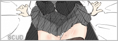
| I think he meant: http://myanimelist.net/myfriends.php?go=add&id=2097193 |
 |
Apr 27, 2013 11:06 AM
#4142
Scud said: I think he meant: http://myanimelist.net/myfriends.php?go=add&id=2097193 Thanks |


May 18, 2013 10:07 AM
#4144

| finally made one since i joined MAL OTL idk how it turns out//  |
May 19, 2013 5:52 AM
#4145

| i edited my lists and profil check it out if you want |
 |
May 20, 2013 10:14 PM
#4146
| Finally end up updating mines. |
May 22, 2013 3:08 PM
#4147

| I did a new one, it's pretty simple though. |
 |
May 24, 2013 11:08 PM
#4148

| Extremely simple design. Check it out. ~http://myanimelist.net/profile/Houndour87~ |
 。◕‿◕。 Fun In Life is what Matters! The More the Fun the better your Life Becomes!! 。◕‿◕。 |
May 24, 2013 11:09 PM
#4149
| Make a new one. Bet not every one will like mine. http://myanimelist.net/profile/GoldenBRS |
More topics from this board
» My Realism Oil Painting #NSFWsalsalsalsal - Aug 17 |
2 |
by Zarutaku
»»
4 hours ago |
|
» This my DrawingKirika_Madeleine - Aug 24 |
2 |
by Zarutaku
»»
5 hours ago |
|
» favorite moviesO_Peres - Sep 20 |
3 |
by Little_Sheepling
»»
Yesterday, 10:45 AM |
|
» favorite TV series/showsO_Peres - Sep 20 |
0 |
by O_Peres
»»
Sep 20, 7:34 PM |
|
» favorite mangas/in manga styleO_Peres - Sep 20 |
0 |
by O_Peres
»»
Sep 20, 7:11 PM |