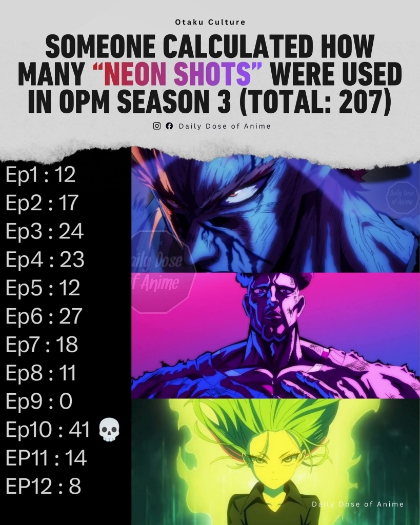
Forum SettingsEpisode Information
Forums

why people hate the neon disco colors of one punch man season 3 but not dandadan anime?

New
Yesterday, 2:40 PM
#1
lagom
Offline
Jan 2009
108627
i observe many comments on social media hated the neon colors on one punch man season 3 but there is barely any complains about neon colors on dandadan anime so your thoughts on this?
Yesterday, 2:52 PM
#2
Offline
Nov 2023
1817
You know as well as I do that the hate generated for OPM 3 began before any material was aired, those looking to attack it just used every possible reason to complain. I saw a thread complaining about the use of the still shot of the outside of Saitama’s apartment block yet in S1 ep1 the same shot with different lighting was used for about 15 seconds. Lack of background during action was also given as a reason that S3 is unacceptable yet S1 used similar shortcuts. Haters just don’t care how stupid their ‘reasons’ look because they act like a mob and try to bully anyone who doesn’t agree.
Yesterday, 3:53 PM
#3
Offline
Nov 2020
115
just because it works for one thing doesn’t mean its gonna work for everything, the issues with season 3 go much deeper than the “neon colors”.
Yesterday, 4:10 PM
#4
Offline
Nov 2016
4294
The neon colors in Dandadan aren't nearly as annoying as the ones from OPM S3.

And the fact that not much happened in OPM S3 due to the shitty animation and direction with those godawful still frames made it a lot easier to focus on the neon colors, and yeah, they were quite ugly.

In Dandadan, I didn't even notice them that much because the nice animation kept my mind busy and away from focusing on the neon colors.

In short, Dandadan succeeded with the neon colors; OPM S3 failed.
Yesterday, 4:33 PM
#5
Offline
Nov 2021
106
the difference lies in who you use the stuff and In OPM it's the worst way possible
Yesterday, 5:46 PM
#6
Offline
Apr 2023
240
most of them are fine, but the shots on Garou specifically lose way too much detail.
Yesterday, 6:19 PM
#7
Offline
Oct 2024
7
Correct me if I’m wrong I haven’t watched the 1st season in a while but I’m pretty sure they never put in the neon lights so the addition of them now is what ppl don’t like?
Yesterday, 6:19 PM
#8
Offline
Feb 2018
833
"Why people hate stuff done bad and not things done right"

lol.
Yesterday, 6:23 PM
#9
Offline
Aug 2022
11
Poor directing would be the best way to sum it up in 2 words. The "disco ball" shot in episode 10 where they make it look like a damn nightclub is the perfect example. Besides the fact that the way they're used is obnoxious and annoying, they appear to be deliberately trolling the viewer. The filters crudely and abruptly draw attention away from whatever might be happening onscreen, rather than enhancing it like in Dandadan. They're grossly misused in almost every instance.
Yesterday, 6:33 PM
Offline
Oct 2020
302
Suprgamr123 said:
most of them are fine, but the shots on Garou specifically lose way too much detail.

So about that weather… /s

lol that thread got locked
Yesterday, 9:34 PM
Offline
Apr 2023
240
Old_Greggu said:
Suprgamr123 said:
most of them are fine, but the shots on Garou specifically lose way too much detail.

So about that weather… /s

lol that thread got locked

about as expected. This thread'll probably stay though.

The weather's still just about the same. 15° C over here.
Yesterday, 10:21 PM
Laughing Man

Offline
Jun 2012
7167
You can't be serious. OPM s3 replaced iconic panels the fanbase was looking forward to with bad looking still frames with random colors vomited on them.
What's next, "why do hate CGI in Berserk 2016 but not in Houseki no kuni?"

I'm level on MAL-Badges. View my badges.
Yesterday, 10:23 PM
Offline
Oct 2020
302
Reply to Suprgamr123
Old_Greggu said:
Suprgamr123 said:
most of them are fine, but the shots on Garou specifically lose way too much detail.

So about that weather… /s

lol that thread got locked

about as expected. This thread'll probably stay though.

The weather's still just about the same. 15° C over here.
@Suprgamr123 if it was daytime for me then it would be about the same.
Yesterday, 10:25 PM
lagom
Offline
Jan 2009
108627
Reply to BatoKusanagi
You can't be serious. OPM s3 replaced iconic panels the fanbase was looking forward to with bad looking still frames with random colors vomited on them.
What's next, "why do hate CGI in Berserk 2016 but not in Houseki no kuni?"
@BatoKusanagi this is specifically about color design only and to me its something trivial so im not talking about a major part of animation like consistent onmodel drawings or even 3d models here
Yesterday, 10:40 PM
Laughing Man

Offline
Jun 2012
7167
Reply to deg
@BatoKusanagi this is specifically about color design only and to me its something trivial so im not talking about a major part of animation like consistent onmodel drawings or even 3d models here
@deg If you think people are only looking at the color design, then I can understand why you're somehow confused about this.

I'm level on MAL-Badges. View my badges.
Yesterday, 10:41 PM
lagom
Offline
Jan 2009
108627
Reply to BatoKusanagi
@deg If you think people are only looking at the color design, then I can understand why you're somehow confused about this.
@BatoKusanagi wut? the question is about color design specifically the neon colors complains
Yesterday, 11:10 PM
Laughing Man

Offline
Jun 2012
7167
Reply to deg
@BatoKusanagi wut? the question is about color design specifically the neon colors complains
@deg I'm saying your take is too shallow. No one's complaining because the colors are too saturated or something. The problem is the whole frame looks bad and uninspired.

I'm level on MAL-Badges. View my badges.
Yesterday, 11:13 PM
lagom
Offline
Jan 2009
108627
Reply to BatoKusanagi
@deg I'm saying your take is too shallow. No one's complaining because the colors are too saturated or something. The problem is the whole frame looks bad and uninspired.
@BatoKusanagi dude im not the one making the complains of "neon disco colors bad"

youre the one confuse here because this is only about the color design complains
Today, 12:11 AM
Watamate

Offline
Aug 2014
1202
Do we really need to explain this? It's random, it's completely unnecessary, it looks like ass and it's overused to shit. How many of those shots were in 2 whole seasons of DDD? At least there, it made sense and wasn't used obnoxiously just to make you lose immersion and realize how cheaply this bs was made.

If I'm not mistaken, Seven Deadly Frames also had the random, stupid neon light coloring and how did that turn out? Sure, it wasn't nowhere near as bad as OPM, but it was still out of place and looked dumb. I'm pretty sure if it's done right and in consideration, people don't mind it at all.
Today, 12:26 AM
lagom
Offline
Jan 2009
108627
Reply to GTRaijin
Do we really need to explain this? It's random, it's completely unnecessary, it looks like ass and it's overused to shit. How many of those shots were in 2 whole seasons of DDD? At least there, it made sense and wasn't used obnoxiously just to make you lose immersion and realize how cheaply this bs was made.

If I'm not mistaken, Seven Deadly Frames also had the random, stupid neon light coloring and how did that turn out? Sure, it wasn't nowhere near as bad as OPM, but it was still out of place and looked dumb. I'm pretty sure if it's done right and in consideration, people don't mind it at all.
@GTRaijin maybe a lot of fans calls it unnecessary but i think its a very minor complain compared to the animation quality and direction quality

heck i see less complains about continuity errors of scenes
Today, 12:30 AM
Offline
Jul 2024
8
Bro have you even watched both shows????
DDD has beautiful animation and on top of that the neon shots were used so well that some people like me didn't even notice em at all. On the other hand, OPM s3 fucked up... This is not even a debatable statement rn. It fucked up way too bad, from using still shots for a long ass time, putting neon frames after every breath, PowerPoint animated fights, and even arguing with overseas fans for watching it illegally. We were holding Bandai Namco alone accountable for it, but JC Staff also farted here and there so you gotta hate on both. The only ep that was actually kinda OK was the Flashy Flash fight and that was the bare minimum btw.
Today, 12:50 AM

Offline
Sep 2016
24202
Neon color haters belong in gulags.
*kappa*
Today, 12:53 AM
Offline
Feb 2022
1
because neon color in dandadan have an strong context behind that. the neon color is avoid thet show domain area of each yokai, ghost, alien or cryptid. and each of them have a different a spesific color. but, neon color in the opm s3 have no context and out of nowhere.
11 hours ago
Offline
Jan 2023
197
well in Dandadan we've flashy motions with neon colors so ofc I do like it there but a image with neon effect? what's the use?
5 hours ago
Offline
Dec 2022
203
it's called doing it tastefully

More topics from this board

Poll: » One Punch Man 3 Episode 12 Discussion ( 1 2 3 4 5 )

IzanaSolos - Dec 28, 2025

206 by Azea1688 »»
33 minutes ago

» part 2 in 2027 ( 1 2 )

deg - Dec 27, 2025

80 by ItachinotfoundXD »»
3 hours ago

Poll: » One Punch Man 3 Episode 6 Discussion ( 1 2 3 4 5 ... Last Page )

Softhenic03 - Nov 16, 2025

344 by nghuytoan1993 »»
9 hours ago

Poll: » One Punch Man 3 Episode 9 Discussion ( 1 2 3 4 )

IzanaSolos - Dec 7, 2025

170 by Klava1980 »»
Yesterday, 12:04 PM

Poll: » One Punch Man 3 Episode 11 Discussion ( 1 2 3 4 )

UaEfAlCoN83 - Dec 21, 2025

171 by Zeus_Games »»
Yesterday, 8:58 AM
It’s time to ditch the text file.
Keep track of your anime easily by creating your own list.
Sign Up Login