Forum Settings
Forums
New
Reply Disabled for Non-Club Members
Pages (6) « First ... « 2 3 [4] 5 6 »
Nov 9, 2009 3:37 PM

Offline
Oct 2009
19
its not anime but what do you think? (its my background)

Nov 9, 2009 6:47 PM

Offline
Oct 2009
19
AniiFreakk said:
havent done any recently so heres one i did


il like but the scanlines kinda take away from this 1.

over all very good
Nov 9, 2009 9:15 PM

Offline
Oct 2009
19


i tried to go for a simplistic look tell me what you think
wtevansNov 9, 2009 9:22 PM
Nov 10, 2009 5:19 PM
Offline
Jan 2009
1022


Damn photoshop won't do smooth corners.
Nov 12, 2009 10:55 PM
Offline
Jan 2009
1022
Very nice, I like how you managed to keep both light sources realistic, by putting them on the render too. The text could use a little work, it's distracting.
It's very bright. That isn't a bad thing in and of itself but the whole bottom left is just *woah* =/
Border is very distracting, same with the scanlines.
The look is good but the text throws it off, because you put it on the right, where it's completely empty, it's distracting from the focal
Nov 18, 2009 7:56 PM

Offline
Aug 2009
1530
http://myanimelist.net/forum/?topicid=131697

I'll update my graphics through this thread~~~

and some other show case;


You guys can see what my style is... u.u~~

I don't use C4Ds, or Brush much. They all look too artificial... >_>... THough, I use techbrush sometimes...
Nov 20, 2009 3:47 AM

Offline
Apr 2009
913
haven't looked here for quite a while but
-Shio said:


Damn photoshop won't do smooth corners.


your sig is great, nice lights and colours!

// new one with 2 versions


SixFlagsNov 20, 2009 12:03 PM
Nov 23, 2009 6:25 PM

Offline
Oct 2009
19
i love it great depth and lighting i like the septa one better
Dec 6, 2009 9:44 AM

Offline
Apr 2009
913
Guys, I want to see all your nice new siggies, its not fair to hide them.

Dec 6, 2009 9:52 AM

Offline
Aug 2008
2262
I really like the first one *_*
Dec 6, 2009 1:36 PM

Offline
Oct 2006
507
@SixFlags: I like the No Need To Cry one; looks very nice :X
scorpedoDec 6, 2009 1:39 PM
Dec 8, 2009 4:38 AM
Offline
Jul 2008
3032
SixFlags said:
Guys, I want to see all your nice new siggies, its not fair to hide them.


They look great SixFlags.
Need more work on depth and typography but over all nice.

Man, it's been a while since I've contributed in here >_<
Must do it soon.
Dec 8, 2009 9:11 AM

Offline
Apr 2009
913
thanks for the feedback guys!
as a lesson: I'm trying to push my Typo skils a bit ^^

-> http://xpnze.deviantart.com/art/Typography-Tutorial-90551186
a sig can look so good with the right Text (especially the "Thinker" one) *_*

Meri said:

Man, it's been a while since I've contributed in here >_<
Must do it soon.


I'm really looking forward to it :)
Dec 10, 2009 8:05 AM
Offline
Jan 2009
1022
SixFlags said:
Guys, I want to see all your nice new siggies, its not fair to hide them.

Ohohoho, awesome stuff going on there. First and second ones are awesome, I'm not a big fan of the text on the third, and I don't really like the last one.
Dec 10, 2009 10:44 PM

Offline
May 2009
138
I'm still trying to get the hang out of Photoshop.

Dec 11, 2009 9:35 AM

Offline
Apr 2009
913
Zuly did you only used brushes to make the flowers? It matches the watercolour style real nice.

I've read some Stuff about the Distort function in Photoshop and its such a nice and easy tool to work with. Its really surprising what just a klick can cause decent effects.


If anyone is interested, here are the Renders (taken from PlanetRenders.net)
Dec 11, 2009 2:21 PM

Offline
May 2009
138
^Yup, only brushes in there. I will add some lighting and my name whenever I figure out where to put them.
Dec 14, 2009 1:26 AM
Offline
Jul 2008
3032
SixFlags said:
Meri said:

Man, it's been a while since I've contributed in here >_<
Must do it soon.

I'm really looking forward to it :)


And here it is:
My typo skills are bad >_<


v2. no lettering

Dec 14, 2009 8:44 PM

Offline
May 2009
138
Made this for another forum:


V2:

ZulyDec 15, 2009 12:44 AM
Dec 18, 2009 1:23 AM

Offline
Apr 2009
913
Meri, wow a Hamlet theme ^^
the scenery in the back looks nice and mysterious, and the render simply looks: o.O
It may look even better if you either highlight the lightsources in the Background on the right and left more with a white brush (blending mode on overlay) or the dark areas with a black brush. But thats just my humble opinion.

Zuly, can't see the first one, but the second one looks nice too.
Dec 20, 2009 9:37 AM
Offline
Jul 2008
3032
@zuly
Cant see the first but the second looks nice. Typo could be better.


@SixFlags
Poor Yorick :3
I tried to get more depth, worked on the background and typo. Moved the render a bit to the left too and I followed your advice on some parts, and this is what I got.

v3.

Dec 21, 2009 6:48 PM
Offline
Jan 2009
1022
Meri, I think the effects are very nice, but the text could use some work. It's too big for my taste, and I don't think it should be blurred.

anyway, new one for me:
Dec 22, 2009 11:42 AM

Offline
Apr 2009
913
Meri: I definetly like v3!

Shio_: Its so nice what you can make using the smudge tool.
Jan 12, 2010 4:37 PM

Offline
Apr 2008
113
hi there
Just saw that there is a gfx club on mal..and well, since i love to play with ps in my freetime i tought i present some of my sigs here. still pretty much a beginner so feel free to critisize. ;)


Jan 13, 2010 3:17 AM
Offline
Jul 2008
3032
@Shio
I really like that smudge effect \o/

@Razzhem
These are just the sort of thing we need to see more on MAL. You have some talent. They are pretty good for a beginner.

@SixFlags
I really love your current sigie. *_* Great mix of effects and c4d renders.


@All
Considering gfx tag making is not the strongest side of MAL artists, here is a site with
+ 1500 tutorials: http://sigresource.com/
Also high number of all stocks, renders, c4ds, brushes..you name it.
It will definitely improve your tag making if you bother to check those out.
Jan 13, 2010 11:19 AM

Offline
Apr 2009
913
Razzhem - your sigs are nice and some effects are awesome, especially the Kallen one.

Meri - thanks ^^ I wanted it to be flashy but bright colors didn't suit the render, so it turned out into a dark one. And I'm definetly going to check out your site.

here are two new, the first one is based on a tutorial

tutorial -> I hope it can help with only looking at the pictures too

Jan 14, 2010 4:52 AM
Offline
Jul 2008
3032
I like the 1st one a lot. Great effects and some clipping masks if I'm not mistaking.
I saved the tut but it's on german. lol. Mine is a bit rusty but we'll see how that goes ^^

The second one is good, it has some flow, but I generally dont like small focals so I'm liking the 1st more :3

SixFlags said:
Meri - thanks ^^ I wanted it to be flashy but bright colors didn't suit the render, so it turned out into a dark one. And I'm definetly going to check out your site.

it looks great :>some other time maybe?
make sure you do. it's really gfx heaven ;)
Jan 15, 2010 10:45 AM

Offline
Apr 2009
913
I checked out the site, its awesome!
I saved at least 20 tutorials and lots of stocks and theres still a lot more to browse. ^^
And not to mention the signatures of all the members there, so talented!
Jan 28, 2010 1:17 PM
Offline
Jan 2009
109
Havnt Done any photoshop In a LONG TIME soo heres one

Feb 3, 2010 8:20 AM
Offline
Jul 2008
3032
Made this one over the last weekend


original pic

It's Morrigan from Dragon Age, in case you missed that :)


@AniiFreakk
looks different. not my kinda thing really. there is composition, but lighting and depth is questionable to say at least. kiu
Feb 22, 2010 6:49 PM

Offline
Oct 2009
19
Man i haven't added one in months so here

had a little trouble with the flow on this not my best


this is my favorite one iv done
wtevansFeb 23, 2010 5:39 PM
Feb 26, 2010 12:35 AM

Offline
Jan 2009
36
Hey ^.^
First time here :o3


epic fail :D
Apr 9, 2010 4:54 AM

Offline
Apr 2009
205
I'm new to this gfx things though i'll try best!
Here's one that i made :D
Apr 13, 2010 2:10 AM
Offline
Jul 2008
3032
@wtevans
flow is messy, but the blend is good. also need more work on shading & lighting.

@Lieed
I like your style, those nice soft colors. you need to work on depth more.

@19leon95
nice colors as well but the lighting is a bit dodgy and the bg looks flat.

kiu guys ^^

I thought I post 2 of my latest sotw entries on one gfx site :3


-won me a 1st place :3 -


-will see how this goes -
Apr 14, 2010 4:28 AM

Offline
Apr 2009
205
Meri said:

@19leon95
nice colors as well but the lightithlighting effects ng is a bit dodgy and the bg looks flat.


Thanks ! I'll remeber it xD you really got me there . im having a hard time with lighting effects :3 i would keep it in mind ^^
Apr 17, 2010 10:08 AM

Offline
Aug 2008
2262
Thought I post the "original" for my sig here. This one has an extra gradient map, and it's cropped coz the 600x140 version was way too big for its own good. Dunno if cropping messed up the flow or not.

Anyway, I was experimenting with smudging and using C4Ds as light effects

Apr 19, 2010 10:08 PM

Offline
Apr 2009
205
Here's another one i made ^^
this time i got help with a tut :D so please tell me you opinion ~! it would help me alot :D


-used smudging for the background and splatter brushes ~
19leon95Apr 19, 2010 10:13 PM
Apr 20, 2010 1:51 PM

Offline
Apr 2009
913
@Meri: Was it on sigresource? Its been a while since I checked that site.
Love the first one, congrats on the first place! On the second I'm not too fond of the left part of the sig, but the C4D's are melted very well with the render.

@Kavakond: 
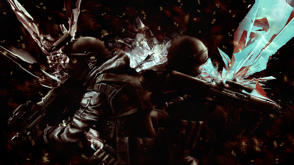
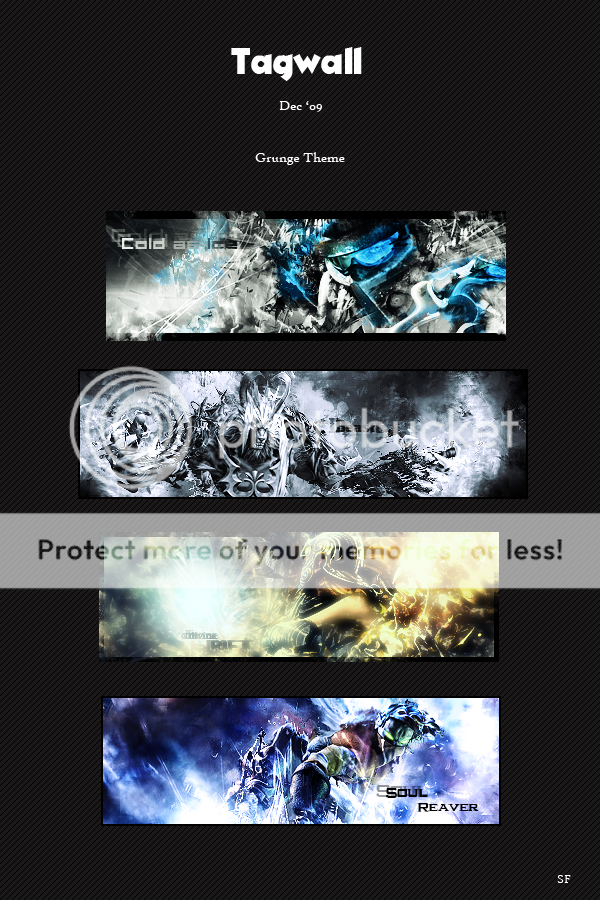
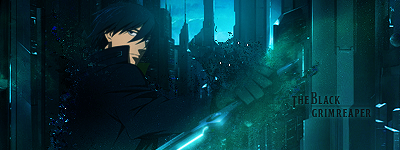
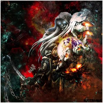
the one you use now looks much better than the one with the gradient, overall it looks much more vivid, and the explosive background just looks great.

@leon95: Overall it looks very nice, but what I notice is that exaclty the focal points are kind of empty, I'm sure if you add more effects or a nice typography there, it would look even more badass.
Apr 21, 2010 1:41 AM
Offline
Jul 2008
3032
SixFlags said:
@Meri: Was it on sigresource? Its been a while since I checked that site.
Love the first one, congrats on the first place! On the second I'm not too fond of the left part of the sig, but the C4D's are melted very well with the render.

Nah. It's one other site, I visit regularly. I used sigresource when you could use it without the posts, but now, I'm too lazy to post xD
Thanks :) Yeah, the 2nd one is bit unfinished. I was short on the deadline and low on ideas xD
But I think I did ok, considering I got this stock: http://i41.tinypic.com/sdco7o.jpg
and I didn't know what I was going to get ;)


Btw, I'd love to see more of your works here.
Apr 21, 2010 2:59 AM

Offline
Apr 2009
205
SixFlags said:
[img]
@leon95: Overall it looks very nice, but what I notice is that exaclty the focal points are kind of empty, I'm sure if you add more effects or a nice typography there, it would look even more badass.


Thanks ... I'm not really good on typhography ~ i tried putting though it looks bad ..
Maybe a little more practice will do ^^
Apr 21, 2010 3:57 AM

Offline
Apr 2009
913
ok, here are the works of the past weeks from my blog:
they are all only brushwork, but they were a welcomed break from learning.


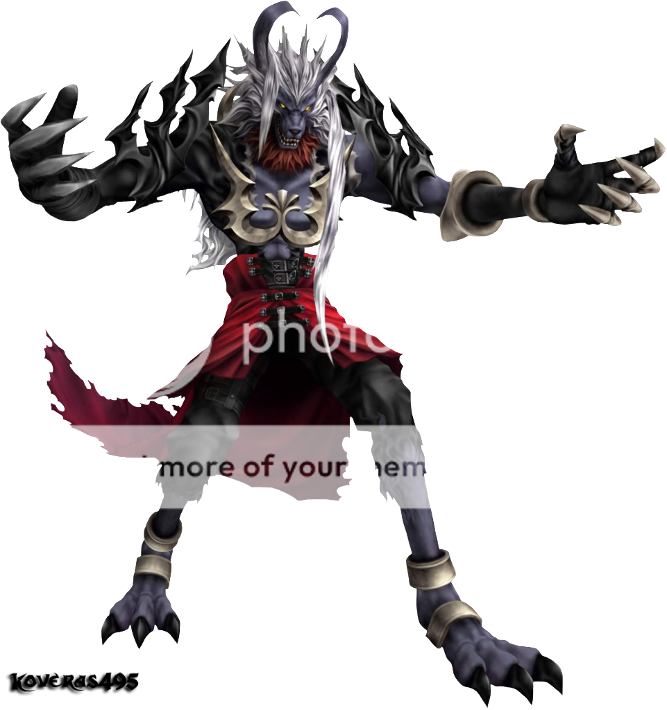
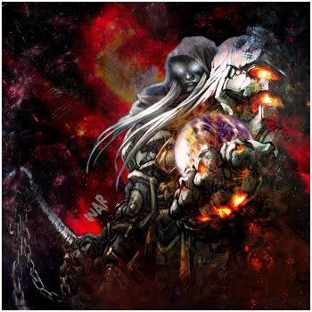
(strictly followed this tutorial: http://psd.tutsplus.com/tutorials/designing-tutorials/dynamic-recessed-watercolor-typography-in-photoshop/) but deciced not to enter the mini challenge with it


Sigressource had a post limit? oO
they seem to have removed it, at least the Tutorial section is accessible.

@leon95: me neither.. ^^ but thats the right spirit!
SixFlagsApr 21, 2010 4:04 AM
Apr 21, 2010 5:59 AM

Offline
Aug 2008
2262
Thank you SixFlags, and I really love that first two ^

When it comes to gfx you are my role model
Apr 23, 2010 7:13 PM

Offline
Apr 2009
205
Hey i made another xD
I followed some tips on putting text on sigs xD here's what i got :D


Oh yeah ^_^ i got inspired by the border i saw in the mini challenge and i don't know who made it so if any one of you guys made it then please don't get mad ^^

@sixflags: YEAH~! i'll keep trying xD so watch out for me ^_^
19leon95Apr 23, 2010 7:18 PM
Apr 26, 2010 10:14 AM

Offline
Apr 2009
913
Thank you Kvakond <3

@leon95: http://xpnze.deviantart.com/art/Typography-Tutorial-90551186 this tutorial was on the last page in this thread, I hope it helps you

New brush sets, new test runs:

and 2 with C4D's


c&c always appreciated ^^
SixFlagsApr 26, 2010 10:20 AM
Apr 27, 2010 12:32 PM

Offline
Aug 2008
2262
^
I like the colors in the first very much but..well..it's empty

The 3rd and 4th are really really nice. If I had to nitpick i'm not fond of the typography in the 4th and that black shape left to her seems out of place
Apr 29, 2010 10:05 AM

Offline
Apr 2009
913
thank you for your thoughts!
I considered scripting the first one, but since I didn't, I'll just say that it is an "artistic way of expressing the contrast with the brushes" *knee-slap*

I will try to improve working with a stock image and of course typo.
Apr 29, 2010 1:11 PM

Offline
Aug 2008
2262
I wanted to ask btw, do you have a place where you usually get your brushes?
Apr 30, 2010 5:49 AM

Offline
Apr 2009
913
I mostly get them from Deviantart, since most of the brushes provided in gfx forums can be found there too. Excellent brushes are for example from these users:

Recently I'm looking up tutorials on http://psd.tutsplus.com/, they sometimes also have links to nice brushes, for example the watercolor ones in the floristic tutorial above.
May 2, 2010 9:41 PM

Offline
Apr 2009
205
@SixFlags thanks for the link :D
It would really help me a lot ^^
May 25, 2010 7:48 PM
Offline
Mar 2008
11
I'm new to MAL forums, thought I'd share some here.

Warning, tag wall may take a while to load :)

Reply Disabled for Non-Club Members
Pages (6) « First ... « 2 3 [4] 5 6 »

More topics from this board

» :: GFX Mini Challenge :: *WINNER / OCT 09*

Moony - Nov 9, 2009

21 by Boyscout31 »»
Oct 26, 2018 7:42 AM

» Share some of your fonts!

Kyroh - Aug 28, 2014

1 by Isalina »»
Sep 1, 2014 4:28 AM

Sticky: » :: Tutorials ::

Moony - Sep 18, 2009

11 by Kyroh »»
Aug 28, 2014 3:47 AM

» Discussion ?:

iamlovelace - Apr 1, 2013

0 by iamlovelace »»
Apr 1, 2013 4:32 PM

Sticky: » :: Previous Challenges ::

scorpedo - Mar 8, 2009

3 by tsumu »»
Jan 31, 2012 11:09 AM
It’s time to ditch the text file.
Keep track of your anime easily by creating your own list.
Sign Up Login