Forum Settings
Forums
New
Sep 20, 2015 11:12 PM
#1

Offline
Jul 2012
48259

manga titles in the spoiler below


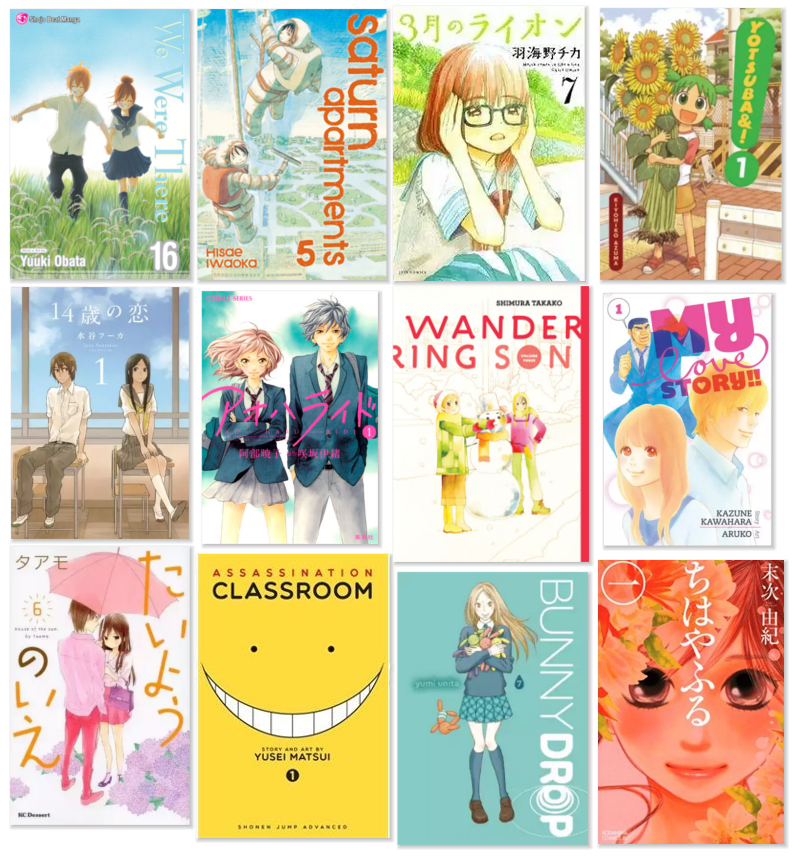
Hey guys! I'm a manga collector and yes, I do care about how my collection looks, based on the cover. Of course, I still collect my all time favourites that don't have very aesthetically pleasing covers like Mars or Nodame. Sometimes, I already liked the series after reading it online but then I see the actual volume and it looks great! So I want to own it on my shelf.

Some things I like in a manga cover are:
1. Simple but unique font. Simple like Bunny Drop's (3rd row), or unique like My Love Story's! I typically don't like serif style fonts because they look too gothicy with the pictures.
2. Focus on one or two characters. If it's a romance series, I've love it if the series had a diverse range of covers for each character and pairing. I like it when it's always different scenes between the main pair, like Wandering Son or Ao Haru Ride
3. Watercolour style art. For some reason, I really like that style especially for a volume cover. So in the example above, Ao Haru, 3gatsu, My Love Story
4. Face zoom in. It looks really stylish and pretty. Examples: Assclass and Chihayafuru
5. Characters + scenery, as seen in Saturn Apartments and Yotsuba. But the background has to be simple.

What do you guys prefer and like? Post pics below!
Sep 21, 2015 12:12 AM
#2
Offline
Jan 2013
10764
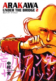
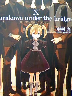
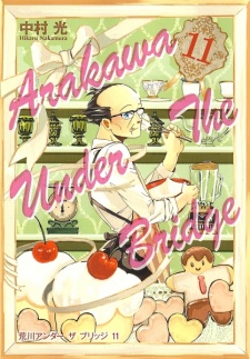
A winner from me, is Arakawa Under the Bridge, it basically follow no pattern apart from basing the design of each volume cover on each character, then it makes use of the character personality, actions and even plot-relevant details to customize it.


But apart from that, your point 5, It gives more life to em covers or somethin along these lines ( ̄ー ̄), such as Genshiken and the already mentioned Yotsuba&. They seem just like someone casually taking a picture and that, for me, is great.
gone bai bai
Sep 21, 2015 12:16 AM
#3

Offline
Jul 2012
48259
Whoa! That's really cool. Each of Arakawa's volumes differ so much by style xD I like Genshiken's use of colours although the art seems a bit messy
Sep 21, 2015 7:27 AM
#4
Offline
May 2015
450
Bleach. The image is too big, so I'll just link it: http://i.imgur.com/4EpTNdZ.png

Kubo's lack of backgrounds has long become a joke by no]w, but the lack of backgrounds on his chapter covers just looks cool. Every cover has a singular focus on one character simply for the visual (they're not always the focus of the arc or volume - it's all aesthetic). I just want to print everything out and use it as a poster. The typography is interesting as well.

Faves:

More topics from this board

» Isekai Benki

GinIonSui - 6 hours ago

0 by GinIonSui »»
6 hours ago

» Recently Bought Manga, Mahnwa, Manhua, or Light Novels. ( 1 2 3 4 5 ... Last Page )

Maora - Oct 24, 2008

6145 by Maou_heika »»
Yesterday, 8:20 AM

» Looking for "your eternal lies" on this website

Inter_anime - Dec 13, 2023

9 by keikechaaa »»
Yesterday, 5:49 AM

» Mecha Comi

GinIonSui - Oct 9

1 by Retro8bit »»
Oct 9, 3:10 PM

» Manga collection pictures ( 1 2 3 4 5 ... Last Page )

crazekat - Apr 12, 2008

265 by Damuzen »»
Oct 9, 6:35 AM
It’s time to ditch the text file.
Keep track of your anime easily by creating your own list.
Sign Up Login