I should just link you a bunch of tutorials but I trust you can type "photoshop gfx tutorial" into google on your own, so I'm gonna walk the extra mile. I'm gonna use my own work to demonstrate good and bad examples.
0. Paint is only good for quick cropping. DON'T use it for anything other, use photoshop
1. Always have a story/message/concept/theme. You should have a story to tell, a ruff visual concept in your mind of what you want to achieve, a theme that describes your finished work even before you start it. These can change dramatically along the way, but if you start with a 'let's do something, I'll figure out what it is" mentality you'll end up with something mediocre at best
So what's your concept? You like baka to test and you like kampfer? And you put textures on top? That's not really a concept. For the time being you should pick one show (message). More on that in point 5
2. Always use the highest quality sources possible, ones that match your theme. Sometimes you don't have much to choose from and have to get creative, but if you have a choice, pick something that looks nice to begin with
3. When resizing images always keep the aspect ratio
4. Did I tell you to keep the aspect ratio? Good. Keep the ****** aspect ratio, no exceptions
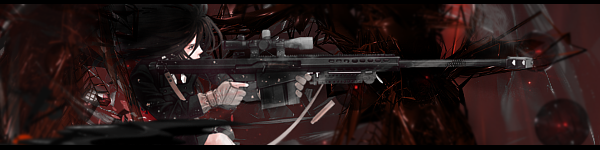
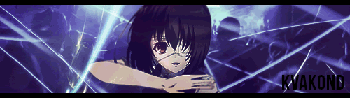
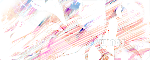
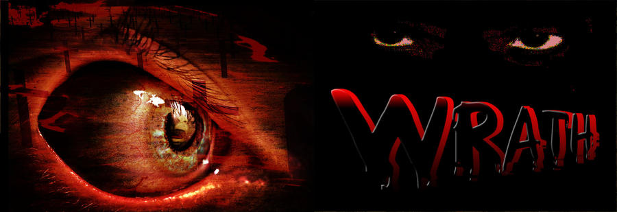
5. This may change between signatures, profile layouts, etc but normally you want to have 1 main focus point. Meaning you want your viewer to look at one, maybe two points of your work. That's where you normally put your character(s). I say 'character(s)' because usually you should use one or if you really must use more you'd want to put them close to each other compared to the total size of the image.
If you put your whole image full of characters you lose focus. Less is more.
6. You can put the focus in the middle, but it's recommended to use the rule of thirds. Read:
http://www.twin-pixels.com/photoshop-and-the-rule-of-thirds/
7. Also, even if all hell breaks loose on your image, you want to keep your character clear and visible (for reasons described in point 5). You can overlay textures if you really want but do it in the background, do it around your character.
8. To achieve this you will need to use masking in most cases, and you should. Masking is one of the most important features in photoshop. Whether you prefer pixel or vector masking, learn it love it use it. No link, just google.
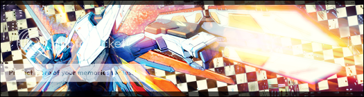
9. So at this point you should have a character at a focus-point and an idea of what you wanna do for the background. You can use a background image or make something from scratch. Either way brushes can be useful, either to create something or to blend your character with the background*. You can find an infinite number of custom themed brushes on the net.
*Blending here means that your character doesn't look completely out of place from the background. With some backgrounds it will be easier, with some it will be more difficult. Experiment.
10. You can and should use blending modes to..well..blend, but as always, don't go overboard and keep focus.
11. We got something going on but we are still far from perfection. What makes or breaks graphics? Colors.
Always try to keep a good grip on your colors. Read up on 'color theory' and 'color wheel' to get an idea on what to use and what not to use. You usually want to avoid rainbow puke.
12. Text. If your main focus is on the character, your secondary should be on text. Make text visible and readable. If it's not, you shouldn't put text on your image to begin with.
If you got your colors in line, you shouldn't have that much trouble picking a color. Hint: black or red are rarely good picks on a dark background. Color theory can give you good hints here too.
13. Fonts. Your font should be in line with your theme and style. Pick grungy for grunge, pick minimalistic for simple, clean images. If you have main and secondary etc text, try mixing up different fonts. Read up on 'typograhpy', serif and sans serif.
+1 Borders are usually nice. People like borders because they're an easy way to give a bit of extra contrast.
If you got all this down, practiced and practiced some more, then you can start thinking about things like using gradients to add subtle variety, keeping lights and lighting in mind, and adding depth. |