Some quick and hopefully constructive criticism.
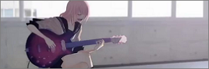
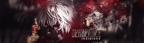
- Aweful typography, no offense, but the second sig in your spoiler box, for instance, does that way better. It's smooth, artistic, has the right color composition, uses a fitting font and looks like it's part of the overall work. Your latest work lacks all of that.
Don't use strokes, outer glows, etc. and try to use simple fonts with no frills. Also try to incorporate it more (make it overlap by some c4d render or whatever) and apply some gradients or something like that eventually, so that the colors smoothly match your overall composition.
- Said typography also distracts from the real focus. I don't think you want people to look at the text instead of her face. But if you distance it that much, make it too big and too flashy, your eyes don't really know where to look at and that's something you should try to avoid.
- Pay more attention to light sources. You have them pretty much everywhere which destroys the overall atmosphere and gives it a rather unnatural feeling. For instance, there's a light source in the lower left corner (below the text), but if you look carefully at her face, that's actually where the shadows are. Makes it look unnatural like that.
- And on a personal note, I think the background is too 'boring'. It has smooth colors uses smooth wave-like shapes which gives it a calming feeling, but your actual motif is quite different as it uses 'agitative' c4d renders, shapes and colors. Doesn't really complement each other.
- Also, don't put your name on it, even if it's that small. I know you're afraid of people stealing your work, but, honestly, there's no bigger compliment than someone stealing it, is there ;). If you simply write your name in one of the corners it only destroy your overall work and, again, distracts from what is supposed to be the real focus. Unless you do it in a way that it actually looks like it's part of the artwork, that is (which would include to not put it into a corner).
And please remember, I'm only trying to help you improve, I'm not trying to belittle your work or anything. :) |