aand the second place goes to Ri_Butcher! congratulations and fanfares! X)
--------------------------------
so! vote for creator of cards you liked the most. the winner will then recieve the congratulation card from me and of course some fanfares! if somehow i win then i'll make a card for the second place to the one below [well of course i'll be glad if someone'd make the congratulation card for me too in such situation X)].
and also feel free to discuss all of the works here~
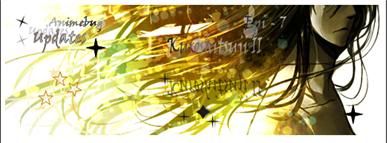
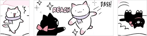
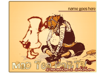
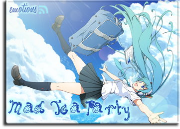
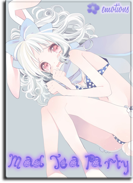
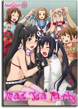
itkiz
1
2
3
4
5
6
7
8
9
10
11
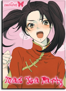
EnkoKasumi
1/2
3/4
5/6
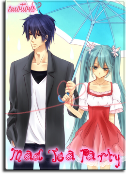
HazukiSama
A
B
C
D
E
F
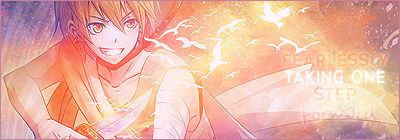
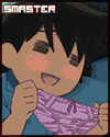
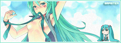
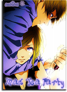
Kida_Masaomi
A
B
C
D
E
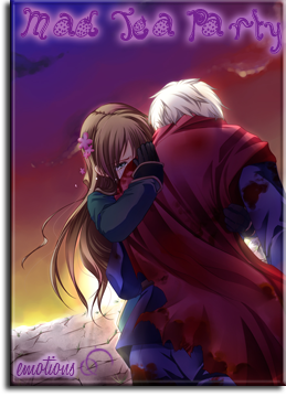
Daika-san
1 || 2
3 || 4
5 || 6
NinjaxChick
1///2
3///4
5///6
7///8
9///10
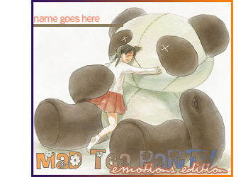
-panda-
A//B
C//D
E//F
G//H
I//J
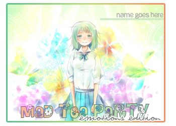
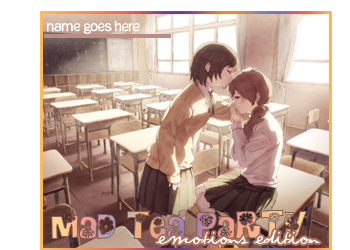
Saku_Chan
Template A || Template B
Template C || Template D
Rukia_23
A
B
C
D
E
Ri_Butcher
A
B
C
D
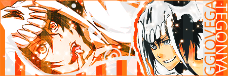
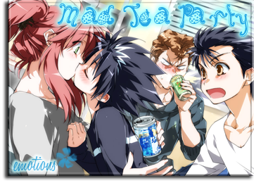
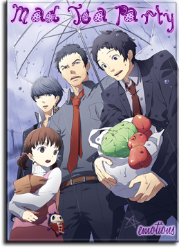
Fugax
1//2
3//4
5
6
7//8
9//10
11//12
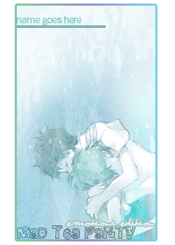
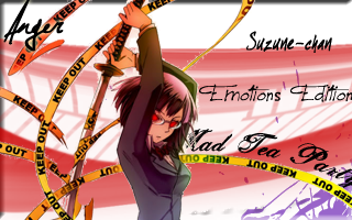
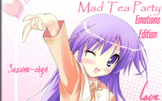
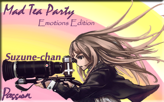
Suzune-chan
/anger/
/Love/
/Passion/
NekoDee
1///2
3///4
5///6
along with it the card buffet will be open, where you can request any card(s) from any creator(s) listed here, following their conditions~
Pff...So many great cards to chose from. I love the theme since there's so many ways to express ones emotions and it fun to see it exaggerated in art.
Since I was able to request from all the creators I'll try and write something down for everyone since you guys took the time to make these wonderful cards. o3o
----------------------
itkiz
I like the font you used for "emotions edition." I may be looking at it too deeply, but I feel liked the flowly sort of random direction of the text represents how free and abstract our feelings can be like when in one instant we can be on top of the world only to have it shattered in an instant my the harsh reality of the truth or just the complete opposite. Although that may be an extreme example so umm....Like when I eat a yummy dessert and it makes me so happy (maybe partly because of the sugar rush, teehee), but then when you finish it your a bit sadden since it's all gone. However, you still have a content feeling afterwards since you were able to enjoy something delicious. ^^;
Oh! I like the glowing effect on the cards since it makes it stand out more from the background. Thought I'd say something more constructional. xD
EnkoKasumi
I like the funky font you used for "Mad House Tea Party." It sort of stresses the crazy part of the club. :3 Also the layout of the text is very balanced and doesn't make the cards look busy. Plus the border is a nice touch of detail. In short nice, clean, and simple cards.
HazukiSama
I like the dotted border you did for the first two cards. Even though it's a small detail it makes the card look more thought out and detailed.
I love swirl font, but having three different types of them close together make the card look busy and is a bit distracting. Also I think it would help to vary the size of the text to help with the flow and also helps stresses which text more important.
Also I like how you used a lot of colors for the text. It contrasts with the background really well, and emotions are tied to color (dark blue => sadness and yellow => happiness).
Kida_Masaomi
I really like the pictures used for the cards because it's really obvious to tell what emotion is expressed in each one. The design is nice and simple as well with the character on one half and text on the other. Black text is good since it goes with everything, but I think changing the font to match with the background would be nice.
Daika-san
Hmm...What to start with. Umm...Well for one the shape of the card is unique since it has both sharp and rounded corners so that's a nice change of pace.
I don't know why, but I really like the "Mad Tea Party" tag. I just fits so well with the cards and the under-shadow from it makes it pop out from the card.
I'm not usually a fan for big font, but since it's partly transparent it fades into the background but the white text against the dark background brings it back to focus (well except for the 4th card since it's white against white).
It's also nice that you put the emotion expressed in the art on the cards, but it's interesting how I can see different emotions than the text. Take the guilt card for example, at first I though it was suppose to be fear or insecurity, but I can also see how it could convey guilt as well. Same with the fear card since it looks like the guy on the right is looking down at the other guy with a smug look so that could be arrogance or loathing.
So all together it looks really unique and nicely made cards so that's why I voted for yours. n_n
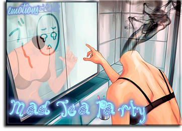
NinjaxChick
Font, font, font...Honestly, I've been writing about it for every card maker and it's starting to sound repetitive. :/ But I guess that can't be helped since the key points for a card is the text/font, art/background, and layout/organization. Oh! And lets not forget creativity (although I did almost forget ^^;). So here we go!
My first impression was that I didn't like the font style of the "Mad Tea Party-Emotions" logo since it's sort of blurry and blochy. But then that does describe emotions pretty well. Sometime they're simple and pure like rage and how it controls you to only want to make chaos and destroy stuff. Other times there's not just one, but several mixed together crowding each other causing you confusion and frustration. So those feeling lead to other emotions just to complicate the situation and hence why there's so much drama in life. =P
Also the fading effect is also a nice parallel to how fleeting and ever changing our feelings are. As said in the other comments I think the username text should be smaller and play around with the font color. I see you started to do that, but then changed to a solid black, which isn't bad but it might be a nice little detail. :3
Oh and sorry for the mini side-rant. I just wanted to say that so I don't seem nick-picky about font (or maybe I really am >.>). Blah now I'm contradicting myself. I'm just going to leave it alone since I think I'm just confusing myself or something...
-panda-
First off, I want to say that I was really close to voting for yours and NekoDee's cards, but I don't know I just liked Daika-san's more. Not saying your cards are bad or anything. ^^; Did I end up insulting you? I hope didn't. ^^; Argh! Were is my concentration?! Oh yeah my job killed it...Dx
Okay, getting back on track... *cough*
You have a really nice variety of cards from a bunch of animes I can recognize them from. The quality of the art is good and they clearly express a defined emotion.
Also good attention to detail as well by having the text follow the same color-scheme as the background. Plus the little cast-shadows and the borders for the cards are nice little details that go a long way.
Having the a glowly effect (or colored font with a white middle) with swirly text is my favorite combination, and the organization is simple and effective. Honestly, I can't think of anything negative or something that needs changing. Everything is put together so well to make some professional looking cards. :D
Saku_Chan
I love the pictures you used and the color coordinated borders with each card. I've always liked that picture of Luka so it's good to have it turned into a card. Great well-balanced and pretty cards. I have nothing bad or constructive to say either since I would change anything with them.
Hmm..This comment feels too short. >.<
I don't know this may be random, but I've been wondering what emotion card D represents. Is it flirtation/teasing since he's winking and smiling? Or maybe sleepiness since he has bed-hair (although that is a common style to draw guys hair)? Haha I don't need an answer. I've just been staring at it for a while trying to figure out it's tie to emotion. ^^
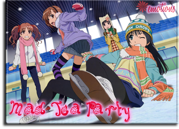
Rukia_23
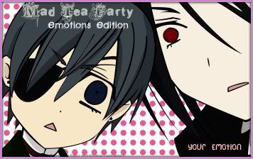
Hurray cards of Sawako's awesome smile! =) That made me smile so big when I opened the spoiler. Afterward, that smile got even bigger at Ciel's and Sebastian's priceless expressions. Lol. x3 So yay loved the art you used and more love for swirly font. <3
Ri_Butcher
Great and creative way to organize the edition and club's name. The font styles of each line of text matches each other perfectly and the two arrows/indents was a lovely detail. n_n
Also having the emotion behind the username is a nice subtle way to tell what emotion is being expressed. I guess the only thing I would change is making the emotions/club logo-tag text bigger since it looks liked there's a bit too much empty space on the cards, but other than that wonderful cards. :3
Fugax
There's a nice collection of various images and I like how theres a little decorative sticker next to the word emotion. Also the strawberry font is cute and fun. Just some lovely cards overall. :)
Suzune-chan
For the anger card I'm not sure if I like the purple in the background. I love how it stands out, but then at the same time it doesn't match with the art. Maybe orange would have been better, but nice way to fill the empty white background. ^^
The love card is simple and cute. I think using some orange text would be good since there's a lot of pink.
I think a darker background would have been better since the character has darker tones so it's a bit of a weird clash between the two.
Good cards and keep it up. =D
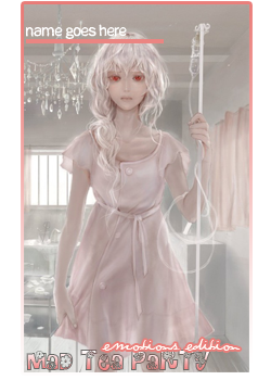
NekoDee
Wonderful pictures used for the cards. The organization is good and balanced. The "Mad Tea Party" text may be a bit too tilted for my liking, but other than that the cards are really beautiful. c:
OMG!! it's soo haaard i don't know who to vote to ><"
I took like an hour to Pick really xD
they are so good and woderful cards thank you all for you hard work :3
i'll go with NekoDee and Saku_Chan, ooooh what to do? ><;
but i'll go with Saku_Chan, i like her work :3


 |
| |
|