New
Sep 3, 2014 6:46 PM
#5801

| Ringabel was one of my least liked characters of Bravely Default but you make him so sxccc perfect signature with perfect text. OH I SEE THAT E IS PART OF HIS NAME THERE IS A FADED RINGABEL ^Took me too long to figure this out. |
Sep 5, 2014 7:40 AM
#5802
Sep 5, 2014 8:42 AM
#5803

Isa__ said: sxccc = sexxxxyyyy? xD?@Zelot: WHY? D: What exactly means sxccc? xD Thanks, man o/ Don't feel bad, it's not very visible, I admit. >< New signature. Something completely random which is rare for me. 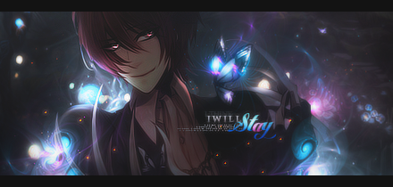 Looks amazing c:, and the "stay" text in aprticular, so beautiful TuT |
 |
Sep 6, 2014 10:24 AM
#5804
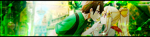
| @shuryukan: Oh,.. that's so obvious. Another proof I'm an idiot :'D And thank you ^^ Did another sig guess it's my good days atm. This time something I wanted to do for a long time but never found a good stock. 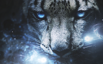 Original 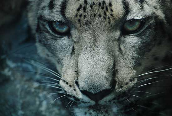 |
 |
Sep 6, 2014 1:14 PM
#5805
Isa__ said: @shuryukan: Oh,.. that's so obvious. Another proof I'm an idiot :'D And thank you ^^ Did another sig guess it's my good days atm. This time something I wanted to do for a long time but never found a good stock. Original Awesome as usual, yes, sxc means sexy :) Really enjoying your latest stuff! Love the color blue ^^ Been reading a bunch of shoujo and felt like my OTP needed a shoujo moment...  I also made one with a ripped paper effect, though I get this weird white border surrounding it... The strange white border goes away when I add a rectangle behind it though.. so I did a white one to match the background of MAL (Assuming a user is using default..) GIFs are weird to edit EDIT:  I think this is the final product :) |
ZelotSep 6, 2014 1:24 PM
Sep 7, 2014 7:36 PM
#5806

Zelot said: Been reading a bunch of shoujo and felt like my OTP needed a shoujo moment... I also made one with a ripped paper effect, though I get this weird white border surrounding it... The strange white border goes away when I add a rectangle behind it though.. so I did a white one to match the background of MAL (Assuming a user is using default..) GIFs are weird to edit EDIT: I think this is the final product :) In my opinion, the black vertical lines are a little weird.. It's like they don't belong there. Maybe if you make them grey it'll be better. The rest is good, I like the manga-style. I made another one: 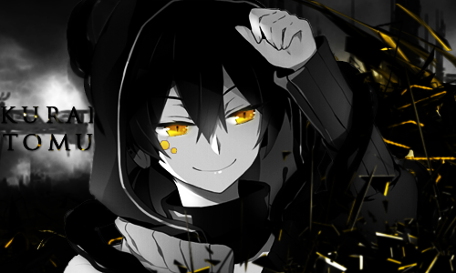 |
 |
Sep 8, 2014 5:17 AM
#5807

| @KuraiTomu Not the best place for the text imo. I also feel like you could have done something with the lighting to blend the signature together better. @Zelot Love the "doki doki" part. Nice job! @Isa Beautiful works as always, not much to say. I've been lazing around for the past month or so, just playing league. Finally I got the motivation to do something. I wasn't sure whether to make it blue or maroon, so I did both and put them in a tag wall.  |
RyugenSep 8, 2014 5:45 AM
Sep 8, 2014 6:16 AM
#5808
Ryugen said: Is this version better? @KuraiTomu Not the best place for the text imo. I also feel like you could have done something with the lighting to blend the signature together better. @Zelot Love the "doki doki" part. Nice job! @Isa Beautiful works as always, not much to say. I've been lazing around for the past month or so, just playing league. Finally I got the motivation to do something. I wasn't sure whether to make it blue or maroon, so I did both and put them in a tag wall. 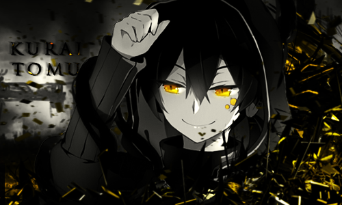 |
|
Sep 8, 2014 7:12 AM
#5809
| @Ryugen: THank you. And nothing much to say to yours either. But I wouldn't have put that girl in the background of the tagwall. It makes it look unsettled. Too much going on. Nooo, it's not just a tagwall, it also has to look good, otherwise it ruins the tags it presents :x |
|
Sep 8, 2014 9:10 AM
#5810
| @Ryuugen, thank you, the Doki Doki thing was weird to edit since it was my first time trying to make a good edited gif. I agree with Isa_ that the tag wall looks weird with the girl there.. The actual signatures look amazing though! Love the blue one a lot, since blue is my favorite color. @KuraiTomu Do the black lines not make it look like manga cells? Cause I was going for a manga strip that was ripped out. On the newer version, the text still doesn't fit well.. Too far to the left. Try to remember the rules of thirds when placing renders and text :) (Though I sorta ignored it with my signature, text wise... I always end up looking for a loop hole when it comes to text) |
Sep 8, 2014 9:16 AM
#5811
Zelot said: Yeah it looks like a manga but I was saying that they were too black, I'd prefer them grey, then again, personal tastes.@Ryuugen, thank you, the Doki Doki thing was weird to edit since it was my first time trying to make a good edited gif. I agree with Isa_ that the tag wall looks weird with the girl there.. The actual signatures look amazing though! Love the blue one a lot, since blue is my favorite color. @KuraiTomu Do the black lines not make it look like manga cells? Cause I was going for a manga strip that was ripped out. On the newer version, the text still doesn't fit well.. Too far to the left. Try to remember the rules of thirds when placing renders and text :) (Though I sorta ignored it with my signature, text wise... I always end up looking for a loop hole when it comes to text) |
|
Sep 8, 2014 7:02 PM
#5812
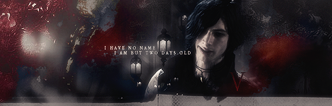
| So much hate for my tagwall T_T But yeah, I understand what you guys mean. @KuraiTomu I think reversing the render just ruined the flow. I also would have put the text next to his forearm. Again, you need to work on your lighting. I notice that you've been trying to go for a glossy feel with C4D signatures, which can be hard to pull off well. If you want some examples from someone who I think is good at that, try http://piritoo.deviantart.com. |
Sep 9, 2014 6:31 AM
#5813
Ryugen said: I think your tagwall is awesome, btw.So much hate for my tagwall T_T But yeah, I understand what you guys mean. @KuraiTomu I think reversing the render just ruined the flow. I also would have put the text next to his forearm. Again, you need to work on your lighting. I notice that you've been trying to go for a glossy feel with C4D signatures, which can be hard to pull off well. If you want some examples from someone who I think is good at that, try http://piritoo.deviantart.com. I have a doubt, 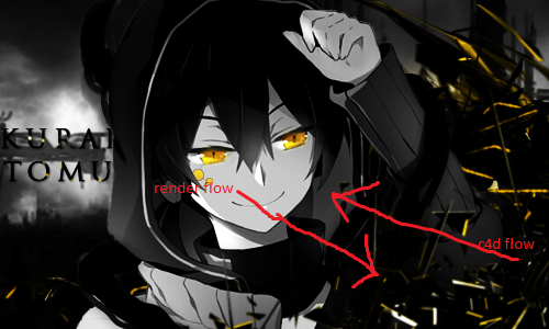 |
|
Sep 9, 2014 6:50 AM
#5814
| It's because the arm is going in the direction of the C4Ds. Think of it as bracing for impact of a wave, being consumed by the C4D. I think the whole thing would work better if you moved the render up a little and cut off 35px or so off the bottom, though, but that might just be my opinion from what I'm used to. |
Sep 9, 2014 7:27 AM
#5815
Ryugen said: ah I see now. Now I can't but later I'll try and do what you said, thanks.It's because the arm is going in the direction of the C4Ds. Think of it as bracing for impact of a wave, being consumed by the C4D. I think the whole thing would work better if you moved the render up a little and cut off 35px or so off the bottom, though, but that might just be my opinion from what I'm used to. |
|
Sep 9, 2014 8:19 AM
#5816

Ryugen said: @KuraiTomu Not the best place for the text imo. I also feel like you could have done something with the lighting to blend the signature together better. @Zelot Love the "doki doki" part. Nice job! @Isa Beautiful works as always, not much to say. I've been lazing around for the past month or so, just playing league. Finally I got the motivation to do something. I wasn't sure whether to make it blue or maroon, so I did both and put them in a tag wall. I like maroon better personally. Which is weird, because blue is my favorite color. ;p Blue connotates sadness, but red makes me think of death/tragic romance/roses. Updated my sig for the first time in like a year and a half... Not too great, might make another one today. |
Sep 9, 2014 8:31 AM
#5817
Made another one with an animal stock. I personally think my leopard sig was better, but.. feedback pwease~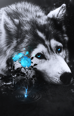 |
|
Sep 9, 2014 8:42 AM
#5818
Isa__ said: Made another one with an animal stock. I personally think my leopard sig was better, but.. feedback pwease~ Perty. I like your leopard one better as well though. |
Sep 9, 2014 9:10 AM
#5819
Ryugen said: Something like this? It's because the arm is going in the direction of the C4Ds. Think of it as bracing for impact of a wave, being consumed by the C4D. I think the whole thing would work better if you moved the render up a little and cut off 35px or so off the bottom, though, but that might just be my opinion from what I'm used to. 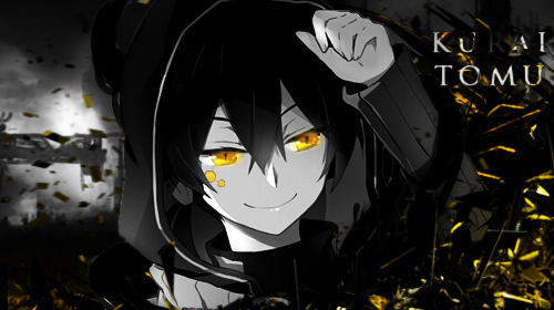 |
|
Sep 9, 2014 4:40 PM
#5820
KuraiTomu said: Ryugen said: Something like this? It's because the arm is going in the direction of the C4Ds. Think of it as bracing for impact of a wave, being consumed by the C4D. I think the whole thing would work better if you moved the render up a little and cut off 35px or so off the bottom, though, but that might just be my opinion from what I'm used to. Noooooo, don't put the text in the corner. I was talking about here:  |
Sep 9, 2014 11:29 PM
#5821
Ryugen said: Ooops. KuraiTomu said: Ryugen said: It's because the arm is going in the direction of the C4Ds. Think of it as bracing for impact of a wave, being consumed by the C4D. I think the whole thing would work better if you moved the render up a little and cut off 35px or so off the bottom, though, but that might just be my opinion from what I'm used to. Noooooo, don't put the text in the corner. I was talking about here: 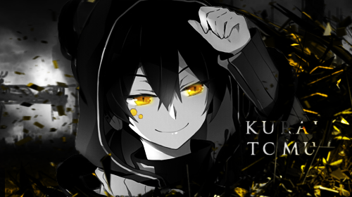 |
|
Sep 10, 2014 4:45 AM
#5822
Isa__ said: Made another one with an animal stock. I personally think my leopard sig was better, but.. feedback pwease~ The ripple looks weird. |
Sep 11, 2014 1:06 AM
#5823
Alright, I fixed my tagwall up. Tell me if it looks good now. |
Sep 11, 2014 1:13 AM
#5824
Sep 11, 2014 1:26 AM
#5825
| Yes, the circle. Or is that not water? I was under the impression he was lying down next to a puddle with a flower growing from it. |
Sep 11, 2014 3:04 AM
#5826

| Ryugen I TOTALLY like the maroon version.Great job :) |
| S H O U T _ O L D _ B U T _ G O L D |
Sep 11, 2014 3:25 AM
#5827
Ryugen said: Yes, the circle. Or is that not water? I was under the impression he was lying down next to a puddle with a flower growing from it. No it's.. well it's not SUPPOSED to be water. Anyone's free to interpret it as they like. It's not made to look realistic after all. |
|
Sep 11, 2014 5:20 AM
#5828
Isa__ said: I thought that was water too.Ryugen said: Yes, the circle. Or is that not water? I was under the impression he was lying down next to a puddle with a flower growing from it. No it's.. well it's not SUPPOSED to be water. Anyone's free to interpret it as they like. It's not made to look realistic after all. |
|
Sep 12, 2014 7:59 AM
#5829
| Hey,I updated my signature,what do you think? (I'm a beginner in photoshop though) |
| Signature removed. Please follow the signature rules, as defined in the Site & Forum Guidelines. |
Sep 12, 2014 8:03 AM
#5830
NaTaSo0 said: Hey,I updated my signature,what do you think? (I'm a beginner in photoshop though) Very nice for a beginner. :x The left side looks like you made the pic black and white and then inverted it. I would've liked it better not inverted. Hard to make it out as it is. Also not a fan of the font. |
Sep 14, 2014 4:24 PM
#5831
NaTaSo0 said: Hey,I updated my signature,what do you think? (I'm a beginner in photoshop though) Iirc... it was something that was half picture, half gif. My complaint would be to make the gif more "embedded" within in the signature rather than creating sections. Creates more unity. |
Sep 24, 2014 5:15 PM
#5832

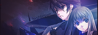
What do you guys think? Needs work? Where can I improve? |
 |
Sep 24, 2014 5:22 PM
#5833
| Thread Merged @hvshbrown The entire picture looks grainy... i'm not sure that I like it. There are these weird circle patterns in the sky that stand out a bit much and the text could use some work. Always avoid putting text in the middle, try using the Rules of Thirds. I do see that you did try to create depth by layering some things on top of the render which is great! I also think the colors all look nice, a dark purple that matches the rest of the picture. Oh, remove the water mark in the top left. |
Sep 25, 2014 3:04 PM
#5834
| Your lighting count use some work, otherwise I like the spacey feel to it. The grainy look isn't bad. I just think it would look better with some blurring for depth. The text is plain and doesn't fit. |
Sep 27, 2014 8:37 PM
#5835

| http://fc08.deviantart.net/fs70/f/2014/270/a/0/aldnoah_zero_by_takujay-d80sabh.png Hi everyone~ Long time no see! |
 |
Sep 27, 2014 8:48 PM
#5836
Takujay said: http://fc08.deviantart.net/fs70/f/2014/270/a/0/aldnoah_zero_by_takujay-d80sabh.png Hi everyone~ Long time no see! hate it i see a character i hate two hate it so much SO MUCHHHHHH Jokes, jokess I really like the text, though i think the colors don't really "flow" throughout the signature and the mecha in the back looks a bit out of place... I think it's the lighting. |
Sep 28, 2014 12:47 PM
#5837
Zelot said: Takujay said: http://fc08.deviantart.net/fs70/f/2014/270/a/0/aldnoah_zero_by_takujay-d80sabh.png Hi everyone~ Long time no see! hate it i see a character i hate two hate it so much SO MUCHHHHHH Jokes, jokess I really like the text, though i think the colors don't really "flow" throughout the signature and the mecha in the back looks a bit out of place... I think it's the lighting. Why Senpai. Slaine is love, Inaho is life. I didn't really know how to combine the colors of the renders...what do you think I could do with the lighting to fix it? And should I remove the mecha? |
|
Sep 28, 2014 1:25 PM
#5838
| @Takujay Yeah, i'd remove it and replace it with a mecha that fits in with the lighting more. The mecha has orange and a more saturated light blue lighting which doesn't fit with the lights coming from the background, from the left and right, respectively. |
|
Sep 28, 2014 2:55 PM
#5839
Takujay said: Zelot said: Takujay said: http://fc08.deviantart.net/fs70/f/2014/270/a/0/aldnoah_zero_by_takujay-d80sabh.png Hi everyone~ Long time no see! hate it i see a character i hate two hate it so much SO MUCHHHHHH Jokes, jokess I really like the text, though i think the colors don't really "flow" throughout the signature and the mecha in the back looks a bit out of place... I think it's the lighting. Why Senpai. Slaine is love, Inaho is life. I didn't really know how to combine the colors of the renders...what do you think I could do with the lighting to fix it? And should I remove the mecha? Inaho was fine and I really really really really really really really really really really really really really really really really really really really really really really really really really really really really really really really really really really really really really really really really really really really really really really really really really really really really really really really really really really really really really really really really really really really really really really really really really really really really really really really really really really really really really really really really really really really really really really really really really really really really really really really really really really really really really really really really really really really really really really really really really really really really really really really really really really really really really really really really really really really really really really really really really really really really really really really really really really really really really really really really really really really really really really really really really really really really really really really really really really really really really really really really really really really really really really really really really really really really really really really really really really really really really really really really really really really really really really really really really really really really really really really really really really really really really really really really really really really really really really really really really really really really really really really really really really really really really really really really really really really really really really really really really really really really really really really really really really really really really really really really really really really really really really really really really really really really really really really really really really really really really really really really really really really really really really really really really really really really really really really really really really really really really really really really really really really really really really really really really really really really really really really really really really really really really really really really really really really really really really really really really really really really really really really really really really really really really really really really really really really really really really really really really really really really really really really really really really really really really really really really really really really really really really really really really really really really really really really really really really really really really really really really really really really really really really really really really really really really really really really really really really really really really really really really really really really really really really really really really really really really really really really really really really really really really really really really really really really really really really really really really really really really really really really really really really really really really really really really really really really really really really really really really really really really really really really really really really really really really really really really really really really really really really really really really really really really really really really really really really really really really really really really really really really really really really really really really really really really really really really really really really really really really really really really really really really really really really really really really really really really really really really really really really really really really really really really really really really really really really really really really really really really really really really really really really really really really really really really really really really really really really really really really really really really really really really really really really really really really really really really really really really really really really really really really really really really really really really really really really really really really really really really really really really really really really really really really really really really really really really really really really really really really really really really really really really really really really really really really really really really really really really really really really really really really really really really really really really really really really really really really really really really really really really really really really really really really really really really really really really really really really but nooo that last episode >.> I liked the princess a lot though!!!! I would remove the mecha as well and look for a different one. The blue on Slaine matches well, you could add little accents that match Inaho's school uniform like little wisps of light |
Sep 28, 2014 7:05 PM
#5840
| But's it's Inaho's Orange Kataphrakt... @Shu-senpai and Zelot-senpai I'll remove the mecha and find...a...white? Light blue? Silver? What color mecha do I find? Should I remove the mecha all together and move the text to the center? @Zelot-Senpai Aldnoah/Zero Spoiler: WHY DID YOU KILL INAHO DAMMIT SLAINE UGH I LOVED U BUT U BETRAYED ME OMG INAHO WAS JUST CRAWLING TO THE PRINCESS YOU JEALOUS LITTLE BI- *cough* um yes. |
|
Sep 28, 2014 8:39 PM
#5841
Takujay said: FNWAGJAHGOASNKBAJIDHGAOJSOG I CLICKED IT.But's it's Inaho's Orange Kataphrakt... @Shu-senpai and Zelot-senpai I'll remove the mecha and find...a...white? Light blue? Silver? What color mecha do I find? Should I remove the mecha all together and move the text to the center? @Zelot-Senpai Aldnoah/Zero Spoiler: WHY DID YOU KILL INAHO DAMMIT SLAINE UGH I LOVED U BUT U BETRAYED ME OMG INAHO WAS JUST CRAWLING TO THE PRINCESS YOU JEALOUS LITTLE BI- *cough* um yes. |
|
Sep 28, 2014 8:54 PM
#5842
shuryukan said: Takujay said: FNWAGJAHGOASNKBAJIDHGAOJSOG I CLICKED IT.But's it's Inaho's Orange Kataphrakt... @Shu-senpai and Zelot-senpai I'll remove the mecha and find...a...white? Light blue? Silver? What color mecha do I find? Should I remove the mecha all together and move the text to the center? @Zelot-Senpai Aldnoah/Zero Spoiler: WHY DID YOU KILL INAHO DAMMIT SLAINE UGH I LOVED U BUT U BETRAYED ME OMG INAHO WAS JUST CRAWLING TO THE PRINCESS YOU JEALOUS LITTLE BI- *cough* um yes. WHY'D YOU CLICK IT???? D: @Takujay-chan I do think the orange mecha would work.. if you change the colors a bit on both inaho and the mecha, but do look for a brighter picture. but i would also suggest maybe putting in slaines jet thingy in as well. eh, it maybe too much. also.. IKR???? WHYYYYY I WAS REALLY LIKING THAT CHARCTER |
Sep 28, 2014 10:05 PM
#5843
Zelot said: COMPLETELY OFF TOPIC NOW BUT HE'S MY FAV CHAR. WTF. WHY DID I CLICK THAT.shuryukan said: Takujay said: But's it's Inaho's Orange Kataphrakt... @Shu-senpai and Zelot-senpai I'll remove the mecha and find...a...white? Light blue? Silver? What color mecha do I find? Should I remove the mecha all together and move the text to the center? @Zelot-Senpai Aldnoah/Zero Spoiler: WHY DID YOU KILL INAHO DAMMIT SLAINE UGH I LOVED U BUT U BETRAYED ME OMG INAHO WAS JUST CRAWLING TO THE PRINCESS YOU JEALOUS LITTLE BI- *cough* um yes. WHY'D YOU CLICK IT???? D: @Takujay-chan I do think the orange mecha would work.. if you change the colors a bit on both inaho and the mecha, but do look for a brighter picture. but i would also suggest maybe putting in slaines jet thingy in as well. eh, it maybe too much. also.. IKR???? WHYYYYY I WAS REALLY LIKING THAT CHARCTER |
|
Sep 29, 2014 4:59 PM
#5844
shuryukan said: Zelot said: COMPLETELY OFF TOPIC NOW BUT HE'S MY FAV CHAR. WTF. WHY DID I CLICK THAT.shuryukan said: Takujay said: FNWAGJAHGOASNKBAJIDHGAOJSOG I CLICKED IT.But's it's Inaho's Orange Kataphrakt... @Shu-senpai and Zelot-senpai I'll remove the mecha and find...a...white? Light blue? Silver? What color mecha do I find? Should I remove the mecha all together and move the text to the center? @Zelot-Senpai Aldnoah/Zero Spoiler: WHY DID YOU KILL INAHO DAMMIT SLAINE UGH I LOVED U BUT U BETRAYED ME OMG INAHO WAS JUST CRAWLING TO THE PRINCESS YOU JEALOUS LITTLE BI- *cough* um yes. WHY'D YOU CLICK IT???? D: @Takujay-chan I do think the orange mecha would work.. if you change the colors a bit on both inaho and the mecha, but do look for a brighter picture. but i would also suggest maybe putting in slaines jet thingy in as well. eh, it maybe too much. also.. IKR???? WHYYYYY I WAS REALLY LIKING THAT CHARCTER WHY DID YOU CLICK IT I PUT SPOILER FOR A REASON NOOOOOOOOOOO SHU-SENPAI I couldn't find a render of Slaine's Carrier Jet, I was thinking of putting it as well. |
|
Oct 2, 2014 1:55 AM
#5846

Everonica said: Updated signature :3 Looks really nice. It almost puts my sig to shame. |
 |
Oct 2, 2014 3:54 AM
#5847
loserboi said: Everonica said: Updated signature :3 Looks really nice. It almost puts my sig to shame. I hope for the sake of my faith in humanity, that you are not serious. Looks sweet, Shu ^^ |
|
Oct 2, 2014 5:42 PM
#5848
| Nice sig Everonica. The only thing that bothers me is the snowflake on her chest, it seems a little over-sharpened or something. Great typography! |
|
Oct 3, 2014 12:46 PM
#5849
One of the recents. Was a request :)  |
 |
Oct 5, 2014 10:53 PM
#5850
Updated signature after long time |
More topics from this board
» Forum setsSweetIcedMocha - Yesterday |
3 |
by playfulcloud88
»»
2 hours ago |
|
» I made a Browser Extension that let you watch anime from MyAnimeList and moreKuronekoNy4n - 12 hours ago |
0 |
by KuronekoNy4n
»»
12 hours ago |
|
» colourful modern list (adapted from Clarity)sunnysummerday - Oct 14 |
4 |
by sunnysummerday
»»
Yesterday, 2:17 PM |
|
» Sakura Kinomoto ♥ Happy HalloweenMasterTasuke - Yesterday |
0 |
by MasterTasuke
»»
Yesterday, 6:35 AM |
|
» I made a Guess the Anime Opening Mobile AppPortega - Oct 15 |
0 |
by Portega
»»
Oct 15, 10:31 PM |