New
Dec 30, 2009 1:01 AM
#1

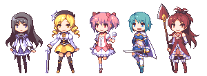
Sample 1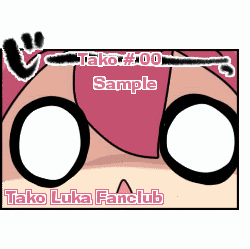 Sample 2 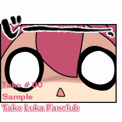 THIS IS N'T OPEN FOR REQUESTING!! I WANT HELP TO CHOOSE WHICH OF THE SAMPLES TO ACTUALLY USE Also please if you have any better ideas for the name/number and fanclub name please say, I mean like suggestion other colors for the font or where else on the card to put it |
 |
Reply Disabled for Non-Club Members
Dec 30, 2009 1:03 AM
#2

| I like the second one, But I think it'd be best to leave the text outside the comic/box. :] Lovely and cute <33 |
Dec 30, 2009 1:07 AM
#3
VioletRebellion said: I like the second one, But I think it'd be best to leave the text outside the comic/box. :] Lovely and cute <33 so do you think I should put the name and number on the top of the card? Also the cards turnt out smaller than expected :s I probably was zoomed in on them when I made them |
| |
Dec 30, 2009 1:10 AM
#4
Yay said: VioletRebellion said: I like the second one, But I think it'd be best to leave the text outside the comic/box. :] Lovely and cute <33 so do you think I should put the name and number on the top of the card? Also the cards turnt out smaller than expected :s I probably was zoomed in on them when I made them That happens to me, except instead of small... it's wayy too big xD Yes, I think so. Unless you wanna put the number at the bottom, because someone might have a long user name.. |
Dec 30, 2009 1:18 AM
#5
VioletRebellion said: Yay said: VioletRebellion said: I like the second one, But I think it'd be best to leave the text outside the comic/box. :] Lovely and cute <33 so do you think I should put the name and number on the top of the card? Also the cards turnt out smaller than expected :s I probably was zoomed in on them when I made them That happens to me, except instead of small... it's wayy too big xD Yes, I think so. Unless you wanna put the number at the bottom, because someone might have a long user name.. Ah yeah I hate that *looks at your username* Ah I mean I don't mind at all...... But seriously your name is ok, I just hate when the have a weird one with random letters and numbers and randomly placed capitals Thinking about it people must look forward to doing me member cards, just three letters Yay XD |
| |
Dec 30, 2009 1:40 AM
#6

| I'd go with the second one, but I'd rather have the FC name in the picture, and the user information in a smaller font below it or something. |
Dec 30, 2009 8:41 AM
#7

| I like the first one only because the text should almost always be outlined if you're not putting anything behind it. If it's not, it becomes much harder to read the username/number/etc. You can place the text wherever you want though. |
Dec 30, 2009 11:36 AM
#8

Jan 12, 2010 10:44 AM
#9

| I say #1. The only improvment it needs is to have the Member Name should be a little closer towards the Member Number on the top. :) |
 |
Mar 20, 2010 11:00 AM
#10

| firsttt onee :3 |
      M U S I C |


Apr 25, 2010 6:08 PM
#13

| I enjoy the first one~ |
  |
Jun 22, 2010 5:35 PM
#14

| For me it's the first one. :3 |
| Here's a llama, there's a llama, and another little llama, fuzzy llama, funny llama, llama llama DUCK! |
Aug 1, 2010 8:37 PM
#15
| first one! :) |
Aug 9, 2010 9:19 AM
#16

| I prefere the second one =3 |
Apr 29, 2012 4:55 PM
#17

| First one~ I want the cards soon x) |
  |
Reply Disabled for Non-Club Members