Attack on Titan
Available on Manga Store
New

Nov 27, 2020 1:55 PM
#52
I know right? Ugh... |
Nov 27, 2020 1:55 PM
#53

Saray said: @Crimsunreaper I couldn't agree more. I was literally thinking the same thing! You're not the only one to have this opinion so thank you! No problem, man. I was never a fan of rationalizing shortcomings or being apologetic to studios just because they are producing a series that I enjoy. Being frank and keeping it real is the best thing to do right now. I can already tell most casuals probably won't enjoy this as much as the last seasons. Too bad though because this season could've easily been the most cogent and powerfully gripping season due to its thought-provoking material and writing. Now I believe it's precarious to tell for sure. |
 |
Nov 27, 2020 1:57 PM
#54

Sorry to burst your bubble, but Mikasa was always supposed to look like that, WIT wasn't accurate to her true designs (of which Isayama told them not to but they still did) and Eren's designs have not been released yet so I am not sure what you are on about. Also, Mikasa's face is very womanly and beautiful, and if it is her body shape that disturbs you, I would imagine being a soldier all your life would do that. Keep in mind that the way she is standing in the sheet also gives her an exaggerated non-hourglass like look, the one that most people are used to. |
Nov 27, 2020 1:58 PM
#55
Artay said: Mikasa looks more like a man then Eren, just why. Because she is more realistic with this design, before she was muscular but her old character design was inconsistent in showing reality, because her torso did not match her muscular physique. It seemed that in the past I was seeing a person with almost no physical appearance even though the anime said that he was strong, now it is much more credible with the new design to say that this is consistent now. |
Nov 27, 2020 2:00 PM
#56
Crimsunreaper said: Saray said: @Crimsunreaper I couldn't agree more. I was literally thinking the same thing! You're not the only one to have this opinion so thank you! No problem, man. I was never a fan of rationalizing shortcomings or being apologetic to studios just because they are producing a series that I enjoy. Being frank and keeping it real is the best thing to do right now. I can already tell most casuals probably won't enjoy this as much as the last seasons. Too bad though because this season could've easily been the most cogent and powerfully gripping season due to its thought-provoking material and writing. Now I believe it's precarious to tell for sure. Lol I wouldn't think that people would dislike the whole series just because Mikasa's character design doesn't look like her previous designs. |
Nov 27, 2020 2:01 PM
#57
Crimsunreaper said: Saray said: @Crimsunreaper I couldn't agree more. I was literally thinking the same thing! You're not the only one to have this opinion so thank you! No problem, man. I was never a fan of rationalizing shortcomings or being apologetic to studios just because they are producing a series that I enjoy. Being frank and keeping it real is the best thing to do right now. I can already tell most casuals probably won't enjoy this as much as the last seasons. Too bad though because this season could've easily been the most cogent and powerfully gripping season due to its thought-provoking material and writing. Now I believe it's precarious to tell for sure. This comment made my day, is so hilarious 😂😂 |
Nov 27, 2020 2:03 PM
#58
Zprotu said: Have you not seen Eren's new look in the anime? Because it is out.Sorry to burst your bubble, but Mikasa was always supposed to look like that, WIT wasn't accurate to her true designs (of which Isayama told them not to but they still did) and Eren's designs have not been released yet so I am not sure what you are on about. Also, Mikasa's face is very womanly and beautiful, and if it is her body shape that disturbs you, I would imagine being a soldier all your life would do that. Keep in mind that the way she is standing in the sheet also gives her an exaggerated non-hourglass like look, the one that most people are used to. |
Nov 27, 2020 2:06 PM
#59
z7ProSpyce said: Crimsunreaper said: keragamming said: Crimsunreaper said: keragamming said: Crimsunreaper said: My greatest issue with Mappa has always been that I felt they were an unmotivated studio always striving to achieve the absolute minimum to attain acceptable status. These designs just prove my point, they basically copy and pasted manga designs with no improvement upon the author's work or refinement towards the current formula. Mappa is well-known for this kind of stuff. They gave granblue fantasy the same treatment where they butchered and sucked all the life out of it in their sequel after its license was referred from A-1 pictures to Mappa. These designs just reaffirmed my concerns and I'm not in the least bit surprised or impressed. Wut! The design looks.like the manga but actually looks better than the manga, they have improved upon it and everyone that looks at this has said the designs are way too complex, so how can a complex design considered to be unmotivated or the best minimum when it is this detail??? Animators are struggling because of how detail and complex this design is and if you compare the manga and this they do look different and mappa design looks more refine. Kishi isn't even the character designer for the sequel for granblur fantasy so what you on about? Or you are going to lump them all since they all work at Mappa. You seem ignorant to the whole anime industry, FYI there are more than one character designer in a studio, also we have animators for snk overworking to get the best possible quality and you are going to shit on the entire series just because the designs look similar to the manga? Dude if you are coming in with that mindset don't even bother watching the series. Pure disrespect to these animators. You whole argument makes no fucking sense from the very tense, you must be high or a troll, if you a troll good job. The designs look the literal same from the manga, you can compare them, there is not difference aside from different shades and colors. Let's not turn this into Animators are trying their best and work x hours a day so so you can't criticize the anime because it's a non-argument. A studio's work is representative of their merits and talent. Doesn't matter who is the character designer if his organization has an incongruent vision to his, they have the final say. Good job for deeming me as a troll and assuming things about me from our first interaction to undermine my argument. Really goes to show how civilized and respectful you are!! The designs look the literal same from the manga No point arguing, because I disagree and many others disagree as well. And I also don't see anything wrong if a studio tries and replicate the manga character designs (which is normal btw) Even wit studio change their design because Isayama wanted it to look more like the manga in season 3, I'm pretty sure you notice the big change between season 1 design and season 3 and it looked a bit more similar to the manga, the mappa version just looks more similar to the manga but it has its difference and you can tell is the character designer for Banana fish anime as they look similar to that design. So its a mixture of Isayama and Kishi style, go look at Banana fish for reference. Sure I wouldn't have a problem if they replicated the manga designs if they were on par with wit's designs. But this to me, feels like a step-down from its excellent predecessors. If you like it, then by all means do so. Just here to share my thoughts and express my opinion. In any case, we'll find out very soon if this meets expectations or if its another blemish on Mappa's track record. ??? Do you know what you're talking about? No! Wit Studio has not made any improvements in character design! The design of character's in the manga was horrible, there was no way to adapt, so together with Production I.G they created a original design, not a improvement design. They make the design in your style, it's not mean that this was a improvement. No! MAPPA is not just copying, they are remodeling and making changes too. What MAPPA is doing is to follow the original material in a certain way and make changes, giving Isayama's art an opportunity that has improved A LOT! Honestly, how much lack of common sense and knowledge, it's okay not to like the designs, I don't judge you for that. But at least rate it correctly! Not just out of guesswork. Wit studio reinvented the wheel and reimagined Isayama's old designs. You might not like it but the critical acclaim and the sales of the anime due to the phenomenal action scenes and artstyle is undeniable. Even if the designs are decent I don't think it will appeal to a lot of casuals simply because they aren't as flashy as before. It's not an original design if anything it's mostly improvisation and some inconsistency, this a far cry from even being called an improved design. lol |
|
Nov 27, 2020 2:07 PM
#60
Artay said: Zprotu said: Have you not seen Eren's new look in the anime? Because it is out.Sorry to burst your bubble, but Mikasa was always supposed to look like that, WIT wasn't accurate to her true designs (of which Isayama told them not to but they still did) and Eren's designs have not been released yet so I am not sure what you are on about. Also, Mikasa's face is very womanly and beautiful, and if it is her body shape that disturbs you, I would imagine being a soldier all your life would do that. Keep in mind that the way she is standing in the sheet also gives her an exaggerated non-hourglass like look, the one that most people are used to. I'm assuming you're either referring to his look in the PV or the promotional merchandise that looked like WIT's Eren at the beach scene. The one in the PV looks like a real man, I mean I don't know how you would find him womanly and I prefer him the way he looks in the PV. As for the merchandise promotional design thing that looked like beach scene Eren, he was standing right beside MAPPA's Mikasa and you can easily tell that she is obviously more womanly than him (as it is supposed to be like loool) Crimsunreaper said: z7ProSpyce said: Crimsunreaper said: keragamming said: Crimsunreaper said: keragamming said: Crimsunreaper said: My greatest issue with Mappa has always been that I felt they were an unmotivated studio always striving to achieve the absolute minimum to attain acceptable status. These designs just prove my point, they basically copy and pasted manga designs with no improvement upon the author's work or refinement towards the current formula. Mappa is well-known for this kind of stuff. They gave granblue fantasy the same treatment where they butchered and sucked all the life out of it in their sequel after its license was referred from A-1 pictures to Mappa. These designs just reaffirmed my concerns and I'm not in the least bit surprised or impressed. Wut! The design looks.like the manga but actually looks better than the manga, they have improved upon it and everyone that looks at this has said the designs are way too complex, so how can a complex design considered to be unmotivated or the best minimum when it is this detail??? Animators are struggling because of how detail and complex this design is and if you compare the manga and this they do look different and mappa design looks more refine. Kishi isn't even the character designer for the sequel for granblur fantasy so what you on about? Or you are going to lump them all since they all work at Mappa. You seem ignorant to the whole anime industry, FYI there are more than one character designer in a studio, also we have animators for snk overworking to get the best possible quality and you are going to shit on the entire series just because the designs look similar to the manga? Dude if you are coming in with that mindset don't even bother watching the series. Pure disrespect to these animators. You whole argument makes no fucking sense from the very tense, you must be high or a troll, if you a troll good job. The designs look the literal same from the manga, you can compare them, there is not difference aside from different shades and colors. Let's not turn this into Animators are trying their best and work x hours a day so so you can't criticize the anime because it's a non-argument. A studio's work is representative of their merits and talent. Doesn't matter who is the character designer if his organization has an incongruent vision to his, they have the final say. Good job for deeming me as a troll and assuming things about me from our first interaction to undermine my argument. Really goes to show how civilized and respectful you are!! The designs look the literal same from the manga No point arguing, because I disagree and many others disagree as well. And I also don't see anything wrong if a studio tries and replicate the manga character designs (which is normal btw) Even wit studio change their design because Isayama wanted it to look more like the manga in season 3, I'm pretty sure you notice the big change between season 1 design and season 3 and it looked a bit more similar to the manga, the mappa version just looks more similar to the manga but it has its difference and you can tell is the character designer for Banana fish anime as they look similar to that design. So its a mixture of Isayama and Kishi style, go look at Banana fish for reference. Sure I wouldn't have a problem if they replicated the manga designs if they were on par with wit's designs. But this to me, feels like a step-down from its excellent predecessors. If you like it, then by all means do so. Just here to share my thoughts and express my opinion. In any case, we'll find out very soon if this meets expectations or if its another blemish on Mappa's track record. ??? Do you know what you're talking about? No! Wit Studio has not made any improvements in character design! The design of character's in the manga was horrible, there was no way to adapt, so together with Production I.G they created a original design, not a improvement design. They make the design in your style, it's not mean that this was a improvement. No! MAPPA is not just copying, they are remodeling and making changes too. What MAPPA is doing is to follow the original material in a certain way and make changes, giving Isayama's art an opportunity that has improved A LOT! Honestly, how much lack of common sense and knowledge, it's okay not to like the designs, I don't judge you for that. But at least rate it correctly! Not just out of guesswork. Wit studio reinvented the wheel and reimagined Isayama's old designs. You might not like it but the critical acclaim and the sales of the anime due to the phenomenal action scenes and artstyle is undeniable. Even if the designs are decent I don't think it will appeal to a lot of casuals simply because they aren't as flashy as before. It's not an original design if anything it's mostly improvisation and some inconsistency, this a far cry from even being called an improved design. lol There is no need for the artstyle to be flashy for this season. Most would prefer it not to be actually, considering the themes and what is to come. |
Nov 27, 2020 2:10 PM
#61
Zprotu said: Crimsunreaper said: Saray said: @Crimsunreaper I couldn't agree more. I was literally thinking the same thing! You're not the only one to have this opinion so thank you! No problem, man. I was never a fan of rationalizing shortcomings or being apologetic to studios just because they are producing a series that I enjoy. Being frank and keeping it real is the best thing to do right now. I can already tell most casuals probably won't enjoy this as much as the last seasons. Too bad though because this season could've easily been the most cogent and powerfully gripping season due to its thought-provoking material and writing. Now I believe it's precarious to tell for sure. Lol I wouldn't think that people would dislike the whole series just because Mikasa's character design doesn't look like her previous designs. When did i say it was because of Mikasa? You can't argue without twisting narratives? It's more of a holistic issue rather than a specific problem I have with a character. |
|
Nov 27, 2020 2:14 PM
#62
Crimsunreaper said: Zprotu said: Crimsunreaper said: Saray said: @Crimsunreaper I couldn't agree more. I was literally thinking the same thing! You're not the only one to have this opinion so thank you! No problem, man. I was never a fan of rationalizing shortcomings or being apologetic to studios just because they are producing a series that I enjoy. Being frank and keeping it real is the best thing to do right now. I can already tell most casuals probably won't enjoy this as much as the last seasons. Too bad though because this season could've easily been the most cogent and powerfully gripping season due to its thought-provoking material and writing. Now I believe it's precarious to tell for sure. Lol I wouldn't think that people would dislike the whole series just because Mikasa's character design doesn't look like her previous designs. When did i say it was because of Mikasa? You can't argue without twisting narratives? It's more of a holistic issue rather than a specific problem I have with a character. Sorry my bad I was looking at something else and managed to confuse what you wrote and what was shown there. To truly reply to you, I would say that the character designs and artstyle is good enough for everyone to adapt to. Some actually prefer this over what WIT did, and some would rather have WIT's style, which is understandable. But yea they wouldn't be disappointed for long, if they do get disappointed anyway. |
Nov 27, 2020 2:15 PM
#63
Crimsunreaper said: z7ProSpyce said: Crimsunreaper said: keragamming said: Crimsunreaper said: keragamming said: Crimsunreaper said: My greatest issue with Mappa has always been that I felt they were an unmotivated studio always striving to achieve the absolute minimum to attain acceptable status. These designs just prove my point, they basically copy and pasted manga designs with no improvement upon the author's work or refinement towards the current formula. Mappa is well-known for this kind of stuff. They gave granblue fantasy the same treatment where they butchered and sucked all the life out of it in their sequel after its license was referred from A-1 pictures to Mappa. These designs just reaffirmed my concerns and I'm not in the least bit surprised or impressed. Wut! The design looks.like the manga but actually looks better than the manga, they have improved upon it and everyone that looks at this has said the designs are way too complex, so how can a complex design considered to be unmotivated or the best minimum when it is this detail??? Animators are struggling because of how detail and complex this design is and if you compare the manga and this they do look different and mappa design looks more refine. Kishi isn't even the character designer for the sequel for granblur fantasy so what you on about? Or you are going to lump them all since they all work at Mappa. You seem ignorant to the whole anime industry, FYI there are more than one character designer in a studio, also we have animators for snk overworking to get the best possible quality and you are going to shit on the entire series just because the designs look similar to the manga? Dude if you are coming in with that mindset don't even bother watching the series. Pure disrespect to these animators. You whole argument makes no fucking sense from the very tense, you must be high or a troll, if you a troll good job. The designs look the literal same from the manga, you can compare them, there is not difference aside from different shades and colors. Let's not turn this into Animators are trying their best and work x hours a day so so you can't criticize the anime because it's a non-argument. A studio's work is representative of their merits and talent. Doesn't matter who is the character designer if his organization has an incongruent vision to his, they have the final say. Good job for deeming me as a troll and assuming things about me from our first interaction to undermine my argument. Really goes to show how civilized and respectful you are!! The designs look the literal same from the manga No point arguing, because I disagree and many others disagree as well. And I also don't see anything wrong if a studio tries and replicate the manga character designs (which is normal btw) Even wit studio change their design because Isayama wanted it to look more like the manga in season 3, I'm pretty sure you notice the big change between season 1 design and season 3 and it looked a bit more similar to the manga, the mappa version just looks more similar to the manga but it has its difference and you can tell is the character designer for Banana fish anime as they look similar to that design. So its a mixture of Isayama and Kishi style, go look at Banana fish for reference. Sure I wouldn't have a problem if they replicated the manga designs if they were on par with wit's designs. But this to me, feels like a step-down from its excellent predecessors. If you like it, then by all means do so. Just here to share my thoughts and express my opinion. In any case, we'll find out very soon if this meets expectations or if its another blemish on Mappa's track record. ??? Do you know what you're talking about? No! Wit Studio has not made any improvements in character design! The design of character's in the manga was horrible, there was no way to adapt, so together with Production I.G they created a original design, not a improvement design. They make the design in your style, it's not mean that this was a improvement. No! MAPPA is not just copying, they are remodeling and making changes too. What MAPPA is doing is to follow the original material in a certain way and make changes, giving Isayama's art an opportunity that has improved A LOT! Honestly, how much lack of common sense and knowledge, it's okay not to like the designs, I don't judge you for that. But at least rate it correctly! Not just out of guesswork. Wit studio reinvented the wheel and reimagined Isayama's old designs. You might not like it but the critical acclaim and the sales of the anime due to the phenomenal action scenes and artstyle is undeniable. Even if the designs are decent I don't think it will appeal to a lot of casuals simply because they aren't as flashy as before. It's not an original design if anything it's mostly improvisation and some inconsistency, this a far cry from even being called an improved design. lol No! It's a original remodel design. Sorry but this discussion this will not work with me, you are analyzing it wrong. And since when I denied out, I said I didn't like Wit's designs ??? lol....... I love Wit's design but is a fact that it's not a improvement design. What further proves this is that on S1 and S2, they used THICC lines. These lines are generally used when the artwork is not finished, or is not developed yet. So much so that there were several changes in the art after S1, either in the lines or character design itself. Bye. |
Nov 27, 2020 2:15 PM
#64
Zprotu said: Wait, when did i call Eren womanly?Artay said: Zprotu said: Sorry to burst your bubble, but Mikasa was always supposed to look like that, WIT wasn't accurate to her true designs (of which Isayama told them not to but they still did) and Eren's designs have not been released yet so I am not sure what you are on about. Also, Mikasa's face is very womanly and beautiful, and if it is her body shape that disturbs you, I would imagine being a soldier all your life would do that. Keep in mind that the way she is standing in the sheet also gives her an exaggerated non-hourglass like look, the one that most people are used to. I'm assuming you're either referring to his look in the PV or the promotional merchandise that looked like WIT's Eren at the beach scene. The one in the PV looks like a real man, I mean I don't know how you would find him womanly and I prefer him the way he looks in the PV. As for the merchandise promotional design thing that looked like beach scene Eren, he was standing right beside MAPPA's Mikasa and you can easily tell that she is obviously more womanly than him (as it is supposed to be like loool) Crimsunreaper said: z7ProSpyce said: Crimsunreaper said: keragamming said: Crimsunreaper said: keragamming said: Crimsunreaper said: My greatest issue with Mappa has always been that I felt they were an unmotivated studio always striving to achieve the absolute minimum to attain acceptable status. These designs just prove my point, they basically copy and pasted manga designs with no improvement upon the author's work or refinement towards the current formula. Mappa is well-known for this kind of stuff. They gave granblue fantasy the same treatment where they butchered and sucked all the life out of it in their sequel after its license was referred from A-1 pictures to Mappa. These designs just reaffirmed my concerns and I'm not in the least bit surprised or impressed. Wut! The design looks.like the manga but actually looks better than the manga, they have improved upon it and everyone that looks at this has said the designs are way too complex, so how can a complex design considered to be unmotivated or the best minimum when it is this detail??? Animators are struggling because of how detail and complex this design is and if you compare the manga and this they do look different and mappa design looks more refine. Kishi isn't even the character designer for the sequel for granblur fantasy so what you on about? Or you are going to lump them all since they all work at Mappa. You seem ignorant to the whole anime industry, FYI there are more than one character designer in a studio, also we have animators for snk overworking to get the best possible quality and you are going to shit on the entire series just because the designs look similar to the manga? Dude if you are coming in with that mindset don't even bother watching the series. Pure disrespect to these animators. You whole argument makes no fucking sense from the very tense, you must be high or a troll, if you a troll good job. The designs look the literal same from the manga, you can compare them, there is not difference aside from different shades and colors. Let's not turn this into Animators are trying their best and work x hours a day so so you can't criticize the anime because it's a non-argument. A studio's work is representative of their merits and talent. Doesn't matter who is the character designer if his organization has an incongruent vision to his, they have the final say. Good job for deeming me as a troll and assuming things about me from our first interaction to undermine my argument. Really goes to show how civilized and respectful you are!! The designs look the literal same from the manga No point arguing, because I disagree and many others disagree as well. And I also don't see anything wrong if a studio tries and replicate the manga character designs (which is normal btw) Even wit studio change their design because Isayama wanted it to look more like the manga in season 3, I'm pretty sure you notice the big change between season 1 design and season 3 and it looked a bit more similar to the manga, the mappa version just looks more similar to the manga but it has its difference and you can tell is the character designer for Banana fish anime as they look similar to that design. So its a mixture of Isayama and Kishi style, go look at Banana fish for reference. Sure I wouldn't have a problem if they replicated the manga designs if they were on par with wit's designs. But this to me, feels like a step-down from its excellent predecessors. If you like it, then by all means do so. Just here to share my thoughts and express my opinion. In any case, we'll find out very soon if this meets expectations or if its another blemish on Mappa's track record. ??? Do you know what you're talking about? No! Wit Studio has not made any improvements in character design! The design of character's in the manga was horrible, there was no way to adapt, so together with Production I.G they created a original design, not a improvement design. They make the design in your style, it's not mean that this was a improvement. No! MAPPA is not just copying, they are remodeling and making changes too. What MAPPA is doing is to follow the original material in a certain way and make changes, giving Isayama's art an opportunity that has improved A LOT! Honestly, how much lack of common sense and knowledge, it's okay not to like the designs, I don't judge you for that. But at least rate it correctly! Not just out of guesswork. Wit studio reinvented the wheel and reimagined Isayama's old designs. You might not like it but the critical acclaim and the sales of the anime due to the phenomenal action scenes and artstyle is undeniable. Even if the designs are decent I don't think it will appeal to a lot of casuals simply because they aren't as flashy as before. It's not an original design if anything it's mostly improvisation and some inconsistency, this a far cry from even being called an improved design. lol There is no need for the artstyle to be flashy for this season. Most would prefer it not to be actually, considering the themes and what is to come. |
Nov 27, 2020 2:16 PM
#65

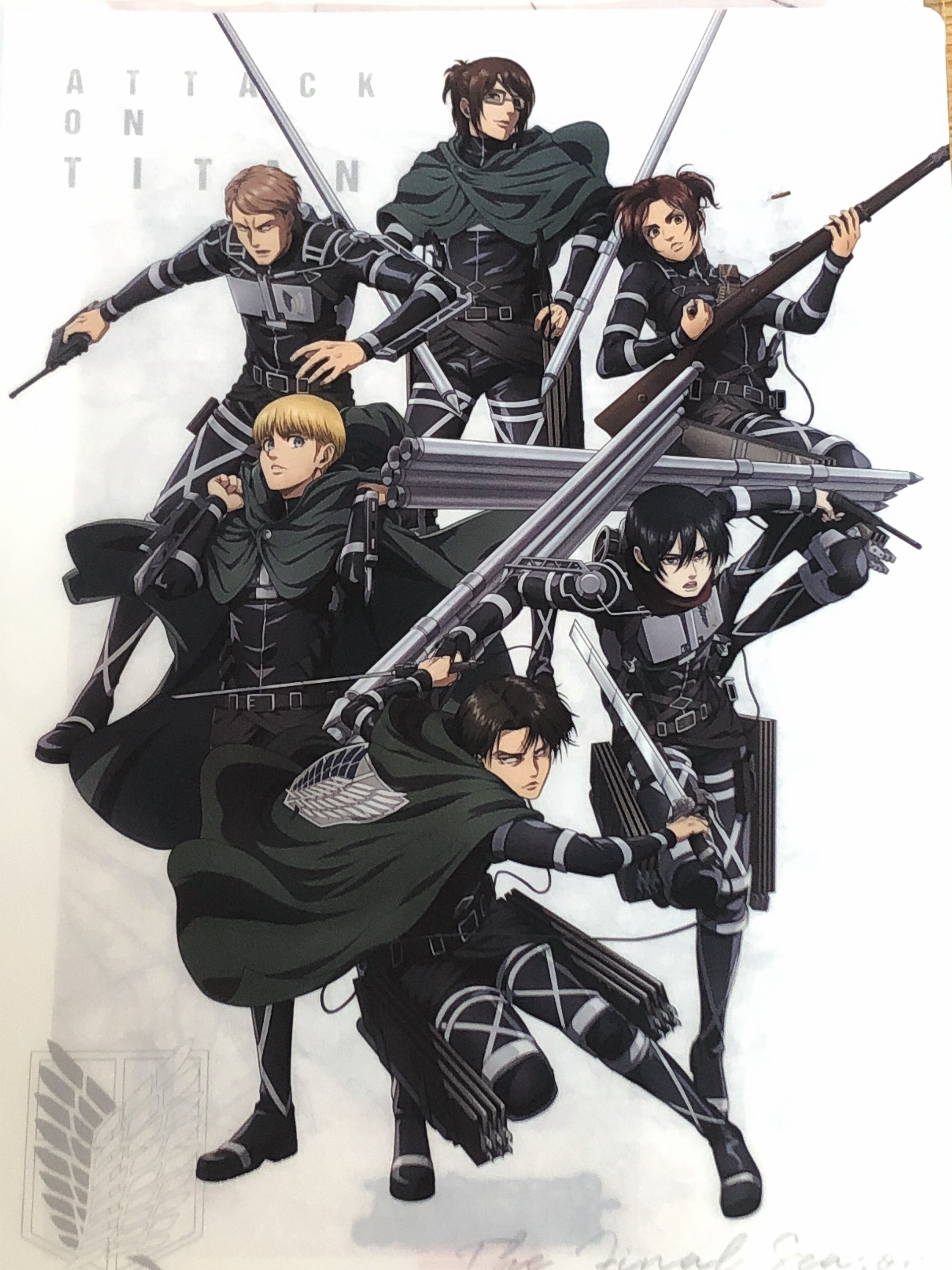
| People are talking about how manga accurate they look while ignoring how big their bodies are. They look thick as fuck compared to manga where most of the people look borderline malnourished, which makes them look much more intense and threatening. If this is really accurate, everyone must have put on some weight after chapter 90 then. Other than this, I like how their faces are drawn here, but in PV they looked terrible except for Connie. I'm curious about how will they actually look in anime with shades and colors added. My biggest fear is lesser characters/extras looking bland and distracting because they won't have Wit's flair anymore, they need to add details to make up for it |
Nov 27, 2020 2:18 PM
#66
Artay said: Zprotu said: Wait, when did i call Eren womanly?Artay said: Zprotu said: Have you not seen Eren's new look in the anime? Because it is out.Sorry to burst your bubble, but Mikasa was always supposed to look like that, WIT wasn't accurate to her true designs (of which Isayama told them not to but they still did) and Eren's designs have not been released yet so I am not sure what you are on about. Also, Mikasa's face is very womanly and beautiful, and if it is her body shape that disturbs you, I would imagine being a soldier all your life would do that. Keep in mind that the way she is standing in the sheet also gives her an exaggerated non-hourglass like look, the one that most people are used to. I'm assuming you're either referring to his look in the PV or the promotional merchandise that looked like WIT's Eren at the beach scene. The one in the PV looks like a real man, I mean I don't know how you would find him womanly and I prefer him the way he looks in the PV. As for the merchandise promotional design thing that looked like beach scene Eren, he was standing right beside MAPPA's Mikasa and you can easily tell that she is obviously more womanly than him (as it is supposed to be like loool) Crimsunreaper said: z7ProSpyce said: Crimsunreaper said: keragamming said: Crimsunreaper said: keragamming said: Crimsunreaper said: My greatest issue with Mappa has always been that I felt they were an unmotivated studio always striving to achieve the absolute minimum to attain acceptable status. These designs just prove my point, they basically copy and pasted manga designs with no improvement upon the author's work or refinement towards the current formula. Mappa is well-known for this kind of stuff. They gave granblue fantasy the same treatment where they butchered and sucked all the life out of it in their sequel after its license was referred from A-1 pictures to Mappa. These designs just reaffirmed my concerns and I'm not in the least bit surprised or impressed. Wut! The design looks.like the manga but actually looks better than the manga, they have improved upon it and everyone that looks at this has said the designs are way too complex, so how can a complex design considered to be unmotivated or the best minimum when it is this detail??? Animators are struggling because of how detail and complex this design is and if you compare the manga and this they do look different and mappa design looks more refine. Kishi isn't even the character designer for the sequel for granblur fantasy so what you on about? Or you are going to lump them all since they all work at Mappa. You seem ignorant to the whole anime industry, FYI there are more than one character designer in a studio, also we have animators for snk overworking to get the best possible quality and you are going to shit on the entire series just because the designs look similar to the manga? Dude if you are coming in with that mindset don't even bother watching the series. Pure disrespect to these animators. You whole argument makes no fucking sense from the very tense, you must be high or a troll, if you a troll good job. The designs look the literal same from the manga, you can compare them, there is not difference aside from different shades and colors. Let's not turn this into Animators are trying their best and work x hours a day so so you can't criticize the anime because it's a non-argument. A studio's work is representative of their merits and talent. Doesn't matter who is the character designer if his organization has an incongruent vision to his, they have the final say. Good job for deeming me as a troll and assuming things about me from our first interaction to undermine my argument. Really goes to show how civilized and respectful you are!! The designs look the literal same from the manga No point arguing, because I disagree and many others disagree as well. And I also don't see anything wrong if a studio tries and replicate the manga character designs (which is normal btw) Even wit studio change their design because Isayama wanted it to look more like the manga in season 3, I'm pretty sure you notice the big change between season 1 design and season 3 and it looked a bit more similar to the manga, the mappa version just looks more similar to the manga but it has its difference and you can tell is the character designer for Banana fish anime as they look similar to that design. So its a mixture of Isayama and Kishi style, go look at Banana fish for reference. Sure I wouldn't have a problem if they replicated the manga designs if they were on par with wit's designs. But this to me, feels like a step-down from its excellent predecessors. If you like it, then by all means do so. Just here to share my thoughts and express my opinion. In any case, we'll find out very soon if this meets expectations or if its another blemish on Mappa's track record. ??? Do you know what you're talking about? No! Wit Studio has not made any improvements in character design! The design of character's in the manga was horrible, there was no way to adapt, so together with Production I.G they created a original design, not a improvement design. They make the design in your style, it's not mean that this was a improvement. No! MAPPA is not just copying, they are remodeling and making changes too. What MAPPA is doing is to follow the original material in a certain way and make changes, giving Isayama's art an opportunity that has improved A LOT! Honestly, how much lack of common sense and knowledge, it's okay not to like the designs, I don't judge you for that. But at least rate it correctly! Not just out of guesswork. Wit studio reinvented the wheel and reimagined Isayama's old designs. You might not like it but the critical acclaim and the sales of the anime due to the phenomenal action scenes and artstyle is undeniable. Even if the designs are decent I don't think it will appeal to a lot of casuals simply because they aren't as flashy as before. It's not an original design if anything it's mostly improvisation and some inconsistency, this a far cry from even being called an improved design. lol There is no need for the artstyle to be flashy for this season. Most would prefer it not to be actually, considering the themes and what is to come. You said that Mikasa looks more like a man compared to Eren, which means that Eren must look more womanly than Mikasa, since in reality, Mikasa does not look more manly than Eren. I'm gonna assume that the image of Eren when you made that statement was the one from S1-S3, which is not the case for this season anymore, as he looks more manly than anyone tbh |
Nov 27, 2020 2:18 PM
#67
Zprotu said: Artay said: Zprotu said: Sorry to burst your bubble, but Mikasa was always supposed to look like that, WIT wasn't accurate to her true designs (of which Isayama told them not to but they still did) and Eren's designs have not been released yet so I am not sure what you are on about. Also, Mikasa's face is very womanly and beautiful, and if it is her body shape that disturbs you, I would imagine being a soldier all your life would do that. Keep in mind that the way she is standing in the sheet also gives her an exaggerated non-hourglass like look, the one that most people are used to. I'm assuming you're either referring to his look in the PV or the promotional merchandise that looked like WIT's Eren at the beach scene. The one in the PV looks like a real man, I mean I don't know how you would find him womanly and I prefer him the way he looks in the PV. As for the merchandise promotional design thing that looked like beach scene Eren, he was standing right beside MAPPA's Mikasa and you can easily tell that she is obviously more womanly than him (as it is supposed to be like loool) Crimsunreaper said: z7ProSpyce said: Crimsunreaper said: keragamming said: Crimsunreaper said: keragamming said: Crimsunreaper said: My greatest issue with Mappa has always been that I felt they were an unmotivated studio always striving to achieve the absolute minimum to attain acceptable status. These designs just prove my point, they basically copy and pasted manga designs with no improvement upon the author's work or refinement towards the current formula. Mappa is well-known for this kind of stuff. They gave granblue fantasy the same treatment where they butchered and sucked all the life out of it in their sequel after its license was referred from A-1 pictures to Mappa. These designs just reaffirmed my concerns and I'm not in the least bit surprised or impressed. Wut! The design looks.like the manga but actually looks better than the manga, they have improved upon it and everyone that looks at this has said the designs are way too complex, so how can a complex design considered to be unmotivated or the best minimum when it is this detail??? Animators are struggling because of how detail and complex this design is and if you compare the manga and this they do look different and mappa design looks more refine. Kishi isn't even the character designer for the sequel for granblur fantasy so what you on about? Or you are going to lump them all since they all work at Mappa. You seem ignorant to the whole anime industry, FYI there are more than one character designer in a studio, also we have animators for snk overworking to get the best possible quality and you are going to shit on the entire series just because the designs look similar to the manga? Dude if you are coming in with that mindset don't even bother watching the series. Pure disrespect to these animators. You whole argument makes no fucking sense from the very tense, you must be high or a troll, if you a troll good job. The designs look the literal same from the manga, you can compare them, there is not difference aside from different shades and colors. Let's not turn this into Animators are trying their best and work x hours a day so so you can't criticize the anime because it's a non-argument. A studio's work is representative of their merits and talent. Doesn't matter who is the character designer if his organization has an incongruent vision to his, they have the final say. Good job for deeming me as a troll and assuming things about me from our first interaction to undermine my argument. Really goes to show how civilized and respectful you are!! The designs look the literal same from the manga No point arguing, because I disagree and many others disagree as well. And I also don't see anything wrong if a studio tries and replicate the manga character designs (which is normal btw) Even wit studio change their design because Isayama wanted it to look more like the manga in season 3, I'm pretty sure you notice the big change between season 1 design and season 3 and it looked a bit more similar to the manga, the mappa version just looks more similar to the manga but it has its difference and you can tell is the character designer for Banana fish anime as they look similar to that design. So its a mixture of Isayama and Kishi style, go look at Banana fish for reference. Sure I wouldn't have a problem if they replicated the manga designs if they were on par with wit's designs. But this to me, feels like a step-down from its excellent predecessors. If you like it, then by all means do so. Just here to share my thoughts and express my opinion. In any case, we'll find out very soon if this meets expectations or if its another blemish on Mappa's track record. ??? Do you know what you're talking about? No! Wit Studio has not made any improvements in character design! The design of character's in the manga was horrible, there was no way to adapt, so together with Production I.G they created a original design, not a improvement design. They make the design in your style, it's not mean that this was a improvement. No! MAPPA is not just copying, they are remodeling and making changes too. What MAPPA is doing is to follow the original material in a certain way and make changes, giving Isayama's art an opportunity that has improved A LOT! Honestly, how much lack of common sense and knowledge, it's okay not to like the designs, I don't judge you for that. But at least rate it correctly! Not just out of guesswork. Wit studio reinvented the wheel and reimagined Isayama's old designs. You might not like it but the critical acclaim and the sales of the anime due to the phenomenal action scenes and artstyle is undeniable. Even if the designs are decent I don't think it will appeal to a lot of casuals simply because they aren't as flashy as before. It's not an original design if anything it's mostly improvisation and some inconsistency, this a far cry from even being called an improved design. lol There is no need for the artstyle to be flashy for this season. Most would prefer it not to be actually, considering the themes and what is to come. Flashy is in less-detailed not gaudy and there are many fight scenes that are going to need that polish in order to impact the viewers the same way as before. Round chins which are very glaring don't look as pleasing to the eye either. |
|
Nov 27, 2020 2:20 PM
#68
SirTristram said: People are talking about how manga accurate they look while ignoring how big their bodies are. They look thick as fuck compared to manga where most of the people look borderline malnourished, which makes them look much more intense and threatening. If this is really accurate, everyone must have put on some weight after chapter 90 then. Other than this, I like how their faces are drawn here, but in PV they looked terrible except for Connie. I'm curious about how will they actually look in anime with shades and colors added. My biggest fears are lesser characters/extras looking bland and distracting because they won't have the Wit's flair anymore, they need to add details to make it up. Mikasa's, Armin's and Levi's faces were apparently changed from the PV to better line up with these character designs so they look much better now in the same exact scenes. |
Nov 27, 2020 2:21 PM
#69
Zprotu said: So you assumed i called him womanly, not that i actually did?Artay said: Zprotu said: Artay said: Zprotu said: Have you not seen Eren's new look in the anime? Because it is out.Sorry to burst your bubble, but Mikasa was always supposed to look like that, WIT wasn't accurate to her true designs (of which Isayama told them not to but they still did) and Eren's designs have not been released yet so I am not sure what you are on about. Also, Mikasa's face is very womanly and beautiful, and if it is her body shape that disturbs you, I would imagine being a soldier all your life would do that. Keep in mind that the way she is standing in the sheet also gives her an exaggerated non-hourglass like look, the one that most people are used to. I'm assuming you're either referring to his look in the PV or the promotional merchandise that looked like WIT's Eren at the beach scene. The one in the PV looks like a real man, I mean I don't know how you would find him womanly and I prefer him the way he looks in the PV. As for the merchandise promotional design thing that looked like beach scene Eren, he was standing right beside MAPPA's Mikasa and you can easily tell that she is obviously more womanly than him (as it is supposed to be like loool) Crimsunreaper said: z7ProSpyce said: Crimsunreaper said: keragamming said: Crimsunreaper said: keragamming said: Crimsunreaper said: My greatest issue with Mappa has always been that I felt they were an unmotivated studio always striving to achieve the absolute minimum to attain acceptable status. These designs just prove my point, they basically copy and pasted manga designs with no improvement upon the author's work or refinement towards the current formula. Mappa is well-known for this kind of stuff. They gave granblue fantasy the same treatment where they butchered and sucked all the life out of it in their sequel after its license was referred from A-1 pictures to Mappa. These designs just reaffirmed my concerns and I'm not in the least bit surprised or impressed. Wut! The design looks.like the manga but actually looks better than the manga, they have improved upon it and everyone that looks at this has said the designs are way too complex, so how can a complex design considered to be unmotivated or the best minimum when it is this detail??? Animators are struggling because of how detail and complex this design is and if you compare the manga and this they do look different and mappa design looks more refine. Kishi isn't even the character designer for the sequel for granblur fantasy so what you on about? Or you are going to lump them all since they all work at Mappa. You seem ignorant to the whole anime industry, FYI there are more than one character designer in a studio, also we have animators for snk overworking to get the best possible quality and you are going to shit on the entire series just because the designs look similar to the manga? Dude if you are coming in with that mindset don't even bother watching the series. Pure disrespect to these animators. You whole argument makes no fucking sense from the very tense, you must be high or a troll, if you a troll good job. The designs look the literal same from the manga, you can compare them, there is not difference aside from different shades and colors. Let's not turn this into Animators are trying their best and work x hours a day so so you can't criticize the anime because it's a non-argument. A studio's work is representative of their merits and talent. Doesn't matter who is the character designer if his organization has an incongruent vision to his, they have the final say. Good job for deeming me as a troll and assuming things about me from our first interaction to undermine my argument. Really goes to show how civilized and respectful you are!! The designs look the literal same from the manga No point arguing, because I disagree and many others disagree as well. And I also don't see anything wrong if a studio tries and replicate the manga character designs (which is normal btw) Even wit studio change their design because Isayama wanted it to look more like the manga in season 3, I'm pretty sure you notice the big change between season 1 design and season 3 and it looked a bit more similar to the manga, the mappa version just looks more similar to the manga but it has its difference and you can tell is the character designer for Banana fish anime as they look similar to that design. So its a mixture of Isayama and Kishi style, go look at Banana fish for reference. Sure I wouldn't have a problem if they replicated the manga designs if they were on par with wit's designs. But this to me, feels like a step-down from its excellent predecessors. If you like it, then by all means do so. Just here to share my thoughts and express my opinion. In any case, we'll find out very soon if this meets expectations or if its another blemish on Mappa's track record. ??? Do you know what you're talking about? No! Wit Studio has not made any improvements in character design! The design of character's in the manga was horrible, there was no way to adapt, so together with Production I.G they created a original design, not a improvement design. They make the design in your style, it's not mean that this was a improvement. No! MAPPA is not just copying, they are remodeling and making changes too. What MAPPA is doing is to follow the original material in a certain way and make changes, giving Isayama's art an opportunity that has improved A LOT! Honestly, how much lack of common sense and knowledge, it's okay not to like the designs, I don't judge you for that. But at least rate it correctly! Not just out of guesswork. Wit studio reinvented the wheel and reimagined Isayama's old designs. You might not like it but the critical acclaim and the sales of the anime due to the phenomenal action scenes and artstyle is undeniable. Even if the designs are decent I don't think it will appeal to a lot of casuals simply because they aren't as flashy as before. It's not an original design if anything it's mostly improvisation and some inconsistency, this a far cry from even being called an improved design. lol There is no need for the artstyle to be flashy for this season. Most would prefer it not to be actually, considering the themes and what is to come. You said that Mikasa looks more like a man compared to Eren, which means that Eren must look more womanly than Mikasa, since in reality, Mikasa does not look more manly than Eren. I'm gonna assume that the image of Eren when you made that statement was the one from S1-S3, which is not the case for this season anymore, as he looks more manly than anyone tbh |
Nov 27, 2020 2:21 PM
#70
Crimsunreaper said: Zprotu said: Artay said: Zprotu said: Wait, when did i call Eren womanly?Artay said: Zprotu said: Have you not seen Eren's new look in the anime? Because it is out.Sorry to burst your bubble, but Mikasa was always supposed to look like that, WIT wasn't accurate to her true designs (of which Isayama told them not to but they still did) and Eren's designs have not been released yet so I am not sure what you are on about. Also, Mikasa's face is very womanly and beautiful, and if it is her body shape that disturbs you, I would imagine being a soldier all your life would do that. Keep in mind that the way she is standing in the sheet also gives her an exaggerated non-hourglass like look, the one that most people are used to. I'm assuming you're either referring to his look in the PV or the promotional merchandise that looked like WIT's Eren at the beach scene. The one in the PV looks like a real man, I mean I don't know how you would find him womanly and I prefer him the way he looks in the PV. As for the merchandise promotional design thing that looked like beach scene Eren, he was standing right beside MAPPA's Mikasa and you can easily tell that she is obviously more womanly than him (as it is supposed to be like loool) Crimsunreaper said: z7ProSpyce said: Crimsunreaper said: keragamming said: Crimsunreaper said: keragamming said: Crimsunreaper said: My greatest issue with Mappa has always been that I felt they were an unmotivated studio always striving to achieve the absolute minimum to attain acceptable status. These designs just prove my point, they basically copy and pasted manga designs with no improvement upon the author's work or refinement towards the current formula. Mappa is well-known for this kind of stuff. They gave granblue fantasy the same treatment where they butchered and sucked all the life out of it in their sequel after its license was referred from A-1 pictures to Mappa. These designs just reaffirmed my concerns and I'm not in the least bit surprised or impressed. Wut! The design looks.like the manga but actually looks better than the manga, they have improved upon it and everyone that looks at this has said the designs are way too complex, so how can a complex design considered to be unmotivated or the best minimum when it is this detail??? Animators are struggling because of how detail and complex this design is and if you compare the manga and this they do look different and mappa design looks more refine. Kishi isn't even the character designer for the sequel for granblur fantasy so what you on about? Or you are going to lump them all since they all work at Mappa. You seem ignorant to the whole anime industry, FYI there are more than one character designer in a studio, also we have animators for snk overworking to get the best possible quality and you are going to shit on the entire series just because the designs look similar to the manga? Dude if you are coming in with that mindset don't even bother watching the series. Pure disrespect to these animators. You whole argument makes no fucking sense from the very tense, you must be high or a troll, if you a troll good job. The designs look the literal same from the manga, you can compare them, there is not difference aside from different shades and colors. Let's not turn this into Animators are trying their best and work x hours a day so so you can't criticize the anime because it's a non-argument. A studio's work is representative of their merits and talent. Doesn't matter who is the character designer if his organization has an incongruent vision to his, they have the final say. Good job for deeming me as a troll and assuming things about me from our first interaction to undermine my argument. Really goes to show how civilized and respectful you are!! The designs look the literal same from the manga No point arguing, because I disagree and many others disagree as well. And I also don't see anything wrong if a studio tries and replicate the manga character designs (which is normal btw) Even wit studio change their design because Isayama wanted it to look more like the manga in season 3, I'm pretty sure you notice the big change between season 1 design and season 3 and it looked a bit more similar to the manga, the mappa version just looks more similar to the manga but it has its difference and you can tell is the character designer for Banana fish anime as they look similar to that design. So its a mixture of Isayama and Kishi style, go look at Banana fish for reference. Sure I wouldn't have a problem if they replicated the manga designs if they were on par with wit's designs. But this to me, feels like a step-down from its excellent predecessors. If you like it, then by all means do so. Just here to share my thoughts and express my opinion. In any case, we'll find out very soon if this meets expectations or if its another blemish on Mappa's track record. ??? Do you know what you're talking about? No! Wit Studio has not made any improvements in character design! The design of character's in the manga was horrible, there was no way to adapt, so together with Production I.G they created a original design, not a improvement design. They make the design in your style, it's not mean that this was a improvement. No! MAPPA is not just copying, they are remodeling and making changes too. What MAPPA is doing is to follow the original material in a certain way and make changes, giving Isayama's art an opportunity that has improved A LOT! Honestly, how much lack of common sense and knowledge, it's okay not to like the designs, I don't judge you for that. But at least rate it correctly! Not just out of guesswork. Wit studio reinvented the wheel and reimagined Isayama's old designs. You might not like it but the critical acclaim and the sales of the anime due to the phenomenal action scenes and artstyle is undeniable. Even if the designs are decent I don't think it will appeal to a lot of casuals simply because they aren't as flashy as before. It's not an original design if anything it's mostly improvisation and some inconsistency, this a far cry from even being called an improved design. lol There is no need for the artstyle to be flashy for this season. Most would prefer it not to be actually, considering the themes and what is to come. You said that Mikasa looks more like a man compared to Eren, which means that Eren must look more womanly than Mikasa, since in reality, Mikasa does not look more manly than Eren. I'm gonna assume that the image of Eren when you made that statement was the one from S1-S3, which is not the case for this season anymore, as he looks more manly than anyone tbh I never said that. This dude imagines things. 😂😂 That wasn't even a reply to you, look closely. Artay said: Zprotu said: So you assumed i called him womanly, not that i actually did?Artay said: Zprotu said: Wait, when did i call Eren womanly?Artay said: Zprotu said: Have you not seen Eren's new look in the anime? Because it is out.Sorry to burst your bubble, but Mikasa was always supposed to look like that, WIT wasn't accurate to her true designs (of which Isayama told them not to but they still did) and Eren's designs have not been released yet so I am not sure what you are on about. Also, Mikasa's face is very womanly and beautiful, and if it is her body shape that disturbs you, I would imagine being a soldier all your life would do that. Keep in mind that the way she is standing in the sheet also gives her an exaggerated non-hourglass like look, the one that most people are used to. I'm assuming you're either referring to his look in the PV or the promotional merchandise that looked like WIT's Eren at the beach scene. The one in the PV looks like a real man, I mean I don't know how you would find him womanly and I prefer him the way he looks in the PV. As for the merchandise promotional design thing that looked like beach scene Eren, he was standing right beside MAPPA's Mikasa and you can easily tell that she is obviously more womanly than him (as it is supposed to be like loool) Crimsunreaper said: z7ProSpyce said: Crimsunreaper said: keragamming said: Crimsunreaper said: keragamming said: Crimsunreaper said: My greatest issue with Mappa has always been that I felt they were an unmotivated studio always striving to achieve the absolute minimum to attain acceptable status. These designs just prove my point, they basically copy and pasted manga designs with no improvement upon the author's work or refinement towards the current formula. Mappa is well-known for this kind of stuff. They gave granblue fantasy the same treatment where they butchered and sucked all the life out of it in their sequel after its license was referred from A-1 pictures to Mappa. These designs just reaffirmed my concerns and I'm not in the least bit surprised or impressed. Wut! The design looks.like the manga but actually looks better than the manga, they have improved upon it and everyone that looks at this has said the designs are way too complex, so how can a complex design considered to be unmotivated or the best minimum when it is this detail??? Animators are struggling because of how detail and complex this design is and if you compare the manga and this they do look different and mappa design looks more refine. Kishi isn't even the character designer for the sequel for granblur fantasy so what you on about? Or you are going to lump them all since they all work at Mappa. You seem ignorant to the whole anime industry, FYI there are more than one character designer in a studio, also we have animators for snk overworking to get the best possible quality and you are going to shit on the entire series just because the designs look similar to the manga? Dude if you are coming in with that mindset don't even bother watching the series. Pure disrespect to these animators. You whole argument makes no fucking sense from the very tense, you must be high or a troll, if you a troll good job. The designs look the literal same from the manga, you can compare them, there is not difference aside from different shades and colors. Let's not turn this into Animators are trying their best and work x hours a day so so you can't criticize the anime because it's a non-argument. A studio's work is representative of their merits and talent. Doesn't matter who is the character designer if his organization has an incongruent vision to his, they have the final say. Good job for deeming me as a troll and assuming things about me from our first interaction to undermine my argument. Really goes to show how civilized and respectful you are!! The designs look the literal same from the manga No point arguing, because I disagree and many others disagree as well. And I also don't see anything wrong if a studio tries and replicate the manga character designs (which is normal btw) Even wit studio change their design because Isayama wanted it to look more like the manga in season 3, I'm pretty sure you notice the big change between season 1 design and season 3 and it looked a bit more similar to the manga, the mappa version just looks more similar to the manga but it has its difference and you can tell is the character designer for Banana fish anime as they look similar to that design. So its a mixture of Isayama and Kishi style, go look at Banana fish for reference. Sure I wouldn't have a problem if they replicated the manga designs if they were on par with wit's designs. But this to me, feels like a step-down from its excellent predecessors. If you like it, then by all means do so. Just here to share my thoughts and express my opinion. In any case, we'll find out very soon if this meets expectations or if its another blemish on Mappa's track record. ??? Do you know what you're talking about? No! Wit Studio has not made any improvements in character design! The design of character's in the manga was horrible, there was no way to adapt, so together with Production I.G they created a original design, not a improvement design. They make the design in your style, it's not mean that this was a improvement. No! MAPPA is not just copying, they are remodeling and making changes too. What MAPPA is doing is to follow the original material in a certain way and make changes, giving Isayama's art an opportunity that has improved A LOT! Honestly, how much lack of common sense and knowledge, it's okay not to like the designs, I don't judge you for that. But at least rate it correctly! Not just out of guesswork. Wit studio reinvented the wheel and reimagined Isayama's old designs. You might not like it but the critical acclaim and the sales of the anime due to the phenomenal action scenes and artstyle is undeniable. Even if the designs are decent I don't think it will appeal to a lot of casuals simply because they aren't as flashy as before. It's not an original design if anything it's mostly improvisation and some inconsistency, this a far cry from even being called an improved design. lol There is no need for the artstyle to be flashy for this season. Most would prefer it not to be actually, considering the themes and what is to come. You said that Mikasa looks more like a man compared to Eren, which means that Eren must look more womanly than Mikasa, since in reality, Mikasa does not look more manly than Eren. I'm gonna assume that the image of Eren when you made that statement was the one from S1-S3, which is not the case for this season anymore, as he looks more manly than anyone tbh Lmao what I mean is that when you called Mikasa more manly than Eren, it automatically meant that Eren is more womanly than Mikasa in your eyes. It's not that hard to know, this isn't assuming. |
Nov 27, 2020 2:22 PM
#71
Zprotu said: Mikasa's, Armin's and Levi's faces were apparently changed from the PV to better line up with these character designs so they look much better now in the same exact scenes. I saw that and I'm probably one of the first people who noticed it. It wasn't a drastic change though, it was more of a correction. They still look way off compared to this sheets which is worrisome. |
Nov 27, 2020 2:27 PM
#72
SirTristram said: Zprotu said: Mikasa's, Armin's and Levi's faces were apparently changed from the PV to better line up with these character designs so they look much better now in the same exact scenes. I saw that and I'm probably one of the first people who noticed it. It wasn't a drastic change though, it was more of a correction. They still look way off compared to this sheets which is worrisome. Are these sheets the official character designs though? It was never confirmed, and I have a small gut feeling that these just might be sketches. I would be pleased to be corrected and proved wrong though. |
Nov 27, 2020 2:36 PM
#73
| All great designs, except Mikasa. I haven't read the manga at all but if the reason for her looking like the protagonist of a yaoi novel is to match her look in the manga then the changes WIT made to her were wonderful and most welcome. Don't hit me with the "more manga accurate" I simply don't care. |
Nov 27, 2020 2:38 PM
#74
John_Glames said: All great designs, except Mikasa. I haven't read the manga at all but if the reason for her looking like the protagonist of a yaoi novel is to match her look in the manga then the changes WIT made to her were wonderful and most welcome. Don't hit me with the "more manga accurate" I simply don't care. tbf she looks great in the second KV. I think that the second KV is closer to what the anime will show |
Nov 27, 2020 2:43 PM
#75

Crimsunreaper said: WIT had inconsistent designs and what do you consider wild exactly? Thick outlines? You dont speak for anyone else but yourself either, shush. If you think Isayama’s recent art is bad, get yourself checked.Zprotu said: Crimsunreaper said: My greatest issue with Mappa has always been that I felt they were an unmotivated studio always striving to achieve the absolute minimum to attain acceptable status. These designs just prove my point, they basically copy and pasted manga designs with no improvement upon the author's work or refinement towards the current formula. Mappa is well-known for this kind of stuff. They gave granblue fantasy the same treatment where they butchered and sucked all the life out of it in their sequel after its license was referred from A-1 pictures to Mappa. These designs just reaffirmed my concerns and I'm not in the least bit surprised or impressed. According to manga readers, these designs ARE closer to the manga, with Armin's being the closest one, but there are noticeable changes, and most actually prefer these designs. Not sure what you are on about. Also, MAPPA has different teams that work on different projects so whatever anime you have in mind that was produced by MAPPA it won't necessarily have the same staff working on it. Being faithful to the manga designs doesn't necessarily mean better if the original is mediocre and commonplace. Translating designs 1 to 1 from the manga medium or even visual novels to anime doesn't automatically mean success. We've already seen this happen before only for its adaptation to fail miserably and be badly received by fans like Studio deen's Fate. Besides, Isayama's drawing has never been his strongest suit, but this weakness presents an opportunity for studios like Wit to go wild, be creative and to prove themselves. Attack on titan wouldn't have gained its massive following and enticed so many viewers if it kept the same uninspired less striking designs of the manga. Also, who delegated you to speak for AOT fans? Speak for yourself, because many have been vocal and angry about the design changes. |
 |
Nov 27, 2020 2:52 PM
#76

John_Glames said: All great designs, except Mikasa. I haven't read the manga at all but if the reason for her looking like the protagonist of a yaoi novel is to match her look in the manga then the changes WIT made to her were wonderful and most welcome. Don't hit me with the "more manga accurate" I simply don't care. It is the clothes that makes her not look attractive, its big on her. An attractive looking girl if wear baggy clothes wont look as attractive if they wear sexy clothes that compliments their body. |
Nov 27, 2020 2:54 PM
#77
Sourire said: Crimsunreaper said: WIT had inconsistent designs and what do you consider wild exactly? Thick outlines? You dont speak for anyone else but yourself either, shush. If you think Isayama’s recent art is bad, get yourself checked.Zprotu said: Crimsunreaper said: My greatest issue with Mappa has always been that I felt they were an unmotivated studio always striving to achieve the absolute minimum to attain acceptable status. These designs just prove my point, they basically copy and pasted manga designs with no improvement upon the author's work or refinement towards the current formula. Mappa is well-known for this kind of stuff. They gave granblue fantasy the same treatment where they butchered and sucked all the life out of it in their sequel after its license was referred from A-1 pictures to Mappa. These designs just reaffirmed my concerns and I'm not in the least bit surprised or impressed. According to manga readers, these designs ARE closer to the manga, with Armin's being the closest one, but there are noticeable changes, and most actually prefer these designs. Not sure what you are on about. Also, MAPPA has different teams that work on different projects so whatever anime you have in mind that was produced by MAPPA it won't necessarily have the same staff working on it. Being faithful to the manga designs doesn't necessarily mean better if the original is mediocre and commonplace. Translating designs 1 to 1 from the manga medium or even visual novels to anime doesn't automatically mean success. We've already seen this happen before only for its adaptation to fail miserably and be badly received by fans like Studio deen's Fate. Besides, Isayama's drawing has never been his strongest suit, but this weakness presents an opportunity for studios like Wit to go wild, be creative and to prove themselves. Attack on titan wouldn't have gained its massive following and enticed so many viewers if it kept the same uninspired less striking designs of the manga. Also, who delegated you to speak for AOT fans? Speak for yourself, because many have been vocal and angry about the design changes. Wit having inconsistent designs is a meme propagated by nitpickers and mappa whiteknights to paint mappa in better light. Yes I only speak for myself when did i ever imply otherwise? I never said Isayama's art is bad? the word uninspired was me referring to studios who replicate a manga's design without trying to improve it and expecting the same end-result when anime and manga industries have their own set of differing circumstances and expectations. Isayama has his shining moments like we've seen in the last previous chapters but also he isn't the most talented either when it comes to drawing, let's not kid ourselves. |
CrimsunreaperNov 27, 2020 3:11 PM
|
Nov 27, 2020 3:06 PM
#78
keragamming said: I'm certain she wore the same outfit or a very similar one in season 3 and looked perfectly fine and feminine. I suppose only time will tell what the end results would be. She looks feminine and attractive on the 2nd KV they released so at least someone at MAPPA knows what they are doing. Hope dies last.John_Glames said: All great designs, except Mikasa. I haven't read the manga at all but if the reason for her looking like the protagonist of a yaoi novel is to match her look in the manga then the changes WIT made to her were wonderful and most welcome. Don't hit me with the "more manga accurate" I simply don't care. It is the clothes that makes her not look attractive, its big on her. An attractive looking girl if wear baggy clothes wont look as attractive if they wear sexy clothes that compliments their body. |
Nov 27, 2020 3:07 PM
#79

Zprotu said: What would it be if it's not the "official" character designs?Are these sheets the official character designs though? It was never confirmed, and I have a small gut feeling that these just might be sketches. I would be pleased to be corrected and proved wrong though. |
Nov 27, 2020 3:30 PM
#80

| I couldn't have asked for a better Mikasa. The tears of post-pubescent virgins crying for their lost waifu are my refreshment. |
 |
Nov 27, 2020 3:47 PM
#81
I_Am_Freeballing said: Insulting everyone who disagrees is just muddying the issue. I'm one of the few final season optimists but it does not mean we have to praise and worship everything MAPPA puts out. Mikasa looked awful in the PV, they got their feedback and took a step forward improving her look in the KV that followed and now they've regressed back to PV design. It's all personal preference so its fine if you like this look of hers more, doesn't mean we all have to.I couldn't have asked for a better Mikasa. The tears of post-pubescent virgins crying for their lost waifu are my refreshment. |
Nov 27, 2020 3:54 PM
#82
John_Glames said: I liked Mikasa in everything they released. I don't think Mappa messed up anywhere when it comes to character designs except the Levi frame from the forest. Either way, what I said above is obviously said in a joking, playful manner, so don't get offended.I_Am_Freeballing said: Insulting everyone who disagrees is just muddying the issue. I'm one of the few final season optimists but it does not mean we have to praise and worship everything MAPPA puts out. Mikasa looked awful in the PV, they got their feedback and took a step forward improving her look in the KV that followed and now they've regressed back to PV design. It's all personal preference so its fine if you like this look of hers more, doesn't mean we all have to.I couldn't have asked for a better Mikasa. The tears of post-pubescent virgins crying for their lost waifu are my refreshment. |
|
Nov 27, 2020 3:59 PM
#83
I_Am_Freeballing said: Yes, Levi was the one i disliked most from the PV, thought he looked the worst of them all. Now however imo he looks the best. Better every time I see him. I'm afraid I disagree about Mikasa but no offense taken dw, just tryna avoid stooping to shit flinging levels of forum posting which I'm guilty of as well.John_Glames said: I liked Mikasa in everything they released. I don't think Mappa messed up anywhere when it comes to character designs except the Levi frame from the forest. Either way, what I said above is obviously said in a joking, playful manner, so don't get offended.I_Am_Freeballing said: I couldn't have asked for a better Mikasa. The tears of post-pubescent virgins crying for their lost waifu are my refreshment. |
Nov 27, 2020 4:44 PM
#84
SirTristram said: People are talking about how manga accurate they look while ignoring how big their bodies are. They look thick as fuck compared to manga where most of the people look borderline malnourished, which makes them look much more intense and threatening. If this is really accurate, everyone must have put on some weight after chapter 90 then. Other than this, I like how their faces are drawn here, but in PV they looked terrible except for Connie. I'm curious about how will they actually look in anime with shades and colors added. My biggest fear is lesser characters/extras looking bland and distracting because they won't have Wit's flair anymore, they need to add details to make up for it if it looks boring then mappa can simply copy the "art style" of wit and make it look much better than wit what do you mean ? |
Nov 27, 2020 4:48 PM
#85
chiearlymorning said: I can already tell the designs are gonna look very inconsistent from episode to episode here we go again... |
Nov 27, 2020 5:07 PM
#86
Hiro4ka11 said: chiearlymorning said: I can already tell the designs are gonna look very inconsistent from episode to episode here we go again... yeeeessssssssss |

Nov 28, 2020 3:31 AM
#88
John_Glames said: All great designs, except Mikasa. I haven't read the manga at all but if the reason for her looking like the protagonist of a yaoi novel is to match her look in the manga then the changes WIT made to her were wonderful and most welcome. Don't hit me with the "more manga accurate" I simply don't care. I know personal taste is subjective, but I cannot comprehend how people are saying "I wish Mikasa was prettier" or "she looks too manly." Like, it's crazy that a girl in anime with short hair who wears pants is just thrown under the bus by general anime audiences. She looks unmistakably feminine to me still. |
Nov 28, 2020 5:18 AM
#89
| I like it, but MAPPA use to soft lines and muted colors in his works the opposite of Wit Studio. |
Nov 28, 2020 10:24 AM
#91

| with everyone knowing this show is a big deal, I am sure they have as much money needed for the best animation. |
Nov 28, 2020 10:31 AM
#92

dsffgjkbk said: with everyone knowing this show is a big deal, I am sure they have as much money needed for the best animation. Budget most of the time does not equal better animation, schedule and time are way more important. More budget means you can hire more animators, however, if they don't have time enough, it will be a mess. That happened to DBS in ep 5. |
 |
Nov 28, 2020 10:37 AM
#93
Karnox001 said: dsffgjkbk said: with everyone knowing this show is a big deal, I am sure they have as much money needed for the best animation. Budget most of the time does not equal better animation, schedule and time are way more important. More budget means you can hire more animators, however, if they don't have time enough, it will be a mess. That happened to DBS in ep 5. ya but the people they have now are really good, so give them more money and you get better looking animation. |
Nov 28, 2020 11:19 AM
#94

| From the designs I see here and the poster and the trailer, it basically confirms to me that for me, this is the worst looking season of Attack on Titan already. I don't like the designs used at all, only thing is that it's much better than the manga at least since I can't stand how Isayama draws them there and much preferred the anime way each season compared to his manga art. Hope the animation at least and the cinematography in general helps it out when the actual show starts to air. |
Nov 28, 2020 12:11 PM
#95

| I can only recognize Levi but the character designs looks decent don't know if I like them better than previous seasons, still only a few days now until the first episode of what will be an incredible ride. |
  死神 ❝What do you think are the most important things in life? Money, dreams, sympathy towards others... Yes, they're all important things as well... But the most important thing is responsibility for your own actions.❞ - Yuichi |
Nov 28, 2020 1:10 PM
#96
revzy said: I can only recognize Levi but the character designs looks decent don't know if I like them better than previous seasons, still only a few days now until the first episode of what will be an incredible ride. It makes sense that Levi is the only one you recognize because there has clearly been a time skip of some sort, and Levi was already fully grown before it, unlike the 104th Cadet people, so you can see why they look so much more mature now. |
Nov 28, 2020 1:18 PM
#97

| huh, I'm not actually bothered by this. I think I'll enjoy season 4 more than I thought I would. |
    beep boop bop pow |
Nov 28, 2020 1:35 PM
#98
TweedleDane said: so this is what the new uniform looks like eh?? looks very complicated to me..... i guess this is what the chinese animator was talking about ......... Jean looks really good. |
Nov 28, 2020 1:41 PM
#99
| Damn Mikasa's character design is fucking amazing. Really shows that no one at MAPPA has a hard on for her unlike the people at WIT who drew her with giant hourglass features, close ups of her butt, make up and made her way too thin despite her being so strong. To all of you upset that you can't jack off to her anymore, theres plenty of anime out there literally dedicated to female fanservice, AOT is not one of them |
Nov 28, 2020 1:47 PM
#100

JuicyDragonCat said: Damn Mikasa's character design is fucking amazing. Really shows that no one at MAPPA has a hard on for her unlike the people at WIT who drew her with giant hourglass features, close ups of her butt, make up and made her way too thin despite her being so strong. To all of you upset that you can't jack off to her anymore, theres plenty of anime out there literally dedicated to female fanservice, AOT is not one of them Bruh, chill with the roasting lmao |
 |
More topics from this board
Poll: » If Eren was in avatar...TASM18 - Apr 17 |
18 |
by belugaanime
»»
3 hours ago |
|
Poll: » Shingeki no Kyojin: The Final Season Episode 13 Discussion ( 1 2 3 4 5 ... Last Page )anime-prime - Mar 7, 2021 |
513 |
by JoestarEISH_020
»»
Apr 13, 8:01 AM |
|
» Isayama: The Perfect Architect ( 1 2 )Mikasa - Mar 29, 2021 |
65 |
by benisfroms
»»
Apr 10, 8:21 AM |
|
Poll: » Shingeki no Kyojin: The Final Season Episode 5 Discussion ( 1 2 3 4 5 ... Last Page )anime-prime - Jan 10, 2021 |
986 |
by Jasmin061011
»»
Apr 2, 8:12 AM |
|
» Falco and Gabi…Arddaa52 - Jul 25, 2021 |
20 |
by Adrena
»»
Mar 27, 6:50 AM |