New
Feb 7, 2019 12:01 AM
#5451

Shishio-kun said: MsBanana said: I need help. I made my list design years ago, and today I made a simple update of changing between list styles. That changed my list appearance regarding the color of the background of the anime details area. Here is how it used to be:  Now the dark purple area is just black. How can I fix that without changing the backgrounds of the completed, dropped ect links? I know that in my code there is the #list_surround codes that effect this but it also change the said links area, and I don't want it to effect that as well. What can I do? Why did it change anyway if I didn't change anything in the code? here is my list design code: /* BACKGROUND IMAGE This is the main background image for the whole page. Change the image link to the background you want! If you're not seeing a background, make sure you are copied the entire CSS code or added any new background image codes correctly. Also your image link may be broken, try uploading a new background then! */ body { background-image: url(http://i44.tinypic.com/2qiqnpv.jpg); background-attachment: scroll; } /* HEADER COLOR AND FONT These codes control the main headers' fonts and colors. Every header is above each part of your list (they say things like Currently Watching, Completed, Dropped, etc). if you don't want a solid color there, go to the line that starts with background-color and replace it the color type (blue for example) with the word "transparent" (no quotations). */ .header_title { background-color:black; color:#FEEA7F; font-family:impact; font-size:50px; } /* SUB-HEADERS BACKGROUND COLOR COLOR Below each main header is the sub-header which says Score, Episodes, Tags, etc. */ .table_header { background-color:#4E3E79; } /* ANIME/MANGA TITLE FONTS This is the type and color of the anime/manga titles on your list, like Bleach, Vampire Knight, etc. */ .animetitle, .animetitle:visited { color:#61CCC3; font-family:mv boli; font-size:15px; } /* LIST FONTS This is the type and color for more of the numbers, links, and words on the list itself! */ .td1, .td2, a, a:visited, .category_totals, .table_header, #grand_totals, #copyright { color:white; font-family:mv boli; } /* LIST WIDTH Use this to increase the width of your list! */ #list_surround { width:800px; } /* REPOSITION MAIN BACKGROUND Change the position your background starts on your screen from with the two properties after "background-position" below. You replace 'center' and '43%' with two other properties, they can be any of the following: left, top, bottom, right, or center. So if you want your background to start from the center of the screen, use "center center" after background-position in the code below, replacing "center 43%". If you want it to start from the top and left, use "top left" If you want it to start from the top and center, use "top center". If you want it to start from the right and top, use "right top" If you want it to start from the right and bottom, use "right bottom" and so forth... Additionally, you can change "left" to a % to determine how far left or right the background starts from. For example "30% top" will start the background from the top but 30% of the pic's width from the left of the layout. You can also change top to a % to change the amount you want to start it from the top or bottom. */ body{ background-position: top center;} /*OTHER CODES Important codes for the layout's setup. Don't mess with these unless you know exactly what you're doing. If you want to customize more on the page, use the link at the top of this CSS, or ask in my club! */ body { font-weight: light; background-repeat: no-repeat; background-color: black; } #list_surround { margin:auto; background-image:url(); } a { text-decoration:none; } a:visited { text-decoration:none; } a:hover, a:visited:hover { color:#DF4E66; text-decoration:underline; } .category_totals, .td1, .td2, #grand_totals, #copyright { background-image:url(http://img15.imageshack.us/img15/228/frame6518.png); border-width:0; padding:2px; } .category_totals:HOVER, .td1:HOVER, .td2:HOVER, #grand_totals:HOVER, #copyright:HOVER {background-color:black; border-width:0; padding:2px; } #copyright:after { content: " Custom CSS by Shishio-kun. Google 'Shishio's Custom Lists' for more designs or info."; } .status_selected { background-color:black; padding:2px; color:white; text-decoration: blink; } .status_not_selected { background-color:black; padding:2px; color:white; } .status_selected a{ color:#61CCC3; } .status_not_selected a{ color:white; } .thickbox { color:cyan; font-family:fantasy; font-size:12px; } .header_title { height:52px; padding:2px; } .table_header { border-width:0; font-weight:bold; padding:2px; } .category_totals { height:30px; } #copyright, #grand_totals { text-align: center; margin:0 auto; } #list_surround { position: absolute !important; top: 500px;} #list_surround { position: absolute !important; margin: auto !important; right: 0px !important; left: 0px !important;} A dead link is the reason you need this at the bottom .category_totals, .td1, .td2, #grand_totals, #copyright { background-image: url(none); background-color: rgba(102,0,102,0.2) !important; } You have to adjust the numbers after rgba until you get the color you want, you can preview it here http://www.menucool.com/rgba-color-picker just click the arrow by demo 2 Also I see a line of code at the bottom of your css "read more" or something, you have to delete that too or else it interferes with codes under it. Thank you, with your help I was able to fix it. :) |
 |
Feb 7, 2019 3:16 AM
#5452

| Can a daughter element created by :after/:before have a higher z-index or opacity than the parent? --- My list has a lot of open white space due to void date cells. So I wanted to fill them with something to break up that area. Void `score` and `progress` stats have a "-" put in their place, so let's go with that for consistency. This can do it, but puts the -'s superimposed on the dates. #list-container > div.list-block > div > table > tbody > tr.list-table-data > td.data.started:after,
#list-container > div.list-block > div > table > tbody > tr.list-table-data > td.data.airing-started:after,
#list-container > div.list-block > div > table > tbody > tr.list-table-data > td.data.finished:after {
text-align: center;
white-space: pre;
content: "-";
position: relative;
margin-left: -8px;
right: 22px;
}Ok, new method: Doing it like this puts the -'s on a separate line if a date is present. #list-container > div.list-block > div > table > tbody > tr.list-table-data > td.data.started:after,
#list-container > div.list-block > div > table > tbody > tr.list-table-data > td.data.finished:after,
#list-container > div.list-block > div > table > tbody > tr.list-table-data > td.data.airing-started:after{
text-align: center;
display: block;
white-space: pre;
content: "-";
position: relative;
left: 6px;
}So how can we get rid of the displaced -'s? The only thing I know how to do is masking, which I hate the results of. But let's go with it. I found this difficult to do, until I realised I could use .list-table-data:after instead of data.started:after [But this prevents the use of color: inherit] #list-container > div.list-block > div > table > tbody > tr.list-table-data:after {
position: absolute;
display: block;
width: 165px;
height: 20px;
background-color: white;
content: "";
right: 10px;
margin-top: 30px;
z-index: 1;
}
#list-container > div.list-block > div > table > tbody:nth-child(odd) > tr.list-table-data:after { background-color: #fdfdfd; }
position: absolute; display: block; width: 165px; height: 20px; background-color: white; content: ""; right: 10px; margin-top: 30px; z-index: 1; } #list-container > div.list-block > div > table > tbody:nth-child(odd) > tr.list-table-data:after { background-color: #fdfdfd; } The results are really nice, but problems come about with dropped-parent entries, because the background is now red. What do then? Mask the mask ofc. .data.tags span a[href*="\=dropped%20parent"]:after,
.data.tags span a[href*="\=premature%20drop"]:after{
position: absolute;
width: 175px;
height: 30px;
background-color: inherit;
content: "";
top: 25px;
right: 3px;
opacity: 1 !important;
z-index: 3 !important;
}1] The 2nd-red mask is under the 1st-white one. 2] It's still transparent at :opacity 1 !important;, limited by the red-banner's maximum opacity. FUCK. So close. The live CSS on my list is at this point, if you wish to see it. Unfortunately I have to tie mask-2 to the dropped-parent red-tag-banner, because it has to be conditional like that. And the dropped-parent red-tag-banner has to be transparent, else it'd block the entire entry. I need mask-2 to behave as a separate entity from the parent. |
mtsRheaFeb 7, 2019 3:26 AM
 |
Feb 7, 2019 3:32 AM
#5453

mutsuto said: Yeah, only basic mathematics but it can really help out in some cases. :) CSS does have variables, but they may not be as dynamic as you wish. They can be used almost anywhere in a property's value, but not anywhere else. Here's an explanation doc (will probably be better than me trying lol): https://www.w3schools.com/css/css3_variables.aspWHOA! TIL CSS can do calculation functions. Makes me wish it could handle variables even more so. mutsuto said: I feel that. They're like drugs though, I can't stop! I hope I'm not subconciously becoming too reliant on them.god damnit it I hate these :after things. mutsuto said: Hm. I'm thinking it's probably caused by either lack of an !important mark on the currentcolor background (seen below) or Chrome applying things wrong again.this is strange. background color and color both have to be defined in the code else this :after effect doesn't work. with only one it becomes grey. bizarre. .list-table .list-table-data .data.status {
background-color: currentcolor !important;
}👍 mutsuto said: Oh, that's odd. I am having the same experience right now, no z-index issues to be seen. But I know that is was required when I was doing it the other night... Pretty sure I'm not going mad. Well, unless it pops up again I am happy to chalk it up to a rogue piece of code or some other mistake I made since I was rushing a bit.oops, uncropped posters display under titles + searchbar … I tried removing your z-index overrides, and I don't see the :after line over the posters as you report. mutsuto said: You know me too well, that would bug me to no end. :) Thanks for pointing it out, I actually have a design on the go with the concept so it's good to catch that early. Using :nth-child seems to work, I just had to specify a different amount for mangalist. Although, I'll have to test it further when I have more time. Fingers crossed it doesn't become an issue.Oh thought I'd mention to you since you said you may experiment with `more` sections yourself. My solution depends on the number of lines above the comments. On a manga list that is different from anime, causing the position to be different. This isn't something I care about for my own list, but I imagine you would. I don't know how you'd solve this, so I can't help. This is the code I'm using on my WIP list, seems to work without any deep testing. .td1::first-line {
font-size: 0;
line-height: 0;
}
.more-info br,
.more-info div:first-of-type {
display: none;
}
.anime .more-info small ~ br,
.manga .more-info br:nth-child(n+10) {
display: initial;
} |
Feb 7, 2019 3:47 AM
#5454
@mutsuto You never cease to impress with your ingenuity. :D That's a difficult question, that. z-index gets real confusing real fast and I avoid it as much as realistically possible haha. What also drives me mad is that opacity can mess with the positioning too, don't know what insane person decided that. But anyhow, what seems to fix the issue on my end is removing the z-index from .list-table-data:after. It's already after the table cells in the HTML, and therefore "above" them so it should be fine this way.#list-container > div.list-block > div > table > tbody > tr.list-table-data:after { z-index: initial; }I wish we could use an :empty selector here but it's really finnicky on what it wants to select. :/ As to some of your other points there, there's no way to make the child behave as though it were a new element. I wish there was though. :( Although you could probably avoid using "opacity" in future cases by instead setting rgba values for the background and colour. This should work in most cases except complex ones (such as images) that require the entire element to be transparent. |
Valerio_LyndonFeb 7, 2019 3:54 AM
Feb 7, 2019 5:10 AM
#5455
Valerio_Lyndon said: Correct. Fixed now.Hm. I'm thinking it's probably caused by either lack of an !important mark on the currentcolor background (seen below) or Chrome applying things wrong again. You never cease to impress with your ingenuity. Thank you.removing the z-index from .list-table-data:after Wow. Really clever stop, I'd have never thought of that.I actually can't believe that finding a solution to this was possible. I was ready to live with this situation. I'm currently having fun wrestling with trying to get an ellipse-gradient just the right amount of pointy-ness. Has proved difficult, and I quickly found the limitations of calc(). edit: I have done it! I present the perfect pointy faded gradient-ellipse edit2: even better with an off-set |
mtsRheaFeb 7, 2019 7:01 AM
|
Feb 7, 2019 6:09 PM
#5456
| Well I just instantly remembered why I'd kept a w h i t e background for all this time... https://i.imgur.com/LJez74x.png p.s. I textured all the things |
|
Feb 8, 2019 3:49 AM
#5457

How Can I Move My Right-Hand character Down A Bit? |
ZainKeanFeb 8, 2019 4:44 AM
 |
Feb 8, 2019 3:52 AM
#5458

anyone got any suggestions for backgrounds to use with this render? I like to use it a lot so any help is appreciated :D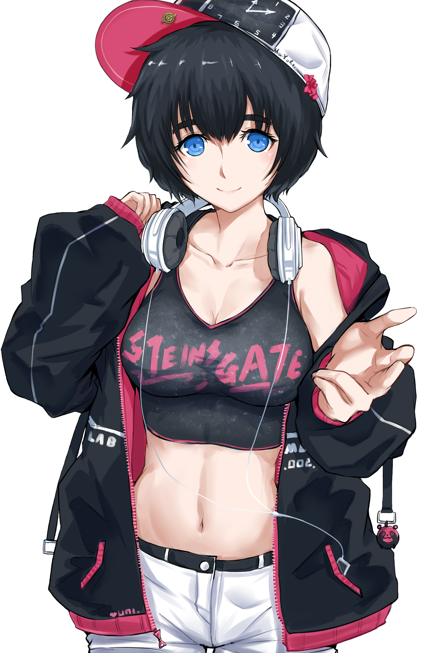 |
Feb 8, 2019 3:58 AM
#5459
| I asked lanblade to have a look at my list, as he's good at feedback. He found 2 bugs. [1] The first were gaps beneath some entry's posters This reminds me of the Babel Nisei OVA issue from a few days ago, except it's on multiple rows now. But both the disease [tag overflow] and symptom [crop] were fixed since then. In the time it took for me to respond to him as I was asleep, those gaps are now gone. This reminds me of the preview caching issue, how certain posters failed to load at all temporarily. [2] The second is what he attributed to bleed-over of certain posters. What I think is happening is a subpixel misalignment of the over-poster and under-posters. We're seeing just a little poking out from the side. Or maybe a random border is being placed there, or maybe chrome is rounding up sometimes and down the other times on his end? Either way it's strange that it's only some posters. Maybe issue [1] is another form of issue [2]. Maybe it's a vertical shift. But if that were true - no gap should be made as the image continues below the row-height. It's also possible that [1] is related to the :after box that was added to the `more` section that @Valerio_Lyndon suggested? |
|
Feb 8, 2019 4:01 AM
#5460
The image you linked is deleted? |
|
Feb 8, 2019 4:46 AM
#5461
| I reuploaded it https://imgur.com/l1ohkNc @mutsuto |
|
Feb 8, 2019 8:12 AM
#5462
Shishio-kun said: anyone got any suggestions for backgrounds to use with this render? I like to use it a lot so any help is appreciated :D https://i.imgur.com/rRqe6ag.png Look at her eyes, those deep blue eyes. The only blue on the entire design. Choose a background which brings those out as much as possible. You could go with another blue, so maybe an ocean or sky scene. Or go with something that complements blue, like orange. Sunset/ fire wouldn't work due to the lighting on the figure though. |
|
Feb 8, 2019 9:45 AM
#5463
| How do I get height: auto; to work for my imported posters? If I use it, they vanish. I think it has something to do with the parent it's :after-ing, but they have declared heights already. Currently I'm using width: 140, height: 220. But that ratio results in clipping the edges. This was a desired effect once-upon-a-time due to trying to conserve title-width. But now I have loads of room due to moving the tags. Something closer to height: 200 is needed. But TV anime poster's ratios are not standardised and the optimum height for me to set changes entry-entry. |
|
Feb 8, 2019 8:18 PM
#5464
Look for "CHARACTER 2" in your CSS. Here's what it looks like currently:/* CHARACTER 2 */
.header .header-title:after{
background-color: transparent !important;
background-image: url(https://image.myanimelist.net/ui/5LYzTBVoS196gvYvw3zjwE7yWHfWA1FCovuelilQZAo) !important;
background-position: center top;
background-repeat: no-repeat;
background-size: contain;
content: "";
height: 100%;
right: -38%;
position: fixed;
top: 0;
width: 100%;
z-index: -1;
}The easiest way to move the character is to change the "background-position" line. By changing the second part of it (the "top") to a number you can move it. The number has to have "px" at the end though. For example: background-position: center 0px; Or, if that sounds like a pain/you can't find the code, you can just add this to the bottom of your CSS and then tweak the second number. Negative numbers (-55px) work just as well as positive ones. :) .header .header-title:after {
background-position: center 0px;
} |
Valerio_LyndonFeb 8, 2019 8:23 PM
Feb 8, 2019 11:45 PM
#5465
mutsuto said: :o It's beautiful!I have done it! I present the perfect pointy faded gradient-ellipse edit2: even better with an off-set mutsuto said: Just took a look at it, very clever! I thought you had used an image, but it's all CSS!Well I just instantly remembered why I'd kept a w h i t e background for all this time... https://i.imgur.com/LJez74x.png p.s. I textured all the things mutsuto said: Hmm, I can't reproduce either of these issues so I won't be of much help this time. :/ Tested on several different browsers, no luck.I asked lanblade to have a look at my list, as he's good at feedback. He found 2 bugs. [1] The first were gaps beneath some entry's posters … [2] The second is what he attributed to bleed-over of certain posters. … It's also possible that [1] is related to the :after box that was added to the `more` section that @Valerio_Lyndon suggested? I honestly have no idea about #1. Might be a clip-path bug or perhaps an issue with a border again? #2 looks like a positioning issue, but scanning the code I can't see what might cause it. The best way to attempt fixing these kinds of issues is to find the offending element, probably the :before element, and then shear off as much styling as possible from least to most important until the problem goes away. Then, rebuild from there until something breaks again and you have a good pointer as to what is causing it. Just make sure to backup your code before starting. I would also try widening the :before element (maybe 10 pixels extra of width) to rule out the browser calculating something wrong and leaving a pixel gap. Nothing's ever impossible, but I don't believe it's more-info that's the problem. more-info is set to "display: none;" until it has been expanded and it would be noticeable if it were displaying. mutsuto said: I don't believe there's a way to do so, or at least I don't know of one. The images are implemented with background-image which has no effect on the container's size. It's normally the opposite rather, with the background being informed by the container.How do I get height: auto; to work for my imported posters? It used to be that we could have used a custom preset for image generators. This might have allowed using the image inside of the "content" property rather than as a background, which would place it into the HTML similar to a normal object. I have not used the trick much but I believe that would allow using auto height. This is just a wishful tangent though since I don't know of a way to do this without a custom generator preset. Edit: Also just noticed, .list-table-data:after seems to be poking through once again. [Image] (look at tag text) I don't remember this being an issue, but maybe something got jumbled. Anyhow, changing z-index from 0 to 1 .data.tags should fix it. 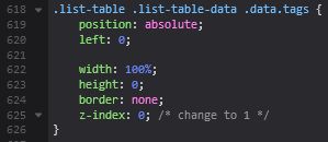 |
Valerio_LyndonFeb 8, 2019 11:58 PM
Feb 9, 2019 12:14 AM
#5466
| Thx @Valerio_Lyndon I was able to move it down. |
|
Feb 9, 2019 8:18 AM
#5467
| Is it not possible to move the row-number without moving the cell? Currently I'm using .data.number {
position: relative;
left: -49px;
}A practice I'd like to avoid. I was hoping there would be a div around the number itself, so I could move it with negative-margin values. But there isn't one |
|
Feb 9, 2019 8:23 AM
#5468
Valerio_Lyndon said: Also just noticed, .list-table-data:after seems to be poking through once again. Yea, I'd been messing with a few z-values. This was collateral damage I missed. Thank you. --- Is it not possible to move the row-number without moving the cell? Currently I'm using .data.number {
position: relative;
left: -49px;
}A practice I'd like to avoid. I was hoping there would be a div around the number itself, so I could move it with negative-margin values. But there isn't one |
|
Feb 9, 2019 10:18 AM
#5469
Something humorously fucked up has happened It's the caching issue again. But now it's much bigger than ever before. Here is a large vertical screenshot. [note: currently the original posters are all opacity=0 therefor you see the status-tint beneath] All plan-to-watch, dropped, and on-hold entries are not loading. in the last 5 minutes since this issue started the missing posters are creeping up the page into the completed section. How does that even make sense. How would the caching be affected by what's on my dropped list, and what's not? I thought maybe I'd fucked something up so I restored from a backup which I know worked yesterday. And no missing posters changed. I guess we'll just wait it out like before. But what on earth. edit: 2 hours later, back to normal. how odd. took a good 10-20s of loading also to open the page. i hope this cache issue doesn't become more common |
mtsRheaFeb 9, 2019 3:57 PM
|
Feb 9, 2019 5:34 PM
#5470
mutsuto said: Hmm, not sure. There's text-indent, but it isn't working for me unless I align the text to the left, which obviously isn't what we want.Is it not possible to move the row-number without moving the cell? … I was hoping there would be a div… /* New Code */
.data.number {
text-indent: -30px;
text-align: left !important;
}
/* Overrides */
.data.number {
position: static !important;
}Is the table cell causing any new issues? There's naturally a lot of jank that goes into CSS themes, so while eliminating it is best it isn't a massive deal as long as it is not actively causing issues. But without the ability to modify the HTML as well there's only so much you can do. As long as you know what you shouldn't be doing on a real website it doesn't matter too much. :) Wish that caching issue wouldn't happen. :/ Must be a bug in the generator somewhere. I assume it's caused or exacerbated by your list having so many entries but that's only a guess. |
Feb 10, 2019 5:25 AM
#5471
Valerio_Lyndon said: Took me a second to realise why this solution wasn't what we wanted [large N values].There's text-indent, but it isn't working for me unless I align the text to the left, which obviously isn't what we want. Dang, so close to perfect. Though I'm surprised that you could get that far, I thought the answer was definitely "no". I'll try to remember text-indent in future. Is the table cell causing any new issues? Nah, just layered jank is getting to me. I assume it's caused or exacerbated by your list having so many entries but that's only a guess. I thought this also.A few hours of me continuously f5-ing while making incremental changing and previewing them must be more traffic than is expected in a week. DDOS by anime-death. |
mtsRheaFeb 10, 2019 5:29 AM
|
Feb 10, 2019 9:00 AM
#5472
| https://i.imgur.com/CclwGSo.png https://i.imgur.com/7wwz9wJ.png TIL you can customise the searching function. Imma start fuckin' around and see what I can do. |
|
Feb 11, 2019 2:48 AM
#5473
How do I change the colour of:
 |
|
Feb 11, 2019 3:21 AM
#5474
| @mutsuto Have you tried using Inspect Element in Firefox (or Waterfox) to find the codes you need? That's what I would do first. https://myanimelist.net/forum/?topicid=1329419 |
Feb 11, 2019 3:31 AM
#5475
Shishio-kun said: Ah ofc. Ty.@mutsuto Have you tried using Inspect Element in Firefox (or Waterfox) to find the codes you need? That's what I would do first. https://myanimelist.net/forum/?topicid=1329419 I need to use :checked. I'll get on it. |
|
Feb 11, 2019 1:06 PM
#5476
| I've come a decent way since I last posted, but I've yet again hit a road block. Most of the initial things I wanted to do are completed. I was only merely able to fudge the box-selection outline. That is not a purple outline, that is red layered over the blue I wish to change. This was done using :focus #advanced-options [class*="-widget"] select:focus{border-color: red; }I also wish to change the highlight-bar's color, and apply Small-Caps to the selected-option [I've only been able to do it for the options in the menu]. I'll continue to see if i can find it myself, but would appreciate help. |
|
Feb 11, 2019 8:02 PM
#5477
mutsuto said: Looking good. :)I've come a decent way since I last posted, but I've yet again hit a road block. Most of the initial things I wanted to do are completed. I was only merely able to fudge the box-selection outline. That is not a purple outline, that is red layered over the blue I wish to change. This was done using :focus #advanced-options [class*="-widget"] select:focus{border-color: red; }I also wish to change the highlight-bar's color, and apply Small-Caps to the selected-option [I've only been able to do it for the options in the menu]. I'll continue to see if i can find it myself, but would appreciate help. Yes, working with focus states and such can get confusing. I can see why you are having some trouble. If you activate focus state and scroll down enough in the inspector you should be able to find a "select:focus" property that is rendering the extra colour. It's controlled using "outline". Unfortunately, it seems that this won't affect the dropdown edges, but it does solve the select box's edge. Outline is similar to border, but not exactly the same. The main differences are: • Outline does not follow the shape of the object, it remains a rectangle no matter the border-radius applied. • It does not affect the size of the element. Unlike a border it is applied without affecting page flow. Normally on the outside, but it looks like Chrome has changed this recently and now begins just inside the border? Firefox still applies outside though. Oh well. It's generally used for selected/focus states such as this and not much else. So to change it you can either set the "outline-color" or the entirety of the "outline". #advanced-options select:focus {
/* These are examples, not meant to work together */
outline-color: red; /* quick fix for the colour */
outline: 1px solid red; /* changing it to a solid red outline */
outline: 1px auto red; /* changing size and colour with "auto" style, which renders differently per browser */
outline: none; /* ew get rid of it */
}--- As to styling the dropdown hover, this is where CSS is somewhat lacking. I don't know of any way to style either the outline/border colour or the hover state. I know you can change: • Item backgrounds. • Selected item's background. • Various font properties, including colour. • (Possibly a couple more I'm forgetting) But even that varies a lot depending on operating system and browser. The problem seems to be that the dropdown treated similarly to a system element or actually is a system element. For instance, on Mac it (probably) looks like this: [Image]. Not that I'd worry about how it looks on Mac for the most part, but it's a good example of the behaviour. Why does it work this way? No clue, but I'm sure it made sense at the time it was implemented. There are ways around this using HTML and/or Javascript but no CSS-only ones yet. Fingers crossed this will be better in the future. --- Looks like applying the font to the <select> tag itself should work, same as the <option>. Just need to be specified differently. #advanced-options select {
font-variant: small-caps !important;
letter-spacing: 0.3px;
} |
Valerio_LyndonFeb 11, 2019 8:09 PM
Feb 12, 2019 7:00 AM
#5478
Valerio_Lyndon said: God fucking damnit. That's an annoying obscure thing.Outline Using: #advanced-options select:focus { outline: 1.5px solid #b19cd9; }Before - https://i.imgur.com/yw1VNzf.png After - https://i.imgur.com/iqoEsJB.png Not that such a thing matters, just thought it's interesting so I'm pointing it out. So I'm writing to outline and border for my desired results. actually is a system element I did suspect this to be the case, on the basis that i] I've never seen anyone ever change it beforeii] Default's never fit the website they're on I'm glad I now have a concrete answer. font G'damn it how did I miss that.A'ight. Thank you. Now that I've got the fundamentals covered, time to start messing with the form-factor. |
mtsRheaFeb 12, 2019 7:44 AM
|
Feb 12, 2019 7:49 AM
#5479
| nymphiae just let me know that my Apply and Clear unicode symbols, 💮 and ❌, display as red on her mobile and when viewed by her desktop [firefox quantum 65.0 on windows 10] 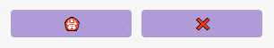 how they should look:  How annoying. Is there anything specific needed to re-color for firefox, or is this a compatibility issue w/ unicode characters? but if that was the case why would they display at all... But being red... that is strange, because the default color is white. They said probably because certain unicode characters are emojis when viewed on mobile? But shouldn't apply to firefox? which is where that image is from.I guess I'll have to move to using fontawesome icons, as they suggested. edit: I've now added color: #fafaf2 !important; edit2: Nope, didn't work no, i think they're displayed like images, because they're emojis. they're not solid color, the x is red with a black outline and the sakura is red/white with a black outline. I'll look for icon replacements. |
mtsRheaFeb 12, 2019 2:29 PM
|
Feb 12, 2019 12:56 PM
#5480
 I've been noticing this more and more, and I'm interested to know why. On some things my user-CSS is prioritied below the default. Despite having the exact same selector. Only with the use of !important can I can something to apply. Why does this exception sometimes happen? edit: For this specific example I can prioritise using #advanced-options #fancybox-close |
mtsRheaFeb 12, 2019 1:06 PM
|
Feb 12, 2019 1:25 PM
#5481
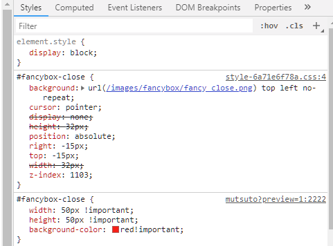
| @mutsuto Yeah, "auto" outline seems to be different from specified options such as "solid", since it allows the browser to give any styling it wants. It seems like there is some loose interpretation of the spec being applied since outline is, generally, only used for focusing elements. You could probably get away with using only border if you wanted, as long as it appears how you want in the end. Nothing saying you have to use outline. ^^ --- I agree with her on the emoji analysis. Normally, you would be correct in that Firefox should use the system font, but Firefox uses a special font for emojis that overrides what the system uses (it's actually quite useful for systems like mine that don't have many emoji available). So image or FontAwesome is indeed the safest way to go since it's defined by the browser and not the client. Any other custom emoji/unicode font with those characters in it should also work, although I am unsure what offerings are out there. FontAwesome is the most convenient since MAL already loads v4.7 onto the website without extra effort from us (full list of FA icons [here] if you're curious, since it's harder to find than v5 icons and v5 is not what's being used). --- Good catch! Looks like the CSS for that is being loaded by a different file than the rest. Most of the default CSS is in the first <style> section here (highlighted line): 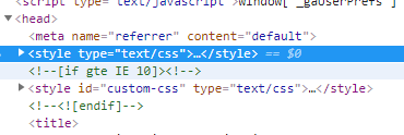 Your CSS gets placed within the "custom-css" section, which is below that and therefore takes precedence. But there is also another stylesheet (the one loading the fancybox-close and some other stuff) that is further down and being loaded from an external file. It's the highlighted line here:  I am not too familiar with HTML loading priority but it does seem that further down is loaded with higher priority, so it must be taking precedence. I assume this was done since the code for fancybox is likely reused elsewhere on MAL so they decided to reuse a file. This should only be an issue with lines of CSS that list the "style-6a71e6f78.css:##" in the top right there. If it says mutsuto:## then it's probably being loaded from either the default CSS (lower priorty than yours) or your CSS.  |
Valerio_LyndonFeb 12, 2019 1:33 PM
Feb 12, 2019 2:20 PM
#5482

Shishio-kun said: Senator said: Hello, This might've been asked before, but how do I make it so that in the list, if the title is longer than the assigned width of the column, then how to shorten it like add "..." to the end to signify that it continues off column? Regards try .td1, .td2 { white-space: nowrap; overflow: hidden !important; text-overflow: ellipsis !important; max-width: 600px; } Thanks, this worked! Also I've got another question, is there any MAL theme or extension that at least shows the seen parts of the franchise in different colour or marks them somehow? As in, say you got a main show with a bunch of OVA's and specials, then it would colour the ones you've seen green or something and the ones you haven't seen are the default colour. Just a thought, but I wanted to ask if there's such a thing. Something like this, I just highlighted the text so you could get an idea what I'm on about..  |
SenatorFeb 12, 2019 2:24 PM
 |
Feb 12, 2019 3:13 PM
#5483
Senator said: Shishio-kun said: Senator said: Hello, This might've been asked before, but how do I make it so that in the list, if the title is longer than the assigned width of the column, then how to shorten it like add "..." to the end to signify that it continues off column? Regards try .td1, .td2 { white-space: nowrap; overflow: hidden !important; text-overflow: ellipsis !important; max-width: 600px; } Thanks, this worked! Also I've got another question, is there any MAL theme or extension that at least shows the seen parts of the franchise in different colour or marks them somehow? As in, say you got a main show with a bunch of OVA's and specials, then it would colour the ones you've seen green or something and the ones you haven't seen are the default colour. Just a thought, but I wanted to ask if there's such a thing. Something like this, I just highlighted the text so you could get an idea what I'm on about.. not sure, so I guess the only thing I can recommend is you look thru the themes and CSS tutorials for what you're looking for? D: unless someone makes the codes to add |
Shishio-kunFeb 12, 2019 3:20 PM
Feb 12, 2019 3:18 PM
#5484
Valerio_Lyndon said: This is so counter-intuitive, counter to the entire point of the unicode consortium...So image or FontAwesome is indeed the safest way to go since it's defined by the browser and not the client. |
mtsRheaFeb 12, 2019 3:28 PM
|
Feb 12, 2019 3:55 PM
#5485
Shishio-kun said: Senator said: Shishio-kun said: Senator said: Hello, This might've been asked before, but how do I make it so that in the list, if the title is longer than the assigned width of the column, then how to shorten it like add "..." to the end to signify that it continues off column? Regards try .td1, .td2 { white-space: nowrap; overflow: hidden !important; text-overflow: ellipsis !important; max-width: 600px; } Thanks, this worked! Also I've got another question, is there any MAL theme or extension that at least shows the seen parts of the franchise in different colour or marks them somehow? As in, say you got a main show with a bunch of OVA's and specials, then it would colour the ones you've seen green or something and the ones you haven't seen are the default colour. Just a thought, but I wanted to ask if there's such a thing. Something like this, I just highlighted the text so you could get an idea what I'm on about.. not sure, so I guess the only thing I can recommend is you look thru the themes and CSS tutorials for what you're looking for? D: unless someone makes the codes to add Well, I guess it requires some feed taken from the anime list itself to be fed to the extension/theme so that it marks the correct ones somehow.. I'm not good at this kinda stuff at all tho, haha, so I tought that maybe there's something like that already.. Getting ideas and never being able to make em happen is a bit irritating :I |
|
Feb 12, 2019 4:55 PM
#5486
Senator said: It should be possible with Javascript, but I don't know of a script that already does this. I have that same irritation, perhaps we should both learn Javascript and finally make our dreams come true. :PWell, I guess it requires some feed taken from the anime list itself to be fed to the extension/theme so that it marks the correct ones somehow.. I'm not good at this kinda stuff at all tho, haha, so I tought that maybe there's something like that already.. Getting ideas and never being able to make em happen is a bit irritating :I |
Feb 12, 2019 5:14 PM
#5487
mutsuto said: Well, it would look consistent if a font with those characters were defined and loaded on the webpage. This is how most text retains its consistency across browsers and devices. But without being told what to load it has to fall back on the system's choice of font, which in this case varies drastically due to how recent emojis are and differing art styles across brands. If the webpage's font is undefined this same issue would occur for normal text and it would fall back on whatever font the system/browser chooses. I'm not sure if there is a free emoji font but there might well be one out there that could give proper cross-platform consistency (I believe, anyway. I won't rule out that some mobiles devices might play weird, I have not tested it). The reason images are great for cross-compatibility is simply that they are unchanging no matter the device (for the most part). If they load, great! If they don't, then unlike a font which falls back on a different file the image will simply not display. This can be a desired result or not depending on the use case though.Valerio_Lyndon said: This is so counter-intuitive, counter to the entire point of the unicode consortium...So image or FontAwesome is indeed the safest way to go since it's defined by the browser and not the client. |
Feb 13, 2019 11:51 AM
#5488
Valerio_Lyndon said: Senator said: It should be possible with Javascript, but I don't know of a script that already does this. I have that same irritation, perhaps we should both learn Javascript and finally make our dreams come true. :PWell, I guess it requires some feed taken from the anime list itself to be fed to the extension/theme so that it marks the correct ones somehow.. I'm not good at this kinda stuff at all tho, haha, so I tought that maybe there's something like that already.. Getting ideas and never being able to make em happen is a bit irritating :I Hehe, indeed, at least I'm not the only one who has thought of this. If nothing else, perhaps someone with actual programming knowledge thinks of the same thing and has the skill to somehow make it happen.. Most I've done is fiddle diddle around with c++ back in the day, forgotten it all by now tho |
|
Feb 18, 2019 3:16 AM
#5489

| Hello the over to see cover thing stopped working how do i fix it? mal - https://myanimelist.net/animelist/theweaboopenguin code - /* ANIMOD by Shixma */ /* COVERS */ /* Replace "YOUR-USERNAME" with your MAL username */ /* Replace "anime" with "manga" if using this for a manga list */ @import "https://mal-image.appspot.com/anime/theweaboopenguin"; /* DESIGN */ @import "https://shixma.github.io/mal/animod-lazy.min.css"; /* == MODS == */ /* MOD: -Alternate BG 0-*/ #mal_control_strip { background-image: url(https://images4.alphacoders.com/787/787761.png) !important; /* GAUSSIAN BLUR */ } body { background-image: url(https://i.imgur.com/qcUs8cn.png) !important; /* NORMAL IMAGE */ } #list_surround { padding-right: 500px; } /* END: -Alternate BG 0- */ ALSO how do i make the gussian blur thing work? |
theweaboopenguinFeb 18, 2019 3:20 AM
| SEND ME DA FRIEND REQUEST AND COMMENT ON MY PROFILE <33 I LOVE YUKINO YUKINOSHITA, CHITOGE AND YUNO GASAI.. they changed my life.. every night b4 sleeping i think about them and pray that i meet a yukino/chitoge/yuno irl <33 i will stay virgin for them <33 i know they are out there and i will meet them <33 i love u yukino bbb |
Feb 18, 2019 3:47 AM
#5490
theweaboopenguin said: Try the fixes in this thread, it should be what you're looking for: https://myanimelist.net/forum/?topicid=439897Hello the over to see cover thing stopped working how do i fix it? mal - https://myanimelist.net/animelist/theweaboopenguin code - /* ANIMOD by Shixma */ /* COVERS */ /* Replace "YOUR-USERNAME" with your MAL username */ /* Replace "anime" with "manga" if using this for a manga list */ @import "https://mal-image.appspot.com/anime/theweaboopenguin"; /* DESIGN */ @import "https://shixma.github.io/mal/animod-lazy.min.css"; /* == MODS == */ /* MOD: -Alternate BG 0-*/ #mal_control_strip { background-image: url(https://images4.alphacoders.com/787/787761.png) !important; /* GAUSSIAN BLUR */ } body { background-image: url(https://i.imgur.com/qcUs8cn.png) !important; /* NORMAL IMAGE */ } #list_surround { padding-right: 500px; } /* END: -Alternate BG 0- */ ALSO how do i make the gussian blur thing work? I can't check your list currently to understand what you mean by blur so I'll have to get back to you on that later. |
Feb 18, 2019 6:25 AM
#5491
Valerio_Lyndon said: theweaboopenguin said: Try the fixes in this thread, it should be what you're looking for: https://myanimelist.net/forum/?topicid=439897Hello the over to see cover thing stopped working how do i fix it? mal - https://myanimelist.net/animelist/theweaboopenguin code - /* ANIMOD by Shixma */ /* COVERS */ /* Replace "YOUR-USERNAME" with your MAL username */ /* Replace "anime" with "manga" if using this for a manga list */ @import "https://mal-image.appspot.com/anime/theweaboopenguin"; /* DESIGN */ @import "https://shixma.github.io/mal/animod-lazy.min.css"; /* == MODS == */ /* MOD: -Alternate BG 0-*/ #mal_control_strip { background-image: url(https://images4.alphacoders.com/787/787761.png) !important; /* GAUSSIAN BLUR */ } body { background-image: url(https://i.imgur.com/qcUs8cn.png) !important; /* NORMAL IMAGE */ } #list_surround { padding-right: 500px; } /* END: -Alternate BG 0- */ ALSO how do i make the gussian blur thing work? I can't check your list currently to understand what you mean by blur so I'll have to get back to you on that later. so apparently my css only works when i am logged in and only i can see it not logged in - https://i.imgur.com/QBB8DDm.png logged in https://i.imgur.com/NU9xP0Z.png current css - @\import "https://malscraper.azurewebsites.net/covers/anime/theweaboopenguin"; /* ANIMOD by Shixma */ /* COVERS */ /* Replace "YOUR-USERNAME" with your MAL username */ /* Replace "anime" with "manga" if using this for a manga list */ @import "https://myanimelist.net/profile/theweaboopenguin"; /* DESIGN */ @import "https://shixma.github.io/mal/animod-lazy.min.css"; /* == MODS == */ /* MOD: -Alternate BG 0-*/ #mal\_control_strip { background-image: url(https://images4.alphacoders.com/787/787761.png) !important; /* GAUSSIAN BLUR */ } body { background-image: url(https://i.imgur.com/qcUs8cn.png) !important; /* GAUSSIAN BLUR */ } #list_surround { padding-right: 500px; } /* END: -Alternate BG 0- */ @\import "https://malscraper.azurewebsites.net/covers/auto/presets/dataimagelinkbefore"; |
theweaboopenguinFeb 18, 2019 6:30 AM
| SEND ME DA FRIEND REQUEST AND COMMENT ON MY PROFILE <33 I LOVE YUKINO YUKINOSHITA, CHITOGE AND YUNO GASAI.. they changed my life.. every night b4 sleeping i think about them and pray that i meet a yukino/chitoge/yuno irl <33 i will stay virgin for them <33 i know they are out there and i will meet them <33 i love u yukino bbb |
Feb 18, 2019 5:51 PM
#5492
@theweaboopenguin There's a fix for that too on the same thread. :) Here's your code with both fixes applied (covers and logged out view). Delete your current code and replace it with this revised version:/* ANIMOD by Shixma */
/* COVERS */
/* Replace "YOUR-USERNAME" with your MAL username */
/* Replace "anime" with "manga" if using this for a manga list */
@\import "https://malscraper.azurewebsites.net/covers/auto/presets/more";
/* DESIGN */
@\import "https://shixma.github.io/mal/animod-lazy.min.css";
/* == MODS == */
/* MOD: -Alternate BG 0-*/
#mal\_control_strip {
background-image: url(https://images4.alphacoders.com/787/787761.png) !important;
}
body {
background-image: url(https://i.imgur.com/qcUs8cn.png) !important;
}
#list_surround {
padding-right: 500px;
}
/* END: -Alternate BG 0- */I don't know why those things said "gaussian blur" next to them, as they don't have any blur. Were you wanting to blur something in particular? If you wanted blur on the background images the easiest way would be to edit the images directly and then replace the current ones with the blurred versions. There's also some ways to do it in CSS though. |
Feb 19, 2019 2:30 AM
#5493
Valerio_Lyndon said: @theweaboopenguin There's a fix for that too on the same thread. :) Here's your code with both fixes applied (covers and logged out view). Delete your current code and replace it with this revised version: /* ANIMOD by Shixma */
/* COVERS */
/* Replace "YOUR-USERNAME" with your MAL username */
/* Replace "anime" with "manga" if using this for a manga list */
@\import "https://malscraper.azurewebsites.net/covers/auto/presets/more";
/* DESIGN */
@\import "https://shixma.github.io/mal/animod-lazy.min.css";
/* == MODS == */
/* MOD: -Alternate BG 0-*/
#mal\_control_strip {
background-image: url(https://images4.alphacoders.com/787/787761.png) !important;
}
body {
background-image: url(https://i.imgur.com/qcUs8cn.png) !important;
}
#list_surround {
padding-right: 500px;
}
/* END: -Alternate BG 0- */I don't know why those things said "gaussian blur" next to them, as they don't have any blur. Were you wanting to blur something in particular? If you wanted blur on the background images the easiest way would be to edit the images directly and then replace the current ones with the blurred versions. There's also some ways to do it in CSS though. Thank you so much!! Thanks a lot its all fixed now Not really i was just wondering why the blur wasnt working. I would have tried it and if it looked good kept it. But its fine haha |
| SEND ME DA FRIEND REQUEST AND COMMENT ON MY PROFILE <33 I LOVE YUKINO YUKINOSHITA, CHITOGE AND YUNO GASAI.. they changed my life.. every night b4 sleeping i think about them and pray that i meet a yukino/chitoge/yuno irl <33 i will stay virgin for them <33 i know they are out there and i will meet them <33 i love u yukino bbb |
Feb 23, 2019 7:20 AM
#5494

| Hey, I've got a little problem and would appreciate it if someone would help me on that matter! It's about my background picture on my anime list, seems like it's not framed right? Akari (the girl on the bottom left) should be more visible than that, seems like the picture was cutted out. How can I fix that? Here's the original picture:  |
 |
Feb 23, 2019 12:32 PM
#5495
@iTitania_ Near the bottom of your list's CSS you should find a section labelled "The list background". Here's what it looks like:/* The list background */
body[data-query*='"status":1'],
body[data-query*='"status":2'],
body[data-query*='"status":3'],
body[data-query*='"status":4'],
body[data-query*='"status":6'],
body[data-query*='"status":7'] {
background-attachment: fixed !important;
background-position: center top;
background-repeat: no-repeat !important;
background-size:cover;
}This is where you can tweak various display settings for the background. Now, a certain amount of cropping is to be expected with the image unless you change how the image is displayed. Currently, it displays in a manner that leaves no blank space and does not stretch the image. The easiest way to reposition the image would be to change the text after "background-position". You can use top/center/bottom/right/left or percentages/pixels. So for instance, "center 66%" or "300px bottom". The first word/number is the horizontal axis, the second is the vertical. It's currently set to "center top" (so centered horizontally, aligned to the top vertically). To get a bit more of the bottom left character to display you could try setting it to "center center" [Before: center top] [After: center center] or you could mess around with percentages, for instance "center 33%", which would move it a little but not as much. It's worth noting that "center center" is equivalent to "50% 50%". Here's the example in code: /* The list background */
body[data-query*='"status":1'],
body[data-query*='"status":2'],
body[data-query*='"status":3'],
body[data-query*='"status":4'],
body[data-query*='"status":6'],
body[data-query*='"status":7'] {
background-attachment: fixed !important;
background-position: center 33%;
background-repeat: no-repeat !important;
background-size: cover;
}There's also the option of changing the background's sizing method. You could change the background-size from "cover" to "contain", but that would leave blank spaces in some areas [Image]. Or you could also set it to "100% 100%" which would stretch it [Image]. Example Lines background-size: contain; background-size: 100% 100%; |
Valerio_LyndonFeb 23, 2019 12:37 PM
Feb 24, 2019 2:34 AM
#5496
| Any GIMP users? Does GIMP have anything that is like Photoshop's Blending Options? Just simple, "change the setting = see the effect" kinda stuff |
Feb 26, 2019 4:58 PM
#5497
| Hello! I would like to remove the background color of this bloc, and make it transparent. https://i.imgur.com/mi6p2bD.png can anyone help me, please? I would be happy ! ^-^ |
Feb 26, 2019 6:50 PM
#5498
ceIest said: This code will do what you want. Add it to your custom CSS box. If you want a different colour at any point just change the "transparent" to any other CSS colour.Hello! I would like to remove the background color of this bloc, and make it transparent. https://i.imgur.com/mi6p2bD.png can anyone help me, please? I would be happy ! ^-^ .list-unit .list-status-title {
background: transparent;
}If you're also looking to change the colour of the text, this can be used (colour can also be changed): .list-unit .list-status-title .text, .list-unit .list-status-title .stats a {
color: #ffffff;
} |
Valerio_LyndonFeb 26, 2019 6:57 PM
Feb 27, 2019 1:53 AM
#5499
| Hey, it resolved my problem, thank you so much!!!! have a good day ^-^ |
Mar 2, 2019 8:57 AM
#5500
| hey, is there a way to change the fonts on the list layots? i'm currently using grid style 5 codes if that help |
More topics from this board
» [CSS- MODERN] ⭐ Minimal Dashboard layout by 5cm ~ Compact and convenient! ( 1 2 3 )Shishio-kun - Sep 4, 2020 |
121 |
by Pokitaru
»»
Apr 21, 3:25 AM |
|
» [CSS-MODERN] Change list text/font colors on any list layoutShishio-kun - May 4, 2021 |
3 |
by hideso
»»
Apr 20, 4:33 PM |
|
» [CSS] [VIDEO GUIDE] ⭐️ How to change fonts on a list layoutShishio-kun - Jul 15, 2019 |
17 |
by hideso
»»
Apr 20, 4:03 PM |
|
» [CSS][Modern] ☀️ Endless Summer Layout by Cateinya ( 1 2 3 4 5 ... Last Page )Cateinya - Aug 18, 2016 |
309 |
by hideso
»»
Apr 20, 3:56 PM |
|
» [CSS - CLASSIC] Wishes of the heart ~ XXXholic layout by HahaidoShishio-kun - Dec 27, 2015 |
9 |
by tsyndi
»»
Apr 18, 9:23 PM |