Hello members, welcome to ER Card Design Main Tournament Round 2 (Summer 2016). We hope that you would take some time to participate in voting the winner of this Main Tournament Round 2.
Here the criteria used for grading: 1. Overall Design Contextuality:
This criterion conceptually evaluates how the design match the description of the theme. A good designer should be able to creatively design an art work that match with the specified concept or the theme. In this particular Summer 2016, the theme is not determined and thus designer has the freedom to choose the theme. But in the future contest we may choose the theme for the tournament.
2. Images and Effects:
This criterion evaluates how the image selection and effects are incorporated together. This may involves coloring and formal composition, utilization of static image or animated gif, and so on.
3. Border Design:
This criterion evaluates how the border is designed and incorporated into the overall layout of the design.
4. Text Styling and Positioning :
This criterion evaluates how the text is incorporated into the design layout and how the style of the text match the theme.
GRADING RULES:
1. Members select the winner from the 1 VS 1 match.
2. The Comment should include critical input and reasons of your selection. Members can use the Grading Criteria Above as the parameters to explain the reasoning.
3. Please also put it under a spoiler tag.
GRADING FORMAT:
[spoiler]
Participant A [b]VS[/b] Participant D
[b]Which one is the winner:[/b]
[b]Critical Comment:[/b]

Participant G [b]VS[/b] Participant H
[b]Which one is the winner:[/b]
[b]Critical Comment:[/b]

[/spoiler]
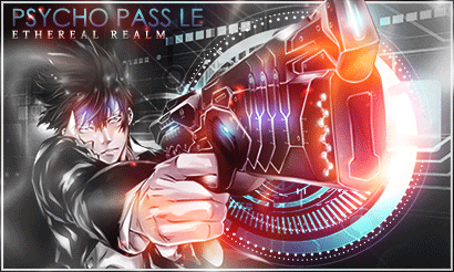
Participant A VS Participant D Winner - D Critical Comment (That sounds mean): This one was a bit of a long shot. First off, we have Memories, obviously based on Madoka Magika. The card was good, and the character in the foreground looks nice. The same can be said for Psycho Pass, maybe for the gif. So why the latter? Let's address the Donphan in the room. In memories, the effects were pretty nice, but what held it back was the background. The background, PLEASE DO NOT BUTCHER ME FOR THIS, looks a little bright. Like a colored aluminum foil. The memories being represented as celluloid kinda erks me, a little. And let's talk about the text, I can barely READ it! What you could've done, is make the background into a broken Stained glass, with each shard showing a piece of memory, while also making the text pop out.. That would be cool. Now let's look at Psycho Pass. The background is perfect, giving a bit of noir feel to it. The smoke definitely nailed it. And the placing of the text was brilliant, and, with the help of the background, really pops out. But the main character in the foreground, most notably, The Dominator, is where the problem lies. First off, it looks RED. Last time I checked, they were neon blue. It seems as though, in my opinion, that what one lacked in one department, the other bested in THAT part. The decision was tough, but the winner goes to D.
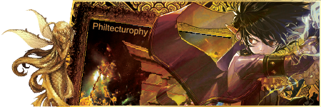
Participant G VS Participant H Winner - G Critical Comment: It was a landslide victory. Let's talk about H, not THAT H. I'm guessing the feel was 'badass', and it is. But there are a few hiccups that might ruin your date with Beyonce. First, the dragon, it looks metallic, that's good, but it blends in too much. For a moment there, I thought the dragon's claw, was HIS hand. Really misleading. The character looks cool, but the dragon kinda bogs the coolness factor. And, raise your hand if you didn't notice it yet, did know there was a SWORD there too? Yeah, I thought it was part of the dragon too. So we have a dragon whose claw blends into the main character, and a sword that blends into said dragon. Oh, and the text placement.....eh? Why is the username on top of the box? WHY? It's off putting.
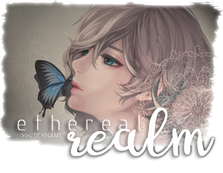
In the case of G, it was pretty nice. The card gives a bit of nostalgic feel to it, adding more to the aesthetic. The text placement was nice, but the username is too small and it kinda fades. The butterfly was a nice touch too. Although I prefer my butterfly kissing me on the cheek. It looks like a birthday card you would find that belonged to your grandmother, and it's looks beautiful, makes you forget that you live in the very bowels of pain and you have to continue work before you get the SWITCH (That means whip). See what I mean by landslide?
I'm sorry if I was TOO critical. They were nice, but there can only be ONE winner.
ONWARDS! Away from homework and on to more anime!!!
Participant A VS Participant D Which one is the winner: D Critical Comment: D does not have the username text, but I love it still. The animation is interesting, and the text is easy to read. A is pretty cute, but D is still much better. Sorry :)
Participant G VS Participant H Which one is the winner: G Critical Comment: The design in H is too complex. Also the username text is not well positioned. I prefer simplicity and elegant. The design G is much more simple, but is more well thought. I like the coloring of G, they are soft and beautiful.
Participant A VS Participant D Which one is the winner: D Critical Comment: Although D have this amazing GIF of the gun, and A got many good effects, it comes down to the text and the core of what the card is. While A got this celluloid film roll as the "memories", that film roll got overshadowed by the brightness of the card and it's colors. ( I suggest using warm colors like a tint of orange, also make a better choice for the "memories", you could take away the character and make the card have 3 or 4 ripples of water that shows the "memories")
Then we got D, it got the feeling of Psycho Pass correctly and it's text is easy to read, also the gun in my memory is not of that color and to me it kinda ruins the feel of the card ( I suggest using cold and sharp colors like a sharp light blue )
Both of them looks good but this one goes to D
Participant G VS Participant H Which one is the winner: G Critical Comment: H's design looks good and complex, although the username place is kinda off, but it all comes down to the colors and the thoughts behind them. H obviously is going for the cool type from the dragon to the dominant blue color, G on the other hand is going for the melancholic type from the color, the lighting and the expression of the woman. Although both are good, but there is one difference : the feeling they induced on the viewer. in my experience, looking at G makes me imagine going to the ball and dancing with my significant other to a calm and melancholic solo violin piece, while H makes me imagine going to the Himalayas naked and near-death while there's a yeti beside me carrying a piano and playing one tune only in the same tempo. Although both are good, but G wins !
WE WILL EITHER FIND A WAY OR MAKE ONE ~Hannibal Barca~ Join these nice clubs everyone
Participants A H out
Message: Don't be discouraged. Your works are really great. But maybe need a bit of improvement or not just your lucky days.
Anyhow, you still earn points rewards for participating :D
Hey Exo, I cannot reach you in PM.
Regarding tournament, Sorry for the long delay on completing the competition in ER Summer 2016. My apology since I have IRL problems, big one, so I was hiatus for more than 1 years or so. Very irresponsible of me x_x
Let me know if you plan to change your card for the last round.
I will determine the winner in this next 2 weeks after posting new vote.
Then the winner will get the prize ^^
Please reply me in PM. I cannot send you PM since your restrict the not friend users.
I had also sent this PM to participant G in PM.