New


Sep 18, 2009 11:23 AM
#2

I guess I'll start up. I'm pretty new to the whole gfx thing. I made my first gfx piece the other day actually. I was wondering if I could get some suggestions on it. I did some basic stuff. I filled the background a dark color and put a c4d on it. I put the blending mode so that the highlights would show through onto the background. I put my render cutout on there and I added a gradient map to both layers so that I could match up the colors. I set the gradient map on overlay and lowered the opacity a little bit for the render, painting out the eyes on the layer mask to keep them blue. I blurred the background a little bit and sharpened only the part that is nearest to the render. I also put the render's shadow on that part. Pentooled a little yellow band, and blurred it and set it on color dodge (add). I added little purple spots with a brush that I tweaked around with and blurred them and then set them on linear dodge(add) to make them kind of glowy. Finally I added a lensflare on a black background (protip: so that I can move it around instead of using the filter over and over again, if you want it to behave like default then turn it to a clipping mask) and then set it where I wanted it and put the blending mode so only the highlights show through. That's pretty much it, but I included the .psd for reference and whatever I didn't explain too well here: http://mal.sorams.com/feedback/aichan.psd Nobody is going to use this sig, so do whatever you want with it. |
perspectiveSep 19, 2009 8:09 AM
Sep 18, 2009 12:20 PM
#3

A couple of things I made cos I was bored lol XD  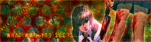   |
 |
Sep 18, 2009 1:45 PM
#4
| well i started using photoshop not to long, still a amature at it heres the sigs i created C&C please=)    - This still has alot of errors,, to lazy to fix=/ - This still has alot of errors,, to lazy to fix=/       -this ones really really bad=/ -this ones really really bad=/   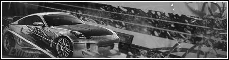  |
YunYouCantWinSep 24, 2009 2:22 PM
 |
Sep 18, 2009 2:40 PM
#5

mal_0702 said: I guess I'll start up. I'm pretty new to the whole gfx thing. I made my first gfx piece the other day actually. I was wondering if I could get some suggestions on it. I did some basic stuff. I filled the background a dark color and put a c4d on it. I put the blending mode so that the highlights would show through onto the background. I put my render cutout on there and I added a gradient map to both layers so that I could match up the colors. I set the gradient map on overlay and lowered the opacity a little bit for the render, painting out the eyes on the layer mask to keep them blue. I blurred the background a little bit and sharpened only the part that is nearest to the render. I also put the render's shadow on that part. Pentooled a little yellow band, and blurred it and set it on color dodge (add). I added little purple spots with a brush that I tweaked around with and blurred them and then set them on linear dodge(add) to make them kind of glowy. Finally I added a lensflare on a black background (so that I can move it around instead of using the filter over and over again) and then set it where I wanted it and put the blending mode so only the highlights show through. That's pretty much it, but I included the .psd for reference and whatever I didn't explain too well here: http://mal.sorams.com/feedback/aichan.psd Nobody is going to use this sig, so do whatever you want with it. This was really educational thank you. One of the Problems I have is to merge the render well with the background. and yours fits in really nice. Some thoughts about pics I made as practice (I've started reading GFX Tutorials this week, so don't expect something professional from me, it's all the result of Trial and Error ...and actually more Error than Trial) 1.      As I mentioned above, the render doesn't fit the Background, I tried to blurr Hikari with Gaussian, and put an sharp render over it (low opacity) but the result isn't good enough. Besides, I used Adjustment Layers to adjust the colours and a monochrome C4D (Blending mode: Soft Light) to darken the background. 2.  A pic I made today, this time I tried to make a Background from scratch, and used Cloud brushes and Gradient Layers. In this one I duplicated the C4d 6 times and just tried to blurr/and use Blending mode. I had no imagination how the result should look like so I just tried them all out and fixed the especially ugly parts with layer masks. Aside from that I used the Adjustment Layers "Curves" and "Brightness/Contrast" (for the very first time, yay! xD) to modify the colors and lights. 2.  A practice in smudging. When I found these Smudge Brushes I decided to give it a try. Main goal was to merge the render with the background well. After duplicating the Render several times, I just smudged the borders in order to get a "motion" effect. I placed the original Render with an low opacity to make the whole render seem a little blurred. Also smudged and gaussian'ed the C4d beyond all recognition and used blending mode to adjust the colors in this one. here are the psd files of each pic for a better understanding of what I wrote about them in my l33t-English If you have advices how to improve or noticed where I went wrong, please don't hold back. //E: AniiFreakk, if someday I'll be able to make GFX's like you do, then I shall shit brixx, they are all amazing! |
SixFlagsSep 18, 2009 2:44 PM
 |
Sep 18, 2009 2:51 PM
#6

A few that I made recently:   I'm so proud of this one *w* it's amazing what a good set of brushes and playing around with gradients will do.    |
 |
Sep 18, 2009 3:21 PM
#7
| @Nyufi: Some of these pieces I like. I looked at one of them and said to myself "Is that a breast? *Shoku*" lol. The first, second and fourth ones look great. I'm not sure if those are what is considered gfx signatures though because the definition of gfx signature is now becoming a bit more strict within this club. I wouldn't know where to begin to define the style, but I'm personally having a little trouble adjusting to it. @Anii-freak: Well you may be new to photoshop, but you way above me in this style of graphics art. Some of those sigs look pretty darn good and I can see gradually how you were getting better at it too. @Six-flags: I'm glad some of it was helpful to you. Personally I looked at my first design as a failure. It just wasn't the visually appealing piece that I had envisioned when I was cutting the render out. I've read in a few tutorials where people have dupped the render and smudged it around. I'm going to experiment with that personally and see if I can come up with some more crazy stuff that might look better :). I really like the Ice Beauty signature. @LucySky: The background patterns in all of your designs are wonderful. I don't like how the colors of the bg and foreground match up though on them. The only one that the colors match up incredibly well on is the last one. If you toyed around with the selective coloring or gradient map adjustment layers, I think you could make everything match up a little better. But this is probably more so to do with my personal color preferences also. Green and purple together, etc isn't my favorite matchup; even if it makes sense on the color wheel. |
Sep 18, 2009 3:40 PM
#8
| @ mal_0702 Well gfx by default means graphic effects, I would call them gfx is, although I know it doesn't follow the current gfx tren style at all. The reason for that is, that I think most of those gfx pretty much look the same. I'm not trying to offend anyone here. You guys can make pretty nice ones, but it's actually always the same basic concept: have a render, have a solid color background, do some brushes (most of the time people use the same brushes), do some strokes, and that's it. Doing things this way, is not really my style, I like photomanipulation and textures much better :) Then again, I admit that these aren't really the bests I made. It's mostly cos it wasn't me thinking up the themes... when I'm bored -Angel- comes up with a theme, and I make a gfx-like thingy in like 20 minutes, so these aren't such serious works like LuckySky's. And yeah, that's a breast 8D Again, blaming Angel for making me do a "sensual" one. |
|
Sep 18, 2009 3:42 PM
#9
| @mal_0702 Sorry if it sounds a bit harsh, but just take it as criticism. There is no flow to the piece, no depth and while there are some effects, they don't look to good. Try to add lighting and blend the effects well using adjustment layers. The thing about gfx sigs though, try not to have too much negative space, as it looks really bad, so the whole bit on the left isn't too good. @Sunyi Sorry yif it sounsd harsh...ok, well you've got what I like to call text whoring, in where you put text everywhere, and it draws away from the main focal point. Aside form that, you also lack flow and depth in your sigs @AniiFreak well, these are all fine and all, you've got a lot of potential in yours, I'd say try to avoid too much darkening and work on fixing flow and depth @SixFlags Your sigs are kinda...big at times and lack too muich effects, also try and fix the depth @Lucysky yours are really nice already, so not much CnC needed for them I'd say that the first one has too much negative space. The last one also lacks effect, but the other ones are excellent, really admire your work with C4Ds. |
Sep 18, 2009 3:54 PM
#10
| @sixflag, i really like teh smudging tech pic looks really nice(tahts just me, love smudge techs really easy=P) and also mine aint that amazing, im still learning=/. need more pratice=( @lucysky, nice c4d sigs=P mind sending me some=D? also thanks for the c&c -shio, but i like dark sigs=P and ya i need to fix teh flow=/ also having lots of text troubles cant seem to find good font that fits the sigs |
|
Sep 18, 2009 3:54 PM
#11
| @Nyufi: Yeah I agree with you on preference for graphics. My own style is more about hyper-realism. I make objects like glass, water, metals, etc etc from scratch using photoshop. I like "composing the scene". It's just that lately there was a push to make this club and competition more like the gfx style that Moony envisioned. I think of this more like taking the opportunity to try out something drastically different for me. @Shio: I don't mind criticism at all. I'm not too sure what you mean by missing depth, however. I applied a gaussian blur on everything except the foreground objects and even added a shadow from the render to achieve that. Can you be more specific? I can see the other arguments you've made. I do use adjustment layers. You should see the piece without them :P. Also the flow concept is a bit airy, is there some type of explanation that you could give there? |
Sep 18, 2009 4:02 PM
#12
| @mal_0702 Well depth is more than just the blurring and sharpening of focal and b/g, although that's a big part of it. I'd try using b+w gradient maps on luminosity and using soft brushes to create lighting. also, use the burn tool to darken parts that are shadows. Etc, like that. And yeah, adjustment layers are kinda hard to tell when you've used...XD As for flow, I could go on for ages about hwo important it is in gfx sigs. But, basically, you could call it the "movement" in the sig, and without it, the sig looks still, and not very interesting. Take mine for example, the flow is from the bottom croner to the top, so all my effects are aligned that way, giving the impression of motion, which is something that ALWAYS needs to be used in gfx sigs. Yeah, you say this is your first time though, it's ok if you don't get this, I mean, my firsts were just terrible. Note: Sorry if I sound condescending, that wasn't what I meant to do. |
Sep 18, 2009 4:05 PM
#13
| also shio is bsgfx fourm any good? |
|
Sep 18, 2009 4:06 PM
#14
AniiFreakk said: also shio is bsgfx fourm any good? Hell yeah, it's where I learned (am still learning) Probably isn't good to advertise sites though, but it desperately needs traffic. |
Sep 18, 2009 4:06 PM
#15
| No offense at all. Like I said, this whole gfx thing is like a new experience for me. So, yeah I'm gonna be bad at first. And I'm glad someone with experience in this area is willing to give me some pointers. |
Sep 18, 2009 4:06 PM
#16
| @ mal_0702 Oh, sorry, I somehow totally missed out that thread, so I didn't know you guys wanted to do something like this. Although I don't really understand why the challenge should be changed, cos I think it's good as long the people are having fun making the entries. But well, I'm not the one to decide ^^ @ Shio I'm a typographie-freak, so yeah I admitt, that I'm text whoring most of the time :3 And everything you said is correct, no wonder 20 minutes work are ought to be not so good lol :D |
|
Sep 18, 2009 4:11 PM
#17
| Thanks for the feedback guys! :D @mal_0702: I'm still not that great at figuring out what colors go with each other. I usually just kind of slap on a bunch of gradients and hope all goes well most of the time xD It's something to work on I guess. @-Shio: Thanks for the compliments! :D I do tend to have trouble with negative space. Some of the earlier sigs I made had a lot of it. Probably should have put the render of the first one in the center and made it a little smaller now that I look back on it. The last one is my least favorite actually. I was playing with trying to get a nice matchup of colors more than focusing on effects. Oh, and also much thanks for the link in your sig. I followed it to all kinds of useful threads with links to brushes and tuts. Some of the GFX on that site are just godly *__* @AniiFreakk: You mean sending you the C4Ds? Sure :) Here are a few that I use frequently: [click] [click] [click] |
|
Sep 18, 2009 4:12 PM
#18
| lol sunynyufi 20min kinda short for a sig xD and shio joined the fourms so far looks prety good=P @lucystar, love the second one, third kinda weird and messy XD |
|
Sep 18, 2009 4:16 PM
#19
| @AniiFreakk and LucySky Awesome that you joined, I really love BSGFX, but it's been going downhill now for a while because of the lack of activity, so if you could liven it up a bit, then that'd be great ^^; oh btw, I'm known as Deviant over there, so you may spot me or something.. @mal_0702 haha expertise? me? I'm a total noob too, so I'm not sure whether I should even be giving advice lol..Besides, we're all here to improve :D @Sunyi:yeah, textwhoring is aproblem I sometimes see, but it's easy to fix..NO TEXT FOR YOU, and as for 20 minute workds, I used to make min ein half an hour or less, but then they all didn't turn out to well and looked very rushed. Now, I like to spend time on mine, upwards of 3 hours sometimes...though that's probably cause I'm posting here at the same time..-_- |
Sep 18, 2009 4:20 PM
#20
| well if we could have some gfx contest in BSGFX it might incourage poeple to join the fourm and make sigs=P |
|
Sep 18, 2009 4:22 PM
#21
AniiFreakk said: well if we could have some gfx contest in BSGFX it might incourage poeple to join the fourm and make sigs=P They run a SOTW there. but this is getting off topic lol... |
Sep 18, 2009 4:23 PM
#22
| @ Shio You know... I can don't feel like text whoring is a problem for me... so I kinda don't wanna fix it :rollseyes: And again: those things were made cos I was bored. If I do some serious graphics, it takes up at least 3-4 hours, or a whole week, depending on what I'm doing :) |
|
Sep 18, 2009 4:24 PM
#23
| Mhm, I suppose so, gfx sigs aren't for everybody I guess. I mean, I could never do what some of you guys make for your profiles and sigs... and text whoring isn't always a bad thing, I've seen text used as part of the effects as well and it turns out amazing. |
Sep 18, 2009 9:17 PM
#24
got bored recently and made a new sig, C&C please=P |
|
Sep 18, 2009 9:21 PM
#25
| @AniiFreakk Hm, Well, the render looks strange because it's too blended into the sig, there's lots of negative space on the right. There's no flow or depth. The effects themselves, it seems as if you just pasted a few C4Ds on, which doesn't really look too good. Another problem is the text, when you use such strong text with such a weak focal, you're going to draw attention away from the focal and onto the text which is a big nono. |
Sep 18, 2009 9:24 PM
#26
| haha ya i did paste c4ds together kinda had nothing to do so i occupied my self with that xd not soo great |
|
Sep 18, 2009 9:26 PM
#27
AniiFreakk said: haha ya i did paste c4ds together kinda had nothing to do so i occupied my self with that xd not soo great You could try some tuts to start off learning about how to make some effects. |
Sep 18, 2009 10:22 PM
#28

well, this was made a while ago (it's my current profile pic) but i would like to get some feedback on it to make a better one next time :)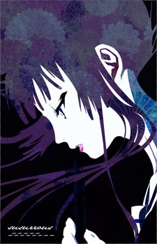 the render I found, and I made the background with c4ds and brushes :) |
KokoroChan: Nobody will beat our SuperAwesomeAsianNinjaSkillzzz (S.A.A.N.S.)!!!!!! l P h o t o s h o p G a l l e r y l |
Sep 18, 2009 11:14 PM
#29
| @Susurrous, it's actually pretty nice, the thing you have to be warned about vertical sigs though, is that there's usually alot of negative space where the effects don't reach such as the top right. Otherwise, it's really nice. |
Sep 19, 2009 12:10 AM
#30
| All this talk of negative space makes me wonder about the top left hand corner of your signature. Without that space there though, wouldn't that interrupt the flow of your piece? Since you see things moving from bottom left to top right? I would think that in gfx art like all other art, that you can create something aesthetic with the absence of an element as well as when it is present. Or am I missing something? |
Sep 19, 2009 4:24 AM
#31
| ^ I agree with that, everything "just" have to match well in the end Thanks for posting your work here, inspired by some of the nice pics here:  the idea is not something new; scrabbeld in ~1 hour |
|
Sep 19, 2009 7:08 AM
#32
| @mal_0702 everyone's definition of negative space is different I suppose, now that you mention it, looking more closely at susrrous' sig, I see that if you removed it, it would intterupt the flow. Yes, not using an element can be used as an element as well, but it has to fit all together, like in some examples, cleaner looking sigs would have a white b/g with minimal effects, but it would still work because of the other effects there that make the b/g seem like part of the elements. It all really depends on the image you're trying to make. In general, vector/brush sigs have less effects than some C4D ones. I actually have some negative space in mine as well, that I was too lazy to try and get rid of...>_>. Basically, as long as the negative space doesn't draw attention away from the focal, then it's fine. @SixFlags A bit plain don't you think? |
Sep 19, 2009 9:23 AM
#33
Made one following on eof the tuts here...didn't turn out nearly as well as his though. |
Sep 19, 2009 9:32 AM
#34


Sep 19, 2009 11:05 AM
#35
| @Silver2k9 Well, for a first it's pretty good but there's a few issues. First of all, I see you used a blur for flow, that's pretty good, but you lack any effects to keep it interesting. the CC on the right really distracts from the focal, same for the geass sign near his hand. Apart from that, there's no lighting or depth. |
Sep 19, 2009 1:16 PM
#38
| Used the tut provided by the club, didnt come out as a planned=/ kinda got lazy afterwards=/  |
|
Sep 19, 2009 1:27 PM
#39
| @Aniifreak, it's good, you're learning more. You have flow in this one, it's pretty good. the arrow on her hand though, kinda messes it up. As for the sig, I think you may have made it too big, either that or your render choice wasn't good, because you got a lotta negative space on the right there. Otherwise, good job. |
Sep 19, 2009 1:39 PM
#40
| thanks shio and ya the arrow kinda mess it up didnt notice it unitll now Lol, kinda made the sig height a bit to big=/ |
|
Sep 19, 2009 2:08 PM
#41

Sep 19, 2009 2:20 PM
#42

Sep 19, 2009 3:36 PM
#44
| The style didnt really fit=/ |
|
Sep 19, 2009 3:40 PM
#45
| @-Shio word of advice, any render that is small will look bad on any tag ;) |
Sep 19, 2009 3:41 PM
#46
| 'Twas a stock... =( And I already cropped it tiny compared to the original...Hm, yeah, it's kinda empty on the left. |
Sep 19, 2009 4:01 PM
#47


Sep 19, 2009 4:09 PM
#48
Sep 19, 2009 4:12 PM
#49
| @-Shio: Yeah you're kind of right xD I didn't spend much time on the first one. I'm not sure what else to do with it. Oh well. I'm glad you think the colors go well in the second. I wasn't sure if they did at first. |
|


![[click]](http://i34.tinypic.com/214dopu.jpg)
![[click]](http://i35.tinypic.com/650dbt.jpg)
![[click]](http://i36.tinypic.com/t5fv3t.jpg)
More topics from this board
» :: GFX Mini Challenge :: *WINNER / OCT 09*Moony - Nov 9, 2009 |
21 |
by Boyscout31
»»
Oct 26, 2018 7:42 AM |
|
» Share some of your fonts!Kyroh - Aug 28, 2014 |
1 |
by Isalina
»»
Sep 1, 2014 4:28 AM |
|
Sticky: » :: Tutorials ::Moony - Sep 18, 2009 |
11 |
by Kyroh
»»
Aug 28, 2014 3:47 AM |
|
» Discussion ?:iamlovelace - Apr 1, 2013 |
0 |
by iamlovelace
»»
Apr 1, 2013 4:32 PM |
|
Sticky: » :: Previous Challenges ::scorpedo - Mar 8, 2009 |
3 |
by tsumu
»»
Jan 31, 2012 11:09 AM |