New
Aug 12, 2011 9:49 PM
#1

This layout is custom CSS. If you don't know how to install it, use the easy Beginner's Tutorial in this section: http://myanimelist.net/forum/?topicid=419405 The design has separate versions for anime and manga lists. For more layouts check the full list of Premade Layouts: http://myanimelist.net/forum/?topicid=318587[/b]  In this topic are the codes for my popular Mio Dating Sim Style CSS, so you can have it too! I modified it so all users can use it, and you can replace the graphics if you have a little experience doing so on other layouts and make your own dating sim graphics. There's notes in the CSS to guide you. Every category (completed, on-hold, etc) has its own individual response with a different pic of Mio! You cycle through them with the right hand menu. In the pic above, you're seeing the scene from the "plan to watch" anime category. There's two versions, both with their own different Mio graphics and text, and then an anime version and manga version of each of those two styles. This way, you can have the style you want on whatever list you want. I'll post all four codes in this topic, one in this post and the next three in separate posts. One more VERY IMPORTANT but easy step before you install one of these codes! Before you install these CSS codes and save, you should set your anime/manga settings correctly for the best overall look. You can do this after installing the CSS too. Go here: http://myanimelist.net/editprofile.php?go=listpreferences and update your anime/manga list settings with the way I have them here in this example: http://i55.tinypic.com/68wpi8.jpg Type 1 style features Mio in neko cosplay, bikini (with special guest), maid outfit, and other sexy outfits! Type 2 features Mio in a wet T-shirt, kimono, waitress costume and some low cut shirts! Type 1 style code (for anime lists), check the other posts for other versions /* MIO DATING SIM CSS If you want to change out the backgrounds and images, keep in mind many sections share the same bg to keep the layout in order. I grouped them together however in the following CSS. Much of the top bar is used to straighten the layout, and you'll find the rest set to display= none. You can ask about this CSS at http://myanimelist.net/forum/?topicid=315825 Below is the main background plus a section that uses the background to curb part of the layout and make it look cleaner. You'll have to put any new background images in both of these sections and leave them with the exact same positional properties (fixed bottom left) or else it won't look straight in the upper left corner as with the original. */ body { background: url(http://i.imgur.com/fSvOyGI.jpg) no-repeat fixed bottom left transparent; } #mal_cs_powered { background:url(http://i.imgur.com/fSvOyGI.jpg) no-repeat fixed bottom left !important; left: 0 !important; max-width: 314px; padding-bottom: 57px !important; position: fixed !important; top: -50px !important; z-index: 0 !important; } /* HEADERS These are the headers with the images of Mio (originally). */ .header_cw { background:transparent url(http://i51.tinypic.com/28jshv.jpg) no-repeat scroll left bottom; color: transparent; font-family: comic Sans MS; font-size: 0; left: 0 !important; right: 0 !important; width: 1024px; z-index: -1; } .header_completed { background:transparent url(http://i54.tinypic.com/zjf1ur.jpg) no-repeat scroll left bottom; color: transparent; font-family: comic Sans MS; font-size: 0; left: 0 !important; right: 0 !important; width: 1024px; z-index: -1; } .header_onhold { background:transparent url(http://i53.tinypic.com/b6c3ut.jpg) no-repeat scroll left bottom; color: transparent; font-family: comic Sans MS; font-size: 0; left: 0 !important; right: 0 !important; width: 1024px; z-index: -1; } .header_dropped { background:transparent url(http://i51.tinypic.com/25j9wtt.jpg) no-repeat scroll left bottom; color: transparent; font-family: comic Sans MS; font-size: 0; left: 0 !important; right: 0 !important; width: 1024px; z-index: -1; } .header_ptw { background: url(http://i56.tinypic.com/332sad5.jpg) no-repeat scroll left bottom transparent; bottom: 1px !important; color: transparent; font-family: comic Sans MS; font-size: 0; left: 2px !important; right: 0 !important; width: 1024px; z-index: -1; } /*OTHER CODES Just a lot of very picky codes to keep the layout straight and clean looking, and the left hand menu. There's really no need to mess with these if all you want to do is change the images and right hand menu. */ #grand_totals { -moz-background-clip:border; -moz-background-inline-policy:continuous; -moz-background-origin:padding; color:black; font-size:18px; } .td1, .td2, .category_totals { background-color:transparent; z-index:6; } .td1, .td2, a, a:visited { color:white; font-family:Lucida Grande; } .animetitle, .animetitle:visited { color:gold; font-family:verdana; font-size:9px; font-weight:lighter; } .category_totals { color:transparent; font-family:times new roman; font-size:1px; font-weight:lighter; } #list_surround { z-index:4; } .header_cw, .header_completed, .header_onhold, .header_dropped, .header_ptw { bottom:0; height:900px; position:fixed; } #grand_totals { height:1317px; margin-bottom:950px; text-align:center; } #list_surround { -moz-background-clip:border; -moz-background-inline-policy:continuous; -moz-background-origin:padding; background:transparent url(http://i.imgur.com/nS3avgL.png) repeat fixed 0 0; margin:1px 0; padding: 37px 2px 600px; width:310px; } .table_header { background:transparent url(http://i.imgur.com/ZykFsQi.png) repeat-y fixed left top; border: 0 none; color: transparent; font-size: 0 !important; height: 56px; margin-top: -72px; padding-left: 234px; position: fixed; width: 154px; z-index: 2; } .td1, .td2 { border-width:0; padding:2px; } .td1:hover, .td2:hover { -moz-background-clip:border; -moz-background-inline-policy:continuous; -moz-background-origin:padding; background:black url() repeat scroll left bottom; border:0 solid white; color:white; z-index:4; } a { text-decoration:none; } a:visited { text-decoration:none; } a:hover, .animetitle:hover { color:red; text-decoration:underline; } a.thickbox { color:cyan; font-size:10px; } #copyright { -moz-background-clip:border; -moz-background-inline-policy:continuous; -moz-background-origin:padding; background: transparent; bottom: 0; color: white; font-family: Tahoma; font-size: 9px; height: 63px; left: 0; padding-left: 8px; position: fixed; text-align: left !important; top: -12px; width: 403px; z-index: 0; } #copyright:after { content: " Dating-sim CSS by Shishio-kun. Google 'Shishio's Custom Lists' for more designs and info."; } #mal_cs_pic { display: none !important; } #mal_cs_links, #mal_cs_otherlinks { display:none !important; } #mal_cs_listinfo { position: fixed; } #mal_cs_listinfo a { position: fixed; } /* THE RIGHT SIDE MENU These are the codes for the menu on the right. Most of them share the same image. The very bottom one is for fixing an error in Google Chrome. */ .status_selected, .status_not_selected {background:transparent url(http://i56.tinypic.com/t96wi9.jpg) no-repeat fixed right top;} .status_not_selected a, .status_not_selected a:visited { background:transparent none repeat scroll 0 0; color:black; font-family:Verdana,Arial,Helvetica,sans-serif; font-size:1px; padding:11px 1px 45px 243px; position:relative; right:-14px; top:11px; } .status_selected a, .status_selected a:visited { background: none repeat scroll 0 0 transparent; color: black; font-family: Verdana,Arial,Helvetica,sans-serif; font-size: 1px; font-weight: bold; padding: 14px 0 37px 252px; position: relative; right: -7px; top: 20px; } .status_selected a:hover, .status_selected a:hover, .status_not_selected a:hover { -moz-background-clip:border; -moz-background-inline-policy:continuous; -moz-background-origin:padding; background:white none repeat scroll 0 0; font-size:1px; opacity:0.6; } .status_selected, .status_not_selected { -moz-background-clip:border; -moz-background-inline-policy:continuous; -moz-background-origin:padding; border:0 none; height:150px; position:fixed; right:0; top:309px; width:225px; z-index:10; } .status_selected + .status_not_selected, .status_not_selected + .status_selected, .status_not_selected + .status_not_selected { height:60px; padding-top:61px; position:fixed; right:0; top:4px; width:224px; } .status_selected + .status_not_selected + .status_not_selected, .status_not_selected + .status_selected + .status_not_selected, .status_not_selected + .status_not_selected + .status_selected, .status_not_selected + .status_not_selected + .status_not_selected { -moz-background-clip:border; -moz-background-inline-policy:continuous; -moz-background-origin:padding; height:60px; padding-top:0; position:fixed; right:0; top:126px; width:224px; } .status_selected + .status_not_selected + .status_not_selected + .status_not_selected, .status_not_selected + .status_selected + .status_not_selected + .status_not_selected, .status_not_selected + .status_not_selected + .status_selected + .status_not_selected, .status_not_selected + .status_not_selected + .status_not_selected + .status_selected, .status_not_selected + .status_not_selected + .status_not_selected + .status_not_selected { -moz-background-clip:border; -moz-background-inline-policy:continuous; -moz-background-origin:padding; bottom:0; padding-top:0; position:fixed; right:0; top:248px; width:224px; } .status_selected + .status_not_selected + .status_not_selected + .status_not_selected + .status_not_selected, .status_not_selected + .status_selected + .status_not_selected + .status_not_selected + .status_not_selected, .status_not_selected + .status_not_selected + .status_selected + .status_not_selected + .status_not_selected, .status_not_selected + .status_not_selected + .status_not_selected + .status_selected + .status_not_selected, .status_not_selected + .status_not_selected + .status_not_selected + .status_not_selected + .status_selected, .status_not_selected + .status_not_selected + .status_not_selected + .status_not_selected + .status_not_selected { -moz-background-clip:border; -moz-background-inline-policy:continuous; -moz-background-origin:padding; height:60px; padding-top:0; position:fixed; right:-10px; top:187px; width:234px; } .status_not_selected + .status_not_selected + .status_not_selected + .status_not_selected + .status_not_selected + .status_not_selected, .status_not_selected + .status_not_selected + .status_not_selected + .status_not_selected + .status_not_selected + .status_selected, .status_not_selected + .status_not_selected + .status_not_selected + .status_not_selected + .status_selected + .status_not_selected, .status_not_selected + .status_not_selected + .status_not_selected + .status_selected + .status_not_selected + .status_not_selected, .status_not_selected + .status_not_selected + .status_selected + .status_not_selected + .status_not_selected + .status_not_selected, .status_not_selected + .status_selected + .status_not_selected + .status_not_selected + .status_not_selected + .status_not_selected, .status_selected + .status_not_selected + .status_not_selected + .status_not_selected + .status_not_selected + .status_not_selected { -moz-background-clip:border; -moz-background-inline-policy:continuous; -moz-background-origin:padding; bottom:0; display:none; height:37px; margin-left:800px; padding-bottom:20px; position:fixed; width:150px; } #mal_cs_listinfo a strong { font-size: 1px !important; padding-top: 60px !important; padding-right: 50px !important; padding-left:50px !important; color:black !important; background: transparent !important; position: fixed !important; right: 55px !important; top:370px !important; z-index: 100 !important; } .category_totals { background: url(http://i56.tinypic.com/t96wi9.jpg) repeat scroll 0 0 transparent !important; font-size: 1px; height: 456px !important; position: fixed !important; right: 0 !important; top: 0 !important; width: 226px;} @media screen and (-webkit-min-device-pixel-ratio:0) { .category_totals { background: url(http://i56.tinypic.com/t96wi9.jpg) repeat scroll 0 0 transparent !important; height: 367px !important; position: fixed !important; right: -0px !important; top: 0 !important; width: 228px; } } #mal_cs_powered { max-width: 320px !important;} #list_surround { width: 312px !important;} .category_totals { width: 228px !important;} #copyright {color: white;} #copyright a {color: white;} |
Shishio-kunJul 8, 2015 1:20 PM
Reply Disabled for Non-Club Members
Jan 23, 2012 3:27 AM
#2
| Type 1 style code (for manga lists) /* MIO DATING SIM CSS If you want to change out the backgrounds and images, keep in mind many sections share the same bg to keep the layout in order. I grouped them together however in the following CSS. Much of the top bar is used to straighten the layout, and you'll find the rest set to display= none. You can ask about this CSS at http://myanimelist.net/forum/?topicid=315825 Below is the main background plus a section that uses the background to curb part of the layout and make it look cleaner. You'll have to put any new background images in both of these sections and leave them with the exact same positional properties (fixed bottom left) or else it won't look straight in the upper left corner as with the original. */ body { background: url(http://i.imgur.com/fSvOyGI.jpg) no-repeat fixed bottom left transparent; } #mal_cs_powered { background:url(http://i.imgur.com/fSvOyGI.jpg) no-repeat fixed bottom left !important; left: 0 !important; max-width: 314px; padding-bottom: 57px !important; position: fixed !important; top: -50px !important; z-index: 0 !important; } /* HEADERS These are the headers with the images of Mio (originally). */ .header_cw { background:transparent url(http://i52.tinypic.com/ibfjsw.jpg) no-repeat scroll left bottom; color: transparent; font-family: comic Sans MS; font-size: 0; left: 0 !important; right: 0 !important; width: 1024px; z-index: -1; } .header_completed { background:transparent url(http://i54.tinypic.com/10ofz3b.jpg) no-repeat scroll left bottom; color: transparent; font-family: comic Sans MS; font-size: 0; left: 0 !important; right: 0 !important; width: 1024px; z-index: -1; } .header_onhold { background:transparent url(http://i54.tinypic.com/2e4yckk.jpg) no-repeat scroll left bottom; color: transparent; font-family: comic Sans MS; font-size: 0; left: 0 !important; right: 0 !important; width: 1024px; z-index: -1; } .header_dropped { background:transparent url(http://i51.tinypic.com/288mq0z.jpg) no-repeat scroll left bottom; color: transparent; font-family: comic Sans MS; font-size: 0; left: 0 !important; right: 0 !important; width: 1024px; z-index: -1; } .header_ptw { background: url(http://i51.tinypic.com/dbpls1.jpg) no-repeat scroll left bottom transparent; bottom: 1px !important; color: transparent; font-family: comic Sans MS; font-size: 0; left: 2px !important; right: 0 !important; width: 1024px; z-index: -1; } /*OTHER CODES Just a lot of very picky codes to keep the layout straight and clean looking, and the left hand menu. There's really no need to mess with these if all you want to do is change the images and right hand menu. */ #grand_totals { -moz-background-clip:border; -moz-background-inline-policy:continuous; -moz-background-origin:padding; color:black; font-size:18px; } .td1, .td2, .category_totals { background-color:transparent; z-index:6; } .td1, .td2, a, a:visited { color:white; font-family:Lucida Grande; } .animetitle, .animetitle:visited { color:gold; font-family:verdana; font-size:9px; font-weight:lighter; } .category_totals { color:transparent; font-family:times new roman; font-size:1px; font-weight:lighter; } #list_surround { z-index:4; } .header_cw, .header_completed, .header_onhold, .header_dropped, .header_ptw { bottom:0; height:900px; position:fixed; } #grand_totals { height:1317px; margin-bottom:950px; text-align:center; } #list_surround { -moz-background-clip:border; -moz-background-inline-policy:continuous; -moz-background-origin:padding; background:transparent url(http://i.imgur.com/nS3avgL.png) repeat fixed 0 0; margin:1px 0; padding: 37px 2px 600px; width:310px; } .table_header { background:transparent url(http://i.imgur.com/ZykFsQi.png) repeat-y fixed left top; border: 0 none; color: transparent; font-size: 0 !important; height: 56px; margin-top: -72px; padding-left: 234px; position: fixed; width: 154px; z-index: 2; } .td1, .td2 { border-width:0; padding:2px; } .td1:hover, .td2:hover { -moz-background-clip:border; -moz-background-inline-policy:continuous; -moz-background-origin:padding; background:black url() repeat scroll left bottom; border:0 solid white; color:white; z-index:4; } a { text-decoration:none; } a:visited { text-decoration:none; } a:hover, .animetitle:hover { color:red; text-decoration:underline; } a.thickbox { color:cyan; font-size:10px; } #copyright { -moz-background-clip:border; -moz-background-inline-policy:continuous; -moz-background-origin:padding; background: transparent; bottom: 0; color: white; font-family: Tahoma; font-size: 9px; height: 63px; left: 0; padding-left: 8px; position: fixed; text-align: left !important; top: -12px; width: 403px; z-index: 0; } #copyright:after { content: " Dating-sim CSS by Shishio-kun. Google 'Shishio's Custom Lists' for more designs and info."; } #mal_cs_pic { display: none !important; } #mal_cs_links, #mal_cs_otherlinks { display:none !important; } #mal_cs_listinfo { position: fixed; } #mal_cs_listinfo a { position: fixed; } /* THE RIGHT SIDE MENU These are the codes for the menu on the right. Most of them share the same image. The very bottom one is for fixing an error in Google Chrome. */ .status_selected, .status_not_selected {background:transparent url(http://i52.tinypic.com/2e5mg4x.jpg) no-repeat fixed right top;} .status_not_selected a, .status_not_selected a:visited { background:transparent none repeat scroll 0 0; color:black; font-family:Verdana,Arial,Helvetica,sans-serif; font-size:1px; padding:11px 1px 45px 243px; position:relative; right:-14px; top:11px; } .status_selected a, .status_selected a:visited { background: none repeat scroll 0 0 transparent; color: black; font-family: Verdana,Arial,Helvetica,sans-serif; font-size: 1px; font-weight: bold; padding: 14px 0 37px 252px; position: relative; right: -7px; top: 20px; } .status_selected a:hover, .status_selected a:hover, .status_not_selected a:hover { -moz-background-clip:border; -moz-background-inline-policy:continuous; -moz-background-origin:padding; background:white none repeat scroll 0 0; font-size:1px; opacity:0.6; } .status_selected, .status_not_selected { -moz-background-clip:border; -moz-background-inline-policy:continuous; -moz-background-origin:padding; border:0 none; height:150px; position:fixed; right:0; top:309px; width:225px; z-index:10; } .status_selected + .status_not_selected, .status_not_selected + .status_selected, .status_not_selected + .status_not_selected { height:60px; padding-top:61px; position:fixed; right:0; top:4px; width:224px; } .status_selected + .status_not_selected + .status_not_selected, .status_not_selected + .status_selected + .status_not_selected, .status_not_selected + .status_not_selected + .status_selected, .status_not_selected + .status_not_selected + .status_not_selected { -moz-background-clip:border; -moz-background-inline-policy:continuous; -moz-background-origin:padding; height:60px; padding-top:0; position:fixed; right:0; top:126px; width:224px; } .status_selected + .status_not_selected + .status_not_selected + .status_not_selected, .status_not_selected + .status_selected + .status_not_selected + .status_not_selected, .status_not_selected + .status_not_selected + .status_selected + .status_not_selected, .status_not_selected + .status_not_selected + .status_not_selected + .status_selected, .status_not_selected + .status_not_selected + .status_not_selected + .status_not_selected { -moz-background-clip:border; -moz-background-inline-policy:continuous; -moz-background-origin:padding; bottom:0; padding-top:0; position:fixed; right:0; top:248px; width:224px; } .status_selected + .status_not_selected + .status_not_selected + .status_not_selected + .status_not_selected, .status_not_selected + .status_selected + .status_not_selected + .status_not_selected + .status_not_selected, .status_not_selected + .status_not_selected + .status_selected + .status_not_selected + .status_not_selected, .status_not_selected + .status_not_selected + .status_not_selected + .status_selected + .status_not_selected, .status_not_selected + .status_not_selected + .status_not_selected + .status_not_selected + .status_selected, .status_not_selected + .status_not_selected + .status_not_selected + .status_not_selected + .status_not_selected { -moz-background-clip:border; -moz-background-inline-policy:continuous; -moz-background-origin:padding; height:60px; padding-top:0; position:fixed; right:-10px; top:187px; width:234px; } .status_not_selected + .status_not_selected + .status_not_selected + .status_not_selected + .status_not_selected + .status_not_selected, .status_not_selected + .status_not_selected + .status_not_selected + .status_not_selected + .status_not_selected + .status_selected, .status_not_selected + .status_not_selected + .status_not_selected + .status_not_selected + .status_selected + .status_not_selected, .status_not_selected + .status_not_selected + .status_not_selected + .status_selected + .status_not_selected + .status_not_selected, .status_not_selected + .status_not_selected + .status_selected + .status_not_selected + .status_not_selected + .status_not_selected, .status_not_selected + .status_selected + .status_not_selected + .status_not_selected + .status_not_selected + .status_not_selected, .status_selected + .status_not_selected + .status_not_selected + .status_not_selected + .status_not_selected + .status_not_selected { -moz-background-clip:border; -moz-background-inline-policy:continuous; -moz-background-origin:padding; bottom:0; display:none; height:37px; margin-left:800px; padding-bottom:20px; position:fixed; width:150px; } #mal_cs_listinfo a strong { font-size: 1px !important; padding-top: 60px !important; padding-right: 50px !important; padding-left:50px !important; color:black !important; background: transparent !important; position: fixed !important; right: 55px !important; top:370px !important; z-index: 100 !important; } .category_totals { background: url(http://i56.tinypic.com/t96wi9.jpg) repeat scroll 0 0 transparent !important; font-size: 1px; height: 456px !important; position: fixed !important; right: 0 !important; top: 0 !important; width: 226px;} @media screen and (-webkit-min-device-pixel-ratio:0) { .category_totals { background: url(http://i56.tinypic.com/t96wi9.jpg) repeat scroll 0 0 transparent !important; height: 367px !important; position: fixed !important; right: -0px !important; top: 0 !important; width: 228px; } } #mal_cs_powered { max-width: 320px !important;} #list_surround { width: 312px !important;} .category_totals { width: 228px !important;} #copyright {color: white;} #copyright a {color: white;} |
Shishio-kunJul 18, 2014 9:01 AM
Mar 21, 2012 12:51 AM
#3
| Type 2 style (for anime lists) /* MIO DATING SIM CSS If you want to change out the backgrounds and images, keep in mind many sections share the same bg to keep the layout in order. I grouped them together however in the following CSS. Much of the top bar is used to straighten the layout, and you'll find the rest set to display= none. You can ask about this CSS at http://myanimelist.net/forum/?topicid=315825 Below is the main background plus a section that uses the background to curb part of the layout and make it look cleaner. You'll have to put any new background images in both of these sections and leave them with the exact same positional properties (fixed bottom left) or else it won't look straight in the upper left corner as with the original. */ body { background: url(http://i.imgur.com/fSvOyGI.jpg) no-repeat fixed bottom left transparent; } #mal_cs_powered { background:url(http://i.imgur.com/fSvOyGI.jpg) no-repeat fixed bottom left !important; left: 0 !important; max-width: 314px; padding-bottom: 57px !important; position: fixed !important; top: -50px !important; z-index: 0 !important; } /* HEADERS These are the headers with the images of Mio (originally). */ .header_cw { background:transparent url(http://i54.tinypic.com/t8sv3n.jpg) no-repeat scroll left bottom; color: transparent; font-family: comic Sans MS; font-size: 0; left: 0 !important; right: 0 !important; width: 1024px; z-index: -1; } .header_completed { background:transparent url(http://i52.tinypic.com/ixdusg.jpg) no-repeat scroll left bottom; color: transparent; font-family: comic Sans MS; font-size: 0; left: 0 !important; right: 0 !important; width: 1024px; z-index: -1; } .header_onhold { background:transparent url(http://i56.tinypic.com/2afbwqg.jpg) no-repeat scroll left bottom; color: transparent; font-family: comic Sans MS; font-size: 0; left: 0 !important; right: 0 !important; width: 1024px; z-index: -1; } .header_dropped { background:transparent url(http://i55.tinypic.com/30nal1e.jpg) no-repeat scroll left bottom; color: transparent; font-family: comic Sans MS; font-size: 0; left: 0 !important; right: 0 !important; width: 1024px; z-index: -1; } .header_ptw { background: url(http://i54.tinypic.com/2nj8pxz.jpg) no-repeat scroll left bottom transparent; bottom: 1px !important; color: transparent; font-family: comic Sans MS; font-size: 0; left: 2px !important; right: 0 !important; width: 1024px; z-index: -1; } /*OTHER CODES Just a lot of very picky codes to keep the layout straight and clean looking, and the left hand menu. There's really no need to mess with these if all you want to do is change the images and right hand menu. */ #grand_totals { -moz-background-clip:border; -moz-background-inline-policy:continuous; -moz-background-origin:padding; color:black; font-size:18px; } .td1, .td2, .category_totals { background-color:transparent; z-index:6; } .td1, .td2, a, a:visited { color:white; font-family:Lucida Grande; } .animetitle, .animetitle:visited { color:gold; font-family:verdana; font-size:9px; font-weight:lighter; } .category_totals { color:transparent; font-family:times new roman; font-size:1px; font-weight:lighter; } #list_surround { z-index:4; } .header_cw, .header_completed, .header_onhold, .header_dropped, .header_ptw { bottom:0; height:900px; position:fixed; } #grand_totals { height:1317px; margin-bottom:950px; text-align:center; } #list_surround { -moz-background-clip:border; -moz-background-inline-policy:continuous; -moz-background-origin:padding; background:transparent url(http://i.imgur.com/nS3avgL.png) repeat fixed 0 0; margin:1px 0; padding: 37px 2px 600px; width:310px; } .table_header { background:url("http://i.imgur.com/ZykFsQi.png") repeat-y fixed left top transparent; border: 0 none; color: transparent; font-size: 0 !important; height: 56px; margin-top: -72px; padding-left: 234px; position: fixed; width: 154px; z-index: 2; } .td1, .td2 { border-width:0; padding:2px; } .td1:hover, .td2:hover { -moz-background-clip:border; -moz-background-inline-policy:continuous; -moz-background-origin:padding; background:black url() repeat scroll left bottom; border:0 solid white; color:white; z-index:4; } a { text-decoration:none; } a:visited { text-decoration:none; } a:hover, .animetitle:hover { color:red; text-decoration:underline; } a.thickbox { color:cyan; font-size:10px; } #copyright { -moz-background-clip:border; -moz-background-inline-policy:continuous; -moz-background-origin:padding; background: transparent; bottom: 0; color: white; font-family: Tahoma; font-size: 9px; height: 63px; left: 0; padding-left: 8px; position: fixed; text-align: left !important; top: -12px; width: 403px; z-index: 0; } #copyright:after { content: " Dating-sim CSS by Shishio-kun. Google 'Shishio's Custom Lists' for more designs and info."; } #mal_cs_pic { display: none !important; } #mal_cs_links, #mal_cs_otherlinks { display:none !important; } #mal_cs_listinfo { position: fixed; } #mal_cs_listinfo a { position: fixed; } /* THE RIGHT SIDE MENU These are the codes for the menu on the right. Most of them share the same image. The very bottom one is for fixing an error in Google Chrome. */ .status_selected, .status_not_selected {background:transparent url(http://i52.tinypic.com/20swpph.jpg) no-repeat fixed right top;} .status_not_selected a, .status_not_selected a:visited { background:transparent none repeat scroll 0 0; color:black; font-family:Verdana,Arial,Helvetica,sans-serif; font-size:1px; padding:11px 1px 45px 243px; position:relative; right:-14px; top:11px; } .status_selected a, .status_selected a:visited { background: none repeat scroll 0 0 transparent; color: black; font-family: Verdana,Arial,Helvetica,sans-serif; font-size: 1px; font-weight: bold; padding: 14px 0 37px 252px; position: relative; right: -7px; top: 20px; } .status_selected a:hover, .status_selected a:hover, .status_not_selected a:hover { -moz-background-clip:border; -moz-background-inline-policy:continuous; -moz-background-origin:padding; background:white none repeat scroll 0 0; font-size:1px; opacity:0.6; } .status_selected, .status_not_selected { -moz-background-clip:border; -moz-background-inline-policy:continuous; -moz-background-origin:padding; border:0 none; height:150px; position:fixed; right:0; top:309px; width:225px; z-index:10; } .status_selected + .status_not_selected, .status_not_selected + .status_selected, .status_not_selected + .status_not_selected { height:60px; padding-top:61px; position:fixed; right:0; top:4px; width:224px; } .status_selected + .status_not_selected + .status_not_selected, .status_not_selected + .status_selected + .status_not_selected, .status_not_selected + .status_not_selected + .status_selected, .status_not_selected + .status_not_selected + .status_not_selected { -moz-background-clip:border; -moz-background-inline-policy:continuous; -moz-background-origin:padding; height:60px; padding-top:0; position:fixed; right:0; top:126px; width:224px; } .status_selected + .status_not_selected + .status_not_selected + .status_not_selected, .status_not_selected + .status_selected + .status_not_selected + .status_not_selected, .status_not_selected + .status_not_selected + .status_selected + .status_not_selected, .status_not_selected + .status_not_selected + .status_not_selected + .status_selected, .status_not_selected + .status_not_selected + .status_not_selected + .status_not_selected { -moz-background-clip:border; -moz-background-inline-policy:continuous; -moz-background-origin:padding; bottom:0; padding-top:0; position:fixed; right:0; top:248px; width:224px; } .status_selected + .status_not_selected + .status_not_selected + .status_not_selected + .status_not_selected, .status_not_selected + .status_selected + .status_not_selected + .status_not_selected + .status_not_selected, .status_not_selected + .status_not_selected + .status_selected + .status_not_selected + .status_not_selected, .status_not_selected + .status_not_selected + .status_not_selected + .status_selected + .status_not_selected, .status_not_selected + .status_not_selected + .status_not_selected + .status_not_selected + .status_selected, .status_not_selected + .status_not_selected + .status_not_selected + .status_not_selected + .status_not_selected { -moz-background-clip:border; -moz-background-inline-policy:continuous; -moz-background-origin:padding; height:60px; padding-top:0; position:fixed; right:-10px; top:187px; width:234px; } .status_not_selected + .status_not_selected + .status_not_selected + .status_not_selected + .status_not_selected + .status_not_selected, .status_not_selected + .status_not_selected + .status_not_selected + .status_not_selected + .status_not_selected + .status_selected, .status_not_selected + .status_not_selected + .status_not_selected + .status_not_selected + .status_selected + .status_not_selected, .status_not_selected + .status_not_selected + .status_not_selected + .status_selected + .status_not_selected + .status_not_selected, .status_not_selected + .status_not_selected + .status_selected + .status_not_selected + .status_not_selected + .status_not_selected, .status_not_selected + .status_selected + .status_not_selected + .status_not_selected + .status_not_selected + .status_not_selected, .status_selected + .status_not_selected + .status_not_selected + .status_not_selected + .status_not_selected + .status_not_selected { -moz-background-clip:border; -moz-background-inline-policy:continuous; -moz-background-origin:padding; bottom:0; display:none; height:37px; margin-left:800px; padding-bottom:20px; position:fixed; width:150px; } #mal_cs_listinfo a strong { font-size: 1px !important; padding-top: 60px !important; padding-right: 50px !important; padding-left:50px !important; color:black !important; background: transparent !important; position: fixed !important; right: 55px !important; top:370px !important; z-index: 100 !important; } .category_totals { background: url(http://i52.tinypic.com/20swpph.jpg) repeat scroll 0 0 transparent !important; font-size: 1px; height: 456px !important; position: fixed !important; right: 0 !important; top: 0 !important; width: 226px;} @media screen and (-webkit-min-device-pixel-ratio:0) { .category_totals { background: url(http://i52.tinypic.com/20swpph.jpg) repeat scroll 0 0 transparent !important; height: 367px !important; position: fixed !important; right: -0px !important; top: 0 !important; width: 228px; } } #mal_cs_powered { max-width: 320px !important;} #list_surround { width: 312px !important;} .category_totals { width: 228px !important;} #copyright {color: white;} #copyright a {color: white;} |
Shishio-kunJul 2, 2014 7:15 AM
Apr 26, 2012 6:31 PM
#4
| Type 2 style (for manga lists) /* MIO DATING SIM CSS If you want to change out the backgrounds and images, keep in mind many sections share the same bg to keep the layout in order. I grouped them together however in the following CSS. Much of the top bar is used to straighten the layout, and you'll find the rest set to display= none. You can ask about this CSS at http://myanimelist.net/forum/?topicid=315825 Below is the main background plus a section that uses the background to curb part of the layout and make it look cleaner. You'll have to put any new background images in both of these sections and leave them with the exact same positional properties (fixed bottom left) or else it won't look straight in the upper left corner as with the original. */ body { background: url(http://i.imgur.com/fSvOyGI.jpg) no-repeat fixed bottom left transparent; } #mal_cs_powered { background:url(http://i.imgur.com/fSvOyGI.jpg) no-repeat fixed bottom left !important; left: 0 !important; max-width: 314px; padding-bottom: 57px !important; position: fixed !important; top: -50px !important; z-index: 0 !important; } /* HEADERS These are the headers with the images of Mio (originally). */ .header_cw { background:transparent url(http://i55.tinypic.com/20sg4uq.jpg) no-repeat scroll left bottom; color: transparent; font-family: comic Sans MS; font-size: 0; left: 0 !important; right: 0 !important; width: 1024px; z-index: -1; } .header_completed { background:transparent url(http://i56.tinypic.com/23mpzq9.jpg) no-repeat scroll left bottom; color: transparent; font-family: comic Sans MS; font-size: 0; left: 0 !important; right: 0 !important; width: 1024px; z-index: -1; } .header_onhold { background:transparent url(http://i51.tinypic.com/24600f4.jpg) no-repeat scroll left bottom; color: transparent; font-family: comic Sans MS; font-size: 0; left: 0 !important; right: 0 !important; width: 1024px; z-index: -1; } .header_dropped { background:transparent url(http://i51.tinypic.com/140i3k4.jpg) no-repeat scroll left bottom; color: transparent; font-family: comic Sans MS; font-size: 0; left: 0 !important; right: 0 !important; width: 1024px; z-index: -1; } .header_ptw { background: url(http://i51.tinypic.com/dngdc4.jpg) no-repeat scroll left bottom transparent; bottom: 1px !important; color: transparent; font-family: comic Sans MS; font-size: 0; left: 2px !important; right: 0 !important; width: 1024px; z-index: -1; } /*OTHER CODES Just a lot of very picky codes to keep the layout straight and clean looking, and the left hand menu. There's really no need to mess with these if all you want to do is change the images and right hand menu. */ #grand_totals { -moz-background-clip:border; -moz-background-inline-policy:continuous; -moz-background-origin:padding; color:black; font-size:18px; } .td1, .td2, .category_totals { background-color:transparent; z-index:6; } .td1, .td2, a, a:visited { color:white; font-family:Lucida Grande; } .animetitle, .animetitle:visited { color:gold; font-family:verdana; font-size:9px; font-weight:lighter; } .category_totals { color:transparent; font-family:times new roman; font-size:1px; font-weight:lighter; } #list_surround { z-index:4; } .header_cw, .header_completed, .header_onhold, .header_dropped, .header_ptw { bottom:0; height:900px; position:fixed; } #grand_totals { height:1317px; margin-bottom:950px; text-align:center; } #list_surround { -moz-background-clip:border; -moz-background-inline-policy:continuous; -moz-background-origin:padding; background:transparent url(http://i.imgur.com/nS3avgL.png) repeat fixed 0 0; margin:1px 0; padding: 37px 2px 600px; width:310px; } .table_header { background:url("http://i.imgur.com/ZykFsQi.png") repeat-y fixed left top transparent; border: 0 none; color: transparent; font-size: 0 !important; height: 56px; margin-top: -72px; padding-left: 234px; position: fixed; width: 154px; z-index: 2; } .td1, .td2 { border-width:0; padding:2px; } .td1:hover, .td2:hover { -moz-background-clip:border; -moz-background-inline-policy:continuous; -moz-background-origin:padding; background:black url() repeat scroll left bottom; border:0 solid white; color:white; z-index:4; } a { text-decoration:none; } a:visited { text-decoration:none; } a:hover, .animetitle:hover { color:red; text-decoration:underline; } a.thickbox { color:cyan; font-size:10px; } #copyright { -moz-background-clip:border; -moz-background-inline-policy:continuous; -moz-background-origin:padding; background: transparent; bottom: 0; color: white; font-family: Tahoma; font-size: 9px; height: 63px; left: 0; padding-left: 8px; position: fixed; text-align: left !important; top: -12px; width: 403px; z-index: 0; } #copyright:after { content: " Dating-sim CSS by Shishio-kun. Google 'Shishio's Custom Lists' for more designs and info."; } #mal_cs_pic { display: none !important; } #mal_cs_links, #mal_cs_otherlinks { display:none !important; } #mal_cs_listinfo { position: fixed; } #mal_cs_listinfo a { position: fixed; } /* THE RIGHT SIDE MENU These are the codes for the menu on the right. Most of them share the same image. The very bottom one is for fixing an error in Google Chrome. */ .status_selected, .status_not_selected {background:transparent url(http://i56.tinypic.com/30hse4l.jpg) no-repeat fixed right top;} .status_not_selected a, .status_not_selected a:visited { background:transparent none repeat scroll 0 0; color:black; font-family:Verdana,Arial,Helvetica,sans-serif; font-size:1px; padding:11px 1px 45px 243px; position:relative; right:-14px; top:11px; } .status_selected a, .status_selected a:visited { background: none repeat scroll 0 0 transparent; color: black; font-family: Verdana,Arial,Helvetica,sans-serif; font-size: 1px; font-weight: bold; padding: 14px 0 37px 252px; position: relative; right: -7px; top: 20px; } .status_selected a:hover, .status_selected a:hover, .status_not_selected a:hover { -moz-background-clip:border; -moz-background-inline-policy:continuous; -moz-background-origin:padding; background:white none repeat scroll 0 0; font-size:1px; opacity:0.6; } .status_selected, .status_not_selected { -moz-background-clip:border; -moz-background-inline-policy:continuous; -moz-background-origin:padding; border:0 none; height:150px; position:fixed; right:0; top:309px; width:225px; z-index:10; } .status_selected + .status_not_selected, .status_not_selected + .status_selected, .status_not_selected + .status_not_selected { height:60px; padding-top:61px; position:fixed; right:0; top:4px; width:224px; } .status_selected + .status_not_selected + .status_not_selected, .status_not_selected + .status_selected + .status_not_selected, .status_not_selected + .status_not_selected + .status_selected, .status_not_selected + .status_not_selected + .status_not_selected { -moz-background-clip:border; -moz-background-inline-policy:continuous; -moz-background-origin:padding; height:60px; padding-top:0; position:fixed; right:0; top:126px; width:224px; } .status_selected + .status_not_selected + .status_not_selected + .status_not_selected, .status_not_selected + .status_selected + .status_not_selected + .status_not_selected, .status_not_selected + .status_not_selected + .status_selected + .status_not_selected, .status_not_selected + .status_not_selected + .status_not_selected + .status_selected, .status_not_selected + .status_not_selected + .status_not_selected + .status_not_selected { -moz-background-clip:border; -moz-background-inline-policy:continuous; -moz-background-origin:padding; bottom:0; padding-top:0; position:fixed; right:0; top:248px; width:224px; } .status_selected + .status_not_selected + .status_not_selected + .status_not_selected + .status_not_selected, .status_not_selected + .status_selected + .status_not_selected + .status_not_selected + .status_not_selected, .status_not_selected + .status_not_selected + .status_selected + .status_not_selected + .status_not_selected, .status_not_selected + .status_not_selected + .status_not_selected + .status_selected + .status_not_selected, .status_not_selected + .status_not_selected + .status_not_selected + .status_not_selected + .status_selected, .status_not_selected + .status_not_selected + .status_not_selected + .status_not_selected + .status_not_selected { -moz-background-clip:border; -moz-background-inline-policy:continuous; -moz-background-origin:padding; height:60px; padding-top:0; position:fixed; right:-10px; top:187px; width:234px; } .status_not_selected + .status_not_selected + .status_not_selected + .status_not_selected + .status_not_selected + .status_not_selected, .status_not_selected + .status_not_selected + .status_not_selected + .status_not_selected + .status_not_selected + .status_selected, .status_not_selected + .status_not_selected + .status_not_selected + .status_not_selected + .status_selected + .status_not_selected, .status_not_selected + .status_not_selected + .status_not_selected + .status_selected + .status_not_selected + .status_not_selected, .status_not_selected + .status_not_selected + .status_selected + .status_not_selected + .status_not_selected + .status_not_selected, .status_not_selected + .status_selected + .status_not_selected + .status_not_selected + .status_not_selected + .status_not_selected, .status_selected + .status_not_selected + .status_not_selected + .status_not_selected + .status_not_selected + .status_not_selected { -moz-background-clip:border; -moz-background-inline-policy:continuous; -moz-background-origin:padding; bottom:0; display:none; height:37px; margin-left:800px; padding-bottom:20px; position:fixed; width:150px; } #mal_cs_listinfo a strong { font-size: 1px !important; padding-top: 60px !important; padding-right: 50px !important; padding-left:50px !important; color:black !important; background: transparent !important; position: fixed !important; right: 55px !important; top:370px !important; z-index: 100 !important; } .category_totals { background: url(http://i52.tinypic.com/20swpph.jpg) repeat scroll 0 0 transparent !important; font-size: 1px; height: 456px !important; position: fixed !important; right: 0 !important; top: 0 !important; width: 226px;} @media screen and (-webkit-min-device-pixel-ratio:0) { .category_totals { background: url(http://i52.tinypic.com/20swpph.jpg) repeat scroll 0 0 transparent !important; height: 367px !important; position: fixed !important; right: -0px !important; top: 0 !important; width: 228px; } } #mal_cs_powered { max-width: 320px !important;} #list_surround { width: 312px !important;} .category_totals { width: 228px !important;} #copyright {color: white;} #copyright a {color: white;} |
Shishio-kunJul 18, 2014 9:05 AM
May 6, 2012 12:13 AM
#5
| I was strolling in the club layouts when I stumbled here yesterday. I'm really intrigued by this layout! So I wanna know what pic lresolution should I use for the bgs. Furthermore, I'm wiling to make a drastic change in the whole layout without non-repetitive bg, one pic for different pages for all anime, watching etc. Lastly, which codes should I remove for the sub headers like title, score etc. to have the original MAL settings with transparency in the list? |
May 6, 2012 2:17 AM
#6
Hinaya said: I was strolling in the club layouts when I stumbled here yesterday. I'm really intrigued by this layout! So I wanna know what pic lresolution should I use for the bgs. Furthermore, I'm wiling to make a drastic change in the whole layout without non-repetitive bg, one pic for different pages for all anime, watching etc. Lastly, which codes should I remove for the sub headers like title, score etc. to have the original MAL settings with transparency in the list? I love when people customize this, only two people have actually done that as far as I seen. Its my fave I ever made! Just know this is a really touchy layout- it is the hardest layout here to edit (in my opinion) but ClearSinz made a really good remix: http://myanimelist.net/animelist/TooJustice The resolution of the background is about 2000x1200: http://img585.imageshack.us/img585/8513/miodatingsimbg2011.jpg The resolution of the dating sim pics (Mio) is about 1020 by 800. But keep in mind there is empty space on the side of it, so it would fit it to the right of the list. You can see the space if you put it in a photo editor like Photoshop: http://i52.tinypic.com/ibfjsw.jpg I don't think you can do an all anime page for this type of layout, since when you do all-anime all the Mios pop up and it can look really messy. Thats why I only use the five main categories separate. Unless you're using a random background generator, if you want alternate backgrounds in addition to alternate messages (Mio things) this is extremely hard to do imo cuz you have to use the backgrounds in codes that only show up per each individual category at a time. The only I know that you can use for that is padding around selected links which is what I did on my World of Moecraft layout but its not up atm, tho the code is here (last spoiler in first post) if you install the layout and find the codes that have the alternating backgrounds you could use those for this maybe, however my personal CSS isn't made for other accounts either so you may have to dig: http://myanimelist.net/forum/?topicid=411779 I just reduce the list categories to episodes complete and score. But keep in mind there are many pieces to the thing on the left to make it work. If you learn and use Firebug (tutorials for it in this group) you can pick it apart in real time and get an idea of how it works. List surround and table header have the backgrounds for that part. |
Shishio-kunMay 6, 2012 2:20 AM
May 8, 2012 2:02 PM
#7

| Lol, thx for sharing mine, tho it is actually still incomplete, just placed the list on-hold for now... but anyhow @Hinaya, are there anything else/ specifics you need to know? happy to know that someone else is willing to making something out of this awesome code/layout XD |
May 9, 2012 3:27 AM
#8
Probably.... do I need to make a "Click to Exit" text as well? I've designed my navigation texts but forgot to place that text. Here's the pic: Basically I don't want that text. That wasn't that important but this is. I thought over the point that Shishio-kun and you used a same pic for the background. How about I use a white background and then overlap it with the alternate full reso. pics in the different segments. I've yet to edit my pics for the backgrounds. I tried overlapping Shishio-kun's original background as well as removing it, it didn't work. |
May 9, 2012 1:20 PM
#9
| OK you'd have to change all the headers with these codes: width: 2000px !important; height: 1200px !important; z-index: -2 !important; Now they'll be the new background and alternate. Unfortunately I just realized its not made for that cuz of the copyright section, which shares a background with body so that it can make the list have a top (hard to explain but you'll see it if you remove the images), but its something you can adjust later after you put in your alternating backgrounds. |
May 9, 2012 1:21 PM
#10
| Oh and yeah add an exit button it'll be much easier to add images. |
Jun 2, 2012 11:38 PM
#11

| Hey i used this design layout, but i need some help cleaning up and fixing my list. Can you assist me with that? For starters my columns don't exactly align up with my entries. The only categories i use usually are just Name of title, Type, Episode#, score and tag. Is it possible to add these to the top header or maybe just add title and score at the top header and the rest have them just aligned, cause right now it looks like a mess and im pretty sure thats because this design layout is created by only using less categories. Also change the font or the width size of the list it self so it expands a little further out to the right would probably help because with the default width that the profile design has is rather small. Anyways let me know where to go in the code to change these, and i can probably do it my self, other wise you can copy and changed code here and i can just insert it. I am a real green horn at this stuff though. But learning. Once im done with this im going to try and edit this one with different theme and photo's of my own. But i really love this design layout, probably my most favorite, the poster design layout looks nice to but for large lists like me, its pretty difficult to use. |
  |
Jun 3, 2012 12:31 AM
#12
link9us said: For starters my columns don't exactly align up with my entries. The only categories i use usually are just Name of title, Type, Episode#, score and tag. In the top post it says "One more VERY IMPORTANT.." and shows what your category settings need to be. Unfortunately its not possible to add those to the top header as it is, since my original design replaced the header and list background with a custom one (the blue graphics) and made the default text invisible. I made this for myself in 2010, with the graphics intended for the settings I had at the time and just released this here for anyone to use it, but they can edit with Firebug or replace the graphics. Its not intended to be something flexible or easy to customize. imo this is the hardest layout to customize by far since you have to replace the graphics but some people have. I'm glad you like it tho, a lot of love went into this lol. link9us said: Also change the font or the width size of the list it self so it expands a little further out to the right would probably help because with the default width that the profile design has is rather small. For the premade version, I can't make those changes you're suggesting. It will affect the overall design on computer screens at 1024px width and cover the graphic. link9us said: Anyways let me know where to go in the code to change these, and i can probably do it my self, other wise you can copy and changed code here and i can just insert it. For the changes you want, you could remove the header, list background, and expand width of the list. For now you could go to #list_surround, then width (near the bottom) and change it to "470px !Important" from "312px !important". Or whatever width you'd prefer. Then you can make a new header graphic and list background graphic to replace these old ones but with the width you choose: http://img39.imageshack.us/img39/1385/2listbg1.png http://img51.imageshack.us/img51/4540/tabelheader21.png If you made those you can upload those and replace the urls in the parenthesis under #list_surround and .table_header. If the list covers the dating sim part, it might be possible to use background-size on the Mio graphics so they will be resized for the new dimensions. |
Shishio-kunJun 3, 2012 12:40 AM
Jun 3, 2012 11:12 AM
#13
| I know this designs is amazing, i can tell alot of hard work went into it. Ok thanks, i understand that. You have to make sure the size of the background graphic is exactly the same as what you want to add to the list categories. I have another question though. The header that you created, is it possible to create the same functions as what the default header has, for example clicking on the different header titles organizes your entries. I notice that this design layout does not have that function. Is that possible to add? Because for a list design as large as mine, its definitively mandatory for me to be able to organized my entries by like name or type, etc. |
| |
Jun 3, 2012 1:24 PM
#14
link9us said: I know this designs is amazing, i can tell alot of hard work went into it. Ok thanks, i understand that. You have to make sure the size of the background graphic is exactly the same as what you want to add to the list categories. I have another question though. The header that you created, is it possible to create the same functions as what the default header has, for example clicking on the different header titles organizes your entries. I notice that this design layout does not have that function. Is that possible to add? Because for a list design as large as mine, its definitively mandatory for me to be able to organized my entries by like name or type, etc. Yes! You can have the old header text come back. It will take a simple code patch I can write for you later if you create the header for it. It would have to be similar to this one, except blank, and fit the width of the list, which you choose. http://img51.imageshack.us/img51/4540/tabelheader21.png |
Jun 12, 2012 6:17 AM
#15

| Thanks! This is splendid! Hoping for more versions :p |
Jul 20, 2012 3:56 AM
#16

| my one is kinda out of place from the original... i dont know how to fix it to make it look like the pre-made, coulds yall help? :D |
 |
Jul 20, 2012 7:02 AM
#17
J1gS4wLTD said: my one is kinda out of place from the original... i dont know how to fix it to make it look like the pre-made, coulds yall help? :D always read the top post  |
Shishio-kunJul 20, 2012 7:06 AM
Feb 18, 2013 3:59 PM
#19

| Thank you so much for this lovely design ^^ I saw it once in someone's list and thought: Whoa, I would love to have a list like this. And I finally find out, where it came from, lucky day~ I changed it a little according my tastes, so you can check my Lelouch design, if you want. Thanks a lot once more~ |
Feb 18, 2013 6:44 PM
#20
namea said: Thank you so much for this lovely design ^^ I saw it once in someone's list and thought: Whoa, I would love to have a list like this. And I finally find out, where it came from, lucky day~ I changed it a little according my tastes, so you can check my Lelouch design, if you want. Thanks a lot once more~ Wow I love it! The little background pics are a really nice touch. On the first version of this I had a TV screen with a screenshot from the anime on it, but I like these pics a lot more cuz of things like that. |
Feb 19, 2013 1:27 PM
#21
Shishio-kun said: namea said: Thank you so much for this lovely design ^^ I saw it once in someone's list and thought: Whoa, I would love to have a list like this. And I finally find out, where it came from, lucky day~ I changed it a little according my tastes, so you can check my Lelouch design, if you want. Thanks a lot once more~ Wow I love it! The little background pics are a really nice touch. On the first version of this I had a TV screen with a screenshot from the anime on it, but I like these pics a lot more cuz of things like that. Yeah, background photos are really nice. I thought I will change the background, but I couldn't find any good picture and the one you've chosen is nice enough, so I just changed those photos. It would be weird if Lelouch had girls from K-On on wall in his living-room xD |
Aug 4, 2013 1:42 AM
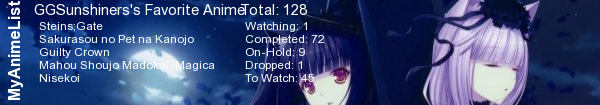
#22

| Thank you for this lovely design, the instruction on the css is easy to follow. You are awesome you know. :D Btw, here is my Steins;Gate Design. There's some minor mistake in it. like the link hovering on the right bar is kinda messy and some of the character picture quality is kinda bad. But i still like it. hehehehe... |
 |
Aug 13, 2013 7:56 AM
#23
GGSunshiners said: Thank you for this lovely design, the instruction on the css is easy to follow. You are awesome you know. :D Btw, here is my Steins;Gate Design. There's some minor mistake in it. like the link hovering on the right bar is kinda messy and some of the character picture quality is kinda bad. But i still like it. hehehehe... Cool, I'm always so happy to see remakes of this more than anything! I have a new version on my list currently which will hopefully be public soon and even more customizable! |
Aug 14, 2013 11:10 AM
#24
| Wow, i will be waiting for your new version Shishio-kun. Again, thank you for your lovely design. ^^ |
|
Jul 2, 2014 7:22 AM
#25
| I've restored these layouts back to normal as well after Imageshack deleted most of the pics. |
Jul 8, 2015 12:38 PM
#26

| I love this layout! And I think this is the first time I manage to make it look good. (by good I mean, with everything in order) Thank you for the code and for making it simple to understand ^^ |
 |
Mar 25, 2017 1:15 PM
#27
| what do you think of my list? I took yours and added a yugioh inspired twist. https://myanimelist.net/animelist/mrwaffleson |
Reply Disabled for Non-Club Members
More topics from this board
» ❓ Ask for help here + See Frequently Asked Questions ( 1 2 3 4 5 ... Last Page )Shishio-kun - Apr 15, 2010 |
7812 |
by mtsRhea
»»
Apr 21, 5:25 AM |
|
» [CSS- MODERN] ⭐ Minimal Dashboard layout by 5cm ~ Compact and convenient! ( 1 2 3 )Shishio-kun - Sep 4, 2020 |
121 |
by Pokitaru
»»
Apr 21, 3:25 AM |
|
» [CSS-MODERN] Change list text/font colors on any list layoutShishio-kun - May 4, 2021 |
3 |
by hideso
»»
Apr 20, 4:33 PM |
|
» [CSS] [VIDEO GUIDE] ⭐️ How to change fonts on a list layoutShishio-kun - Jul 15, 2019 |
17 |
by hideso
»»
Apr 20, 4:03 PM |
|
» [CSS][Modern] ☀️ Endless Summer Layout by Cateinya ( 1 2 3 4 5 ... Last Page )Cateinya - Aug 18, 2016 |
309 |
by hideso
»»
Apr 20, 3:56 PM |