New
Jul 24, 2012 12:38 PM
#5101

| If I have an image in a table, is it possible to have a border around just the image rather than a border around the whole table section? --- Also, I also just started changing mine, and I'm brick theming it (lame, I know, but it's just so I can figure out new and different things) |
 |
Jul 24, 2012 1:46 PM
#5102
Stateless said: If I have an image in a table, is it possible to have a border around just the image rather than a border around the whole table section? This: .header_cw, .header_completed, .header_onhold, .header_dropped, .header_ptw { display: block !important; border: ...; } + add width of image to all header classes. For example: .header_cw { width: 160px; } |
Jul 25, 2012 12:41 AM
#5103

Gouko_Tenrou said: Myanimelist: http://myanimelist.net/animelist/Gouko_Tenrou I just recently started changing it, would you guys mind letting me know what you think of it? Really nice colour scheme, but i think it would be better giving a transparent background to your category links (currently watching etc on top) to make it easier to read |
 |
Jul 25, 2012 3:03 AM
#5104

| Thanks, I'll look into that |
Jul 25, 2012 11:01 AM
#5105

| My Anime List http://myanimelist.net/animelist/Demonic9ight Just got done with it. How does it look? |
 |
Jul 25, 2012 11:04 AM
#5106
Demonic9ight said: My Anime List http://myanimelist.net/animelist/Demonic9ight Just got done with it. How does it look? Very nice. I just finished mine. After posting it here I decided to change the entire thing, so if you guys would not mind, some feedback would be great. |
Jul 25, 2012 11:14 AM
#5107

Demonic9ight said: I would give your "status_(not_)selected", "table headers" and "totals/grand total" a background colour too.My Anime List http://myanimelist.net/animelist/Demonic9ight Just got done with it. How does it look? |
 |
Jul 25, 2012 11:18 AM
#5108
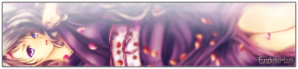
Gouko_Tenrou said: I like it, it gives off a nice atmosphere. Put's my mind at ease. I think it's because of the blues & greens.I just finished mine. After posting it here I decided to change the entire thing, so if you guys would not mind, some feedback would be great. Maybe give your list a transparent background? Something like a white background set at 10% opacity saved as .png or something. I just dislike floating text :D Your headers are lovely though! |
|
Jul 25, 2012 11:35 AM
#5109
| Thank you, very much. Nice to know that someone else likes it too. |
Jul 25, 2012 1:14 PM
#5110

| Hi guys, I'm having a blast making my page but hit a couple of brick walls... Here's my page: http://myanimelist.net/animelist/flaxman85 1. I can't edit my header (editing .header_cw, .header_completed, etc. has no effect) 2. I can't edit .category_totals nor #grand_totals (the stats below each section) 3. I'd like my background to stay static and zooming the page only affects the list and not background like this page: http://myanimelist.net/mangalist/mattusha Any help would be appreciated. :) |
 |
Jul 25, 2012 2:43 PM
#5111

flaxman85 said: Hi guys, I'm having a blast making my page but hit a couple of brick walls... Here's my page: http://myanimelist.net/animelist/flaxman85 1. I can't edit my header (editing .header_cw, .header_completed, etc. has no effect) 2. I can't edit .category_totals nor #grand_totals (the stats below each section) 3. I'd like my background to stay static and zooming the page only affects the list and not background like this page: http://myanimelist.net/mangalist/mattusha Any help would be appreciated. :) You've some errors in those lines : .status_selected { filter:alpha(opacity=85; <== not closed ... } .status_not_selected { filter:alpha(opacity=85; <== not closed ... } and try this for the last : body { background-size:100%; } |
ShinsaeJul 25, 2012 2:54 PM
Jul 25, 2012 3:24 PM
#5112
| Those opacity lines are pre-filled so I didn't mess with them >.< Thanks for the help, I'll get right on it. :) |
|
Jul 25, 2012 3:29 PM
#5113
| Its finished, its finally finished. http://myanimelist.net/animelist/Gouko_Tenrou |
Jul 25, 2012 4:41 PM
#5114
flaxman85 said: Those opacity lines are pre-filled so I didn't mess with them >.< Thanks for the help, I'll get right on it. :) You must close the parentheses filter:alpha(opacity=85; <== not good filter:alpha(opacity=85); <== good Try to edit .header_cw and other when you correct it. Gouko_Tenrou said: Its finished, its finally finished. http://myanimelist.net/animelist/Gouko_Tenrou It's good but if you have an background with (or not) transparency in list_surround (or headers and td) it will be better i think. |
ShinsaeJul 25, 2012 5:48 PM
Jul 25, 2012 6:13 PM
#5115

| I am having a problem loading the individual images upon hover .hide{ visibility:hidden; } .td1:hover .hide, .td2:hover .hide{ visibility:visible; } I have also tried this ~ and +. Do you know what I am doing wrong? |
YawmusJul 25, 2012 6:17 PM
 |
Jul 25, 2012 6:23 PM
#5116
| @Yawmus but the hide element work with javascript, you can't display with css, i am wrong ? |
Jul 25, 2012 6:39 PM
#5117
Jul 25, 2012 7:12 PM
#5118
Yawmus said: Shinsae said: @Yawmus but the hide element work with javascript, you can't display with css, i am wrong ? Is there another method of loading images that allows the hover? Does Hahaido's method eliminate the need of Javascript? It's Hahaido's css files : http://dl.dropbox.com/u/78192465/MyAnimeList/CSS/AnimeStyle.css ; you have another into for the covers. But it's too short, look to that too : http://dl.dropbox.com/u/78340470/animetitle.css (from Demonic9ight 's animelist). I've to logout now. If you have other questions, please ask. I will try to answer (when i comeback) :) Good night/day. |
Jul 25, 2012 7:23 PM
#5119
Shinsae said: Yawmus said: Shinsae said: @Yawmus but the hide element work with javascript, you can't display with css, i am wrong ? Is there another method of loading images that allows the hover? Does Hahaido's method eliminate the need of Javascript? It's Hahaido's css files : http://dl.dropbox.com/u/78192465/MyAnimeList/CSS/AnimeStyle.css ; you have another into for the covers. But it's too short, look to that too : http://dl.dropbox.com/u/78340470/animetitle.css (from Demonic9ight 's animelist). I've to logout now. If you have other questions, please ask. I will try to answer (when i comeback) :) Good night/day. My friend figured it out, table:hover + .hide{ visibility:visible; } |
|
Jul 25, 2012 9:02 PM
#5120

Gouko_Tenrou said: Its finished, its finally finished. http://myanimelist.net/animelist/Gouko_Tenrou Haven't done anything with mine yet but.. Just thought I'd say yours looks very nice. :) Always love when the print moves but the back image does not. The colors are also quite pretty. |
Jul 25, 2012 10:08 PM
#5121
| Took me days to complete my MAL pipboy. A lot of the time was spent trying to get some features to work, and I am happy with the results. *Only google chrome does my list justice right now *Still have some things to fix, this is not the final version |
|
Jul 25, 2012 10:16 PM
#5122

| ^ Yes. Google Chrome is doing justice. it's pretty unique idea and very well done. You just need to get it work in other browsers (firefox, safari, opera).. Great setting overall. |
 |
Jul 26, 2012 5:45 AM
#5123
Yawmus said: Took me days to complete my MAL pipboy. A lot of the time was spent trying to get some features to work, and I am happy with the results. *Only google chrome does my list justice right now *Still have some things to fix, this is not the final version I like it :) I wait for the final version. |
ShinsaeJul 26, 2012 7:53 AM
Jul 26, 2012 6:37 AM
#5124

Yawmus said: Indeed, it looks very good but it's quite visible it's not the final version. Took me days to complete my MAL pipboy. A lot of the time was spent trying to get some features to work, and I am happy with the results. *Only google chrome does my list justice right now *Still have some things to fix, this is not the final version A 16:9 pic (1366x768) 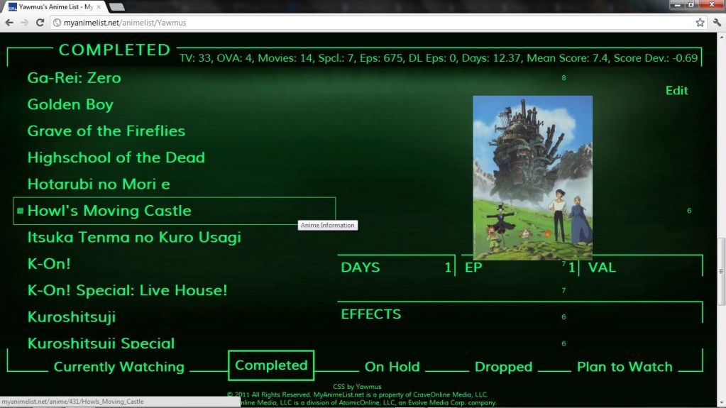 And a 4:3 resolution (1024x768) 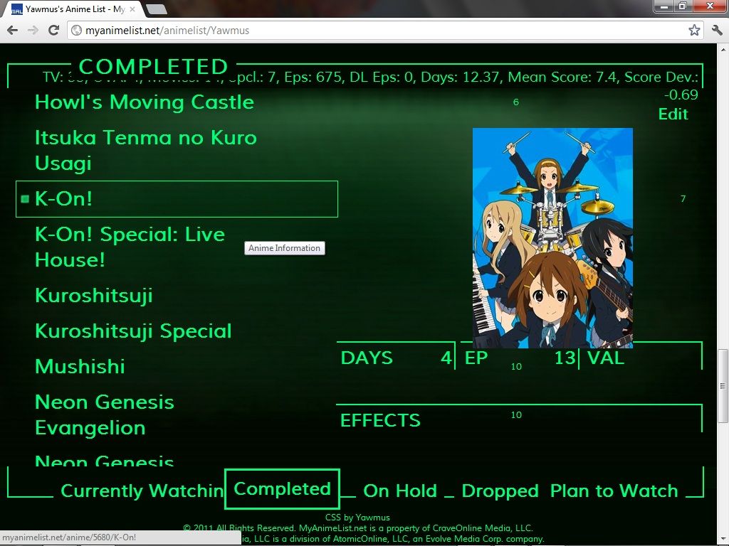 As a suggestion, the Edit/Add button is pretty useless. You might as well hide it/ force it off the screen :D Again, kudos to the idea and the very nice color pallet. |

Jul 26, 2012 8:44 AM
#5125
In case you don't have chrome this is what it is supposed to look like with 1440 x 900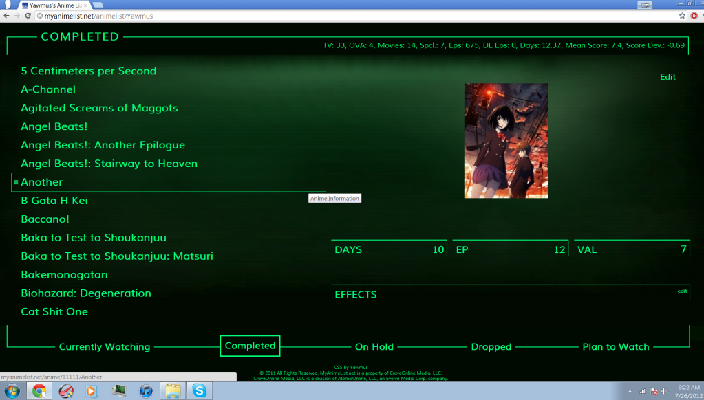 koleare said: Yawmus said: Indeed, it looks very good but it's quite visible it's not the final version. Took me days to complete my MAL pipboy. A lot of the time was spent trying to get some features to work, and I am happy with the results. *Only google chrome does my list justice right now *Still have some things to fix, this is not the final version A 16:9 pic (1366x768) And a 4:3 resolution (1024x768) As a suggestion, the Edit/Add button is pretty useless. You might as well hide it/ force it off the screen :D Again, kudos to the idea and the very nice color pallet. Yeah I thought about removing that button, but in the actually pipboy interface (I don't know if you've played fallout 3) there is a repair icon. You may be right, and I might have to give it the boot though. Shinsae said: I like it :) I wait for the final version. Han-yuu said: ^ Yes. Google Chrome is doing justice. it's pretty unique idea and very well done. You just need to get it work in other browsers (firefox, safari, opera).. Great setting overall. Thanks, hopefully I can finish the design by the end of the week. Things I still need to improve
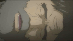
Lastly if you haven't played fallout 3 than this is where the idea came from  |
YawmusJul 26, 2012 8:51 AM
|
Jul 26, 2012 8:50 AM
#5126
Endelerius said: Gouko_Tenrou said: I like it, it gives off a nice atmosphere. Put's my mind at ease. I think it's because of the blues & greens.I just finished mine. After posting it here I decided to change the entire thing, so if you guys would not mind, some feedback would be great. Maybe give your list a transparent background? Something like a white background set at 10% opacity saved as .png or something. I just dislike floating text :D Your headers are lovely though! Added a transparent background to list, and finished up some of the finer details. |
Jul 26, 2012 9:17 AM
#5127
| Updated My List. What do you guys think? http://myanimelist.net/animelist/Demonic9ight |
|
Jul 26, 2012 9:21 AM
#5128
Yawmus said: Wow. It actually looks very good, but only at your resolution :Those pics I posted were taken at the respective resolutions, in Chrome. I'm a web designer myself, so I have all the browsers installed, the irony being that I installed all of them for css testing purposes only. I took those pics after you said your list looks best in Chrome :D In FF it looks even more mutated. Took at 1366x768 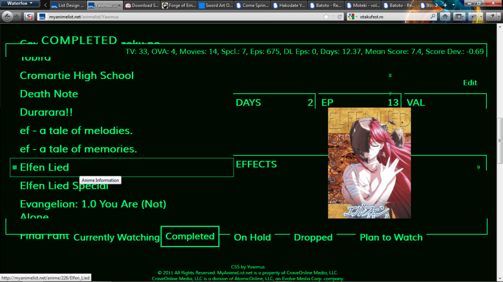 Css is and forever will be the biggest pain for web browsers, but oh well. My advice is that you should not think about cross-browser scripting, but cross-resolutions as well. I wish you good look for now, since you're trying to do something pretty hard xD Gouko_Tenrou said: Looks very good. A tad more transparency to the table background and it should be all good. Also, it may not influence anything, but you may consider adding something to the hover of the links (maybe make the text italic and a tad bigger?). |
Jul 26, 2012 12:32 PM
#5129
| Ah ha! At first I thought to myself that it would be impossible to share the same code between browsers and then I discovered this. *edit* Dude. . . What if depending on the browser you choose the color scheme will be different similarly to how you can change you pipboy color scheme in-game. I am going to do that. |
YawmusJul 26, 2012 1:36 PM
|
Jul 27, 2012 12:42 AM
#5130
| Here's the update: http://myanimelist.net/animelist/flaxman85 4 more headers to go! My photoshop skill is slowly coming back to me :D Any comments/critique are welcomed. |
|
Jul 27, 2012 12:58 AM
#5131
flaxman85 said: Here's the update: http://myanimelist.net/animelist/flaxman85 4 more headers to go! My photoshop skill is slowly coming back to me :D Any comments/critique are welcomed. That is a very nice design |
Jul 27, 2012 3:31 AM
#5132
Yawmus said: Wow!! Such a huge improvement over last night: Ah ha! At first I thought to myself that it would be impossible to share the same code between browsers and then I discovered this. *edit* Dude. . . What if depending on the browser you choose the color scheme will be different similarly to how you can change you pipboy color scheme in-game. I am going to do that. Taken at 1280x1024, FF 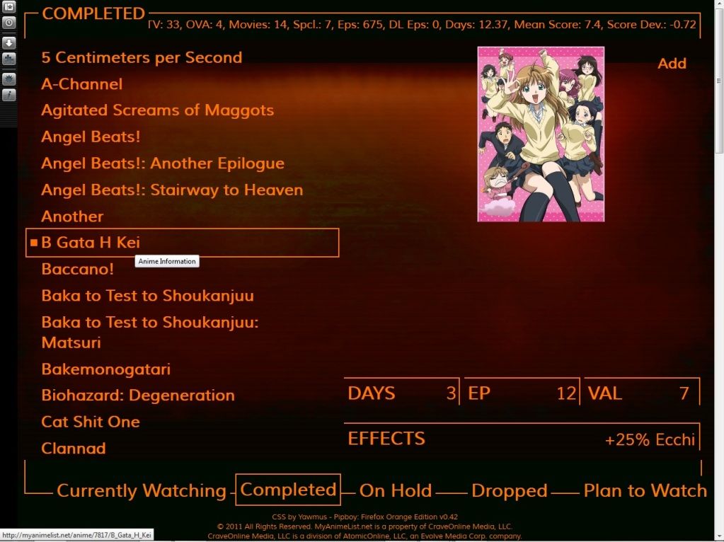 Taken at 1366x768, FF 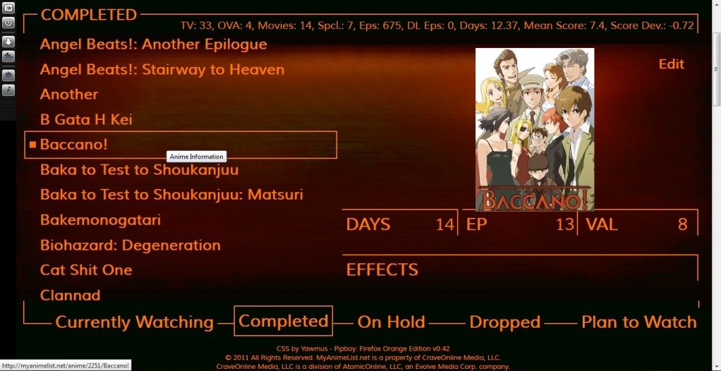 flaxman85 said: A very nice design, indeed.Here's the update: http://myanimelist.net/animelist/flaxman85 4 more headers to go! My photoshop skill is slowly coming back to me :D Any comments/critique are welcomed. My only suggestion would be uploading your background image to photobucket or your personal website, since it has a very long loading time. |
Jul 27, 2012 6:48 AM
#5133
koleare said: A very nice design, indeed. My only suggestion would be uploading your background image to photobucket or your personal website, since it has a very long loading time. Thanks m8. The image is less than 400kb. I think it's my gigantic list that's making every thing load slow, but I took your advice and host it on a private image site. Let me know if there's anything else. Cheers. |
|
Jul 27, 2012 7:01 AM
#5134
flaxman85 said: Much much better. MAL's images generally have long loading times, so it isn't any good; it wasn't your list's fault. Even if I don't quite support imageshack (from what I've seen, it has longer loading times in comparison to other image hosting sites), it loads the image as a charm, at least better than loading it from MAL.koleare said: A very nice design, indeed. My only suggestion would be uploading your background image to photobucket or your personal website, since it has a very long loading time. Thanks m8. The image is less than 400kb. I think it's my gigantic list that's making every thing load slow, but I took your advice and host it on a private image site. Let me know if there's anything else. Cheers. |
Jul 27, 2012 8:29 AM
#5135
Jul 28, 2012 2:25 AM
#5136
| Finished 2 more headers today (On Hold + Plan to Watch) 2 more to go :D http://myanimelist.net/animelist/flaxman85 |
|
Jul 28, 2012 2:39 AM
#5137

Yawmus said: @koleare Thanks Does anyone know of a better way to scale the .hide div images? Because I am trying to get my images to work on different resolutions and it doesn't really accept a width and height percentage (cuts off some of it). Maybe with something like this http://www.css3.info/preview/background-size/ http://css-tricks.com/perfect-full-page-background-image/ Background-size:cover Or with percent. Impressive work indeed. It certainly took days. And this is really tricky Did someone already made a CSS including the entire MAL anime image cover base ? |
HapaxJul 28, 2012 2:47 AM
 I sometime have funky grammar, sorry about that. If you can correct some of my post, you would be an angel. |
Jul 28, 2012 2:57 AM
#5138
| mmm.. what's the specific code to make a portion of a row clickable rather than having to put your mouse over the text? I'm still pretty new at editing css and had no luck with google on this one. Thanks. |
|
Jul 28, 2012 3:14 AM
#5139
flaxman85 said: mmm.. what's the specific code to make a portion of a row clickable rather than having to put your mouse over the text? I'm still pretty new at editing css and had no luck with google on this one. Thanks. Add display:block On the link (a), then specify the area supposed to be clickable with width/height |
I sometime have funky grammar, sorry about that. If you can correct some of my post, you would be an angel. |
Jul 28, 2012 3:17 AM
#5140
Yawmus said: With javascript, that would be simple, but no js in a css list. This could be done with multiple divs, with multiple margins and paddings in percentage, but that would only reduce the error of a pic and you don't have many divs to work with. The third would be a simple php script, but I'm not too sure how you can input the right resolution to the script, so it can output a nicely sized image. I think it's best you make it out with fixed sized pics for now.@koleare Thanks Does anyone know of a better way to scale the .hide div images? Because I am trying to get my images to work on different resolutions and it doesn't really accept a width and height percentage (cuts off some of it). flaxman85 said: .td1 a, .td2 a {mmm.. what's the specific code to make a portion of a row clickable rather than having to put your mouse over the text? I'm still pretty new at editing css and had no luck with google on this one. Thanks. display: block; height: 100%; width: 70%; } //I hope I nailed it (I'm not sure it would work out in percentages) xD |
Jul 28, 2012 3:38 AM
#5141
Yawmus said: @koleare Thanks Does anyone know of a better way to scale the .hide div images? Because I am trying to get my images to work on different resolutions and it doesn't really accept a width and height percentage (cuts off some of it). This sould do the trick -webkit-background-size: auto 100%; -moz-background-size: auto 100%; -o-background-size: auto 100%; background-size: auto 100%; Should work on any recent browser (sorry for spamming) Edit : If it still not work, you may try Media Queries. http://www.w3.org/TR/css3-mediaqueries/ Maybe with something like @media screen and (max-height: 700px) {...} |
HapaxJul 28, 2012 3:50 AM
I sometime have funky grammar, sorry about that. If you can correct some of my post, you would be an angel. |
Jul 28, 2012 4:53 AM
#5142
koleare said: .td1 a, .td2 a { display: block; height: 100%; width: 70%; } //I hope I nailed it (I'm not sure it would work out in percentages) xD Apparently, .td1 and .td1 a both have separate text for some reason. If I use display:block to extend the clickable range, it would pushes everything to the right creating an extra row. .td1 --- includes these texts: "Airing", #, and Type (TV/OVA/Movie) column (see white texts on my anime list) .td1 a --- affects everything that's clickable So, is there a way to bypass text in .td1 so that they won't be affected by display:block? or do I have to just create separate table for each column? >.< |
flaxman85Jul 28, 2012 4:57 AM
|
Jul 28, 2012 5:15 AM
#5143
| Try(note, I never worked with MAL's lists, so I don't know if it's exactly as I say to be xD): .td1 a[class="animetitle"], .td2 a[class="animetitle"] { display: block; width: put it in pxs; height: put it in pxs; } |
Jul 28, 2012 5:28 AM
#5144
koleare said: Try(note, I never worked with MAL's lists, so I don't know if it's exactly as I say to be xD): .td1 a[class="animetitle"], .td2 a[class="animetitle"] { display: block; width: put it in pxs; height: put it in pxs; } I found .animetitle and it worked also. Thanks :D However, that dreaded "airing" text is the only problem now. It still create an extra row for those that has it. Any ideas? |
|
Jul 28, 2012 5:29 AM
#5145
| The airing stuff in <small> is the painful part. I didn't found the answer, but If you can select it with some selector, maybe it's possible to position it somewhere else, or just remove it. edit: Simultaneous post :) You may also add this proprieties directly in .animetitle |
I sometime have funky grammar, sorry about that. If you can correct some of my post, you would be an angel. |
Jul 28, 2012 5:36 AM
#5146
| maybe there's a command to disable display:block command if there's "airing" text in that row? or a command to delay display:block to start at a certain space right after "airing" text? |
|
Jul 28, 2012 6:12 AM
#5147
| Found it .td1 a[class="animetitle"], .td2 a[class="animetitle"] { display: block; float: left; height: 100%; width: 80%; } .td1 small, .td2 small { display: block; float: right; padding-right: 10px; } Edit : It would be cleaner to just use .animtitle instead of .td1 a[class="animetitle"], .td2 a[class="animetitle"] (as it's the same :) |
I sometime have funky grammar, sorry about that. If you can correct some of my post, you would be an angel. |
Jul 28, 2012 8:15 AM
#5148
| ^ Wow I'd like to say thank you for spending your precious time for my sake. Never thought I'd be getting help from a French m8 xD Let me know you need anything. :) |
|
Jul 28, 2012 8:37 AM
#5149
| @flaxman85 Improved it .animetitle { display: block; float: left; font-weight: bold; height: 100%; width: 100%; } .td1 small, .td2 small { display: block; float: right; left: 812px; padding-right: 10px; position: absolute; z-index: 100; } .td1 small a:first-child, .td2 small a:first-child { margin-left: 45px; } So the title without airing should be clickable in the entire row. It's a bit tricky so I'm not sure it will work fine everywhere Edit: Nice list indeed, You sure like fair hair :) |
HapaxJul 28, 2012 8:42 AM
I sometime have funky grammar, sorry about that. If you can correct some of my post, you would be an angel. |
Jul 28, 2012 9:06 AM
#5150
| ^ That makes the 'airing, not yet aired, edit, more' all jumbled up in the same place xD I tried messing around with some lines with no luck, but here's my final commands, and I like it a lot: .animetitle { font-weight: bold; display: block; float: left; height: 100%; width: 74%; } .td1 small, .td2 small { display: block; float: right; padding-right: 10px; } --- So, I'm done with this part for sure. Thanks again for all your help. PS. What do you see for my sig? Blue Ky (Guilty Gear) or Red Gats? (Berserk). Also, how is the quality? This is what you see right?  |
|
More topics from this board
» People who don't believe that there is anything wrong with western entertainment and influence.kratos960203 - Apr 19 |
28 |
by Ex-Aid
»»
1 hour ago |
|
» Made An Anime Youtube Video thoughts?panque - Yesterday |
1 |
by TheMechaManiac
»»
Yesterday, 11:43 AM |
|
» Share Your YouTube Channel/Videos! ( 1 2 3 4 5 ... Last Page )nin-tendo - Dec 16, 2022 |
361 |
by panque
»»
Yesterday, 8:38 AM |
|
» Anime hoodies - New brandabambata - Apr 13 |
3 |
by abambata
»»
Yesterday, 7:47 AM |
|
» Anime hoodies - Would you wear it ?abambata - Apr 17 |
3 |
by abambata
»»
Yesterday, 7:46 AM |