Forum Settings
Forums
New
Pages (7) « First ... « 2 3 [4] 5 6 » ... Last »
Jun 2, 2016 1:58 PM

Offline
Apr 2011
13769
@tsudecimo it's not bad, but there's no flow. Also, I'd recommend blurring the edges of the render. It helps blend the render better. It's actually pretty hard to fuck up smudge, since it'll look decent almost always... from what I've seen, at least.
Jun 3, 2016 4:53 AM

Offline
Jun 2014
688
Does anyone know (or know an easy way of finding out) the amount of pixels between the profile picture and the about me section? I would like to make a profile picture and graphic that connect with one another.
Jun 3, 2016 4:55 AM

Offline
Jul 2011
277
yhunata said:
@tsudecimo it's not bad, but there's no flow. Also, I'd recommend blurring the edges of the render. It helps blend the render better. It's actually pretty hard to fuck up smudge, since it'll look decent almost always... from what I've seen, at least.


Really? I think smudge is something really easy to fuck up and hard to master... For me good smudging is somehow the masterclass of tagging and I could never master it or remotely got any good results. It's just to hard for me xD

But maybe our understanding of what smudge is is somehow different o: Here are some good examples I found on deviantart.
1
2
3
4
5

I think it's really hard because you need to get the flow and colors right and also really need to connect the render with the smudged surrounding to get something good...

Ethcaria said:
Does anyone know (or know an easy way of finding out) the amount of pixels between the profile picture and the about me section? I would like to make a profile picture and graphic that connect with one another.


Give me a few seconds :)

EDIT: 17px

I hope that's what you mean? o:
BigJkJun 3, 2016 4:59 AM
Jun 3, 2016 5:00 AM

Offline
Jun 2014
688
Yes that is what I mean, thank you ^_^
Jun 3, 2016 5:03 AM

Offline
Jul 2011
277
Ethcaria said:
Yes that is what I mean, thank you ^_^


No Problem :3

If you want to know how I did it. Just make a screenshot, put it in Photoshop. Zoom into the area you want to know and select the free space. Then use the Info Window to check how many pixel wide your selection is and that's it :P
Jun 3, 2016 5:39 AM

Offline
Dec 2012
24356
BigJk said:
yhunata said:
@tsudecimo it's not bad, but there's no flow. Also, I'd recommend blurring the edges of the render. It helps blend the render better. It's actually pretty hard to fuck up smudge, since it'll look decent almost always... from what I've seen, at least.


Really? I think smudge is something really easy to fuck up and hard to master... For me good smudging is somehow the masterclass of tagging and I could never master it or remotely got any good results. It's just to hard for me xD

Agreed. Smudge is the highest level when it comes to this graphic stuff, as it is the closest thing to actual art.

The one I tried to do is the basic level. The complex one is like the examples you mentioned where it looks like a painting.
Jun 3, 2016 10:23 AM

Offline
Dec 2012
24356


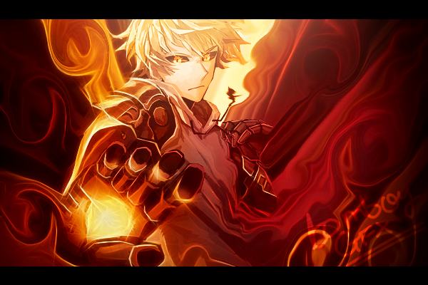
Pretty bad I know, and the render isn't blended in. But on the bright side I finally have some understanding of smudge. A video tutorial made a lot more sense.
Jun 3, 2016 7:46 PM

Offline
Nov 2015
995
Can any of you guys help me with my avi? I'm trying to take this gif
and have it as my avatar but when I shrink it it keeps messing up. I want to have it look like my avi now just animated and maybe better quality lol. I keep trying to do it myself but it keeps taking the image and like... stretching it out? Idk.. it's weird lol
Jun 4, 2016 3:06 AM

Offline
Dec 2012
24356
Gabagool said:
Can any of you guys help me with my avi? I'm trying to take this gif
and have it as my avatar but when I shrink it it keeps messing up. I want to have it look like my avi now just animated and maybe better quality lol. I keep trying to do it myself but it keeps taking the image and like... stretching it out? Idk.. it's weird lol

http://ezgif.com/resize

then crop and optimize if necessary.
Jun 4, 2016 7:02 AM

Offline
Jul 2011
277
tsudecimo said:


Pretty bad I know, and the render isn't blended in. But on the bright side I finally have some understanding of smudge. A video tutorial made a lot more sense.


That's definitely the right direction. Really good in comparison to your first try! o: The flow of the Smudge is really nice, but the colors could blend in a bit more and ofc the render needs to be worked into the smudge. Keep trying :3
Jun 4, 2016 8:03 AM

Offline
Nov 2015
995
tsudecimo said:
Gabagool said:
Can any of you guys help me with my avi? I'm trying to take this gif
and have it as my avatar but when I shrink it it keeps messing up. I want to have it look like my avi now just animated and maybe better quality lol. I keep trying to do it myself but it keeps taking the image and like... stretching it out? Idk.. it's weird lol

http://ezgif.com/resize

then crop and optimize if necessary.


Thanks. The site I was trying to use before was a pain in the ass and kept messing up my image.
Jun 4, 2016 8:27 AM

Offline
Jun 2013
1079
There are people who do amazing jobs at smudges with just a mouse after I bought a cheap tablet, it became really easy.

But hey, I'm more of a c4d person.
Jun 4, 2016 9:00 AM

Offline
Jul 2011
277
Tomboy said:
There are people who do amazing jobs at smudges with just a mouse after I bought a cheap tablet, it became really easy.

But hey, I'm more of a c4d person.


I also tried to smudge with my tablet. It worked better but still nothing compared to good smudge. Do you have anything to show of the stuff you did with your tablet?
Jun 4, 2016 9:03 AM

Offline
Jun 2013
1079
BigJk said:
Tomboy said:
There are people who do amazing jobs at smudges with just a mouse after I bought a cheap tablet, it became really easy.

But hey, I'm more of a c4d person.


I also tried to smudge with my tablet. It worked better but still nothing compared to good smudge. Do you have anything to show of the stuff you did with your tablet?


Sadly my shit is destroyed since my old laptop's motherboard fried.

Found these on my dA (don't bother checking it since I retired from it)


Jun 4, 2016 9:32 AM

Offline
Jul 2011
277
Tomboy said:
BigJk said:


I also tried to smudge with my tablet. It worked better but still nothing compared to good smudge. Do you have anything to show of the stuff you did with your tablet?


Sadly my shit is destroyed since my old laptop's motherboard fried.

Found these on my dA (don't bother checking it since I retired from it)


Looks really good ^^ really like the first one. Good work :3
Jun 4, 2016 10:36 AM

Offline
Dec 2012
24356
Agreed, the first one looks great. I saw it before. First time seeing the genos one though.
Thanks @BigJk I will definitely keep trying, it's fun.

-------------------
Was bored so I did some scraps

Jun 6, 2016 7:05 AM

Offline
Apr 2011
13769
I did it. I updated my profile layout.... and I just realised that I left my seasonal statistics bare naked. The "favorites" and "recent obsessions" are linked, btw. That was a bloody pain in the ass. EDIT: Oh my God, I just noticed the Scandal screen shot is unedited to to adjust for the text.
Jun 6, 2016 11:24 AM

Offline
Apr 2011
13769
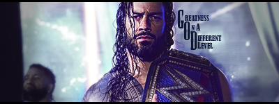
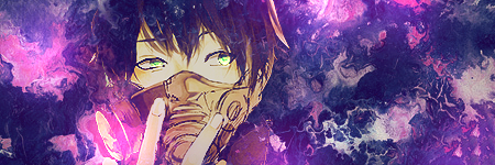
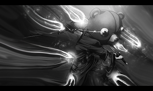
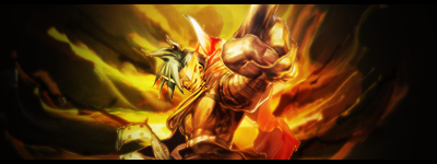
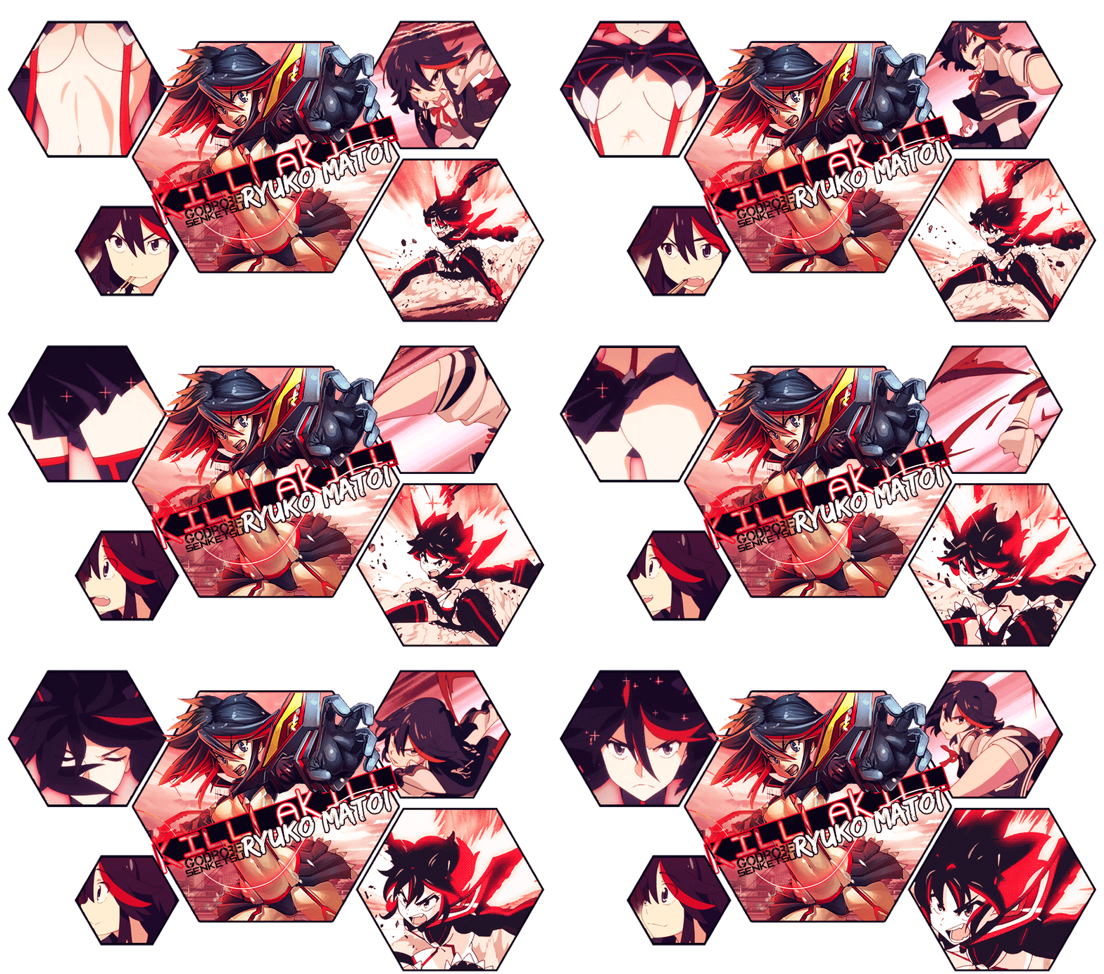
I was doing some practice runs on Zelkiiro's request. Got these two:


The first one, I was genuinely trying to do an advanced smudge. It's surprisingly easier than I thought. The second, I just went haywire on that. Might even use that style for my next set.
Jun 6, 2016 11:43 AM

Offline
Dec 2012
24356
The second one makes more sense.
Jun 6, 2016 11:45 AM

Offline
Apr 2011
13769
tsudecimo said:
The second one makes more sense.


I was trying to make an explosion though.
Jun 6, 2016 11:51 AM

Offline
Dec 2012
24356
yhunata said:
tsudecimo said:
The second one makes more sense.


I was trying to make an explosion though.

Well it happened to match the dynamics of the render :p

I also think the smudge in it is better than the advanced smudge you tried (something is iffy about the first one)

Your best work imo.
Jun 7, 2016 3:29 PM

Offline
Dec 2012
24356


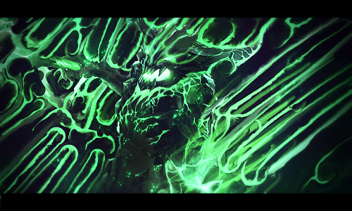
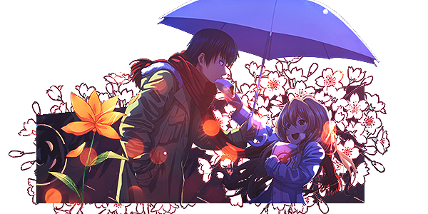
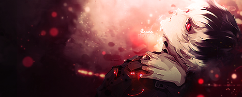
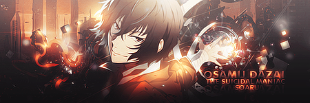
Tried doing something bright. Background is smudged.
Jun 7, 2016 7:28 PM

Offline
Apr 2016
271
Hi all,

I've been wanting to get into manga and anime drawing and was wondering if anyone recommends any instructional books.

Thanks.
Jun 8, 2016 7:14 AM

Offline
Jul 2011
277
Kakuhan said:
Hey everyone; I began to custom my MAL profile. I'm searching around some infos like the size of the profile template, the width of the board.
Thanks you !


I think the max. width of your profile should be 800px.

What do you mean with board width?
Jun 8, 2016 9:54 AM

Offline
Dec 2012
24356
silverwhirlwind said:
I only made it because I was searching to join a graphics club but the newest comment on any of the ones I found were from 2013 :(

This club is active
http://myanimelist.net/clubs.php?cid=67153
Jun 8, 2016 12:01 PM

Offline
Apr 2011
13769
New set. What do you guys think?

tsudecimo said:


Tried doing something bright. Background is smudged.


It looks pretty nice. The background fits nicely with the render. Text is somewhat unreadable, though that may be because I'm on one eye.
Jun 8, 2016 12:08 PM

Offline
Dec 2012
24356
yhunata said:
New set. What do you guys think?

It looks great, the blending of the render in particular feels Natural. What's the original render?

I have been digging your latest stuff. They are different form what you usually make.

It looks pretty nice. The background fits nicely with the render. Text is somewhat unreadable, though that may be because I'm on one eye.

It's unreadable. It's just a text icon. So it's not meant to be readable, just a little bit for effect.
http://i.imgur.com/ldYK7EO.png
Jun 8, 2016 12:14 PM

Offline
Apr 2011
13769
@tsudecimo I was using this.
Jun 8, 2016 12:19 PM

Offline
Dec 2012
24356

Oh lol. Great render.

It still looks nice nonetheless, and you kept the flow in the right and left.
Jun 11, 2016 3:49 PM

Offline
Dec 2012
24356
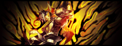
new forum set desu
Jun 12, 2016 1:54 PM

Offline
Apr 2016
905
Hi! I haven't posted here before, I'm Magic. >.<
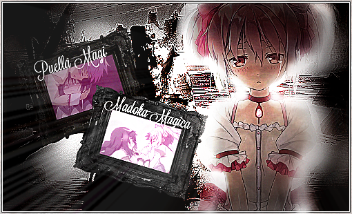
I just finished re-watching Madoka Magica and I wanted to make some graphics to celebrate, so I made this (spoilers if you haven't watched it sorry >.<):

I think I overdid it a little, but what do you think? ^^;

**********Smile! ^^*********
Jun 12, 2016 2:05 PM

Offline
Dec 2012
24356
magicalofmagic said:
Hi! I haven't posted here before, I'm Magic. >.<
I just finished re-watching Madoka Magica and I wanted to make some graphics to celebrate, so I made this (spoilers if you haven't watched it sorry >.<):

I think I overdid it a little, but what do you think? ^^;

The design itself is really good. But why is it so burned like that? I can only make out the big madoka render and the two frames. The background is really weird.
Jun 12, 2016 2:07 PM

Offline
Apr 2016
905
tsudecimo said:
magicalofmagic said:
Hi! I haven't posted here before, I'm Magic. >.<
I just finished re-watching Madoka Magica and I wanted to make some graphics to celebrate, so I made this (spoilers if you haven't watched it sorry >.<):

I think I overdid it a little, but what do you think? ^^;

The design itself is really good. But why is it so burned like that? I can only make out the big madoka render and the two frames. The background is really weird.

I tried to make it kinda black-and-white but it didn't turn out so well ^^; I just went with it, since I felt that it isn't so bad, and the background isn't the main subject of the graphics. Is that a bad thing?

**********Smile! ^^*********
Jun 12, 2016 2:14 PM

Offline
Dec 2012
24356
magicalofmagic said:

I tried to make it kinda black-and-white but it didn't turn out so well ^^; I just went with it, since I felt that it isn't so bad, and the background isn't the main subject of the graphics. Is that a bad thing?

Well in my opinion I think if you picked a normal background (like an fanart of Madoka) and just made that black and white, it will look better than this. And maybe add some sparkles that go well with the magic theme. Yeah the background isn't the main subject but it's distracting here. First thing I noticed was the background.

You did the hard part well which is the design. But the choice of background doesn't make it pretty. I can't really tell what the background is tbh.
Jun 12, 2016 2:27 PM

Offline
Apr 2011
13769
magicalofmagic said:
Hi! I haven't posted here before, I'm Magic. >.<
I just finished re-watching Madoka Magica and I wanted to make some graphics to celebrate, so I made this (spoilers if you haven't watched it sorry >.<):

I think I overdid it a little, but what do you think? ^^;


Too sharpened. Lessen the sharpening (erase, lower the opacity, blur, etc.) and the background is rather unfitting. Also a few problems with the lighting.
Jun 12, 2016 2:28 PM

Offline
Apr 2016
905
tsudecimo said:
magicalofmagic said:

I tried to make it kinda black-and-white but it didn't turn out so well ^^; I just went with it, since I felt that it isn't so bad, and the background isn't the main subject of the graphics. Is that a bad thing?

Well in my opinion I think if you picked a normal background (like an fanart of Madoka) and just made that black and white, it will look better than this. And maybe add some sparkles that go well with the magic theme. Yeah the background isn't the main subject but it's distracting here. First thing I noticed was the background.

You did the hard part well which is the design. But the choice of background doesn't make it pretty. I can't really tell what the background is tbh.


Okay, I'll do that next time. Thanks. :D

It was this:

**********Smile! ^^*********
Jun 12, 2016 3:56 PM

Offline
Jun 2013
1079
Too sharpened and too much contrast.
Jun 12, 2016 6:46 PM

Offline
Apr 2016
905
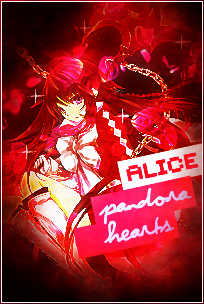
Heh, just made a little something. :D

thoughts?

**********Smile! ^^*********
Jun 13, 2016 1:07 AM

Offline
Apr 2011
13769
silverwhirlwind said:
I recently started using photoshop a few days ago and made this signature. Can I get some feedback on how it look or what I can do to improve it?


Since you're new, I'll recommend following some tutorials first. Not terrible for a first work, blending needs work and the text could be a little smaller. Also, lowering the opacity of a render like that can be bad, due to becoming see through.

magicalofmagic said:
Heh, just made a little something. :D

thoughts?


Again, over-sharpened. Honestly speaking, that's the biggest problem I've seen with your tags so far. Way too much sharpening.
Jun 13, 2016 3:10 AM

Offline
Dec 2012
24356
@magicalofmagic
I like it. The text is really good. The only problem is the red light in the middle area, it's too bright.
Jun 13, 2016 8:31 AM

Offline
Apr 2016
905
yhunata said:
silverwhirlwind said:
I recently started using photoshop a few days ago and made this signature. Can I get some feedback on how it look or what I can do to improve it?


Since you're new, I'll recommend following some tutorials first. Not terrible for a first work, blending needs work and the text could be a little smaller. Also, lowering the opacity of a render like that can be bad, due to becoming see through.

magicalofmagic said:
Heh, just made a little something. :D

thoughts?


Again, over-sharpened. Honestly speaking, that's the biggest problem I've seen with your tags so far. Way too much sharpening.

I'll work on that next time ^^;
tsudecimo said:
@magicalofmagic
I like it. The text is really good. The only problem is the red light in the middle area, it's too bright.

Thanks! :D

**********Smile! ^^*********
Jun 13, 2016 9:53 AM

Offline
Apr 2016
905
Heh, another one here >.<
I decided to make 2 of the same one, since I found a colour effect I liked but I wasn't sure if it was better than the original. Sadly, I changed things before I put the writing down so the writing is in slightly different places and sizes on each one.

**********Smile! ^^*********
Jun 13, 2016 9:56 AM

Offline
Apr 2011
13769
@silverwhirlwind Better, but that just fixes one problem. Like I said, you should look through some tutorials, learn the basics and all. Also, about the text, text does not need to be huge to be easy to read. There are little tricks that you can use to make it easily readable. Making it large is likelier to take focus away from the focal point. And one more thing, personal experience told me that white borders in a site with a white background doesn't really go that well.
Jun 13, 2016 12:42 PM

Offline
Jun 2013
1079
This TOOK FOREVER!

Jun 13, 2016 1:06 PM

Offline
Apr 2016
905
Tomboy said:
This TOOK FOREVER!


:O So amazing!! I love the gifs, they add so much movement. :D

**********Smile! ^^*********
Jun 13, 2016 4:11 PM

Offline
Dec 2012
24356
Tomboy said:
This TOOK FOREVER!

Why, did you not link the layers of the gif when pasted? @_@
Jun 13, 2016 6:52 PM

Offline
Jun 2013
1079
tsudecimo said:
Tomboy said:
This TOOK FOREVER!

Why, did you not link the layers of the gif when pasted? @_@


I did that and pasted it over the selection.
>>Finding the gifs was the hardest part (ones that looked good) :P
And half the time I was dodging my parents, 'what are you doing ( ͡° ͜ʖ ͡°) ?'
Jun 14, 2016 6:25 AM

Offline
Nov 2013
12686
Tomboy said:
tsudecimo said:

Why, did you not link the layers of the gif when pasted? @_@


I did that and pasted it over the selection.
>>Finding the gifs was the hardest part (ones that looked good) :P
And half the time I was dodging my parents, 'what are you doing ( ͡° ͜ʖ ͡°) ?'


Now I understand why it took forever.

Jun 14, 2016 1:23 PM

Offline
Apr 2016
905
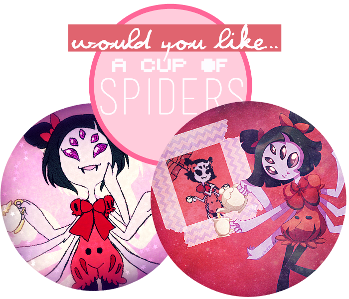
Wo muffet >.<

thoughts?

**********Smile! ^^*********
Jun 14, 2016 2:02 PM

Offline
Dec 2012
24356

Looks nice. But I think your stuff are simpler than before.
Pages (7) « First ... « 2 3 [4] 5 6 » ... Last »

More topics from this board

» Help me modify this layout

Luffie00 - 4 hours ago

0 by Luffie00 »»
4 hours ago

» What software(s) and hardware(s) do you use for digital drawings?

DesuMaiden - Apr 16

10 by JKKH »»
7 hours ago

» Share Your YouTube Channel/Videos! ( 1 2 3 4 5 ... Last Page )

nin-tendo - Dec 16, 2022

357 by nin-tendo »»
11 hours ago

» Protect or punish?

DollzchanAi - Today

2 by Cammell »»
Today, 6:19 AM

» Show us your latest sketch or drawing v.2 ( 1 2 3 4 5 ... Last Page )

Luna - Feb 21, 2017

1628 by JKKH »»
Yesterday, 9:47 PM
It’s time to ditch the text file.
Keep track of your anime easily by creating your own list.
Sign Up Login